You prompt an AI to “create a dashboard.”
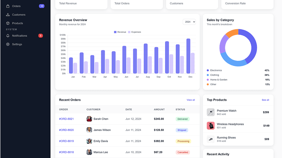
It looks great.
Then you prompt it to “add a settings screen.”
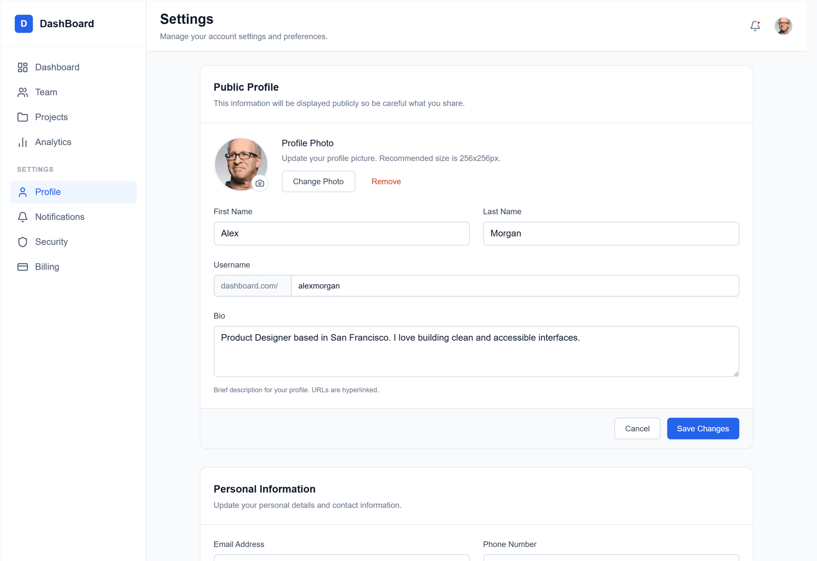
Now the buttons are a different shade of blue. The border radius changed. The sidebar moved. The typography feels… off.
Welcome to the “Frankenstein UI” problem.
AI can generate screens in seconds. But unless you control it, you’ll end up with a product that feels stitched together from five different brands. That’s not just ugly. It’s expensive.
If you’re a founder or designer shipping real SaaS, consistency isn’t optional. It’s trust. It’s velocity. It’s maintainability.
Let’s talk about how to actually enforce coherence in AI-generated UI, without slowing down the speed you adopted AI for in the first place.
The Shift: From Deterministic Design to Probabilistic UI
Traditional design tools were deterministic.
If you set a button to #0066CC, it stayed #0066CC.
AI tools don’t work like that.
When you prompt an AI to “create a primary button,” it doesn’t consult your brand file. It consults statistical probability across millions of interfaces. It predicts what a primary button usually looks like.
That’s the paradigm shift:
- Before: You controlled every pixel.
- Now: You influence probability.
Without constraints, the model drifts toward the average of the internet — not your brand.
What “Consistency” Actually Means in the AI Era
Consistency isn’t just color matching. In SaaS, it’s three layers deep:
- Visual Consistency
- Same color tokens
- Same spacing scale
- Same border radii
- Same typography system
AI often introduces “visual drift”:
- 4px radius on one card
- 8px on the next
- Slightly off-brand blues (#3B82F5 instead of #3B82F6)
It looks small. It feels cheap.
Users subconsciously associate polish with reliability.
- Structural & Functional Consistency
- Back button stays in the same place
- Delete always triggers confirmation
- Navigation logic doesn’t move around
AI treats screens as isolated paintings, not connected states in a system.
It doesn’t inherently understand:
- Object permanence
- Flow continuity
- Interaction contracts
That’s on you to enforce.
- Data & Content Consistency
AI hallucinated data is a silent killer.
- “John Smith” on the dashboard
- “Jane Doe” in the sidebar
- Features that don’t exist mentioned in UI
In a prototype, this breaks credibility. In production, it becomes legal risk.
Why AI Breaks Your Design System
Let’s be blunt: this isn’t because AI is “bad.”
It’s because of how it works.
- It’s Stochastic
LLMs predict tokens probabilistically. Even with similar prompts, there’s always entropy.
Deterministic systems:
Color.Primary → #0055FF
AI systems: “Primary blue” → Maybe your blue. Maybe another blue.
- Context Rot Is Real
You paste your entire design system at the start.
By screen five?
The model “forgets” parts of it.
Context windows are finite. Attention degrades. Recency bias kicks in.
If you don’t re-inject constraints, it reverts to training data patterns.
- No Object Permanence
In Figma:
- One Master Component
- Many instances
- Change one → update all
In naive AI workflows:
- Every button is regenerated
- Nothing is linked
- No shared memory
That’s how Frankenstein UI happens.
Design Tokens as the Control Layer
If AI is probabilistic, you need a deterministic foundation.
That foundation is Design Tokens.
Instead of:
#0055FF 16px 8px
You define:
color-primary-500 spacing-md radius-sm
AI should operate at the semantic token layer, not raw values.
Token Hierarchy That Works for AI
- Primitive Tokens
Raw values (blue-500: #0055FF)
- Semantic Tokens
Intent mapping (primary-action-bg → blue-500)
- Component Tokens
Component-specific mappings (button-primary-bg → primary-action-bg)
AI should use semantic tokens.
Why?
Because if you rebrand from blue to purple:
- Primitive changes
- Semantic logic stays
- AI still applies the right intent
That’s how you future-proof generation.
Tool Architectures: Who Actually Handles Consistency?
Not all AI design tools are built the same.
System-Centric Tools
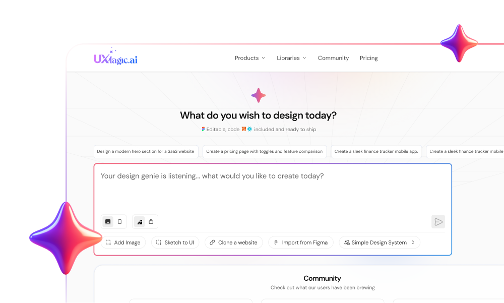
Examples: UXMagic, Motiff These tools are designed to enforce systems.
UXMagic: Component Assembly Model
UXMagic doesn’t “draw” pixels.
It assembles from a pre-built component library (900+ components). That matters.
- Components are internally consistent
- Global style editor enforces color changes
- Flow Mode clones anchor structure instead of regenerating from scratch
So when you update primary color once, it propagates across the flow.
That mimics real CSS variable behavior — not random regeneration.
If you’re curious how this compares to other approaches, see how different AI tools handle design systems in modern workflows.
Code-Centric Tools
Examples: v0, Cursor These generate React/Tailwind.
Consistency depends on:
- Utility class discipline
- Codebase structure
- Retrieval-Augmented Generation (RAG)
Cursor can be extremely consistent — if your codebase is clean. Garbage in, garbage out.
Ideation-Centric Tools
Examples: Galileo AI, Midjourney
Great for:
- Moodboards
- Visual exploration
- Concept screens
Terrible for:
- Multi-screen flows
- Production-ready consistency
High entropy. High drift.
Operational Workflows That Actually Work
Tools alone won’t save you. You need process.
- The Zoom-In Method
Don’t regenerate entire screens repeatedly.
Phase 1 – Rough Structure (50%)
Layout only Ignore visual polish
Phase 2 – Section Refinement (75%)
Refine sidebar only Adjust typography locally
Phase 3 – Component Locking (90%)
Freeze approved sections Reuse exact component definitions
Phase 4 – Micro-Detailing (100%)
Hover states Focus rings Accessibility checks
This reduces drift massively.
- The Anchor Screen Strategy
Pick one screen. Perfect it. That’s your visual DNA.
For every new screen:
- Provide the anchor as reference
- Explicitly say: “Match navigation, header, background exactly.”
You’re forcing matching, not invention.
Tools like UXMagic’s Flow Mode formalize this by cloning structural elements and modifying only content areas. That’s how you scale flows without drift.
- Skeleton-First Workflow
Separate structure from style.
- Generate entire flow in wireframe mode.
- Validate IA and logic.
- Apply global style layer.
Style applied algorithmically is far more consistent than style generated screen-by-screen.
The Real Cost of Inconsistent AI Design
AI promises speed.
Here’s the trap:
Prototype in 10% of time. Spend 200% time cleaning it up.
That’s the Speed-to-Market paradox.
Inconsistent output leads to:
Massive frontend refactoring Technical debt accumulation Accessibility failures Eroded user trust
System-first workflows start slower.
But they finish faster.
And in SaaS, finishing clean beats shipping fast and rewriting later.
AI is an engine of infinite variation. Your product cannot be. The future of design isn’t about writing clever prompts. It’s about building constraints so strong that even a stochastic machine can’t break your brand.
Build With Systems, Not Prompts
If you’re serious about shipping AI-generated UI at scale, stop chasing better prompts.