You prompted for “a beautiful SaaS dashboard.”
The AI gave you 17 charts, three gradients, and a retention rate of 140%.
Now your investor demo looks like a Dribbble fever dream and your developer is asking, “Cool… but where’s the logic?”
If you’ve searched for prompt templates for SaaS dashboards, you’re not looking for art. You’re looking for execution. You want something that connects business metrics (MRR, churn, CAC) to usable interface patterns without generating a junkyard of charts.
Let’s fix that.
Why Most SaaS Dashboard Prompts Fail
- The “Junkyard” Effect
AI hears “detailed dashboard” and thinks:
“More charts = more impressive.”
You get:
- A stacked bar chart no one asked for
- A pie chart showing nothing useful
- 12 KPIs competing for attention
- A Sankey diagram… because why not
Research shows users typically engage with only 10% of metrics shown. The rest? Cognitive load.
Dashboards aren’t artboards. They’re decision machines.
If your prompt doesn’t define purpose, AI will maximize decoration.
- The Hallucination of Consistency
You generate Screen A (Dashboard Home).
Then Screen B (User Profile).
Suddenly:
- Different border radii
- Slightly different padding
- Different shades of blue
- Buttons that don’t match
Now your SaaS looks like it was stitched together from three Figma files and two interns.
This is the classic “Frankenstein UI” problem - and why maintaining design system consistency matters more than ever (see our guide on maintaining design system consistency).
- The Pixels-to-Code Chasm
Tools can generate:
- A beautiful UI image
- Or raw React/Tailwind code
But rarely both well.
You might get:
- A stunning mockup with zero interactivity
- Or clean code that feels painfully generic
The gap between visual ideation and structural implementation is real. That’s why prompting has to evolve from “make a dashboard” to something more structured.
Stop Prompting for Dashboards. Prompt for Decisions.
Here’s the hard truth:
A dashboard that requires analysis is a failed dashboard.
Most prompts focus on shapes:
- “Add a line chart”
- “Include a pie chart”
- “Add KPI cards”
That’s 2018 thinking.
Instead, prompt for outcomes:
❌ Bad: Create a line graph of sales.
✅ Better: Create a visualization that helps a Sales VP instantly identify which region is underperforming against quota.
See the difference?
You’re no longer asking for geometry. You’re asking for insight.
This shift alone will upgrade your AI output by 50%.
The Sandwich Method: Strategy → AI → Refinement
AI is terrible at strategy. Great at execution. Terrible at refinement.
So we use the Sandwich Method.
Phase 1: Strategic Framing (Human Layer)
Before prompting anything, define:
- Persona: CEO? Analyst? Admin?
- North Star Metric: ROAS? Uptime? MRR?
- Complexity Budget: How many clicks to get an answer?
If you skip this, you deserve the junkyard.
Phase 2: Structural Prompting (AI Layer)
Use structured prompts, not paragraphs.
Step A – Blueprint Prompt
Act as a Senior UX Researcher. List the 5 most critical questions a Sales Manager asks on Monday morning. Then describe a dashboard widget that answers each.
Force the AI to think before it paints.
Step B – Visual Prompt
Using the widget list above, generate a high-fidelity UI mockup. Use a 12-column grid. Prioritize the North Star metric visually.
Step C – Component Prompt
Generate the React code for the 'Revenue Widget' using Shadcn/UI and Tailwind CSS.
Structure first. Pixels second.
The R.A.C.E. Framework for UI Prompts
If your prompts feel messy, use R.A.C.E.
R – Role
“You are a UI Engineer specializing in B2B SaaS accessibility.”
A – Action
“Create a responsive data table component.”
C – Context
“For a fintech app handling high-volume transactions.”
E – Execution/Expectation
“Use zebra striping, right-aligned numeric columns, WCAG AA contrast.”
Simple mnemonic. Massive difference in output quality.
Copy-Paste SaaS Dashboard Prompt Templates
These are structural. Not vibe-based.
- The “North Star” KPI Card
Goal: Instant status recognition (<2 seconds)
Design a high-fidelity KPI metric card for a SaaS analytics dashboard.
Header: Label 'Monthly Recurring Revenue' (uppercase, text-sm, muted).
Main Value: '$124,500' (bold, text-4xl, tight tracking, tabular numbers).
Context Badge: '+12.5%' in green (#10B981) with up-arrow icon.
Visual: Low-opacity sparkline chart filling bottom 30%.
Style: White background, subtle shadow-sm, rounded-xl, border-gray-200.
Output: React + Tailwind.
- Enterprise Data Table (Admin Panel)
Goal: High density without overwhelm
Design a B2B admin panel data table for 'User Management'.
Functionality: Sortable headers, pagination bottom-right. Bulk action toolbar appears on row selection.
Columns:
- Avatar + Name (bold) + Email (gray)
- Role badge (Admin=Purple, Editor=Blue)
- Status dot (Green=Active)
- Last Active (relative time)
- Kebab menu aligned right
Styling: Zebra striping (bg-slate-50). Sticky header with blur. Hover state darkens slightly and reveals 'Edit' button.
Notice how specific this is.
Specificity kills hallucination.
- Stacked Bar Chart (Churn Analysis)
Create a stacked bar chart widget: Title: 'Customer Churn by Plan Type' (12 months)
Series: Starter, Pro, Enterprise.
Colors: #3B82F6, #8B5CF6, #10B981. Do NOT use red/green for categories.
Interaction: Custom tooltip showing exact percentage breakdown.
Layout: Title left, 'Export CSV' icon right. White card, border-gray-200, padding-6.
Library: Recharts wrapper.
We’re referencing libraries like Shadcn/UI, React, and Tailwind CSS deliberately, this pushes the output toward real implementation patterns.
- Full Executive Overview (Grid Layout)
Generate a 12-column dashboard layout.
Row 1: 4 KPI cards (Revenue, Churn, CAC, LTV) spanning 3 columns each.
Row 2: Revenue Growth line chart (8 columns). Recent Activity feed (4 columns).
Row 3: Top Performing Sales Reps table (full width).
Spacing: gap-6, professional whitespace. Font: Inter or SF Pro.
This avoids the “AI stacked everything randomly” problem.
Choosing the Right AI Tool for Dashboard Design
There is no “best AI tool.” Only best for your stage.
For Ideation & Vibes
Avoid pure black (#000000). Use slate/zinc scales (bg-slate-900). Add subtle borders (border-white/10). Explicitly request WCAG AA contrast.
The Shift You Need to Make
AI is not your Senior Product Designer.
It’s your very fast junior intern.
If you give it vague instructions, you’ll get generic UI. If you give it structure, constraints, and context — you’ll get usable output.
Stop prompting for dashboards.
Start prompting for decisions.
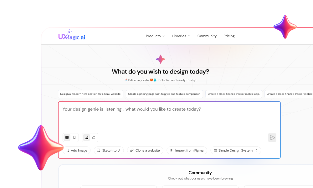
And if you’re serious about shipping consistent, multi-screen SaaS UI without rebuilding everything in Figma from scratch —
Try UXMagic and generate your next dashboard with structure, not guesswork.
Build Better SaaS Dashboards with AI
Generate structured dashboards with consistent UI, real components, and editable layouts your team can actually use. Start designing smarter with AI.