You shipped a “perfect” screen.
Engineering built it.
Then the tickets reopened.
Because nobody designed the error state. Or the loading state. Or what happens when the quote expires. Or when a user’s 30-character surname breaks the layout.
This is the hidden cost of static screens.
Most SaaS teams are still designing snapshots of ideal moments. But products aren’t snapshots. They’re systems — full of logic, edge cases, branching paths, and time.
And if you’re scaling, that gap becomes expensive.
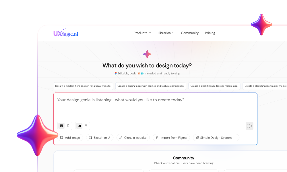
The Hidden Cost of Static Screens
For over a decade, SaaS design has revolved around polished mockups in tools like Figma and Sketch.
Beautiful screens. Dribbble-ready shots. Happy-path perfection.
The problem?
A screen is a frozen moment. A product is a dynamic system.
When teams prioritize screens over flows, they:
- Ignore error states
- Skip edge cases
- Hide system latency
- Push complexity into engineering
- Accumulate “Design Debt”
And that debt shows up later as:
- Inconsistent UI patterns
- Reopened dev tickets
- Slower velocity
- Rising CAC
- Higher churn
You don’t notice it at first. Then suddenly your product feels like a Frankenstein.
Three date pickers. Five button styles. Different navigation logic across sections.
That’s not an aesthetic issue. It’s a systems failure.
What Flow-Based Design Actually Means
Flow-based design is not just drawing arrows between screens.
It’s designing logic first.
A real SaaS flow includes:
- The Trigger
What starts the journey?
- User clicks “Sign Up”
- Session expires
- Email notification link
- Push notification
Context matters. Static screens ignore it. Flows don’t.
- The Decision Points
Every real product asks:
- Is the user logged in?
- Is the cart empty?
- Is the quote expired?
- Did validation pass?
Static design assumes the answer is always “Yes.”
Flow-based design forces you to map the “No.”
That’s where most product friction lives.
- System States
Between action and outcome, the system is:
- Loading
- Validating
- Processing
- Failed
- Success
If you don’t design these states:
Users rage-click.
Trust erodes.
Velocity drops.
- Feedback Loops
Every action needs confirmation:
- Toast message
- Inline error
- Visual state change
- Redirect
In screen-based workflows, feedback is an annotation. In flow-based design, it’s part of the architecture.
Why State Machines Matter for Designers
Here’s the uncomfortable truth:
Engineering already thinks in state machines.
A login screen isn’t one screen. It’s multiple states:
- Idle
- Focused
- Validating
- Error
- Success
When designers only deliver the idle state, developers fill in the rest.
They guess:
- Does validation happen on blur or submit?
- When does error clear?
- What triggers redirect?
Every guess is risk.
Every clarification slows delivery.
Flow-based design aligns design with engineering reality.
You stop handing off pictures. You start handing off systems.
The Financial Impact: Design Debt and the Rule of 40
This isn’t academic.
In SaaS, the Rule of 40 says:
Growth rate + profit margin ≥ 40%
Bad design quietly hits both sides.
Increased CAC
Fragmented onboarding flows reduce conversion. Marketing dollars burn.
Higher Churn
Inconsistent interfaces erode trust. Users assume sloppy UI means sloppy data handling.
Inflated R&D Costs
Refactoring UI components because they weren’t built for scale? That’s design debt. Flow-based design identifies logic gaps early — when changes are cheap.
The Logic-First Workflow: From Wireflow to Code
If you want to move beyond static screens, here’s the workflow.
Step 1: Define the Goal
Start with a user story. “As a Sales Manager, I want to approve a quote so that the rep can send it.”
Step 2: Map the Logic (Before Designing)
Write it in plain text:
- Start: Email notification
- Action: Click “View Quote”
- Check: Logged in? No → Login → Return Yes → Load quote
- Decision: Approve or Reject? Reject → Require reason
- What if quote expired?
No pixels yet.
Step 3: Create the Wireflow
Use low-fidelity screens connected by logic. Show branches. Show unhappy paths. Test it like code.
Step 4: Inject Fidelity Last
Only after logic is validated:
- Apply design system
- Add visual polish
- Finalize interactions
This avoids the sunk-cost trap of defending bad flows because you spent 10 hours polishing them.
If you want to go deeper on this shift, see our breakdown of user flow tools and workflow modernization.
Tokenization: The Backbone of Scalable Flow
In logic-first systems, visuals aren’t hardcoded.
They’re tokens.
Instead of: #0055FF
You define: color.primary.action
Change the token → update the entire flow.
UXMagic operates on this token-based architecture.
When you update a primary color, it propagates across:
- Buttons
- Links
- Active states
- Borders
Across the entire journey.
Not just one screen. That’s the difference between painting pixels and managing systems.
The Handoff Problem (And Why Code Matters)
Traditional handoff:
- Static artboard
- Redlines
- Manual translation into CSS/React
This is where most UI bugs enter.
Logic-first tools shift the deliverable: Not an image. But structured code.
UXMagic exports production-ready React/HTML aligned with the flow logic — reducing ambiguity between design and dev.
The designer moves closer to frontend prototyping.
Velocity increases.
Why Most AI Design Tools Get This Wrong
The first wave of AI tools focused on visuals.
They generate:
- Raster images
- Inconsistent styles
- Hallucinated UI patterns
- Non-editable outputs
They treat UI as art.
Second-wave logic-aware tools treat UI as structured data.
Tools like UXMagic generate:
- Multi-step flows
- Token-enforced consistency
- DOM-aware layouts
- Production-ready code
And importantly:
They understand journeys, not just screens.
Flow Mode allows you to generate entire sequences like:
- Input Email
- Check Inbox
- Reset Password
- Success
With logic continuity built in.
That’s a different category of tool.
If you’re evaluating options, compare logic-first capabilities, not just prompt quality.
Strategic Scenarios: Flow in the Real World
Scenario 1: The Frankenstein Audit
You’re Series B.
Five teams built features for three years.
Inconsistent UI everywhere.
Redesigning one dashboard won’t fix it.
A flow-based, token-driven refactor modernizes the system holistically.
Consistency scales.
Scenario 2: The Onboarding Churn Crisis
Drop-off at “Team Invite.”
The screen isn’t ugly.
The logic is wrong.
Make invite optional. Add “Complete Setup” to dashboard.
Flow change → activation increase.
Visual tweaks wouldn’t solve that.
Scenario 3: The 48-Hour Pivot
Investor demo in two days.
Designing a perfect home screen won’t save you.
You need a complete logic model:
- Pet profile
- Log symptom
- Vet history
- Vaccination reminders
Generate the flow. Validate coverage. Then polish.
Investors want a system, not a painting.
Stop Designing Snapshots
If your team is still debating pixels while engineering debates logic, you’re designing in the wrong unit.