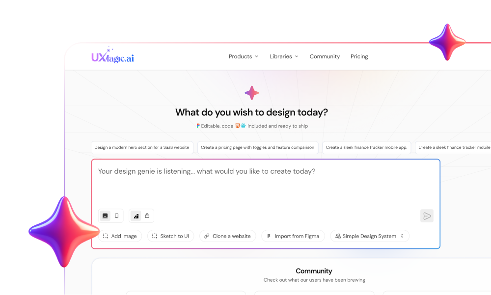
You’ve generated the perfect AI mockup.
It looks incredible. Dribbble-worthy. Soft gradients. Glassmorphism. Clean typography.
And completely unusable.
No Auto Layout. No component structure. No states. Just a flattened image your developer now has to reverse-engineer from scratch.
This is where most AI UI workflows fall apart, not at creativity, but at implementation. If you’re a senior designer or founder trying to ship, not pitch, you already know the frustration.
The “magic button” era is over. If your AI output can’t survive real-world constraints, accessibility, design tokens, responsive breakpoints, code export, it’s a toy.
Let’s talk about how to prompt for UI that actually works.
The Death of the “Magic Button”
Early AI tools sold a fantasy: “Describe your app in one sentence. Get a perfect UI.”
What you actually got:
- Beautiful JPEGs
- Broken charts
- Fake text
- No layers
- No logic
Tools like Midjourney are phenomenal at generating visuals. But UI isn’t just visuals, it’s structure. When you generate a dashboard as an image, there’s no grid, no DOM logic, no real table structure.
Developers call this “vibe coding.” It looks right until it doesn’t work.
Professional teams don’t need prettier pixels. They need deterministic structure.
That’s the shift: from generative novelty to agentic utility.
The Professional Workflow: Prompt → Edit → Refine → Ship
Amateurs treat AI like a slot machine. Professionals treat it like a manufacturing plant.
Here’s the real workflow.
Phase 1: Scaffolding (Kill Blank Page Syndrome)
Start with intent:
- “Fintech SaaS dashboard”
- A hand-drawn sketch
- A competitor URL
- A rough onboarding concept
The goal is structure, not polish.
This is where structured Prompt-to-UI or Sketch-to-UI workflows matter. The output must generate real layout containers — hero, features, pricing — not a flat poster.
Momentum matters. But scaffolding is just the start.
Phase 2: Structural Verification (Logic Before Pixels)
Before obsessing over padding, check flow.
Does the onboarding make sense? What happens after a failed transaction? Is the dashboard isolated or connected to settings?
Design is a system, not a screen.
This is where Flow Mode becomes powerful. Instead of viewing screens in isolation, you see: Login → Dashboard → Settings → Error State
If you’re serious about user experience, you design journeys — not screenshots.
Phase 3: Granular Refinement (The Part Everyone Gets Wrong)
This is where most AI tools break.
You love the hero. The pricing section is weak. You try to “fix it.” The whole page regenerates. Now the hero is ruined.
Professionals need non-destructive editing.
This is the core idea behind Sectional Editing: select only the pricing table and refine it.
Example prompt: “Change this pricing section to three columns. Highlight the middle plan as ‘Best Value’. Use primary-500 for the CTA.”
The rest of the page stays intact.
This is the difference between:
- Regenerate and pray
- Edit with surgical precision
If your AI tool can’t isolate sections, it’s not production-ready.
Phase 4: The Moment of Truth (Handoff)
Here’s the real test:
Can this export to Figma with Auto Layout? Can it generate clean HTML or React code? Is the structure semantic and usable?
If the answer is no, you’re back to manual rebuilds.
Production-ready output is non-negotiable.
Flow Mode: Design Experiences, Not Screens
Most AI tools suffer from screen myopia.
They generate a login screen. Then a dashboard. But they don’t remember the relationship between them.
Users don’t experience screens. They experience flows.
When prompting for flows, use chain-of-thought logic:
“Create a mobile banking onboarding flow. Step 1: Phone number entry Step 2: OTP verification Step 3: Biometric setup Step 4: Dashboard
Maintain consistent branding across all steps.”
You’re not just generating UI. You’re orchestrating behavior.
This is where the industry is headed: Agentic UI, systems that plan and execute multi-screen logic.
If you want to go deeper on designing in flows instead of static screens, our guide on flow-based design systems breaks down the mindset shift.
Sectional Editing: Stop Re-Rolling the Dice
Here’s the hard truth:
If your only option is “Regenerate Screen,” you’re not designing. You’re gambling.
Professional UI design requires:
- Granular regeneration
- Layer preservation
- Non-destructive iteration
- Component-level refinement
Sectional Editing mirrors how designers already work in Figma:
- Group elements
- Refine independently
- Protect stable components
- Iterate safely
This drastically reduces the cost of iteration.
You can A/B test hero variations Swap testimonials Refactor pricing Without touching the footer
That’s not magic. That’s control.
If you’ve ever been frustrated with AI ruining a good design while trying to tweak one detail, this is the workflow shift you’ve been waiting for.
Why Generic AI Fails at Real UI Design
Let’s be blunt.
- The Data Density Problem
Prompt a generic AI for a “financial analytics dashboard.”
You’ll get:
- Random bar widths
- Backward timelines
- Fake numbers
- Illegible micro-text
Because general models understand what charts look like, not how data works.
Real dashboards need:
- Structured grids
- Actual rows and columns
- Logical component hierarchy
If it can’t map to real HTML/CSS structures, it can’t ship.
- Accessibility Is Invisible (Until It’s a Lawsuit)
Generic AI loves low-contrast grey-on-white text.
Looks modern. Fails WCAG.
Accessibility isn’t aesthetic preference. It’s constraint logic:
- Contrast ratios
- Disabled states
- Error states
- Focus states
If your AI isn’t token-aware or rule-constrained, it will introduce design debt.
- Design System Entropy
You define primary color as #0055FF.
AI generates:
- #0056FF on one screen
- Slightly different spacing on another
- Font inconsistencies everywhere
Welcome to token drift.
Real teams rely on design systems. AI must quantize to defined tokens.
When you can import and constrain by tokens, AI stops being chaotic and starts being compliant. If brand consistency matters to you, our breakdown on preventing design drift with AI expands on this.
Advanced Prompting Framework: RTCF
If you want high-fidelity output, use the RTCF structure.
Role
Anchor the AI’s mental model. “Act as a Senior Product Designer specialized in enterprise fintech.” This signals density and clarity, not whimsy.
Task
Define the objective. “Generate a responsive crypto trading dashboard.” Clear scope. No ambiguity.
Context
Add constraints. “Dark Mode. High-frequency trader. Needs order book, execution history, latency metrics. Use Nexus design system tokens.” Constraints prevent generic output.
Format
Specify deliverable structure. “Export as Figma Auto Layout. Separate Order Entry and Market Data modules.” You’re designing for workflow compatibility, not just visuals.
UXMagic vs. The Field: Inspiration vs. Production
The market splits into three categories:
- Inspiration tools
- Code-first tools
- Workflow tools
Inspiration tools generate beautiful screens. Code-first tools generate React components. But most teams need a bridge.
If you’re pitching? A pure text-to-UI generator might work. If you’re coding directly? A chat-to-React tool might be enough.
But if you’re a designer who needs:
- Visual control
- Granular editing
- Flow-level thinking
- Design system enforcement
- Clean code export
You need orchestration.
That’s the difference between generating images and building product.
Ready to Ship?
Stop generating screenshots your developer can’t use. Start designing systems that export cleanly, iterate safely, and scale with your team. Because the future isn’t about prompting harder. It’s about orchestrating smarter.
Ready to Ship?
Try UXMagic’s Flow Mode and build a full product journey, not just another pretty screen.