Your product isn’t slow because of engineering.
It’s slow because your UI is a mess.
Not visually but structurally. Different button styles across modules. Three versions of the same dropdown. Engineers debating spacing tokens instead of shipping features.
And the worst part? You probably called it “creative exploration.”
Here’s the uncomfortable truth: In SaaS, creativity in core UI isn’t a strength. It’s a liability.
The Hidden Cost of Design Debt in SaaS Scaling
Design inconsistency doesn’t just look messy—it compounds into operational damage.
The “Frankenstein” UI Problem
When teams don’t enforce component governance, this happens:
- The same dropdown gets rebuilt 4 times
- Engineers argue over spacing instead of logic
- CSS overrides pile up
- No one trusts the design system anymore
This isn’t hypothetical.
Mid-market SaaS teams lose ~$1.5M/year to design debt—purely from redundant work and engineering friction.
And it gets worse as you scale.
The Real Impact on Product Metrics
Inconsistent UI directly leads to:
- Higher cognitive load → slower onboarding
- Confusion across modules → support ticket spikes
- Broken flows → lower feature adoption
- Friction → increased churn
You’re not just shipping slower. You’re actively making your product harder to use.
Jakob’s Law: Why UI Creativity is a Liability
Designers love originality. Users don’t.
Jakob’s Law is simple: Users expect your product to work like every other product they already use.
The Usability Failure of “Innovative” Navigation Systems
Let’s call this out clearly:
- Centered logos that break navigation expectations
- Scrolljacking for “wow factor”
- Reinvented layouts for standard flows
This isn’t innovation. It’s friction.
Even small deviations can cause massive usability drops. Example: changing logo placement can increase navigation failure rates 6x.
Predictability > Delight
In B2B SaaS:
- Users don’t want to be impressed
- They want to finish tasks fast
“Delight” is a vanity metric.
Predictability is the real KPI.
If users notice your UI, you’ve already lost.
Overcoming “Context Amnesia” in AI UI Generation
AI-generated UI looks impressive—until you try to use it.
The Problem: Stateless Generation
Typical AI tools:
- Forget layout structure after 2–3 screens
- Change colors mid-flow
- Drop navigation components randomly
- Break typography systems
This is called context amnesia.
And it makes AI output unusable for production.
Flow Mode vs. Static Screen Generation
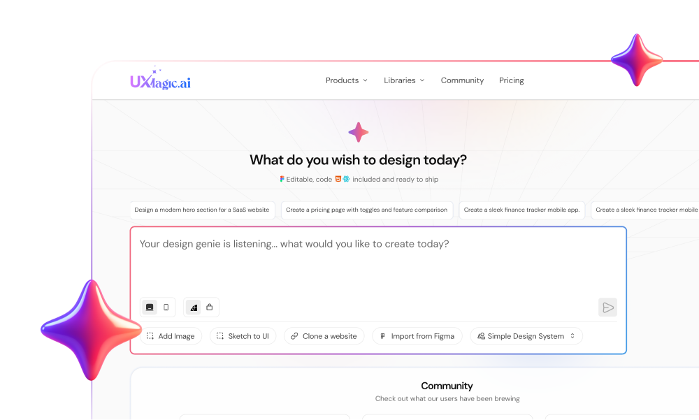
This is where tools like UXMagic actually matter.
Instead of generating isolated screens, UXMagic’s Flow Mode:
- Locks layout anchors (navbars, headers, grids)
- Maintains token consistency across screens
- Prevents structural drift entirely
So instead of “pretty images,” you get:
- Connected flows
- Stable architecture
- Production-ready structure
If you’ve struggled with multi-screen AI outputs, this is the difference between demo and deploy.
The Logic-First Developer Handoff Workflow
If your process still starts with pixels, you’re doing it wrong.
Here’s what actually works.
Phase 1: System Architecture (Before Design)
You don’t design screens. You define constraints.
- Semantic Tokenization
- Replace hex values with tokens (e.g., color.primary.action)
- Enables global consistency and instant updates
- Component Governance
- Define all components upfront
- Include every state (hover, error, disabled)
- Lock spacing to a grid system
- “Frankenstein” Audit
- Identify duplicate components
- Deprecate everything inconsistent
- Force a single source of truth
This is where most teams fail because it’s not “fun.” But it’s where scalability actually comes from.
Phase 2: Logic-First Generation (During Design)
Now you assemble not create.
- Text-to-Structure Planning
Define flows like:
- Dashboard → Select Record → Edit Modal → Save
No visuals yet. Just logic.
- Component Assembly via AI
Use AI to:
- Assemble layouts from predefined components
- Enforce tokens automatically
- Prevent rogue styles
This is where UXMagic’s component assembly model fits naturally, it doesn’t “draw UI,” it builds it.
- Multi-Screen Consistency
- Lock layout anchors
- Maintain state across screens
- Eliminate drift
If you’re still generating screen-by-screen, you’re creating future bugs.
- Progressive Validation
Validate in layers:
- Flow logic
- Layout structure
- Visual polish
Not the other way around.
Phase 3: Automated Handoff (After Design)
Your final output shouldn’t be a Figma file.
It should be structured, validated, and ready to ship.
- Token Linting
- Detect rogue styles
- Replace with approved tokens automatically
(If you want to go deeper here, this connects directly to how design systems workflows actually scale in production.)
- Visual Regression Testing
- Catch UI drift in CI/CD
- Prevent silent breakages
- DOM-Aware Export
- Output React/HTML—not images
- Remove ambiguity in handoff
This is how you eliminate the “verification tax” engineers complain about.
The industry keeps telling you to be more creative.
That’s exactly why most SaaS products break at scale. The teams that win aren’t the most original. They’re the most consistent.
So the real question is:
Are you designing for Dribbble or for deployment?
Stop Designing Screens. Start Building Systems.
If your team is still fixing inconsistencies after design, you’re already too late.