Most designers already know the difference between UI vs UX. That’s not the problem anymore.
The real issue in 2026 is governance. AI can generate polished interfaces instantly but without structure, those interfaces drift, break tokens, fail accessibility, and quietly damage product trust. The debate matters again because the boundary between UI execution and UX logic is where product quality now lives.
If you’re relying on prompt-based generation alone, you’re not designing. You’re supervising hallucinations.
The AI UX Reset: Why the UI vs UX Debate is Changing in 2026
UI production is now automated.
Typography scales, layout structures, and component placement can be generated in seconds. Predictive layouts and generative UI tools have commoditized pixel arrangement. That shifts the value of designers upstream into research synthesis, architecture, and constraint definition.
Most guides still treat UI vs UX as a semantic distinction. That framing is outdated.
Today:
- UI = mechanical execution
- UX = system governance
- AI = execution multiplier that needs constraints
If your workflow still depends on screen-by-screen generation, you’re paying what teams quietly call the Verification Tax hours spent fixing spacing drift, rogue hex codes, and broken component states after the “fast” generation step.
This is exactly why teams are moving toward system-led workflows instead of prompt-led experimentation. If you want a practical breakdown of how designers already do this in production, see how designers actually use AI in real projects.
Context Amnesia: The Hidden Flaw in AI UI Generators
Most AI UI tools treat every prompt like a blank universe.
That’s why your dashboard and settings page suddenly use different typography scales.
This failure mode is called context amnesia.
Typical symptoms:
- buttons change radius mid-flow
- semantic colors drift between screens
- navigation disappears between states
- typography switches families unexpectedly
Generic generators optimize for visual plausibility—not structural continuity.
Why “Vibe Coding” Creates Design Debt
“Build your product from a prompt” sounds efficient.
It isn’t.
Vibe-coded apps usually ship with:
- no reusable component architecture
- no semantic variables
- no token hierarchy
- no source of truth
They look finished. They’re not maintainable.
Speed without governance creates rebuild cycles later. And rebuild cycles cost more than deliberate structure upfront.
This is exactly the trap described in Blank Canvas Syndrome. Teams mistake visual output for product direction.
From Prompt Engineering to Constraint Engineering
Most advice still tells designers to write better prompts.
That’s wrong.
Prompts are fragile control systems. One conflicting adjective can change a typography scale. That’s not governance. That’s negotiation.
The shift happening now is toward constraint engineering.
Instead of describing what you want, you define what the AI is allowed to produce.
Constraint-driven workflows rely on:
- structured design tokens (JSON/YAML)
- semantic spacing systems
- component mappings
- LLM Appendices with exclusion rules
- automated token linting
Example exclusion rules inside an LLM Appendix:
- never introduce new font weights
- always use sentence case for headings
- restrict button sizes to enum values
- prohibit new spacing units outside token scale
Once those exist, AI stops improvising.
Building the LLM Appendix for Design Systems
Traditional style guides don’t work for generative systems. They’re written for humans.
AI requires machine-readable constraints.
A usable appendix defines:
Enums
Allowed component sizes:
- small
- medium
- large
Semantic tokens
Examples:
- --color-brand-primary
- --spacing-medium
- --button-primary-background
Exclusion rules
Examples:
- never generate new border radii
- never invent hex colors
- never override component variants
This is what turns generation into production.
If accessibility enforcement is part of your pipeline (it should be), the same approach applies to contrast ratios and touch targets. A practical walkthrough is covered in prompting AI for WCAG 2.2 accessible UI.
The Intersection of SEO and AI UX Optimization (AIO)
UX and SEO are no longer separate disciplines.
Search engines measure interaction behavior now. Navigation clarity, dwell time, and bounce patterns determine authority.
If your interface creates friction, users leave immediately. That behavior is called pogo-sticking.
And it destroys algorithmic trust.
How “Pogo-Sticking” Destroys Algorithmic Trust
Poor UX triggers:
- shallow engagement
- navigation confusion
- unreadable density
- accessibility failures
Search engines interpret those signals as intent mismatch.
Result: rankings drop.
Fast UI generation without structural UX thinking doesn’t just affect usability. It affects discoverability.
Modern optimization means aligning:
- information architecture
- progressive disclosure
- contrast compliance
- touch target sizing
- navigation predictability
This convergence is now called AI Inclusion Optimization (AIO).
Design speed without behavioral clarity actively harms visibility.
Utilizing Flow Mode for Multi-Screen Consistency
Screen-by-screen generation causes drift.
Flow-based generation prevents it.
Instead of prompting isolated frames, teams now generate entire journeys as connected state machines:
authentication → dashboard → detail view → confirmation modal
This preserves:
- typography scale
- navigation logic
- semantic tokens
- layout anchors
It also removes most of the Verification Tax.
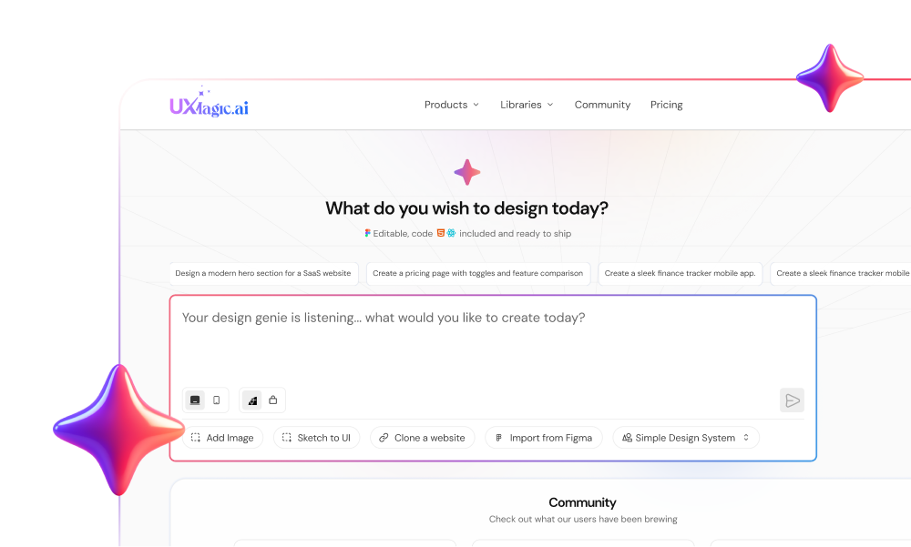
Tools designed for production workflows like UXMagic solve this directly through Flow Mode. Instead of stitching disconnected outputs together later, the system maintains persistent structural memory across the journey.
That’s the difference between generating screens and generating experiences.
UXMagic also enforces imported design tokens and component libraries as hard constraints. That means:
- no rogue spacing values
- no invented colors
- no typography drift
So teams spend time evaluating architecture instead of fixing padding.
This is the same shift described in real prompts we use for production-ready SaaS UI ,generation works when constraints exist before prompts do.
Why the UI vs UX Boundary Still Matters
AI didn’t remove the difference between UI vs UX.
It made the difference operational.
UI is now the fastest layer in the stack. UX is the control layer.
Treat AI output as final deliverables and you inherit:
- accessibility failures
- inconsistent systems
- broken navigation logic
- hallucinated component variants
Treat AI output as representations inside a governed system and velocity increases without quality loss. That’s why modern workflows keep humans inside the loop as auditors, not pixel producers. If that idea sounds abstract, human-in-the-loop AI design workflows explains how teams structure that oversight in practice.
Stop Fixing Screens After Generation
Stop generating isolated UI and repairing it later.
Generate flows with constraints from the start. Try UXMagic free and build your first multi-screen journey without style drift in under five minutes.
UI vs UX isn’t a semantic debate anymore. It’s the difference between shipping interfaces that look finished and shipping products that actually hold together.
AI didn’t erase the difference between UI and UX it exposed it. The teams shipping reliable products in 2026 aren’t generating prettier screens. They’re enforcing stronger systems. If your workflow still depends on prompts instead of constraints, you’re designing outputs, not experiences.
Design both with AI
Generate complete product flows with enforced design tokens instead of repairing drift later. Try UXMagic free and build a consistent multi-screen journey in minutes.