Learning UI design by manually pushing pixels across a blank canvas is officially a legacy skill in 2026.
The modern industry doesn’t pay designers to draw buttons. It pays them to architect flows, control design systems, and fix the chaos AI generates faster than anyone else. If your workflow still starts with gray wireframes, you’re already behind.
This user interface design guide for beginners 2026 exists for people who already understand what UI is, but need a workflow that actually works now. Not in bootcamp slides. Not on Dribbble. In production.
What is User Interface (UI) Design in 2026?
UI design in 2026 is no longer about arranging pixels. It’s about controlling systems.
AI now generates layouts instantly. Typography scales appear in seconds. Entire dashboards materialize from prompts. That means the designer’s role shifted from creator to editor, architect, and constraint manager.
Most beginner guides still teach a linear process:
Sketch → wireframe → mockup → prototype
That workflow is obsolete.
Modern UI design looks like this instead:
- Define structural constraints
- Generate multi-screen baselines
- enforce token consistency
- stress-test edge cases
- ship developer-ready flows
If you’re still starting from scratch inside a blank canvas, read this breakdown of Blank Canvas Syndrome and why it slows teams more than it helps.
The real job now is deciding:
- what information belongs on the screen
- how dense the layout should be
- how navigation persists across flows
- how accessibility holds under pressure
- how tokens scale across screens
AI handles the surface layer. You control the system underneath it.
Core UI Principles That AI Can’t Fake
AI can generate beautiful screens. It cannot reliably generate usable products.
That gap is where designers create value.
Visual hierarchy beats visual decoration
Most AI-generated dashboards look impressive at first glance. Then you notice:
- oversized headings
- low-density tables
- unclear primary actions
- inconsistent spacing logic
Example: a logistics dashboard showing only three rows of critical data on a laptop viewport.
A human designer fixes that instantly by:
- reducing padding
- enforcing 8px spacing grids
- restoring contrast ratios
- restructuring table hierarchy
Hierarchy determines usability. Decoration does not.
Accessibility is not optional polish
Contrast ratios under 4.5:1 fail WCAG compliance. Many AI-generated interfaces default to ~2:1 without warning.
That’s not a visual preference issue. It’s a usability failure.
If your interface breaks accessibility:
- users struggle
- audits fail
- engineering rewrites screens
- timelines slip
Accessibility is structure, not styling.
See how designers prompt systems correctly in this accessibility workflow: Prompting AI for WCAG-compliant UI
Spatial grids prevent “AI spaghetti”
AI often invents spacing values randomly:
12px 17px 22px 31px
That destroys layout predictability.
Production UI relies on strict increments:
- 4px grid
- 8px grid
- semantic spacing tokens
Without grids, scaling across 20+ screens becomes impossible.
Edge cases define real interfaces
AI designs happy paths only.
It doesn’t design:
- empty states
- localization expansion
- error handling
- loading skeletons
- failed network responses
Beginners who ignore edge cases ship fragile products.
Senior designers start there first.
The AI-Augmented UI Design Workflow
This is the real workflow behind modern UI shipping speed.
Not theory. Not bootcamp diagrams. Actual production sequencing.
Phase 1: Strategic definition and constraint mapping
Before prompting anything, define structure.
Bad prompt: Design a modern blue analytics dashboard
Useful prompt: Design a high-density B2B logistics dashboard showing fleet errors and transit history
AI needs architecture, not adjectives.
Most beginners fail here because they describe aesthetics instead of requirements.
Phase 2: Autonomous flow generation
This is where speed happens.
Instead of building components manually, generate entire journeys:
- onboarding
- checkout
- analytics navigation
- settings structures
- dashboard hierarchies
But here’s the trap most guides ignore:
Generating screens separately breaks consistency.
Navigation mutates. Typography shifts. tokens drift.
That’s why designing flows not screens is mandatory.
This is exactly what system-aware workflows described in How designers actually use AI in real projects are built around.
Tools like UXMagic’s Flow Mode generate connected screens together so navigation and hierarchy persist across steps instead of resetting every time.
Phase 3: Systemic calibration and token governance
Never trust raw AI output.
Immediately map:
- colors → semantic tokens
- typography → scale variables
- spacing → grid system
- components → reusable structures
Detached vectors are not UI.
They’re pictures of UI.
This step prevents the “vibe coding” disaster teams complain about when AI outputs look correct but break engineering pipelines.
Phase 4: Micro-interaction and edge-case refinement
AI generates ideal conditions.
Reality includes:
- long usernames
- empty datasets
- failed payments
- slow networks
- translation expansion
Designers must deliberately break their own interfaces.
That’s the job now.
5 Beginner UI Design Mistakes (And How AI Amplifies Them)
AI accelerates mistakes just as fast as it accelerates progress.
Here are the ones that quietly destroy beginner portfolios.
Mistake 1: Starting with wireframes
Low-fidelity wireframes delay feedback loops.
Stakeholders react to realism, not gray rectangles.
Generate high-fidelity structure first. Edit second.
Mistake 2: Designing single screens
Single screens don’t ship products.
They ship confusion.
Recognition across flows depends on:
- persistent navigation
- consistent tokens
- stable hierarchy
Disconnected screens create cognitive friction instantly.
Mistake 3: Ignoring accessibility contrast checks
Low contrast breaks usability faster than bad typography.
Always validate:
- button visibility
- text readability
- data hierarchy
- chart clarity
Accessibility failures compound across screens.
Mistake 4: Letting token drift spread
Token drift happens when:
spacing shifts colors mutate radius values change icons mismatch
Most AI generators cause this automatically.
Consistency requires system enforcement.
That’s why workflows like Human-in-the-loop AI design systems exist—to keep outputs predictable across iterations.
Mistake 5: Optimizing for Dribbble instead of developers
If engineers can’t build it cleanly, it’s not UI.
It’s artwork.
Production-ready interfaces require:
- auto-layout structure
- reusable components
- semantic tokens
- predictable hierarchy
Flat vector exports don’t survive handoff.
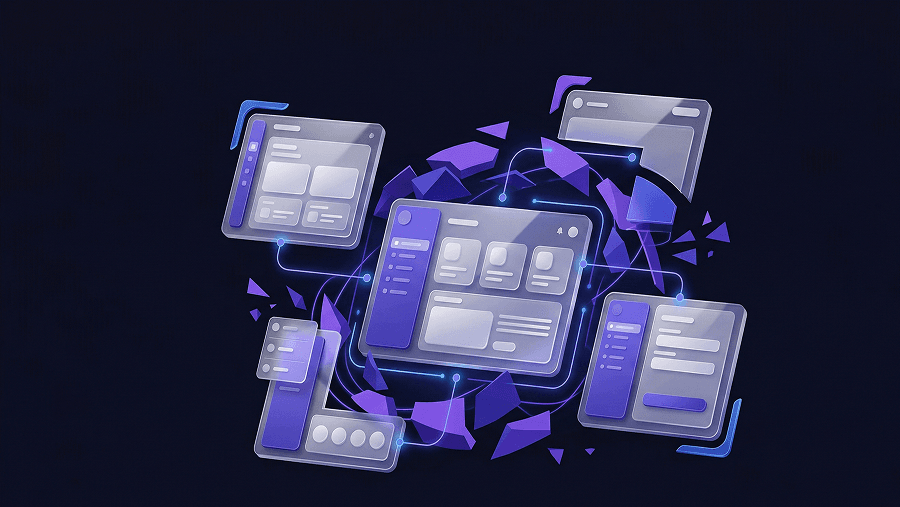
How to Build Multi-Screen Journeys with Flow Mode
Most AI tools generate beautiful screens.
Then they forget everything on the next prompt.
Typography shifts. navigation resets. spacing mutates.
That’s token drift.
Flow-aware generation solves this by treating screens as a system instead of isolated canvases.
With UXMagic Flow Mode, designers can:
- generate onboarding sequences together
- maintain typography tokens across steps
- preserve navigation patterns automatically
- update components globally
Changing one token updates every screen in the flow.
That’s the difference between prototype visuals and production UI.
If you want real prompt structures used for this workflow, study production-ready AI design prompts for SaaS teams.
Bridging the Gap: From UI Design to Developer Handoff
The biggest beginner misconception:
Visual polish equals completion.
It doesn’t.
Developers reject:
- absolute-positioned layouts
- detached vectors
- inconsistent spacing logic
- hallucinated components
They accept structured systems.
Production-ready UI requires:
- component hierarchies
- token mapping
- responsive degradation
- predictable spacing rules
This is where most AI tools fail and where system-based generators like UXMagic matter most.
Instead of exporting disposable mockups, they produce flows aligned with React/HTML structures developers can actually use.
That changes how fast teams ship.
UI design is no longer measured by how fast you can draw interfaces. It’s measured by how well you control systems across entire product flows. The designers who survive 2026 won’t be the ones making prettier screens. They’ll be the ones fixing token drift, enforcing accessibility, and turning raw AI output into something developers can actually ship.
Stop designing isolated screens today.
Generate one full user flow from entry to completion and audit where navigation, hierarchy, and tokens break.