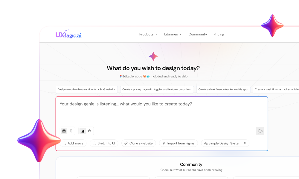
You typed: “Design a clean, modern SaaS dashboard.”
It looked incredible.
Neon gradients. Glassmorphism. Dribbble-worthy.
Then engineering tried to build it.
The charts had no logic. The text was gibberish. The layout broke on resize. And your “magic button” didn’t exist in the backend.
This isn’t an AI creativity problem.
It’s a structural crisis.
AI UI prompts fail because natural language is vague, but interfaces are not. And until you understand that mismatch, you’ll keep cleaning up hallucinations instead of shipping products.
The Psychology Behind Broken Prompts
The “Slot Machine” Effect
When you prompt: “Modern fintech dashboard with dark mode.”
You think you’re issuing a command.
You’re actually pulling a lever.
AI doesn’t “understand” dashboards. It predicts what dashboards statistically look like. When it lands on something visually convincing, you feel like you hit a jackpot.
That 80% visual accuracy creates false confidence.
But then:
- Buttons aren’t components
- Charts have impossible geometry
- Navigation doesn’t connect
- Data disappears between screens
It’s not broken. It was never functional to begin with.
You got a picture, not a product.
The Semantic Trap: Words Like “Clean” Are Useless
Language is fuzzy. UI systems are not.
When you say:
- “Clean”
- “Modern”
- “Minimalist”
AI optimizes for aesthetic averages scraped from the internet.
Which means:
- Excess whitespace
- Rounded corners everywhere
- Dribbble-style floating cards
- Low contrast
- No hierarchy
What you actually meant:
- 8px or 16px spacing rhythm
- Clear typographic hierarchy
- WCAG compliance
- Component reusability
- Defined grid
If you don’t specify constraints, you get vibes. And vibes don’t ship.
The “Bad Intern” Syndrome
Using general AI tools for UI often feels like managing a very fast intern who doesn’t understand product logic.
Symptoms:
- It never pushes back on bad ideas
- It agrees to impossible layouts
- It forgets previous design decisions
- It changes button colors mid-flow
You become the babysitter.
Not the designer.
The Technical Anatomy of AI UI Errors
Let’s be honest: these failures aren’t random.
They’re architectural.
Diffusion Models: The Pixel Problem
Tools like Midjourney, DALL-E, and Stable Diffusion generate images by manipulating pixels. To them:
- A “Submit” button = blue pixels
- Text = texture
- Layout = visual illusion
That’s why you get:
- Corrupted text
- Uneditable layers
- Fused components
You can’t move a button.
You have to redraw it.
That’s not acceleration. That’s rework.
LLM Code Generators: The Spatial Blind Spot
LLMs can generate valid HTML and CSS.
But they don’t always understand spatial logic.
Common failures:
- Sidebar overlaps content
- Flex containers break on resize
- Padding values change randomly
- New hex codes appear every screen
Without a strict design token system, you get style drift.
And drift kills consistency.
Context Window “Memory Loss”
AI has a limited context window.
In a 10-screen flow:
- Screen 1: Inter font
- Screen 10: Roboto
- Screen 1: 12-column grid
- Screen 10: chaos
You end up re-prompting constantly.
The “time-saving” tool becomes a micromanagement machine.
The Hidden Cost: Senior Designers Doing Cleanup
Here’s the reality no one talks about.
AI often gets you 90% there visually.
The final 10%? That takes 90% of the time.
Example workflow:
- Generate concept: 30 seconds
- Vectorize in Figma: 4 hours
- Standardize components: 2 hours
Total: 6+ hours.
Traditional workflow? Often faster.
And cleaner.
The worst part? Leadership sees the 90% and assumes it’s “almost done.”
You’re left defending why a “Magic Sort” button doesn’t exist in the data model.
This is where AI hype crashes into product reality.
The 3 Most Common AI Prompt Mistakes
- The “One-Shot” Fallacy
Prompt: “Design a complete SaaS platform.”
Result: A landing page.
Why?
Because the AI defaults to the simplest visual interpretation. Complex systems require staged logic.
- Ignoring Unhappy Paths
Prompt: “Show me the login screen.”
AI gives you:
- Perfect login form
- No error states
- No lockout
- No forgot password
Developers then ask: “Where are the failure states?”
You never asked.
AI assumes the happy path.
- Lipstick on a Pig
Prompt: “Make it pop. Neon. Cyberpunk.”
You get:
- Inaccessible contrast
- Broken reading patterns
- Cognitive overload
You optimized for aesthetics instead of structure.
This is exactly why “SaaS dashboard best practices” matter before visuals. (If you haven’t reviewed that, fix that first.)
From Prompt Engineering to Context Engineering
Prompt engineering is fragile.
Context engineering scales.
Instead of: “Make the button blue.”
Use: “Use primary-action-color.”
Instead of: “Clean layout.”
Use:
- 4pt grid
- Inter font
- 4px radius
- WCAG AA contrast
Design Tokens are your guardrails.
They eliminate hallucinated spacing, random shadows, and style drift.
If you want a deeper breakdown of how tokens reduce AI errors, study design tokens before prompting again.
How UXMagic Fixes the Structural Problem
This is where generalist AI breaks and specialized workflow wins.
UXMagic isn’t just generating screens.
It generates systems.
- Flow Mode: No More Context Loss
Unlike one-shot generators, UXMagic Flow Mode creates connected screens.
If Screen A is “Signup” Screen B logically becomes “Email Verification” Screen C becomes “Onboarding” Shared navigation. Shared data fields. No disappearing context.
This solves the “Hallucination of Functionality” problem.
- AI Style Guide Generator: Killing Drift
Before generating screens, you create a Style Guide.
You define:
- Typography
- Color palette
- Radius
- Shadow
- Grid logic
The AI is constrained to that system.
It cannot invent a new hex code halfway through your flow.
That’s how real products stay consistent.
- Figma Auto-Layout Export: From Pixels to Production
Unlike image generators, UXMagic exports structured, layered files.
Not PNGs.
Actual editable layouts compatible with Figma Auto-Layout.
Which means:
- Buttons resize with content
- Padding respects constraints
- Global changes update instantly
You skip the vectorization phase entirely.
That alone saves hours.
Case Study: FinTech Dashboard
Failed Workflow
Prompt:
“Cool modern fintech dashboard dark mode.”
Result:
- Stunning visuals
- Fake charts
- No axes
- No labels
- No navigation logic
Unusable.
Systematic Workflow (UXMagic)
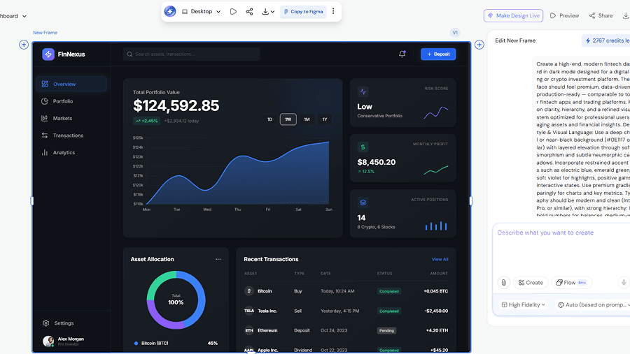
Step 1: Style Guide
- Deep navy primary
- Inter typography
- 4px radius
- 4pt grid
Step 2: Flow Mode
Login → Dashboard → Report Detail
Step 3: Component Refinement
Replace pie chart with sortable data grid Add filtering controls
Step 4: Export
Push to Figma with Auto-Layout
Now you have:
- Editable layers
- Structured layout
- Real data density
- Developer-ready handoff
That’s a workflow.
Not a moodboard.
Stop Vibe Prompting. Start System Building.
The “magic button” era is over.
AI doesn’t remove the need for design knowledge.
It increases it.
If you want usable output:
- Think in flows, not screens
- Use design tokens, not adjectives
- Demand editable output
- Inject context before generation
And if you’re tired of wrestling hallucinations into production-ready layouts:
Sign up for UXMagic and design with structure, not luck.
Because speed without systems is just chaos.
And chaos doesn’t ship.