Output Comparison
Design a one-fold dashboard for a crypto portfolio tracker. Show total value, individual token charts, daily change %, and recent transactions. Use dark theme, neon accents, and clean grid layout.
UXMagic.ai
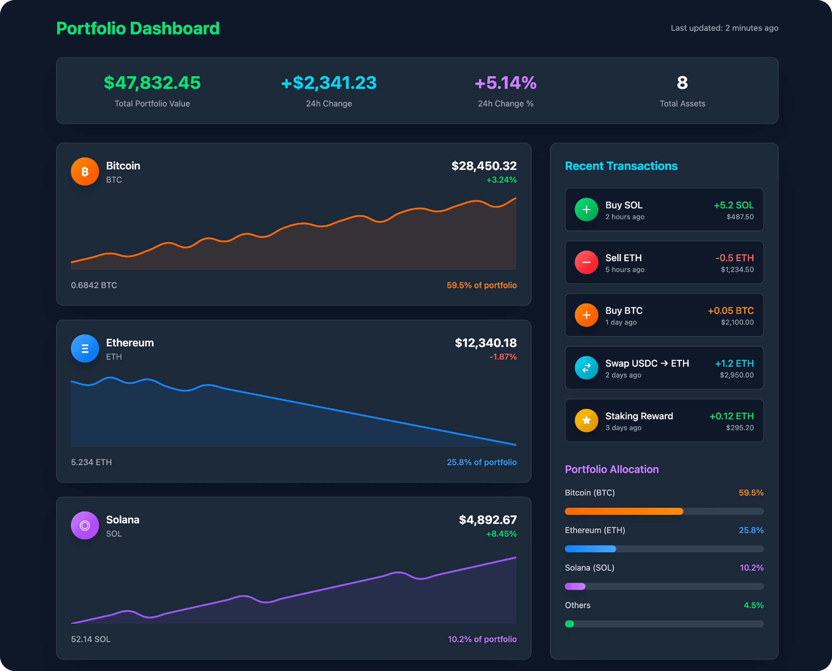
Excellent information hierarchy with key portfolio-wide metrics clearly displayed at the top.
The layout effectively includes portfolio allocation and recent transactions without clutter.
Line graphs lack sufficient detail (like a Y-axis or price markers) to be truly informative.
Some text colors, like the orange percentage on the dark card, have poor contrast, impacting readability.
UXCanvas.ai
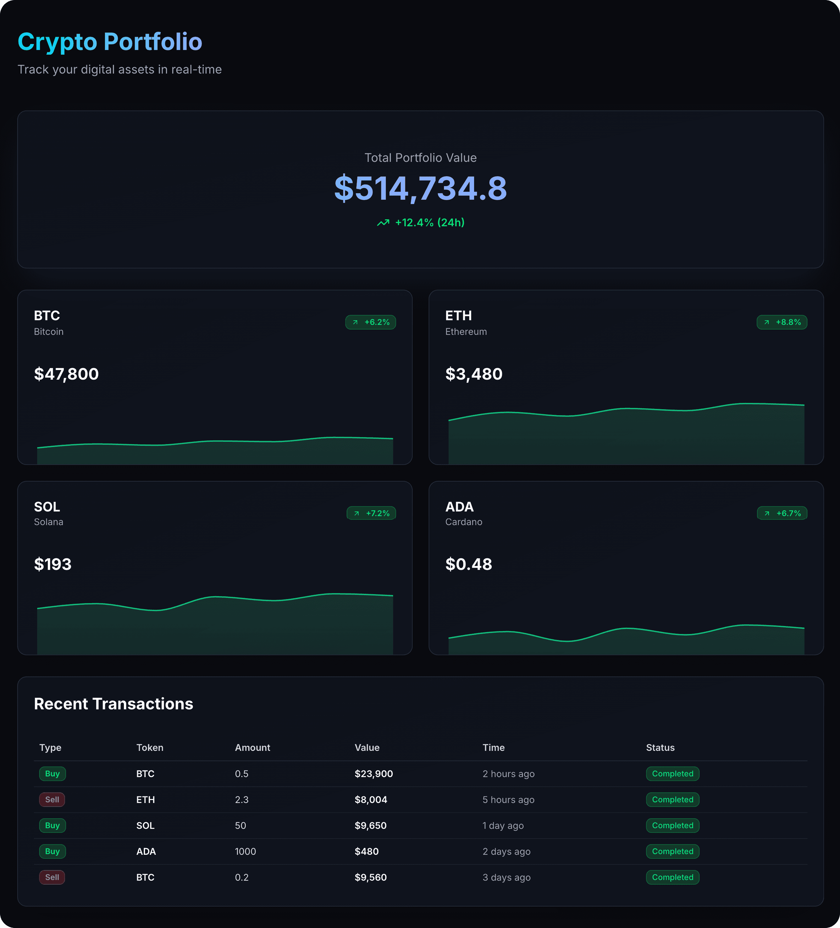
The minimalist aesthetic is very clean and modern, making it easy on the eyes.
The "Recent Transactions" table is well-structured, clear, and highly scannable.
Significant empty space below the total value card is underutilized prime real estate.
Lacks crucial context, such as the portfolio percentage for each asset, making it hard to gauge impact.
Create a beauty brand dashboard with bottom navigation, sales analytics, revenue charts, product performance metrics, customer insights, inventory status, and key business KPIs. Clean, modern design with data visualizations for tracking beauty product sales, trends, and business growth. Target: beauty brand managers and executives. Use brand color: #8152E1
UXMagic.ai
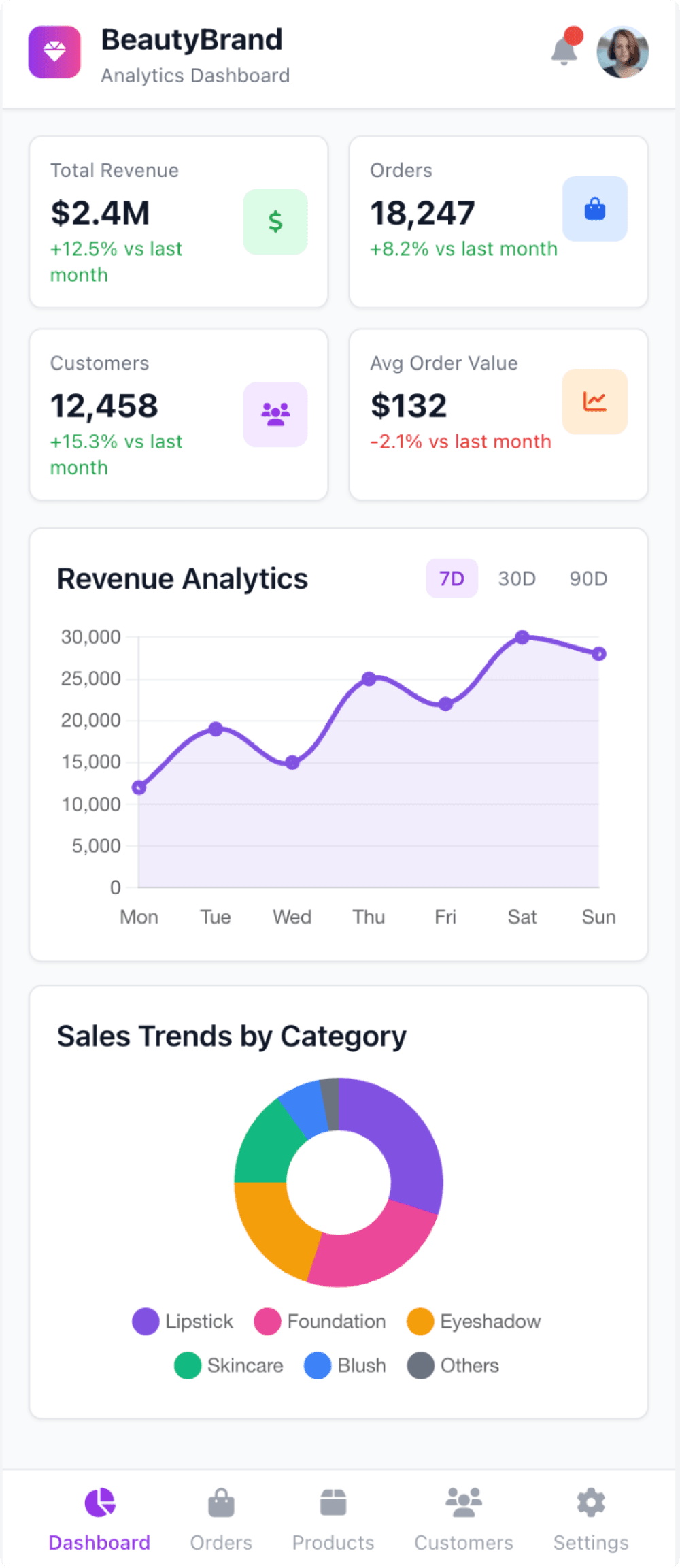
The dashboard provides excellent data context with "vs last month" comparisons and date range filters.
Labeled icons in the bottom navigation bar ensure clear and unambiguous user navigation.
The icons within the main KPI cards are redundant and add unnecessary visual clutter.
Inconsistent spacing and alignment throughout the layout make it feel less polished.
UXCanvas.ai
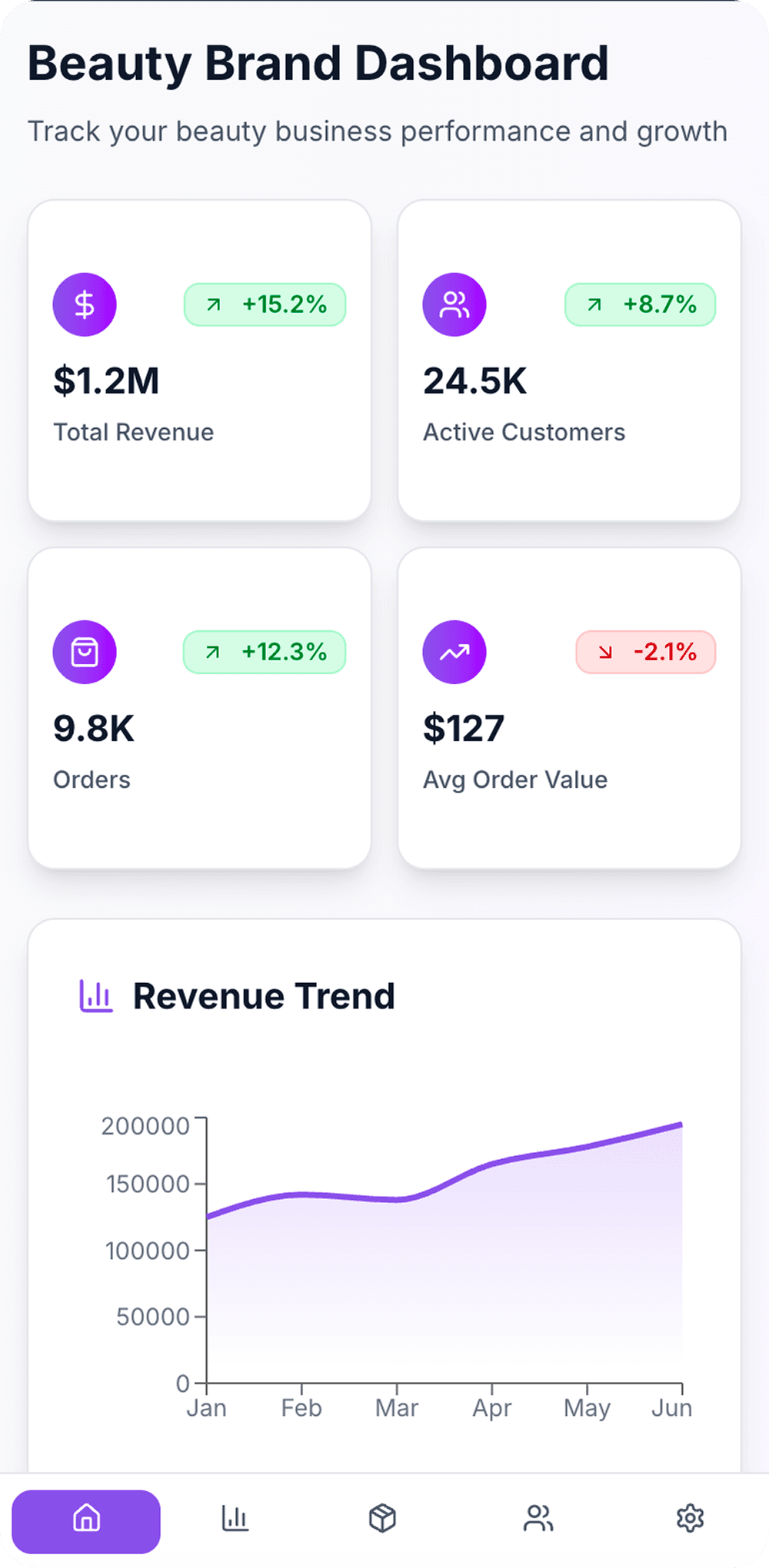
Excellent use of whitespace and a clean layout make the key metrics highly scannable.
The top four KPI cards provide a clear, high-level business summary at a glance.
Icons in the bottom navigation bar are unlabeled, which harms usability and discoverability.
The revenue trend chart lacks crucial context, like a currency symbol or a clear title for the Y-axis.

UXMagic.ai
UXMagic is a professional-grade AI copilot for designers and teams. It accelerates workflows by generating wireframes, sitemaps, and UI screens from prompts, images, sketches, URLs, or even Figma files. With features like sectional editing, real-time preview, and design system application, UXMagic eliminates repetitive tasks while preserving full creative control. It’s designed for agencies, product teams, and creators who want pixel-perfect, brand-consistent design with faster time-to-ship.

UXCanvas.ai
UXCanvas.ai takes a very different approach. It’s a conversational design agent that turns natural language prompts directly into UI and production-ready code. Built with a developer-first mindset, it generates React, TypeScript, and Tailwind CSS output, making it especially appealing to founders and coders who want to skip Figma and jump straight into usable code. Backed by Y Combinator, UXCanvas.ai is currently in a free beta phase, prioritizing growth and iteration speed over monetization.
Feature Comparison
| Feature | UXMagic.ai | UXCanvas.ai |
|---|---|---|
| Prompt to UI | Supports text, image, sketch, URL, and Figma import | Limited to text-only prompts |
| Export Options | Figma, React, HTML (Webflow/Framer planned) | React, TypeScript, Tailwind, Figma |
| Style Guide | Apply full design system & brand style guide | No brand system control, outputs are generic |
| Component Editing | Sectional & granular editing with AI assistant | Conversational refinements only |
| Team Features | Collaboration via Figma ecosystem, supports agencies | Share via secure URL, lightweight |
| Figma Plugin | Deep integration, import/export workflows | Limited support (Figma export only) |
| Real-Time Preview | Live preview + iteration | Conversational iteration loop |
| Project Architecture | Sitemap & user flow generation | Single-screen generation focus |
UXMagic is ideal for:
Pricing Comparison

Free – $0
5 project, 120 free credits (one-time), upto 20 screens, 1 Figma export
Premium – $14/month
20 projects, 480 credits (monthly), upto 80 screens, 80 Figma exports, React/HTML exports
Ultimate – $28/month
Unlimited projects, 1500 credits (monthly), upto 250 screens, 250 Figma exports, unlimited React/HTML exports
Currently free (beta phase) – $0
Final Verdict
In the UXMagic vs UXCanvas.ai debate, the choice depends on who you are:
If you’re a developer or founder racing to MVP, UXCanvas.ai shines with its conversational, speed-to-code workflow.
If you’re a professional designer or team shipping real products, UXMagic is the clear winner—thanks to multi-modal inputs, structural design generation, and brand-level consistency.
UXCanvas.ai is great for starting fast. UXMagic is better for scaling professionally.
got questions?we have answers.
UXMagic is a professional design copilot integrated with Figma, while UXCanvas.ai is a conversational UI builder optimized for speed-to-code.
Yes, UXCanvas.ai is currently free during its beta phase. UXMagic uses a transparent subscription model starting at $14/month.
For rapid MVP prototyping, UXCanvas.ai is faster. For brand-consistent, scalable product design, UXMagic is the stronger choice.
Yes, UXMagic exports React and HTML, with more no-code integrations (Webflow, Framer) on its roadmap.
Designers, agencies, and teams that need control, precision, and seamless integration with Figma should go with UXMagic.