Design handoffs rarely fail because specifications are missing; they fail because developers are forced to invent missing interaction rules on the fly. When engineers guess how an interface should handle loading delays, API failures, or responsive breakpoints, design debt accumulates immediately in the codebase. Eliminating handoff churn requires shifting focus from manual visual specs to systematic behavioral completeness before engineering begins.
You already know your way around Figma, component libraries, and front-end frameworks. This isn't a primer on what a hex code is. It's the specific architecture - state matrices, token alignment, behavioral documentation that separates a handoff producing zero Slack clarification threads from one that generates a week of post-launch rework.
What Is a Design Handoff in Modern Product Teams?
A design handoff is the process of transferring completed UI designs, behavioral logic, component tokens, assets, and specs from designers to developers for engineering implementation. It bridges visual concepts and code to eliminate development guesswork and ensure UI consistency.
Context Gap vs. Artifact Gap: Why Handoffs Break Down
Manual redlining and pixel-annotation in design files represent obsolete effort. Visual inspection tools automatically extract dimensions and properties, yet product teams continue to suffer from implementation divergence because they treat handoff as a visual export rather than an architectural transfer. That's the real distinction worth naming: an artifact gap (missing dimensions, missing assets) is easy to catch and easy to fix. A context gap - missing state logic, undocumented edge cases, unclear business rules is what actually causes rework, and it's invisible in a static Figma file no matter how cleanly it's labeled.
The 3-Layer Design Handoff Architecture
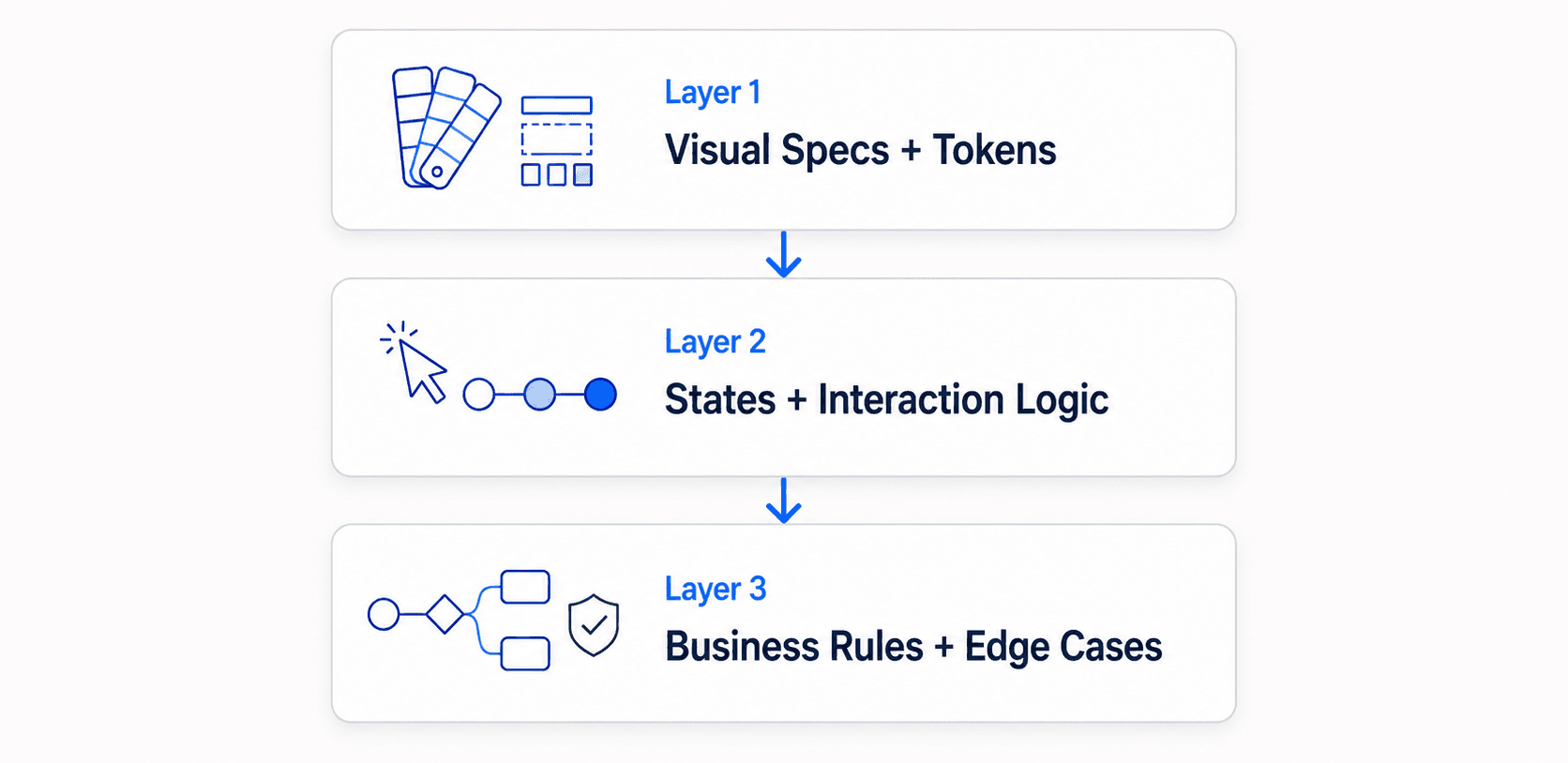
Each layer builds on the one before it. Layer 1 is close to automated already; Layer 2 is where most teams stop short; Layer 3 is where the invisible failures live - the ones that don't show up until a bug report three weeks post-launch.
Layer 1: Automated Visual Specs and Design Tokens
Figma Dev Mode and similar inspection tools already extract layout dimensions, spacing, and color values automatically. Designer effort spent hand-typing those values onto a frame is effort not spent on the layers that actually matter - state logic, system tokens, and edge cases. Teams starting from an existing site or reference rather than a blank canvas can skip a chunk of this manual extraction entirely - cloning a live URL directly captures the real structure and spacing instead of someone re-measuring it by hand.
Layer 2: Behavioral State Matrices and Interactive Logic
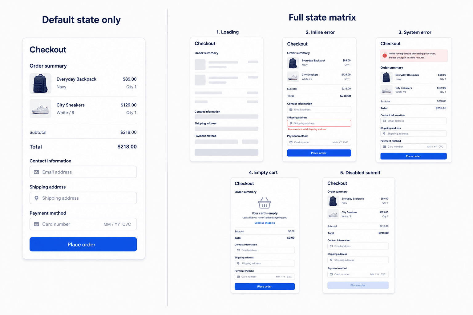
This is where most handoffs quietly fail. Every interactive surface needs an explicit state matrix covering six standard states:
- Default - the primary operational view with real production data
- Hover / Active / Focus - interactive indicators for cursor and keyboard navigation
- Loading / Skeleton - layout behavior during data fetch operations
- Error / Validation - inline input warnings, form validation failures, system-level API errors
- Empty - the visual and instructional guidance shown when no user data exists
- Disabled - inactive elements modified by permissions or incomplete form requirements
A screen delivered with only the default state documented isn't an incomplete handoff - it's five undocumented decisions an engineer now has to make alone, under sprint pressure, without design input.
Layer 3: Context, Business Rules, and Edge Cases
Static canvases can't convey keyboard navigation order, screen reader ARIA landmarks, mobile responsive reflow rules, animation durations, or easing curves. This layer is where "the design looked done" and "the design was actually done" diverge - the parts that never show up in a static export but absolutely show up in a bug report three weeks later.
Traditional vs. Modern Handoff
| Traditional Handoff | Modern Handoff |
|---|---|
| Static Figma export | Structured, multi-screen flow |
| Default state only | Full six-state matrix |
| Manual pixel annotations | Automated inspection (Dev Mode) |
| Slack clarification threads | Documented behavior, upfront |
| Accessibility as post-launch fix | Accessibility built into initial spec |
Every row in this table maps directly to one of the three layers above - the shift isn't really about better tools, it's about which layer a team stops at.
Step-by-Step Design-to-Development Handoff Process
Phase 1: Pre-Handoff Technical Alignment
Before visual design starts, designers and engineers review technical constraints, existing data structures, and reusable component libraries together. This prevents designers from introducing custom UI patterns when standard design system components already exist in the codebase - a surprisingly common and entirely avoidable source of rework.
Phase 2: Complete State Matrix Construction
Expand every core interface screen into the full six-state matrix from Layer 2 above, not just the happy path. This is the single highest-leverage step in the entire process, and the one most frequently skipped under deadline pressure.
Phase 3: Non-Visual Behavioral Documentation
Document the functional rules a static canvas can't show: keyboard navigation order, ARIA landmarks, responsive reflow behavior, animation timing. This is Layer 3 made concrete and shippable, not left as tribal knowledge in someone's head.
Phase 4: Asynchronous Walkthrough and Ticket Integration
Record a brief walkthrough video covering core feature intent and business logic, organize assets sequentially, mark them ready for development in inspection tools, and link everything directly to user stories in Jira or Azure DevOps. Treat this as a practical example rather than a guaranteed outcome: a short video explaining the why behind a design decision tends to prevent the kind of scattered, repeated clarification questions that a purely visual handoff invites - the exact time savings will vary by team and feature complexity, but the mechanism (context that doesn't fit in a static file, delivered once, asynchronously) is sound regardless of the specific number.
Phase 5: Continuous Build Verification
Review functional builds directly in staging environments during implementation, rather than waiting for a formal release candidate. Catching drift early, while it's still a quick fix, beats catching it at final QA, when it's a much larger one.
5 Critical Handoff Errors That Waste Engineering Sprints
Here's what breakdown at any single phase looks like in practice.
Complex form field validation. A designer delivers one checkout screen showing completed user inputs. The engineer implements the basic inputs but has to improvise visual handling for expired cards, server timeouts, and field length constraints resulting in inconsistent layout shifts, missing error text, and post-build QA bugs. The structured version instead delivers an explicit component matrix covering default, focused, inline-error, system-error, and disabled states alongside validation regex rules, enabling first-pass engineering accuracy with no improvisation required.
Data table responsive reflow. A desktop dashboard with a 10-column data table ships with no responsive definitions. On mobile, it breaks horizontal scrolling, overlapping text. The structured version defines explicit reflow behavior upfront: columns collapse into card views below 768px, primary actions pin to a bottom sheet, touch targets hold a minimum 44×44px area. None of that is complicated to specify; it just has to actually get specified.
The other three recurring failure modes worth naming directly:
- Developers hardcoding pixel values instead of design system variables - inspecting Figma Dev Mode correctly but pulling raw numbers instead of the actual token, silently creating drift the moment the token updates later.
- Accessibility postponed until after launch - fixing focus order and ARIA roles after the fact frequently means refactoring the entire DOM, when defining it upfront would have cost minutes.
- Mid-sprint file updates implemented against a stale frame version - the Figma file gets updated, engineering builds the old version anyway, and the two diverge without anyone noticing until QA.
Generic image generation tools compound all five of these. They create unlayered PNG artifacts that lack structured auto-layout, design tokens, and state definitions. When developers try to build from that output, they have to manually reconstruct component hierarchies from scratch, which is exactly the labor a handoff was supposed to eliminate in the first place.
Handoff Tooling: What Each Tool Actually Does
| Tool | Best Use Case |
|---|---|
| Figma Dev Mode | Automated inspection - pulling exact dimensions, spacing, and color values without manual annotation |
| Storybook | Living component documentation that stays in sync with actual shipped code |
| Zeroheight | Centralizing design system documentation in one place engineers can reference alongside Figma |
| AI design tools (e.g., UXMagic) | Generating full multi-state flows upfront, so Layer 2 and Layer 3 exist before engineering starts, not as documentation added after |
None of these replace each other. Dev Mode handles Layer 1, Storybook and Zeroheight help maintain what's already documented, and AI generation tools are the ones actually addressing the Layer 2/3 gap that causes most real handoff friction.
Streamlining Handoff Workflows with AI Design Systems
Generating every interactive state manually - default, hover, loading, error, empty, disabled, times every screen in a flow is where design bandwidth actually goes, and it's the real bottleneck most handoff advice ignores in favor of talking about canvas cleanup and layer naming.
UXMagic's Flow Mode generates full multi-screen flows complete with tokenized loading, error, and empty states from a single text prompt, eliminating the repetitive canvas setup that eats hours per screen when built by hand. That's the direct fix for the checkout scenario above. Instead of one default-state screen an engineer has to improvise around, the full state matrix arrives already structured. On the code side, output lands as real, structured components via UXMagic's React Component Library rather than markup an engineer has to rebuild from a flat export.
Design system drift from manual component creation gets addressed at the source. UXMagic's Style Guide Generator defines colors, typography, and spacing as a real token system once, so generated screens stay aligned with an existing engineering design system instead of introducing the hardcoded-pixel-value problem covered above. Teams with an established token system don't need to redefine it from scratch either, importing existing Figma styles directly keeps every generated state anchored to real production tokens.
Layer 3's business rules and edge cases are usually the hardest thing to keep synchronized between a PM's head and a design file. Structuring that context as a real, versioned spec first using UXMagic's PRD Generator to produce the requirements document and the matching screens together means the edge cases from the checkout and data-table scenarios above get documented once, not reconstructed from memory during a handoff review.
Accessibility documentation deserves its own discipline rather than a single bullet point - this accessibility heuristics checklist covers the full audit process a Layer 3 handoff should reference, not just the focus-order example used above. And for teams still working from early sketches rather than a finished Figma file, Sketch to UI carries that same state-and-token discipline back to the earliest stage of the process, not just the final handoff step.
Generate Complete Design Handoff Flows
Create complete multi-state screen flows with default, loading, empty, and error states before development starts.