
TL;DR
A useful application wireframe is more than a set of polished screens. It maps structure, navigation, interactions, system states, permissions, and recovery paths before development begins. We recommend generating an initial draft quickly, then validating every product decision that AI cannot make for the team.
What is an application wireframe?
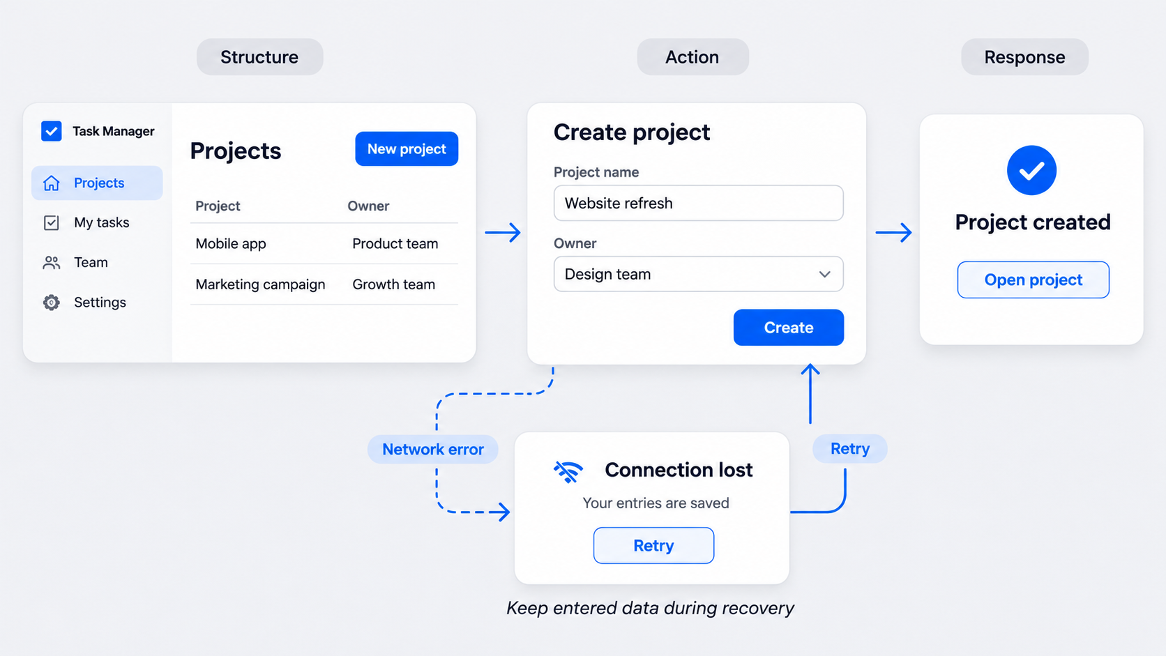 An application wireframe is a structural blueprint of a software interface. It establishes screen hierarchy, content priority, navigation, interactions, and core functionality without committing to finished visual design.
A complete wireframe communicates what appears on each screen and what happens next. It is not a production interface, polished mockup, or disconnected screen list.
Our approach also covers relevant loading, empty, error, permission, interruption, and recovery states. Teams can begin with an AI UI design generator, but the result still requires product judgment.
The five parts of a useful application wireframe
We recommend covering five areas:
- Structure: Content hierarchy, controls, and priorities.
- Movement: Entry points, navigation, back paths, and exits.
- Response: Actions and the resulting system behavior.
- Logic: Conditions, permissions, and data dependencies.
- States: Default, transitional, failure, restricted, and success states.
Missing information does not disappear. It usually becomes a decision for product, design, or engineering later.
A screen list is not an application wireframe
A screen inventory answers, “What screens exist?” An application wireframe should also show how people move between them and what happens when the expected path breaks.
Several happy-path screens may look complete while concealing unanswered questions. Alternate branches, unavailable actions, transitions, and recovery paths make the artifact useful—not visual polish.
Create an application wireframe with UXMagic
At UXMagic, we use a direct workflow: describe, design, and ship.
- Consolidate the requirements.
- Describe the user, task, rules, and platform.
- Generate the primary screens.
- Inspect alternate and system states.
- Revise repeated components consistently.
- Validate the flow with product and engineering.
AI can reduce blank-canvas work and speed up repeated revisions. It cannot determine which permissions apply, what data exists, or whether the proposed flow meets the product requirement.
For a more disciplined process, follow our guide to creating AI UI that is actually shippable.
What to include in an AI wireframe prompt
A strong prompt names:
- The user and their role
- The entry point and task goal
- Required content and primary action
- Secondary, exit, and destructive actions
- Business rules and permissions
- Data dependencies
- Platform and responsive requirements
- Relevant loading, empty, error, success, offline, and restricted states
Avoid vague instructions such as “Create a SaaS dashboard.” Describe the workflow and the decisions the interface must support.
What designers still need to verify
We recommend checking generated drafts for:
- Clear hierarchy and task priority
- Missing screens, branches, and recovery paths
- Accessible labels, controls, focus order, and feedback
- Realistic content and data density
- Technical constraints
- Consistent components and behavior
Generated UI is a proposal, not proof. Once a direction is approved, teams can use an AI-to-Figma workflow to create editable designs for further review.
Inventory screens from requirements before choosing layouts
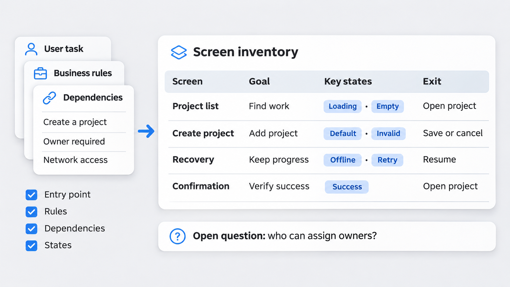 Wireframing problems often begin before anyone draws a screen. Requirements may be scattered across tickets, meeting notes, user stories, existing flows, business rules, and data documentation.
We bring those materials into one working source, starting with user tasks and decisions. Assumptions and unresolved questions should remain visible; placing an assumption in a layout can make it appear approved.
Screen requirements checklist
For each screen, define:
- Entry point: How and why someone arrives
- Goal: The intended outcome
- Content: Data, instructions, and hierarchy
- Actions: Primary, secondary, destructive, and unavailable options
- Rules: Validation, permissions, and conditions
- Dependencies: Required data, services, or prior actions
- Exits: Completion, cancellation, interruption, and back navigation
- States: Relevant default, transitional, failure, and success views
Turn task flows into a screen inventory
Map each meaningful action to a system response and possible next screen. Include cancellation, back navigation, interrupted sessions, and re-entry where they matter.
We also mark reusable patterns such as confirmation dialogs, validation messages, and filter panels. Reuse should create consistency without forcing different tasks into the same layout.
Map navigation, decision logic, and every important state
An application wireframe flow should show how people enter, advance, reverse, abandon, recover, and finish. Connect each significant decision to a visible result.
We prioritize states by frequency, severity, uncertainty, and implementation risk. A clickable happy path can create false confidence if failure logic remains unresolved. Our guide to interactive prototypes, states, and transitions shows how to make behavior testable.
State coverage checklist
Consider:
- Default and first-use states
- Loading and delayed responses
- Empty, no-results, and partial-data states
- Validation and system errors
- Offline and timeout behavior
- Disabled and permission-restricted actions
- Success and confirmation feedback
- Retry, undo, and recovery options
Not every screen needs every state. Each credible risk needs an intentional response.
Annotate behavior the layout cannot explain
Use annotations for:
- Validation timing and error placement
- Conditional visibility and branching
- Data sources and dependencies
- Role-based access
- Persistence and timeout rules
- Retry and recovery logic
Keep notes testable. Instead of “Show error if invalid,” define what makes the input invalid, when validation occurs, and whether entered data remains available.
Application wireframe examples with realistic states
Strong application wireframe examples keep attention on structure and behavior rather than decoration. We include the main path, relevant alternatives, failures, and recovery options.
Onboarding and account verification
An invited user might create an account, wait for verification, and begin setup. The wireframe may also need to cover an expired invitation, invalid input, denied permissions, or an interrupted session.
| Situation | Wireframe response | Recovery |
|---|---|---|
| Verification pending | Show status | Retry or resend |
| Invitation expired | Explain expiration | Request a new link |
| Invalid data | Show inline errors | Preserve valid entries |
| Setup interrupted | Save completed progress | Resume setup |
Authentication contains many branches. A login form wireframe covering every state can extend this pattern to password, session, and account-recovery behavior.
Dashboard, search, and filtering
Dashboards may need empty, complete, partial, loading, and failed-service states. Search can add active filters, no results, offline behavior, and reset logic.
| Situation | Wireframe response | Recovery |
|---|---|---|
| First use | Empty state with setup action | Start configuration |
| Widget failure | Local error message | Retry that widget |
| No results | Show active constraints | Clear filters |
| Offline search | Preserve the query | Retry after reconnecting |
We annotate whether the rest of the dashboard remains usable and whether filters persist after navigation.
Form submission and settings
Forms often require inline validation, saving feedback, duplicate-submission protection, server errors, confirmation, and unsaved-change warnings.
| Situation | Wireframe response | Recovery |
|---|---|---|
| Invalid field | Specific inline feedback | Correct without data loss |
| Saving | Prevent duplicate submission | Wait or cancel safely |
| Server failure | Retain entered values | Retry |
| Unsaved exit | Confirm leave or stay | Return to editing |
Settings may also need dependent controls, permission restrictions, destructive-action confirmation, and reversal options.
Role-based access
Role-based interfaces should distinguish between hidden, disabled, denied, and expired-session behavior.
| Situation | Wireframe response | Recovery |
|---|---|---|
| Action unavailable | Disable with an explanation | Request access |
| Route denied | State the required role | Return safely |
| Approval pending | Show request status | Cancel or wait |
| Session expired | Preserve safe progress | Reauthenticate |
We hide irrelevant or sensitive actions. When visibility helps explain a capability or required permission, a disabled control with clear guidance may be more useful.
Choose the right wireframe fidelity and responsive scope
Higher fidelity is not automatically better. We use the least detailed format that can answer the team’s current question.
Keep drafts rough while task logic, hierarchy, and scope remain uncertain. Add detail when testing realistic content, responsive behavior, or implementation-sensitive components.
For mobile-specific decisions, use our mobile wireframe design system rather than simply shrinking a desktop screen.
When low, mid, and high fidelity are useful
- Low fidelity: Align on tasks, hierarchy, scope, and major branches.
- Mid fidelity: Clarify content, controls, states, and component behavior.
- Higher fidelity: Test realistic interaction and density after the logic stabilizes.
Polishing too early can shift feedback toward typography and color while rules remain unresolved.
Wireframe desktop, tablet, and mobile behavior
Responsive wireframes should define what reflows, collapses, moves, or disappears at each breakpoint. Document changes to navigation, tables, filters, forms, dialogs, and multi-step actions.
Our priority is preserving the task, not compressing a desktop layout until it fits.
Application wireframe vs user flow, sitemap, mockup, prototype, and Figma
These artifacts answer different questions.
| Artifact | Purpose | Primary review question |
|---|---|---|
| User flow | Map routes and decisions | Can people reach the outcome? |
| Sitemap | Organize information | Where does content belong? |
| Wireframe | Define structure and behavior | Does the experience work? |
| Mockup | Show visual treatment | Does the interface look right? |
| Prototype | Simulate interaction | Can people complete the sequence? |
| Production specification | Document build details | Can engineering implement it? |
Figma is a design tool, not a wireframe. Teams can use it to create wireframes, mockups, prototypes, and specifications.
When interaction is the main uncertainty, a scoped clickable startup prototype may answer more questions than additional visual detail.
Which artifact should the team use?
We use:
- Flows for routes and branches
- Wireframes for structure, states, and behavior
- Prototypes for interaction sequences
- Mockups for visual treatment
- Production specifications for implementation details
A project may need several artifacts, but each should have a defined review purpose.
Review and test application wireframes before visual polish
We frame reviews around task completion, missing states, business rules, constraints, and recovery. Color and typography can wait unless they affect comprehension or accessibility.
Test realistic conditions such as empty data, invalid input, restricted access, failed requests, and interruptions. Product can verify rules, design can assess usability, and engineering can check feasibility and dependencies.
A focused wireframe review agenda
- Restate the user, task, assumptions, and open questions.
- Walk through the main path.
- Review an alternate or failure path.
- Check data, permissions, validation, and responsive behavior.
- Discuss technical constraints.
- Record decisions separately from visual ideas.
Wireframe testing tasks that expose risk
Ask participants to:
- Complete a task without existing data
- Recover from invalid input or a failed request
- Search with multiple filters
- Attempt an action without permission
- Resume after an interruption
If the wireframe cannot represent the test, it may have a coverage gap.
Use templates without turning every product into the same interface
We reuse checklists, annotation formats, state matrices, grids, and established interaction patterns. We do not standardize away product goals, content hierarchy, permissions, or edge cases.
Explore our community design examples for patterns rather than fixed answers. Generate quickly, then verify the decisions AI cannot own.
Final pre-handoff checklist
Before handoff, confirm:
- Each required screen has a purpose and entry point.
- Navigation, exits, branches, and recovery paths are visible.
- Important system and permission states are covered.
- Annotations explain rules, validation, data, and dependencies.
- Responsive behavior and unresolved assumptions are documented.
- Repeated components behave consistently.
- Product and engineering have reviewed sensitive logic.
Turn requirements into a state-complete application wireframe
Use uxmagic.ai to describe the task, generate a structured first draft, and validate the screens and states before investing in visual polish. Describe, design & ship.