
TL;DR
A clickable prototype for a startup should test one important decision, not imitate the entire product. Define the risky assumption, generate only the critical screens, connect and QA the flow, then use different scripts for investors and usability testers. Prototype the decision; build only after the evidence supports it.
Define the job of your clickable prototype for a startup
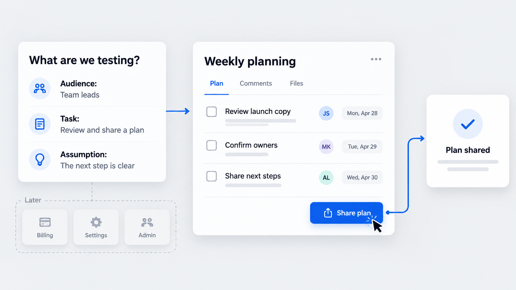 The best deliverable is a scoped, connected critical path suitable for an investor walkthrough, usability task, or both. Stop treating it like a smaller MVP: prototype the decision, not the whole product.
These formats answer different questions:
- Wireframe: explores structure, hierarchy, and content placement.
- Proof of concept: investigates whether an idea or technical approach can work.
- Clickable prototype: simulates navigation, states, and workflow expectations.
- Coded prototype: tests behavior that requires functioning software.
- MVP: delivers limited but real value to actual users.
For realistic interface testing, our high-fidelity wireframe guide explains how detail changes the quality of feedback.
Generated or shareable screens are not automatically a clickable prototype. They become one only after hotspots, transitions, component states, overlays, and navigation rules are configured and tested.
A prototype can reveal desirability, comprehension, navigation problems, and workflow expectations. It cannot prove feasibility, security, reliability, performance, retention, or willingness to pay.
Write the purpose in one sentence
Use this format:
We need [audience] to complete [task] so we can learn [assumption].
“We need to show the whole platform” is not a useful objective. It identifies neither a decision nor measurable evidence.
Turn the sentence into three elements:
- Primary task: what the participant attempts.
- Success moment: the observable end state.
- Evidence target: what the behavior should confirm or challenge.
Complete a lightweight prototype brief
Record the audience, objective, riskiest assumption, primary task, entry point, success moment, required screens and states, fidelity, deadline, sharing method, and deliberate omissions.
This brief becomes a scope agreement among founders, designers, product teams, and stakeholders. It also prevents late requests from quietly turning five screens into a simulated platform.
Add a “do not prototype yet” list:
- Settings and full account management
- Every user role
- Exhaustive error handling
- Admin dashboards
- Speculative features unrelated to the learning question
Choose the audience: investors, testers, or both
The same screens can support investors and testers. The script cannot.
| Decision factor | Investors | Usability testers |
|---|---|---|
| Desired decision | Understand value and opportunity | Reveal comprehension and usability |
| Route | Rehearsed default path | Flexible, minimally coached path |
| States | Enough for a credible story | Enough to expose meaningful problems |
| Facilitator | Narrates strategically | Uses neutral prompts |
| Confidentiality | Controlled disclosure | Research consent and sanitized data |
| Success signal | Value is clear and memorable | Task completed and explained correctly |
Excessive polish can reduce research quality. When a prototype looks finished, participants often discuss colors and visual preferences instead of revealing whether they understand the workflow.
Scope the investor version
Use a two-minute default route:
- Frame the problem and user context.
- Show the primary action.
- Reveal the key value moment.
- Land on a credible end state.
- Connect the outcome to the business implication.
Prepare the starting frame and a reset point before the call. Use realistic names, prices, dates, records, and outputs, but state clearly when data or functionality is simulated.
Scope the usability-test version
Write a task around a goal without naming controls. “Share the action plan with your team” is better than “Click Share.”
Include only branches and states that could affect the finding: empty, loading, success, validation error, or permission denied. Observe completion, hesitation, wrong turns, comprehension, and the participant’s explanation—not merely whether they clicked through.
Map the critical path and minimum screen inventory
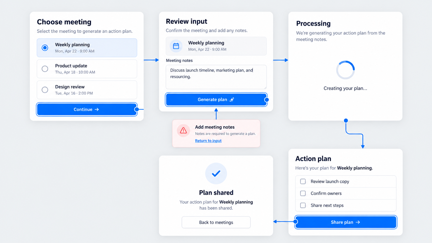 Translate the purpose into an entry point, actions, decisions, value moment, end state, and recovery routes. Cut any screen that neither tests the risky assumption nor prevents a consequential dead end.
A useful starting pattern is:
- Landing or sign-in
- Setup
- Primary action
- Processing
- Result
Adapt it rather than forcing it. Select one primary viewport first; add desktop or mobile variants only when cross-device behavior is part of the risk.
| Screen | Purpose | Entry condition | Action | Destination | Required state |
|---|---|---|---|---|---|
| Setup | Establish context | User has entered | Select input | Primary action | Default |
| Action | Start core task | Input selected | Submit | Processing | Validation |
| Result | Show value | Processing completes | Review or share | Confirmation | Success |
Draw the interaction map before designing screens
Map the default route, meaningful branches, back navigation, overlays, terminal states, and reset point. Label simulations and identify where context must persist between screens.
Separate evidence-producing interactions from decorative motion. An animated card may look impressive, but it adds no value if it does not affect comprehension, trust, or task completion.
Choose only the states that could change the outcome
Consider empty, loading, success, validation error, and permission-denied states.
Include a state when omitting it would mislead a participant, create a dead end, or hide a risky assumption. Do not design exhaustive edge cases when they cannot change the decision.
Use realistic content without misrepresenting functionality
Replace placeholder text with believable labels, dates, prices, instructions, records, and generated outputs. The interface copy should support comprehension without facilitator explanation.
Clearly disclose simulated data and behavior during research and fundraising. Realistic content should improve the test, not create a false claim about product readiness.
Set fidelity according to the evidence you need
Use low fidelity for information architecture, sequence, terminology, and basic comprehension. Use a polished flow when investor storytelling, trust, or perceived value matters.
Choose functional code when the assumption depends on performance, live data, integrations, complex inputs, or technical behavior.
| Situation | Recommended scope |
|---|---|
| Early workflow question | Low-fidelity clickable path |
| Investor narrative | Branded critical path |
| Complex interaction risk | Detailed interactive or coded prototype |
| Technical feasibility risk | Technical spike |
| Real-world value delivery | MVP or concierge test |
Our decision tree is simple: identify the risk, determine the required evidence, then choose the least expensive format capable of producing it.
Compare effort with strength of evidence
| Format | Effort | Demonstrates | Cannot prove | Suitable use |
|---|---|---|---|---|
| Static mockups | Low | Visual direction | Task completion | Design review |
| Clickable prototype | Low–medium | Navigation and comprehension | Technical feasibility | Investor or usability flow |
| Coded prototype | Medium–high | Functional behavior | Sustainable delivery | Integration or interaction risk |
| MVP | High | Real value in use | Long-term retention by itself | Market learning |
Visual fidelity and evidence strength are not interchangeable. A beautiful simulation may provide weaker evidence than a rough concierge test delivering the promised outcome manually.
Pair the prototype with stronger evidence when needed
Pair prototype testing with:
- Pricing interviews for willingness-to-pay risk
- Waitlist conversion or pre-orders for demand signals
- Concierge delivery for operational risk
- A technical spike for feasibility
- Functional code for performance or integration risk
Small qualitative studies reveal recurring patterns and likely causes. They are not statistically conclusive.
Generate the critical UI with UXMagic
An AI UI design generator can compress blank-canvas work and generate connected screen concepts faster. It does not decide what evidence the startup needs.
Our recommended workflow is:
- Describe the product flow.
- Generate the required screens using verified inputs.
- Standardize components and realistic content.
- Annotate interaction intent.
- Prepare assets for a verified interaction layer.
AI-generated screens still require interaction logic, accessibility review, usability review, and QA. Our guide to generating shippable AI UI covers the design discipline required beyond generation.
Describe the flow, not just the visual style
Include the audience, primary task, sequence, key value moment, required states, viewport, and omissions in the generation brief.
Specify repeated names, records, dates, and other persistent entities so context remains consistent. Generate the critical path first; add alternate states only when they affect the learning goal.
Standardize components and prevent visual drift
Normalize navigation, buttons, fields, cards, spacing, typography, terminology, and states. Strong Figma design system examples show why repeated patterns need explicit rules rather than visual approximation.
Assign stable names to screens, components, and states. Review persistent data, selected states, and repeated content before connecting anything.
Annotate every interaction before handoff
For every interaction, record:
- Trigger and destination
- Transition or overlay behavior
- Back and close behavior
- Loading expectation
- Reset route
- Whether the behavior is interactive, static, or simulated
Keep a versioned flow map beside the assets. Otherwise, screen revisions can silently break navigation logic.
Connect screens and create the clickable interaction layer
Begin with generated assets using input and output methods verified at publication time. Transfer them into a suitable prototyping environment if native interaction support is unavailable or unverified.
Configure hotspots, transitions, overlays, states, back behavior, scrolling, a start frame, and a reset point. The outcome matters more than the tool: participants must complete the critical task without dead ends or facilitator repair.
How to make a clickable prototype for a startup in Figma
Move UXMagic-created screens through a currently verified format and destination. Never imply a direct integration when the workflow has not been confirmed.
Rebuild or preserve reusable components and variants before linking screens. Then configure prototype links, overlays, transitions, scrolling, start points, and permissions using current Figma documentation.
Our AI-to-Figma workflow explains how to keep generated interfaces editable and review-ready. Figma remains an optional refinement or interaction layer, not a source of product validation.
Distinguish shareable screens from a clickable prototype
A static gallery supports visual review but does not demonstrate task completion. An embedded prototype supports self-guided exploration only after its navigation and access have been tested.
Moderated screen sharing gives the presenter more control. It can also conceal usability failures if the presenter coaches people through unclear interactions.
Choose the right sharing mode
Use:
- Static links for fast visual review
- Embedded prototypes for controlled self-guided tasks
- Moderated sharing for sensitive or narrated sessions
Base the choice on confidentiality, access restrictions, interaction complexity, and the cost of unexpected navigation. Test access without the creator’s account.
Study three clickable prototype examples for startups
These fictional examples show how the hypothesis—not the product category—determines scope. For additional visual directions, review our community design concepts without copying complete product flows.
AI meeting follow-up tool
Hypothesis: A team lead will understand and trust an AI-generated action plan enough to edit and share it.
- Screens: Sign-in, meeting selection, processing, editable result, confirmation
- Interactions: Select, generate, review, edit, share
- Omissions: Integrations, billing, settings, live AI behavior
- Success: The participant explains, corrects, and shares the output without coaching
- Cannot prove: Model accuracy, latency, security, or adoption
Concept screens showing a five-step AI meeting follow-up flow from meeting selection to shared action items.
B2B expense approval dashboard
Hypothesis: A manager can identify a policy exception and make a confident approval decision.
- Screens: Queue, detail, warning, decision overlay, confirmation
- Interactions: Select, inspect, approve or return, confirm
- Omissions: Employee administration, reporting, exhaustive roles
- Success: The manager notices the exception and chooses an appropriate action
- Cannot prove: Accounting integration, fraud detection, or permission security
A decision-focused dashboard design framework can help prevent dense interfaces from obscuring the one signal a manager needs.
Concept screens showing an expense approval flow with a visible policy exception and decision confirmation.
Service-booking marketplace
Hypothesis: A customer can compare options and book with confidence about price, timing, and cancellation terms.
- Screens: Results, provider detail, time selection, review, confirmation
- Branch: One unavailable time slot
- Omissions: Provider onboarding, messaging, settings, administration
- Success: The participant books and correctly explains the key terms
- Cannot prove: Provider supply, payment reliability, or marketplace liquidity
Concept screens showing a service-booking path from provider comparison to confirmed appointment.
Test, QA, and revise the signal
Five participants can be a practical starting point, not a universal rule. Iterate when repeated patterns emerge.
Record problems by screen and task, then classify each as concept, copy, layout, interaction, content, or prototype defect. Change only the affected section and retest the same critical task.
Run a ten- to fifteen-minute tester task
Give a neutral scenario and let the participant attempt the task without coaching. Observe completion, hesitation, backtracking, wrong turns, help requests, and interpretation of the result.
Afterward, ask what happened, what they expected next, and what felt untrustworthy. Treat click data as directional navigation evidence, not statistically conclusive performance.
Complete prototype QA before sharing
- Click every hotspot and verify its destination and hit area.
- Test back navigation, scrolling, and overlay closing.
- Remove dead ends.
- Confirm the start frame and reset route.
- Open the link in an incognito window.
- Test the presentation device, browser, viewport, and connection.
Feed findings back into the generation loop
Group observations by screen and task instead of compiling undifferentiated comments. Diagnose whether each issue concerns the concept, copy, layout, interaction, content, or fidelity.
Revise or regenerate only the affected screens. Reconnect changed routes, rerun QA, and test the same task again.
Present and share the prototype without losing control
Investors need concise narration linking problem, action, value, and business implication. Researchers need minimal explanation so confusion remains visible.
Create a sanitized version when unreleased features, customer data, or internal plans cannot be shared safely.
Use a two-minute investor demo storyboard
Frame the user problem, show the primary action, reveal the value moment, and finish on a credible outcome. Explain why that outcome matters commercially.
Return to a known reset point before questions. This prevents an alternate-route request from derailing the rest of the presentation.
Prepare for remote presentation failure
Preload tabs, create duplicate start links, and test screen-sharing permissions. Keep recorded footage and a static PDF available as fallbacks.
Verify audio, zoom, viewport, permissions, device, and connection before the session—not while investors are waiting.
Protect confidential startup information
Sanitize personal, customer, financial, and proprietary data. Never expose credentials, API keys, internal roadmaps, or private URLs.
Where the verified environment supports them, configure access, expiration, download, and link-visibility controls.
Turn prototype findings into the next product decision
Separate what the prototype revealed about desirability and comprehension from unanswered questions about feasibility, reliability, security, performance, retention, and payment.
Validated tasks become candidates for MVP scope. Prototype screens are not automatically build requirements.
Decide what to build, test, or remove next
Build the smallest behavior needed to answer the next material risk. Run a technical spike for performance, integrations, live data, or feasibility.
Use pricing research, waitlist conversion, concierge delivery, or pre-orders when commercial evidence is missing. Remove screens that attracted attention but produced no useful evidence.
Describe the assumption. Design the critical path. Connect the screens. Test the signal. Ship the learning.
Measure the guide’s business impact
Track qualified organic visits, engagement with examples, product-workflow clicks, and assisted sign-ups. Rankings are one indicator, not the entire measure of useful content.
Refresh screenshots and instructions whenever generation inputs, exports, interaction support, or sharing options change.
Clickable prototype checklist and FAQs
Before sharing:
- Define the hypothesis and audience.
- Inventory only essential screens and states.
- Generate and standardize the critical UI.
- Map and configure every interaction.
- Add a start frame and reset route.
- QA links, permissions, scrolling, and devices.
- Use different investor and tester scripts.
- Record evidence and unanswered risks.
- Choose the next build, test, or removal decision.
Describe the flow. Generate the screens. Test the idea.
Publication verification checklist
Before publication, confirm current input methods and interface labels, editable-output behavior, component handling, export formats, destinations, and native interaction support.
Also verify sharing permissions, privacy controls, and any published limits affecting multi-screen projects. If a capability cannot be confirmed, describe a neutral handoff rather than making a product claim.
How many screens does a startup prototype need?
Use only the screens required to complete the critical task, expose the risky assumption, and prevent consequential dead ends. Five screens are a useful pattern, not a requirement.
Does a clickable prototype count as an MVP?
No. A prototype simulates an experience; an MVP delivers limited but functioning value. Prototype feedback does not prove feasibility, security, performance, retention, or payment behavior.
How long should a clickable prototype take?
It depends on complexity, fidelity, states, content, and interaction depth. Set the deadline from the decision date, then reduce scope before sacrificing the critical path or QA.
Is Figma required to make a clickable prototype?
No. The requirement is an interaction layer supporting the necessary links, states, sharing, and task completion. Figma is one optional environment.
What should a startup show investors?
Show the problem, one high-value action, the key value moment, a credible outcome, and the business implication. Use realistic content, a rehearsed route, a reset point, and accurate disclosure of simulations.
Can users test a clickable prototype without code?
Yes, when the question concerns comprehension, navigation, workflow expectations, or perceived value. Use code when the risk depends on performance, live data, integrations, or technical behavior.
Turn your critical flow into testable screens
Define the assumption before expanding the interface. Then use UXMagic to describe, design & ship the focused screen set your team can connect, test, and learn from.