A user executes a five-thousand-dollar transfer, the screen flashes a generic error code, and their account balance drops immediately. In those few seconds of system ambiguity, visual polish and brand aesthetic cease to matter, and trust in the platform takes a real hit. Designing modern fintech interfaces requires mastering the precise detail work, micro-interactions, and visual feedback systems that keep users grounded during critical financial moments.
You already understand component libraries, design tokens, and standard onboarding patterns. This isn't a UX-101 primer. It's the specific architectural decisions where friction belongs, how to structure progressive KYC, what a real error state actually needs to be that separate a fintech product users trust with real money from one that quietly loses them during signup.
One regulatory note before diving in: KYC requirements, consent language, and authentication standards vary meaningfully by market - GDPR obligations in the EU differ from US requirements, and financial authentication rules differ again in markets like India or Southeast Asia. Everything below is a UX architecture framework, not legal guidance; confirm actual compliance requirements with legal counsel for each market you operate in.
Traditional Fintech UX vs. Friction-Right UX
| Feature | Traditional Approach | Friction-Right Approach |
|---|---|---|
| Onboarding | Full KYC upfront, before any product value shown | Baseline signup, deep KYC deferred to first real transaction |
| Data density | Hidden behind minimalist navigation layers | Legible at a glance, primary metric front and center |
| High-stakes actions | Same frictionless flow as routine actions | Deliberate confirmation checkpoints and summary screens |
| Errors | Generic technical error codes | Explicit explanation of what happened and what to do next |
| Color indicators | Color alone (red/green) | Color paired with text labels and icons |
The Core Principles of Fintech UX Architecture
Designing Trust into Every Interaction
Trust in a fintech product tends to form quickly, often within the first few interactions, and it's built through consistent visual hierarchy, transparent fee disclosures, and explicit security signals during high-stakes actions not through a wall of legal disclaimers nobody reads.
"Friction-Right" UX: Why Zero Friction Is a Dangerous Myth
Removing friction is standard SaaS product advice, but applying zero friction to a financial application is a real product risk. In high-stakes financial environments, strategic friction isn't a usability flaw - it's a trust mechanism that reassures users their money is being handled carefully. Routine actions like checking balances or reviewing transaction history should stay frictionless. High-stakes actions - initiating wire transfers, modifying account permissions, executing trades - benefit from deliberate friction: short confirmation delays, explicit summary checkpoints, required confirmations.
Data Density Done Right: Beyond Aggressive Simplification
Consumer SaaS design heavily promotes hiding data to achieve minimalist layouts. Applying that instinct to fintech is often a mistake. Financial users open these applications specifically to evaluate data density - balances, interest accruals, risk metrics, transaction timestamps. The design goal shouldn't be visual minimalism; it should be legibility at a glance. Hiding critical numerical details behind deep navigation layers increases cognitive load and can contribute to user anxiety, not just inconvenience.
Master Onboarding & Progressive KYC Verification
Structuring Tiered Onboarding Flows
Progressive disclosure breaks complex onboarding and Know-Your-Customer (KYC) flows into smaller, contextual steps. Collecting only baseline information upfront - email, phone and unlocking advanced features incrementally is generally expected to reduce cognitive load and support lower onboarding drop-off, though the actual impact varies by product, audience, and regulatory context worth validating with your own funnel data rather than assuming a universal lift.
Microcopy & Trust Signals for Sensitive Data Collection
Compliance requirements - legal disclaimers, identity verification, regulatory consent are frequently treated as intrusive pop-ups handed off by legal departments. That approach fractures visual architecture and can erode user confidence. Compliance works better embedded into the progressive disclosure flow itself, where every data request explicitly explains its security justification directly within the interface microcopy not buried in a terms-of-service link nobody clicks.
Eliminating Drop-Off in Identity Verification
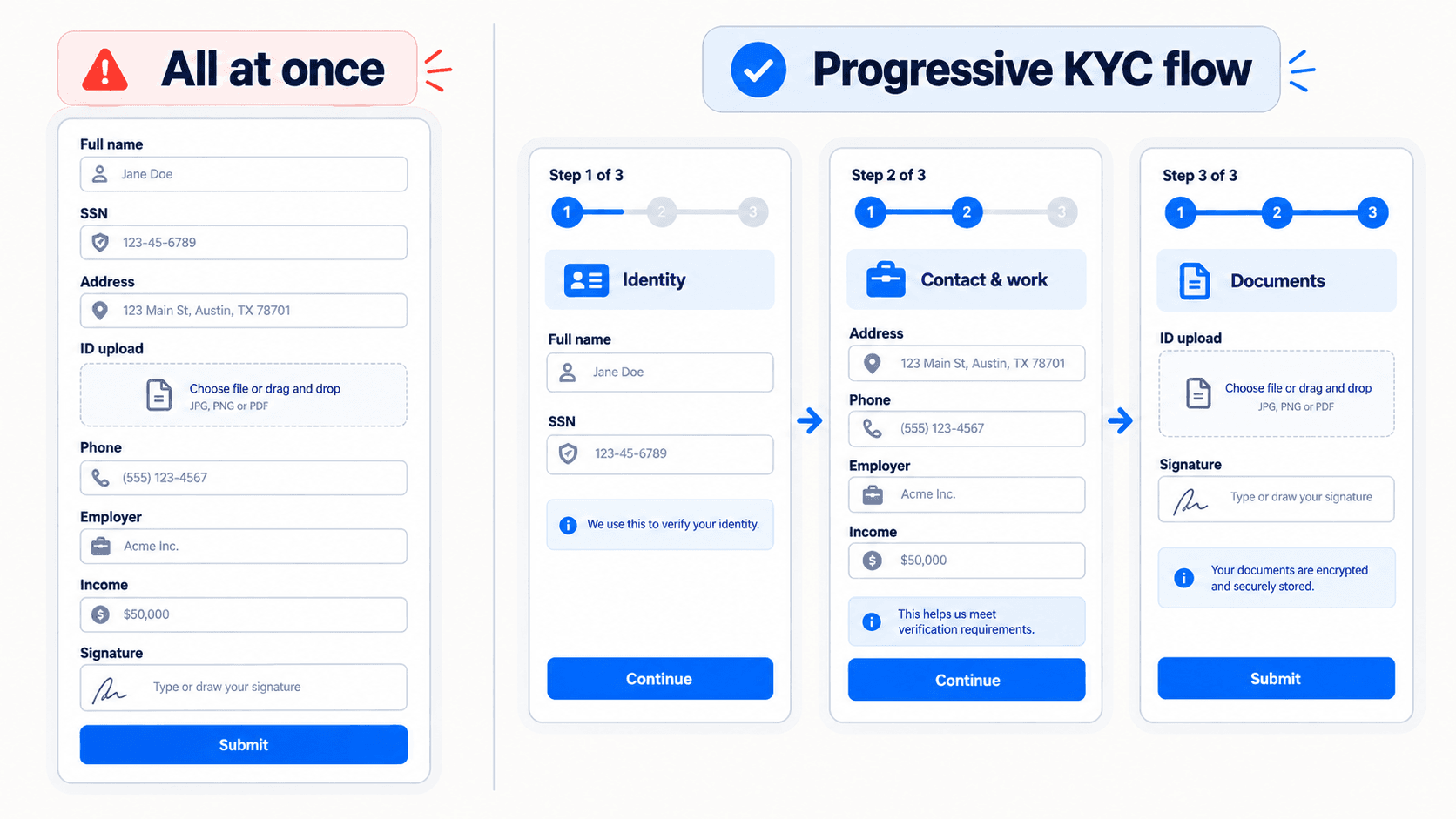
Here's what that contrast looks like on a real flow. The traditional approach: an application presents an 8-page upfront form requesting full personal details, Social Security Number, and photo ID uploads immediately after initial registration, with no contextual explanation - a pattern commonly associated with higher early drop-off, since users have no established reason yet to trust the request.
The friction-right approach instead: baseline signup grants immediate access to an interactive sandbox dashboard. Deep identity verification triggers only when the user attempts a real transaction, paired with explicit microcopy: "We verify your ID to secure your funds and meet regulatory standards, not for marketing." The verification request arrives exactly when the user has a reason to trust why it's being asked.
Generic AI layout tools frequently generate onboarding flows that collect sensitive bank details on single, unencrypted-looking form layouts with no step indicators, progress counters, or regulatory trust badges - visually indistinguishable from a phishing form, which is exactly the wrong impression for a KYC screen to give.
Financial Data Visualization & Information Architecture
Establishing Numerical Typography Hierarchy
Establish strict font weight and size scales for numerical data. Primary account balances need distinct, high-contrast weights; secondary metadata should be visually subordinated so the eye lands on the number that actually matters first, not a wall of equally-weighted digits.
Color-Independent Cues & Accessibility Standards
Pair red and green financial indicators with text labels or directional icons to ensure accessibility for colorblind users. Relying on color alone to signal a debit versus a credit is a real, common accessibility failure in financial interfaces specifically, where getting that distinction wrong has higher stakes than most other UI contexts.
Designing Searchable, High-Utility Transaction History Screens
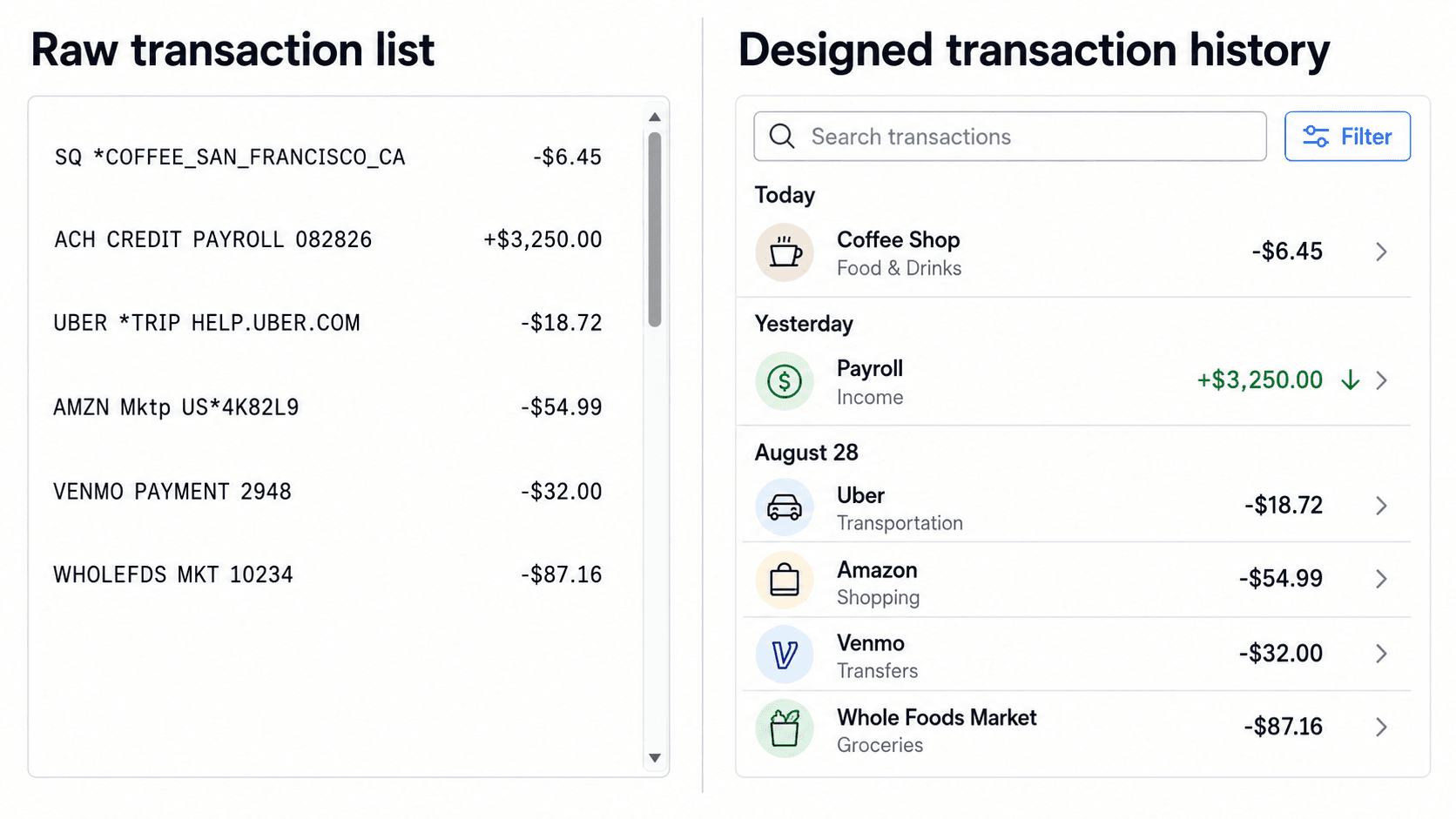
Here's the contrast on a ledger screen. Traditional approach: an unformatted, infinite-scrolling transaction log displaying raw merchant descriptors, identical visual styling for debits and credits, no search bar, requiring a desktop browser for historical records.
The optimized approach: transactions grouped visually by calendar date, incoming transactions carrying a subtle visual accent, outgoing amounts in standard neutral formatting, merchant titles parsed into human-readable text, and direct keyword search plus date filters available on mobile. Basic AI UI generators tend to render transaction history as simple, static tables lacking filtering components, pagination, or clear visual separation between positive and negative cash flows - technically a ledger, functionally unusable at any real transaction volume.
Modern Micro-Interactions & System Feedback
Explicit Error Recovery and Failure States
A failed wire transfer showing "Transaction Error: Code 501 - Execution Failed" leaves the user uncertain whether funds were deducted or whether to try again - genuine uncertainty about their own money, which is a serious trust risk regardless of how the rest of the product looks.
The optimized version replaces that with a dedicated status view: "Transfer Not Completed. Your balance has not been charged. Reason: Receiving bank temporary timeout. [Retry Transfer] [Contact Support]." Standard LLM layout engines routinely fail to generate this kind of secondary failure and edge-case state at all, producing only optimistic "happy path" screens that ignore system recovery flows entirely - precisely the gap that turns a routine technical hiccup into a support ticket and a user who no longer trusts the app with their money.
Reassuring Micro-Animations and Haptic Confirmation
Confirmation modals, animated checkmarks, and haptic feedback need to trigger accurately without introducing latency - a delayed or inconsistent confirmation on a financial action undermines the exact trust the confirmation was supposed to build.
Structuring Mobile Notification Centers for High-Stakes Alerts
High-stakes alerts need visual priority distinct from routine notifications - covered in full in the dedicated section below.
Security Considerations Beyond KYC
KYC is the front door, but ongoing security UX matters just as much for sustained trust:
- Biometric authentication - Face ID / fingerprint login should feel fast and native, not bolted onto a separate settings menu users have to discover.
- Session timeout - financial apps generally benefit from shorter, clearly communicated session timeouts, with a visible warning before logout rather than a silent expiration.
- Device recognition - flag and require extra verification for logins from unrecognized devices, with clear microcopy explaining why the extra step appeared.
- Transaction verification - high-value or unusual transactions benefit from a secondary confirmation step (biometric re-auth, SMS code), proportional to the transaction's risk level.
- Fraud warnings - when a transaction pattern looks unusual, surface a clear, specific warning rather than silently blocking or silently allowing it.
Notification Prioritization
Not all fintech notifications carry the same weight, and treating them identically in the notification center is a common design failure. A reasonable priority order:
- Security alerts (unrecognized login, suspicious activity) - highest priority, distinct visual treatment
- Transaction alerts (large or unusual transactions) - high priority, clear and specific
- Payment failures (declined charges, failed transfers) - high priority, actionable
- Marketing notifications (promotions, feature announcements) - lowest priority, should never visually compete with the above three
A security alert and a promotional push notification should never be visually indistinguishable in a financial app - that's not a minor polish issue, it's a real risk that users start ignoring notifications broadly, including the ones that matter.
Mobile-Specific Design Considerations
Fintech usage skews heavily mobile, and a few specifics deserve deliberate attention:
- Thumb reach - primary actions (confirm, transfer, approve) should sit within comfortable thumb reach on a one-handed grip, not require a stretch to the top of the screen.
- One-handed use - critical flows (checking a balance, approving a payment) should be completely one-handed, since that's how most mobile banking actually happens.
- Numeric keyboards - any amount or PIN entry field should trigger the numeric keyboard automatically, not the full alphanumeric keyboard.
- Mobile biometric flows - Face ID and fingerprint prompts should integrate smoothly into the transaction flow, not require backing out to a separate authentication screen.
- Small-screen data density - the numerical typography hierarchy covered earlier matters most on mobile specifically, where screen real estate is tightest and legibility trade-offs are sharpest.
Modern Fintech Design Systems: From Concept to Production
Enforcing Component Consistency across External APIs
Third-party verification frames - Plaid, Jumio, and similar identity or banking integrations need to maintain visual and structural continuity with native screens. A jarring visual handoff between your app and an embedded third-party verification flow is a common, avoidable place where user trust drops right before the highest-stakes step in onboarding.
Accelerating Edge-Case Flow Generation with AI Design Tools
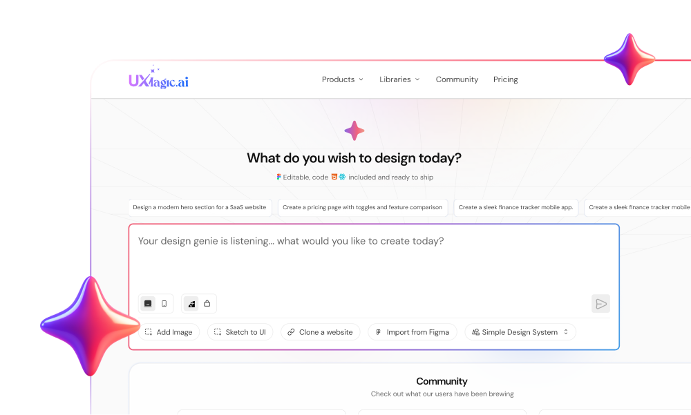
Manually drawing every permutation of an identity verification flow - success, blurry document warning, timed-out session, manual review often consumes real design team capacity across multiple days. Entering plain text prompts into UXMagic generates multi-state UI flows instantly, automatically structuring progressive disclosure steps while embedding standard microcopy explanations directly into the layout - a direct fix for the KYC scenario above, where the missing states were the actual problem, not the happy path.
Establishing precise visual hierarchy across data-dense financial views requires rigorous component token management by hand otherwise. Using UXMagic's Flow Mode, designers can generate structured financial dashboards, investment portfolio overviews, and transaction histories while preserving global design system tokens, typography scales, and accessible contrast ratios across every viewport - closing the exact gap that produces the unformatted, static ledger table covered above.
UXMagic: Generating a Complete Fintech Flow From One Prompt
Everything covered in this guide - progressive KYC, friction-right confirmation, explicit error states, color-independent indicators is exactly what a well-structured prompt can generate in one pass, rather than as five separately built screens someone has to keep consistent by hand.
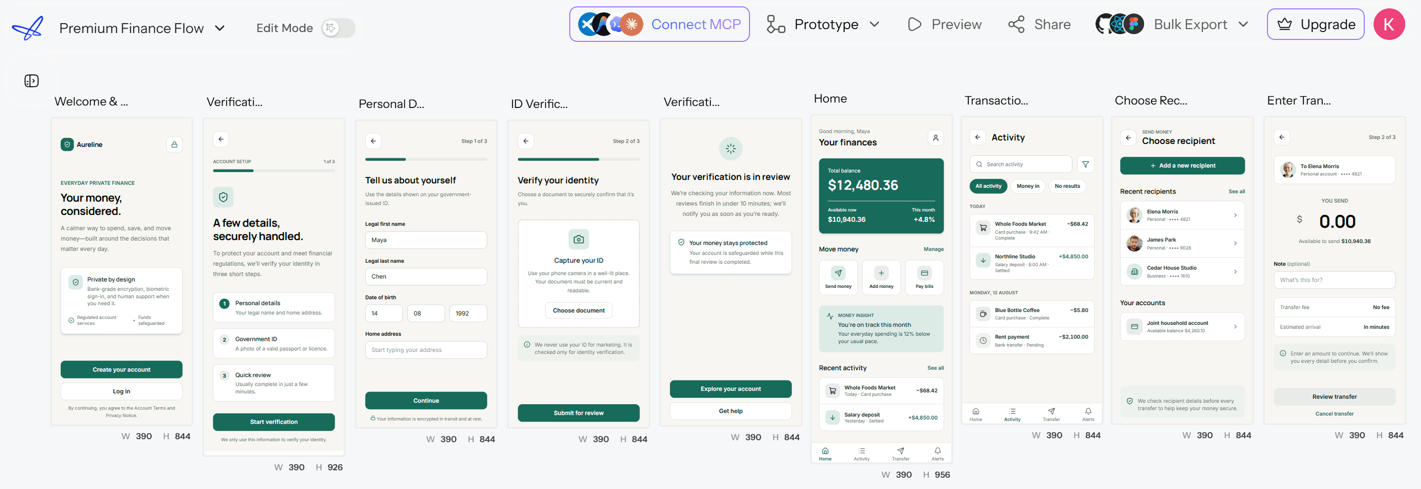
If your team is starting from a category reference rather than a blank prompt, UXMagic's Mobile App Templates library includes fintech specifically as one of its reference categories - a faster starting point than describing every screen from scratch. Once a flow is generated, UXMagic's AI App Builder carries the same token consistency into a full application build rather than isolated screens, and for the onboarding sequence specifically, UXMagic's Signup Flow Generator is purpose-built for exactly the progressive KYC and baseline-signup structure covered throughout this guide. And for teams whose engineering workflow runs through an AI coding assistant, UXMagic's MCP integration connects the generated flow directly into Cursor, Claude Code, or VS Code - closing the loop between the fintech flow you generate and the codebase it needs to land in.
Common Fintech UX Failure Patterns (And How to Fix Them)
A quick reference on the recurring mistakes covered throughout this guide:
- Zero-friction financial flows - removing all friction from high-stakes actions removes the trust signal users actually need at exactly the wrong moment.
- Front-loaded KYC - requesting full identity verification before the user has any reason to trust why it's needed.
- Color-only status indicators - debit/credit or success/error signaled by color alone, with no text or icon backup.
- Generic error codes - a technical error code standing in for a real explanation of what happened and what to do next.
- Inconsistent third-party integration - a visually jarring handoff to an external verification or payment provider mid-flow.
- Undifferentiated notifications - security alerts sharing the same visual priority as marketing pushes.
Design Complete Fintech Flows
Generate a complete, multi-state fintech flow covering KYC, success, error, timeout, and manual review states from a single prompt.