
TL;DR
Interactive prototypes model how a product responds, not just how someone moves between screens. We recommend matching fidelity to product risk, defining failure states before polishing the happy path, and documenting each trigger, condition, outcome, and fallback. Build a focused flow, test the uncertain decision, and hand off clear interaction rules.
What is an interactive prototype?
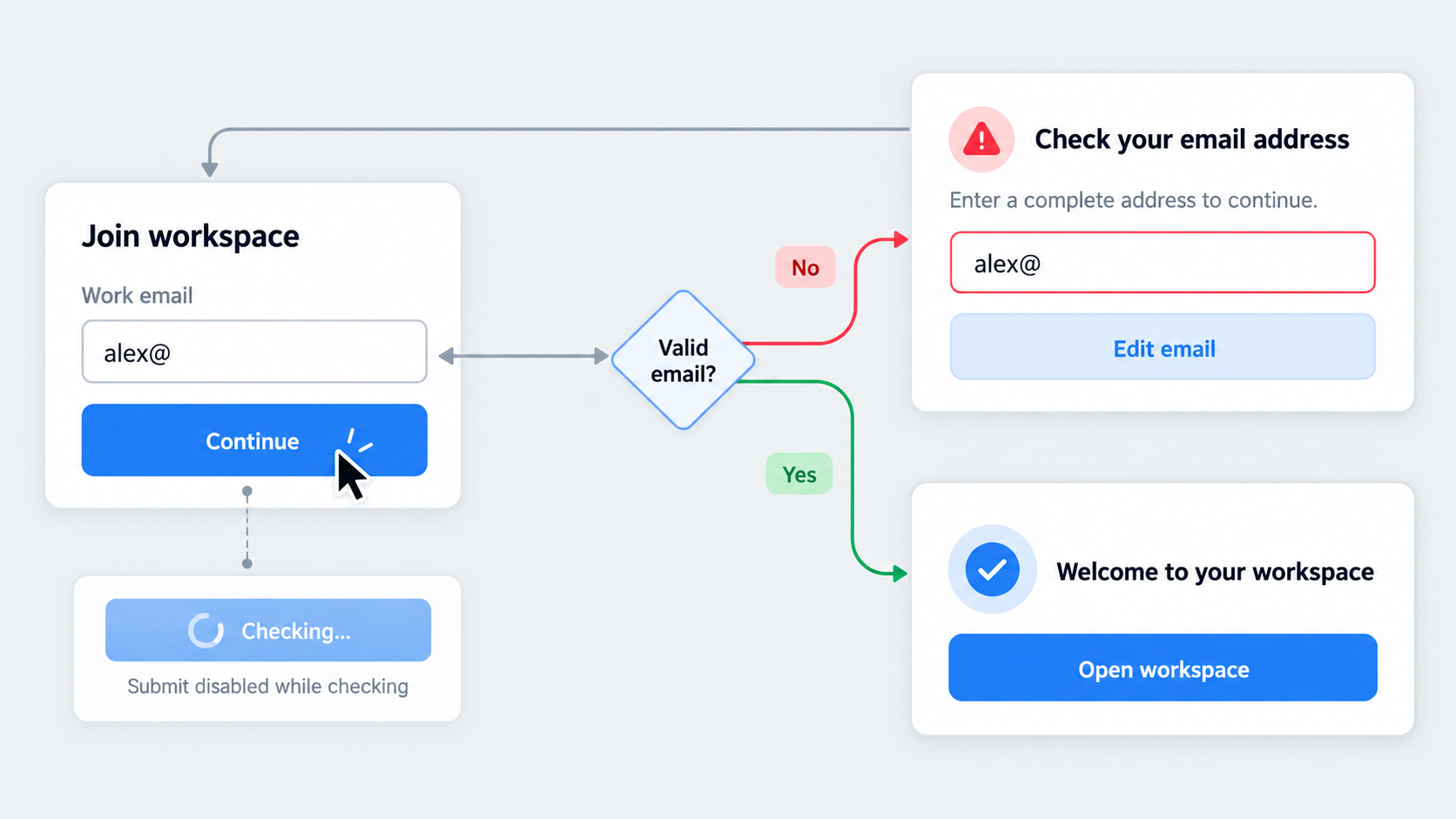 An interactive prototype is a testable product representation that responds to input through defined states, rules, feedback, and transitions.
Clickable does not always mean interactive. Screens connected by hotspots can demonstrate navigation, but they may not show why an interface changes, how the system responds, or what happens when the expected path fails.
Interactive prototype vs clickable prototype
A clickable prototype usually links screens to communicate page order, basic navigation, or a narrow happy path.
An interactive prototype can also model:
- Validation and conditional behavior
- Variables and persistent selections
- Loading, disabled, empty, and error states
- Overlays and component states
- Role-based branches
- Failure recovery
Our test is simple: if the experience advances only when someone selects the correct hotspot, it may be closer to a slideshow than a behavioral model. A clickable prototype for a startup can still be useful, provided its limits are clear.
Interactive prototype vs wireframe, mockup, and coded proof of concept
Each format answers a different question:
| Format | Primary purpose | Visual fidelity | Behavioral fidelity |
|---|---|---|---|
| Wireframe | Test structure and flow | Low | Low |
| Mockup | Review visual direction | Medium to high | Low |
| Interactive prototype | Test behavior and usability | Any | Medium to high |
| Coded proof of concept | Explore technical feasibility | Any | High for selected functions |
An interactive prototype can look rough while behaving precisely. A polished mockup, by contrast, may conceal missing logic and incomplete states.
What is interactive design?
Interactive design shapes the exchange between user input and system response. Someone acts; the system acknowledges, constrains, processes, succeeds, or presents a recoverable failure.
Strong interactive design makes controls discoverable, feedback timely, and errors understandable. Focus visibility, status communication, reduced motion, and recovery belong in that design—not in a final compliance pass.
Choose interactive prototype fidelity based on risk
Higher fidelity does not automatically produce better learning. Detail is worthwhile only when content, logic, timing, motion, or visual treatment affects the decision under review.
We recommend starting with one risky assumption and expanding only when more screens or states are needed to test it. The same discipline supports MVP prototype assumption validation.
When to use low-, mid-, and high-fidelity prototypes
Use fidelity deliberately:
- Low fidelity: Flow order, structure, concepts, and early alternatives
- Mid fidelity: Controls, forms, validation, content hierarchy, and states
- High fidelity: Realistic content, gestures, timing, motion, and visual perception
Fidelity is not one-dimensional. A prototype may need precise behavior and realistic copy without production-ready styling.
Prototype the uncertainty
Prioritize unfamiliar navigation, complex forms, permissions, destructive actions, and branching workflows.
Before designing screens, define the question, target user, task, success signal, and failure signal. “Can an approver understand why a request was rejected?” is testable. “Does this look good?” is not.
Why polished prototypes can produce worse feedback
Polish can imply completion. Reviewers may avoid questioning the behavior or become distracted by typography and color.
Before presenting, label what is fixed, provisional, simulated, and out of scope. Tell reviewers which decision needs their attention.
How to build an interactive prototype step by step
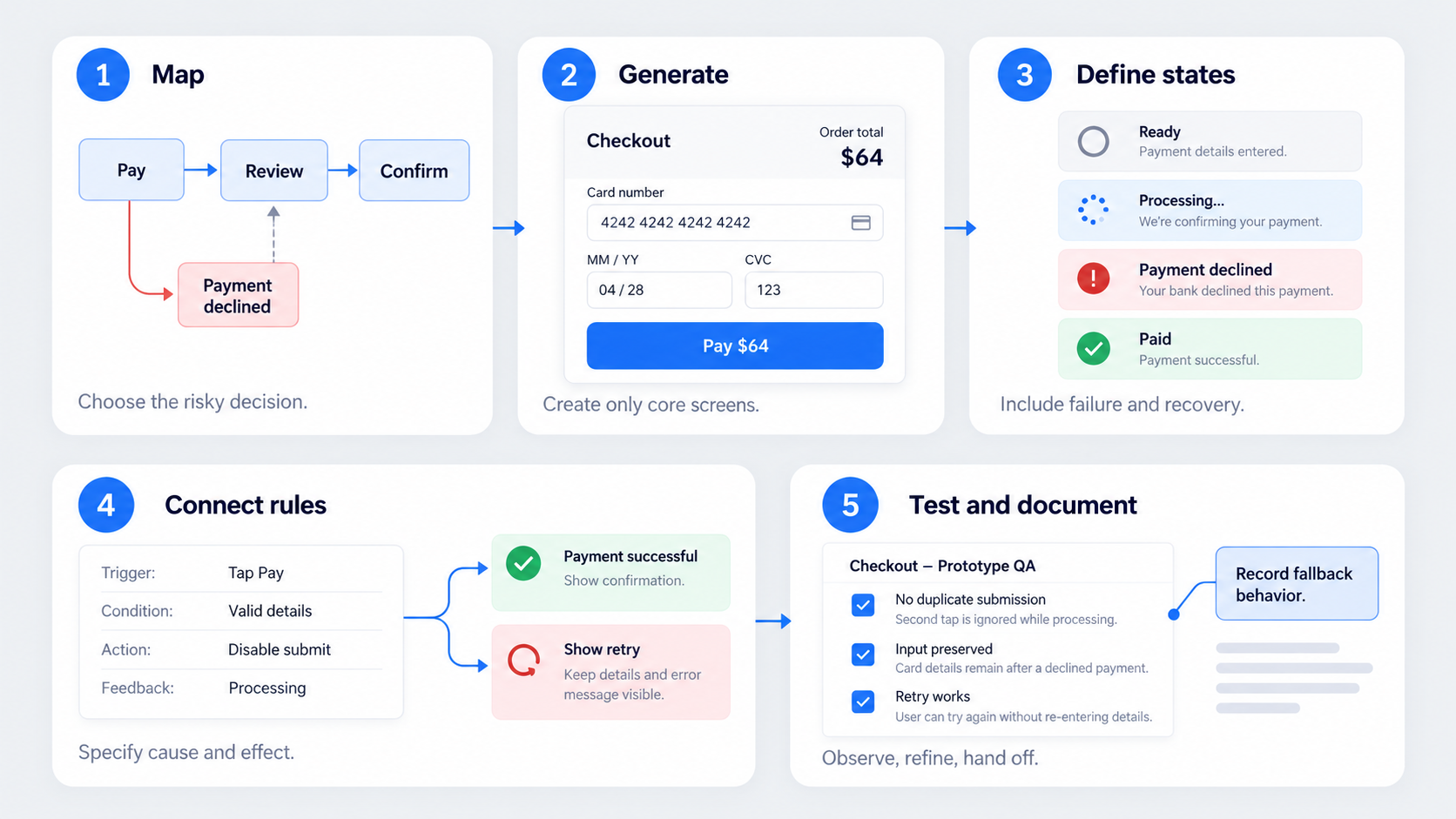 A focused process prevents fragile links and unnecessary screens. Consider a checkout flow where the key question is whether customers can recover after a declined payment without submitting twice.
- Map the task and decision
Record the goal, starting context, critical path, branch points, and completion criteria. Then identify the assumption with the greatest consequence if it proves wrong.
For checkout, map payment entry, processing, decline, correction, retry, and confirmation—not every commerce screen.
- Generate the core screens
Create only the screens needed to understand the task and its important branches. Reuse fields, buttons, alerts, and summaries so changes do not require rebuilding the flow.
AI can speed up screen production, but a shippable AI-generated interface still requires deliberate rules, content, and state refinement.
- Define states before connecting screens
List control, component, screen, system, data, and permission states. For checkout, that may include invalid details, processing, decline, retry, success, and duplicate-submission prevention.
Add failure and recovery before decorating success.
- Connect triggers, rules, and outcomes
For each interaction, specify:
- The trigger
- Required conditions
- The resulting action
- Visible or announced feedback
Every branch needs a next step, recovery route, or intentional endpoint.
- Add transitions, test, and document
Use motion only when it explains change or preserves context. Run task-based reviews, fix ambiguous behavior, and document the final rules instead of asking developers to infer them from playback.
The building blocks of interactive prototypes
Interactive prototypes use a small set of primitives to represent realistic behavior. Reusable patterns reduce duplication and broken connections.
Triggers and actions
Triggers can include click, tap, focus, key press, drag, scroll, timeout, or a system event. Each should produce a defined action and a perceivable response.
A submit action might validate fields, disable the button, show processing feedback, and lead to success or failure.
Conditions, variables, and branching logic
Conditions represent validation, permissions, roles, limits, and previous choices. Variables preserve input, selections, counters, progress, or other state.
Together, they allow one structural view to represent loading, results, empty states, or request failure without duplicating every screen.
Overlays, components, and reusable states
Use overlays for menus, tooltips, dialogs, and confirmations. Define how they open and close, where focus moves, and how outside input behaves.
Component states should cover relevant default, focus, pressed, disabled, and selected behavior.
The UI state checklist most prototypes miss
State completeness matters more than demonstrating every possible screen.
Control and component states
Check the relevant default, hover, keyboard focus, pressed, selected, disabled, read-only, and active states.
Do not simply dim unavailable actions. Explain why an action is unavailable and what must change before it can be used.
System and data states
Consider loading, success, error, empty, partial data, stale data, and offline behavior.
Each non-happy-path state needs a useful next action, such as retrying, editing input, reconnecting, clearing filters, or contacting an administrator.
Accessibility within interactive states
Represent visible keyboard focus, logical navigation order, usable targets, and errors associated with their fields. Color and motion should not be the only signals.
Include reduced-motion behavior and note how status changes should be communicated to assistive technologies.
Use transitions to explain cause and effect
Our rule is direct: if removing an animation does not reduce comprehension, remove it. Motion should support orientation, continuity, hierarchy, or feedback.
When to use instant changes, fades, and slides
Use instant changes for expected updates where delay adds no meaning. Use fades for subtle appearances or status changes.
Use slides when direction communicates a real spatial relationship, such as moving deeper into mobile navigation.
Shared-element motion and microinteractions
Shared-element motion can preserve an object’s identity between contexts, such as expanding a card into a detail view.
Microinteractions can confirm input, show status, or prevent repeated submission. A button that becomes disabled while processing provides functional feedback.
Specify timing, easing, interruption, and reduced motion
Document timing, easing, delay, and direction. Also define what happens when motion is repeated, reversed, or interrupted.
A reduced-motion alternative might replace a spatial transition with an instant update or restrained fade.
Four interactive prototype examples built around risk
Each example should define the decision, risk, required states, rules, and success criteria.
Checkout validation
Test when payment errors appear and whether customers can recover without submitting twice. Include invalid details, processing, decline, retry, disabled submission, and success.
Dashboard filtering
Test whether users can identify and revise active filters. Include loading, zero results, request failure, clear-all behavior, and preserved selections.
Mobile onboarding
Test whether users understand an unfamiliar permission request. Include skip, denial, interrupted progress, returning users, and an alternative route.
Destructive-action confirmation
Test whether the safeguard matches the consequence. Include restricted permission, warning, confirmation, pending, failure, success, and any available recovery.
AI prototype vs traditional interactive prototype
An AI prototype uses generative AI to accelerate screens, structure, content, or interaction setup. Speed does not guarantee sound interaction design.
What AI can accelerate
AI can generate starting screens, explore alternative structures, and reduce repetitive production work. We treat generation as a starting point, not outsourced product judgment.
What designers must still specify
Teams still need to define assumptions, business rules, permissions, accessibility requirements, edge cases, conditions, and expected outcomes.
Generated screens deserve the same scrutiny as manually created ones.
The UXMagic workflow: describe, design & validate
Describe the product, target task, required screens, and constraints. Use the UXMagic AI UI generator to create the core interface, then refine its content, components, failure states, and risky branches.
When useful, continue through an AI-to-Figma workflow, connect the interactions, validate the decision, and document the intended behavior.
How to choose an interactive prototyping tool
Choose a tool for the behavior being tested, not the length of its feature list.
Capabilities to evaluate
Assess editable screen creation, reusable components, variables, conditional logic, responsive behavior, collaboration, accessibility representation, and developer handoff.
The tool should represent the riskiest interaction without excessive duplication or fragile links.
Interactive prototypes and Figma
“Interactive prototypes vs Figma” is not a direct comparison. Figma is a design platform; an interactive prototype is an output.
The practical question is whether the available interactions can model the required behavior. More complex logic may require additional capabilities.
What is ProtoPie?
ProtoPie is an advanced prototyping platform that supports generated interactions, manual refinement, and specification handoff. We recommend considering it when the testing question requires behavior beyond a basic click-through.
What about 3D prototype makers?
A 3D prototype maker generally serves physical, spatial, or three-dimensional concepts. For web and software products, prioritize states, logic, feedback, responsiveness, and handoff.
Test the decision, not the visual polish
A prototype is a learning instrument. Reviews should produce evidence about flows, states, rules, and feedback.
Write a task and success criteria
Ask participants to complete a realistic goal without revealing the intended route. Observe hesitation, wrong turns, recovery, interpretation, and completion.
Clicks alone reveal little. Look for whether people understand the system and can recover from unexpected behavior.
Set stakeholder review boundaries
State the decision under review and identify what is fixed, provisional, simulated, or out of scope. Ask what users would expect next, which feedback is missing, and where recovery feels unclear.
Know when the prototype has done its job
Stop adding fidelity once the uncertainty is resolved well enough to support a decision. Record remaining implementation, content, accessibility, and edge-case questions instead of hiding them with polish.
Make the interactive prototype handoff-ready
Developers should not have to reverse-engineer conditions, state changes, timing, or fallbacks from a recording.
Document each interaction
Record the source state, trigger, conditions, action, resulting state, feedback, validation, variable changes, dependencies, permissions, and branch logic.
Annotate motion and component behavior
Include timing, easing, direction, interruption behavior, and reduced-motion alternatives. Explain whether component changes persist, reset, or synchronize elsewhere.
Define failure and fallback behavior
Document failed requests, timeouts, unavailable actions, offline behavior, partial data, and recovery routes. Mark which responses are simulated and which require production logic.
Turn generated screens into testable product behavior
Use UXMagic to create core screens, then add the states, rules, transitions, and recovery paths needed to test your decision. Describe, design & validate with UXMagic.