Most SaaS landing pages are visual masterpieces that completely fail to generate pipeline. Product teams spend weeks polishing visual micro-interactions while leaving hero headlines so vague that cold visitors bounce in under five seconds. If a landing page doesn't systematically convert traffic into qualified signups, it's an expensive digital ornament - most standard SaaS landing pages convert between 2% and 5%, while top-tier conversion engines reach 8% to 15% for demo requests and trial signups.
A quick but important caveat before any of the numbers below: conversion benchmarks vary heavily by traffic source, industry, offer type, and audience intent. A cold-traffic demo request page and a warm-traffic self-serve trial page aren't comparable, and neither is a highly-regulated fintech form against a simple B2B SaaS lead form. Treat every benchmark in this piece as a directional target for your specific context, not a universal number to hit.
One more important distinction: everything here applies to a dedicated landing page - a focused, single-goal page built for one campaign or one traffic source. It does not automatically apply to your homepage, which typically serves multiple audiences and goals at once. Stripping navigation entirely, for instance, makes sense on a paid campaign landing page; it's usually the wrong call on a homepage visitors expect to explore.
You already understand visual hierarchy, mobile responsiveness, and common SaaS business models. This isn't a primer on what a CTA button is. It's the specific structural and psychological leverage points - form field math, hero copy structure, social proof placement that separate a page that looks good from one that actually converts.
Landing Page Anatomy
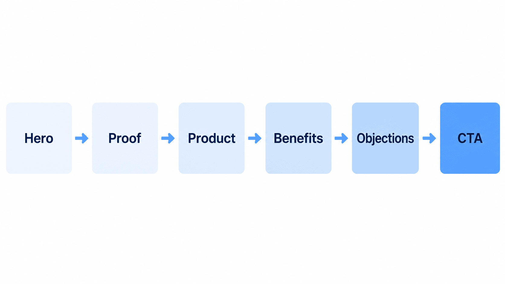
Every high-converting landing page in this guide follows some version of this sequence. The hero earns five seconds of attention; proof resolves skepticism before it fully forms; the product visual shows rather than tells; benefits and objection-handling do the persuasion work; and the CTA reinforced with proof directly beside it - closes the decision. Most underperforming pages either skip a step or reorder them (leading with product specs instead of the pain point, burying proof at the bottom instead of near the CTA).
The Architecture of High-Converting SaaS Landing Pages
The 5-Second Clarity Test: Above-the-Fold Layout Heuristics
Design inspiration galleries can work against conversion performance. Visual portfolios prioritize novelty, heavy animations, and aesthetic experimentation over readability and fast load times - these aesthetic trends degrade core web vitals like Largest Contentful Paint (LCP) and distract visitors from the core conversion action. Mobile visitors abandon pages that take longer than three seconds to load at a notably high rate. Conversion architecture should generally dictate visual design, not the reverse. Getting this brief right before opening any design tool is its own discipline: structuring effective design prompts covers exactly the gap between a vague request and one specific enough to generate a page that actually holds up against the 5-second test.
Pain-Led vs. Product-Led Heroes: Analyzing High-Performer Teardowns
Leading a hero section with detailed product feature descriptions tends to underperform in high-awareness SaaS categories. High-converting pages open by explicitly calling out the target customer's existing operational loss or frustration before introducing the software solution. Product descriptions explain what a tool is; pain-led copy establishes why the prospect must solve the problem immediately.
7 Heuristic Principles That Drive 8 - 15% SaaS Conversion Rates
Eliminating Exit Routes: The Impact of Stripping Navigation Bars
Positioning a full main navigation bar on a campaign landing page is generally an inefficient use of above-the-fold real estate. Stripping top navigation links eliminates secondary exit points, keeping user focus on the primary call-to-action button worth testing on your own page, since reported lift from this change varies by source but directionally points the same way across multiple studies. Again: this applies to a dedicated campaign landing page, not your homepage.
Form Friction Math: Multi-Step Layouts vs. Single-Page Lead Capture
The widespread assumption that reducing the number of total screens always improves conversion rates doesn't hold up for qualified B2B lead generation. According to Formstack's research (based on over 450,000 accounts), multi-page forms achieve a 13.9% conversion rate compared to 4.5% for single-page forms with identical fields that data is now over a decade old, but it's still widely cited, and more recent 2026 industry benchmarks report similar directional lift for multi-step forms (estimates range roughly 14–21% depending on form type and field count, per more recent form-conversion benchmark studies). Multi-step patterns leverage psychological momentum and reduce initial perceived cognitive load. Separately, form length itself matters: 3-field forms have been benchmarked around 25% conversion, while 9-field forms drop to roughly 3.6%.
- Single-page forms: best for low-friction, high-intent actions with three to four fields maximum.
- Multi-step forms: best for enterprise qualification, spreading data collection across logical screens (e.g., Work Email + Company Name on screen one, Team Size + CRM on screen two).
Building that progressive, multi-step sequence is exactly the job UXMagic's Signup Flow Generator is built around generating the full qualification path as one connected flow rather than screens someone assembles separately and hopes to stay visually consistent.
CTA-Adjacent Social Proof: Strategic Placement of Trust Assets
Positioning client logo bars exclusively near the bottom of a landing page is generally an inefficient deployment of trust assets. Trust metrics, customer counts, or review badges placed directly adjacent to or beneath the primary call-to-action button are widely believed to reduce buyer hesitation at the precise moment of decision not at the bottom of the page, after the decision's already been made or abandoned. Worth being direct: I couldn't independently verify a specific lift percentage for this tactic beyond general CRO consensus that proximity to the decision point matters; treat any specific number here as illustrative rather than a confirmed benchmark, and validate it with your own A/B test.
Mobile-Specific Considerations
Mobile traffic often makes up the majority of SaaS landing page visits, and mobile-specific failures are a common, underdiscussed conversion leak:
- Hero height - keep the hero compact enough that the CTA is visible without scrolling on a standard mobile viewport, not just on a desktop monitor.
- CTA placement - a primary CTA buried below a long mobile scroll loses the moment-of-decision advantage entirely.
- Form interaction - mobile keyboards and small touch targets amplify form friction; the case for multi-step forms is often even stronger on mobile than desktop.
- Sticky CTA - a persistent, sticky call-to-action bar on mobile keeps the primary action available regardless of scroll position.
- Page speed - mobile networks and devices are less forgiving of large hero images or heavy animations; compress aggressively.
If your landing page needs a genuinely native mobile presentation rather than a responsive desktop layout squeezed down, UXMagic's mobile app templates start from mobile-first patterns instead of adapting a desktop-first design after the fact.
SaaS Landing Page Teardowns: ShipHero and Loom
Scenario 1: Enterprise B2B Demo Request Page. The traditional, low-converting version: a full navigation bar (Features | Solutions | Enterprise | Pricing | Blog), a vague hero headline ("The Next-Generation Revenue Intelligence Cloud Platform"), a static abstract 3D graphic, a single-page form with 9 required fields, and a customer logo strip parked at the bottom of the page. Result: 1.8% conversion rate to booked demo.
The conversion-engine version: navigation completely removed, an outcome-focused headline ("Reduce Sales Cycle Duration by 35%"), a looping 10-second screen capture of the real product dashboard, a 2-step progressive form (Work Email + Company Name, then Team Size + CRM), and "Trusted by 184,000+ RevOps Leaders" plus a G2 badge placed directly beneath the CTA. Result: 11.4% conversion rate to booked demo.
This pattern shows up in a real, documented case study: when Flowout rebuilt ShipHero's landing page around pain-first architecture instead of feature-first copy, conversion rate went from 6.33% to 23%. Worth being straight about this one - Flowout's own write-up flags it as a genuine outlier, not a typical result, though the underlying principle (pain-led messaging outperforming feature-led messaging in high-awareness categories) held directionally across their broader body of work, not just this one case. Studying a competitor's actual live page structure before rebuilding your own is a real, useful step - cloning a live URL directly captures a reference page's real structure to work from, rather than reverse-engineering it by eye.
Scenario 2: Product-Led Self-Serve Trial Page. The high-friction version: a vague hero headline ("Advanced Async Video Communication Software"), a primary CTA requiring a credit card upfront ("Start 14-Day Free Trial - Credit Card Required"), no secondary action, and a generic text quote buried halfway down the page. Result: high drop-off at the credit card gate.
The friction-matched version closely resembling Loom's actual approach uses a relatable, pain-led headline ("One Video is Worth a Thousand Words"), a genuinely free primary CTA ("Get Loom for Free"), a low-friction secondary path ("Install Chrome Extension"), and an embedded 30-second customer video instead of a text quote. The two-CTA structure gives two different types of ready buyers two different entry points - full product signup for one group, a lightweight browser extension install for the other with the extension path acting as a natural, low-commitment on-ramp into the product for self-serve visitors specifically.
A/B Testing Template and Cadence
Designers frequently get stuck tweaking visual styling and color palettes before validating headline clarity or message match - that's optimizing the wrong layer first. Run experiments in structured four-to-six-week sprints, prioritized by historical impact:
- Headline copy variations (highest lift potential)
- CTA button copy and friction matching
- Hero visual asset selection and preview medium
- Form length and multi-step screen distribution
- Social proof formatting and placement
For each test, define these five things before launching, not after:
| Element | Example |
|---|---|
| Hypothesis | "An outcome-focused headline will outperform a feature-focused one" |
| Variable | Hero headline copy (only this - nothing else changes) |
| Primary metric | Conversion rate to booked demo |
| Test duration | 4 - 6 weeks, or until statistical significance is reached |
| Decision rule | Ship the winner if it beats control by a pre-agreed margin (e.g., 15%+) at 95% confidence |
Testing color palette or button radius before headline clarity is backwards - the biggest conversion gains almost always come from structural and messaging changes, not visual polish. Locking a consistent visual system upfront via UXMagic's Style Guide Generator - means your headline and CTA variants stay the actual variable under test, instead of visual inconsistency between versions quietly contaminating the result.
UXMagic: Generating Conversion UI Flows Directly from Your Copy Brief
Designers working from a validated conversion copy brief often spend hours manually assembling hero containers, positioning CTAs, and aligning social proof elements in Figma - real production time spent on layout mechanics the conversion research has already settled. UXMagic's AI Landing Page Generator is built specifically for this stage: prompting with specific conversion parameters generates a production-ready landing page structured around the heuristics covered above pain-led hero, CTA-adjacent proof, stripped navigation - rather than a blank canvas someone still has to manually assemble screen by screen.
The multi-step form problem gets addressed the same way. UXMagic's Flow Mode generates connected, multi-screen qualification paths from a single prompt, maintaining identical visual styling, button states, and spacing rules across every screen in the sequence - a fit for the ShipHero-style two-step form scenario above, generated as one coherent flow rather than two separately built screens.
If your team already has an existing design system rather than starting from scratch, importing Figma styles directly keeps every generated landing page anchored to real brand tokens instead of introducing a second, competing visual language.
Create Conversion-Ready Landing Page Flows
Generate a conversion-architected landing page flow directly from your copy brief and validate your structure before spending hours on manual design work.