Shipping a bare text input accompanied by a pulsing loading spinner is one of the fastest ways to turn an expensive LLM integration into an abandoned product feature. When streaming outputs trigger continuous layout shifts and safety filters clear user prompts without warning, retention suffers regardless of how capable the underlying model actually is. Building production-ready AI chat interface design requires structured state management, status transparency, and instant recovery pathways not a nicer avatar on the same broken chat bubble pattern.
You already understand basic usability heuristics. This isn't a primer on contrast ratios or visual hierarchy. It's the specific state architecture that handles what makes AI interfaces genuinely different: non-deterministic outputs, streaming latency, context truncation, and safety filter rejections that most chat UI guides never touch.
The Chat State Lifecycle
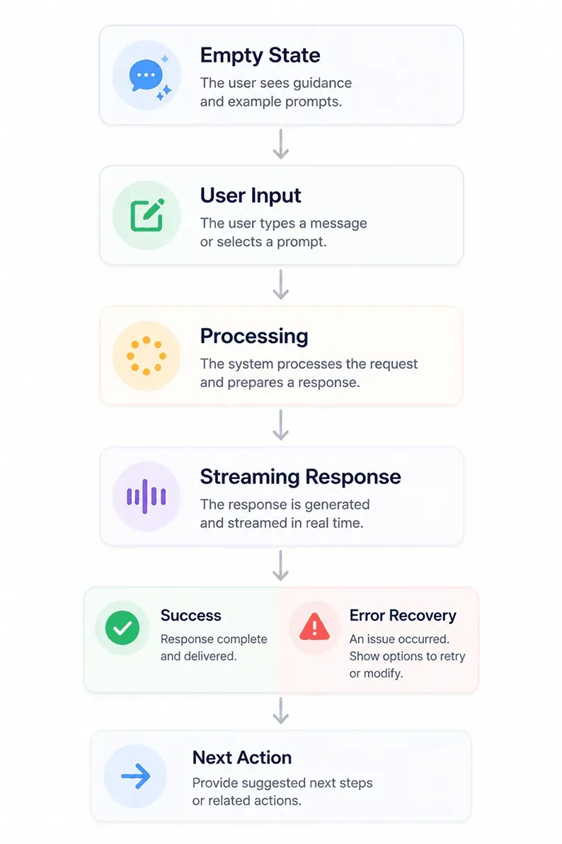
Most chat UI failures trace back to one link in this chain being treated as an afterthought - usually Processing (a bare spinner with no status text) or Error Recovery (a banner that wipes the user's work). Everything below is really just unpacking how to build each link properly.
Bad AI Chat vs. Production AI Chat
| ❌ Basic Chat | ✅ Production Chat |
|---|---|
| Blank input, no guidance | Suggested prompts and capability cards |
| Spinner only | Multi-stage progress updates |
| Prompts lost on error | Full prompt recovery, editable in place |
| Text-only output | Cards, citations, and instant actions |
Core Patterns of Production AI Chat Interface Design
Capability Transparency and Empty-State Architecture
The open-ended prompt field is a common design failure, not a neutral starting point. A blank text input with no visual affordances creates real cognitive friction. Expecting users to understand prompt engineering to extract value from a SaaS product tends to drive high bounce rates - a meaningful share of users open an AI chat, stare at a blank box for a few seconds, and close it, because a generic placeholder like "Ask me anything..." gives zero clue what the system can actually execute.
Capability transparency should generally take priority over persona design. Product teams often spend real time crafting brand "personae" and conversational tone for AI assistants while functional boundaries stay vague. When visual cues suggest human-like understanding without clarifying operational limits, users are more likely to attempt unsupported queries and hit failure quickly. Interfaces benefit from clear prompt starters, system boundaries, and functional scopes visible before a user types a single character.
Structured quick-reply buttons, contextual suggestion chips, and guided parameters can meaningfully reduce response friction and help more users complete their intended workflow - scaffolding intent up front tends to work better than leaving users to invent a prompt from scratch.
Latency Management: Typing Indicators, Status Cues, and Streaming
An animated typing indicator should acknowledge input almost immediately within roughly 200 milliseconds is a reasonable target. Fast acknowledgment like this tends to extend how long a user is willing to wait before assuming something's wrong; silence past a few seconds commonly reads as broken, not busy.
If model execution or retrieval-augmented generation runs past around 5 seconds, render multi-stage status text "Scanning database...", "Synthesizing response..." rather than a static spinner. Descriptive status cues during longer operations help prevent duplicate query resubmissions, since a user who can see what's happening is less likely to assume the app crashed and spam the resubmit button.
A prominent "Stop Generation" control should stay visible throughout streaming. Treating interruptibility as a secondary enhancement degrades product utility - mid-stream stop controls save real API token expenditure and respect user time, and their absence is one of the more common oversights in otherwise polished chat UIs.
Managing Context Windows, Reliability, and Error States
Context Truncation, Conversation Branching, and Persistence
Silent context truncation is a trust killer disguised as a technical limitation. When a model quietly hits its context token limit and forgets a constraint established several messages earlier, the user experiences that as the app being unreliable - the UI never explained that earlier messages got dropped, so the failure reads as a model problem instead of a state-management one.
The fix: render an inline notice when the window truncates, and let users pin critical messages to preserve them within the active context. Making the window's actual behavior visible converts a silent, confusing failure into a transparent, explainable constraint.
Error Handling, Safety Rejections, and State Preservation
Interruptibility and prompt preservation are close to non-negotiable in a production interface. Clearing a prompt input field after an API error or safety filter rejection is a severe failure mode - a long, carefully written prompt vanishing into a generic red error banner damages user trust quickly, and it's entirely avoidable.
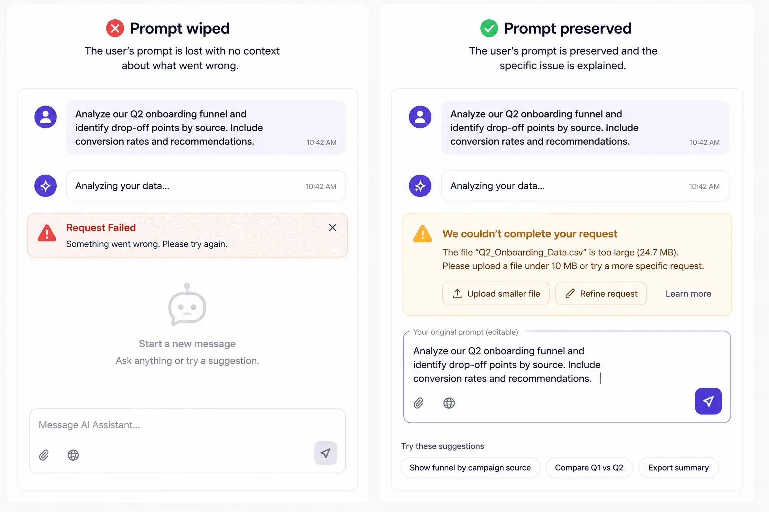
When generation fails, the interface should explain the specific reason, preserve the original input for immediate editing, and suggest alternative phrasing where relevant. Full text preservation during every exception state - timeout, safety rejection, network failure isn't a nice-to-have polish item; it's a meaningful factor in whether a user retries or leaves.
Hybrid Conversational UI vs. Generative UI Frameworks
Integrating Direct GUI Controls with Natural Language Inputs
Conversational UI generally shouldn't replace direct GUI controls outright. Replacing established graphical interfaces with chat inputs tends to degrade usability for precise or high-frequency tasks. For actions with a finite set of choices - toggling settings, selecting dates, filtering datasets direct graphical manipulation is usually faster and less error-prone than composing text.
Turning a simple two-click filter into a conversational turn is a common mistake worth avoiding. Forcing users to type out full sentences to change a date range makes a simple task noticeably slower. Natural language fits best in a hybrid architecture where chat handles open-ended exploration, while structured GUI components handle deterministic execution.
The most efficient AI chat interface is frequently one that minimizes actual chatting. Forcing users to compose natural language sentences for predictable, finite decisions introduces unnecessary cognitive load. High-converting SaaS products tend to replace open-ended text entry with hybrid interfaces blending natural language processing with inline buttons, structured cards, and direct manipulation controls - generative UI dynamically creates and renders customized visual components, forms, and controls in real time based on user intent, moving well beyond simple back-and-forth text exchange.
How AI Interfaces Build User Trust
Trust in an AI interface isn't built through polish alone - it's built through honesty about what the system knows and doesn't. A few specific patterns worth building in deliberately:
- Showing confidence levels. Where a model's output carries genuine uncertainty, surfacing that directly (a confidence flag, a "verify this" note) sets expectations honestly instead of presenting every answer with equal authority.
- Explaining limitations up front. The capability transparency covered earlier isn't just an onboarding nicety - it's an ongoing trust mechanism, reminding users what the system is and isn't built to do.
- Showing sources and citations. Inline citations and collapsible reasoning blocks let a user verify a claim rather than take it on faith, which matters more the higher-stakes the use case.
- Allowing corrections. Thumbs-up/thumbs-down feedback controls, easy prompt editing, and thread branching all give users a way to redirect the system rather than abandoning the session when the first answer misses.
Visual polish that outpaces actual model capability is a real risk here. When an interface looks sophisticated enough to imply human-level reasoning, and the underlying model fails at basic keyword matching, that gap between appearance and performance creates a sharper disappointment than a plainer interface would have. Matching visual confidence to actual system reliability is part of the trust design, not a separate concern from it.
Accessibility in Streaming and Generated Content
Dynamic AI interface elements introduce accessibility challenges static UI doesn't have to solve, and they're worth naming specifically:
- Screen reader announcements for streaming text. Content arriving token-by-token needs deliberate ARIA live region handling, or a screen reader either stays silent through the whole response or interrupts itself repeatedly as new tokens arrive.
- Focus management during generated content. When a response finishes streaming and new interactive elements (citations, action buttons) appear, focus needs to move somewhere sensible not get silently lost or reset to the top of the page.
- Keyboard interaction for prompt suggestions. Capability cards and suggestion chips need full keyboard navigability, not just click targets, or the entire scaffolded empty-state pattern this guide recommends becomes inaccessible to keyboard-only users.
Live token streaming containers and dynamic status alerts frequently violate WCAG AA focus management and screen reader standards in practice, largely because they're newer patterns tested less rigorously than static UI.
Real-World Scenarios: Before and After
Enterprise Lead Qualification Assistant. A B2B SaaS platform's pricing-page assistant opens with an unguided "How can I help you today?" - users submit vague queries, the bot asks a long string of consecutive text questions, and a large share of visitors abandon before providing contact details. Switching to progressive disclosure with three targeted quick-reply buttons ("Evaluate Enterprise Plans," "Request Custom Demo," "Technical Specs"), then rendering structured choice cards for role and company size, reserves free-text input strictly for genuinely custom challenges. Response friction and abandonment both drop noticeably, and qualification completions improve.
Data Analytics Copilot. A financial analytics app's LLM copilot takes several seconds to execute a database query. A static spinner covers the wait, then charts pop into the message list unexpectedly, jumping the scroll position and disorienting the user. Replacing that with a fast light indicator, step-by-step progress text ("Searching Q3 tables...", "Aggregating revenue metrics...") once the wait extends, and pre-allocated skeletal chart containers holding layout stable eliminates the jitter - perceived latency decreases, and repeated resubmissions largely stop.
AI Copywriting Safety Exception Flow. A marketing copy platform hits a safety filter, clears the user's prompt field entirely, and shows a red "Request Failed: Violation Detected" banner over a blank input box. Replacing that with an inline warning card explaining the specific flagged policy category, preserving the full draft in the input box, and highlighting the flagged keywords with single-click remove chips lets most users successfully edit and resubmit flagged prompts without losing work or abandoning the campaign.
Designing comprehensive AI chat interfaces means covering dozens of distinct component states - zero-state prompt starters, active streaming frames, error recovery banners, citation overlays. Rather than manually building every state variation in a design tool, UXMagic generates production-ready, multi-state UI flows from plain text prompts, covering that edge-case range in minutes instead of a design sprint.
Transitioning from basic chat bubbles toward the hybrid interfaces this guide argues for means integrating natural language sidebars with structured visual canvases. UXMagic's Flow Mode translates product requirements into unified layouts, pairing conversational sidebars with interactive cards, direct manipulation controls, and responsive canvas views while maintaining design system token consistency across every generated state including the accessibility patterns covered above, built into generated components rather than added as a separate remediation pass.
Generate Multi-State AI Chat Interfaces Faster
Create complete AI chat flows with capability cards, streaming states, and error recovery patterns from a single prompt.