An enterprise software redesign launches with polished visuals, only for first-month user activation to take a real, measurable hit not because functionality was missing, but because the transition from signup to core value realization got buried under visual noise. Most SaaS platforms don't fail from a lack of features; they fail because the path to value isn't clear. Navigating the 2026 B2B SaaS landscape requires moving beyond surface aesthetics to master adaptive, flow-first design architecture.
You already understand responsive components, dark mode implementation, and standard Figma workflows. This isn't a trend roundup showcasing consumer-app aesthetics or 3D illustrations that break under enterprise constraints. It's the operational shift - flow-first architecture, primitive-first token systems, invisible AI that connects high-level UX strategy to production-ready execution.
Why 2026 Specifically?
A few converging factors make this the year these trends stopped being optional. AI-assisted design and code generation tools matured enough by 2026 that flow-first generation - producing a connected multi-screen journey from one prompt - became genuinely fast, removing the main practical excuse for screen-by-screen wireframing. At the same time, enterprise SaaS products that scaled aggressively through 2023 - 2025 are now carrying real component-library bloat, forcing a reckoning on design system maintenance costs that simply didn't exist at a smaller scale. And AI feature fatigue set in broadly enough after several years of sparkle icons and chat sidebars bolted onto every product that users and teams alike have grown skeptical of AI-as-decoration, pushing genuine adoption toward AI-as-infrastructure instead.
Trend Summary
| Trend | What It Means | Why It Matters | How to Implement |
|---|---|---|---|
| Flow-first architecture | Designing connected journeys, not isolated screens | Prevents context loss and token drift | Map the full user journey before wireframing any screen |
| Calm minimalism | Fewer visible controls, more background logic | Reduces cognitive load and visual noise | Default to the 2–3 things a user needs most; hide the rest |
| Progressive disclosure | Advanced controls hidden until needed | Serves novices and power users in one interface | Use contextual triggers, popovers, and command palettes |
| Invisible AI | AI embedded in workflows, not sidebars | Higher genuine adoption, less ignored UI | Use inline actions, background tagging, contextual triggers |
| Primitive-first systems | ~20–30 composable tokens instead of hundreds of components | Faster engineering velocity, easier governance | Consolidate variants into flexible, reusable primitives |
| Guided activation | Pre-populated states instead of empty dashboards | Reduces early bounce, speeds time-to-value | Use sample data, a single recommended action, and progress indicators |
Trend 1: Flow-First Architecture Replacing Screen-by-Screen Layouts
Context Accumulation and Session Continuity
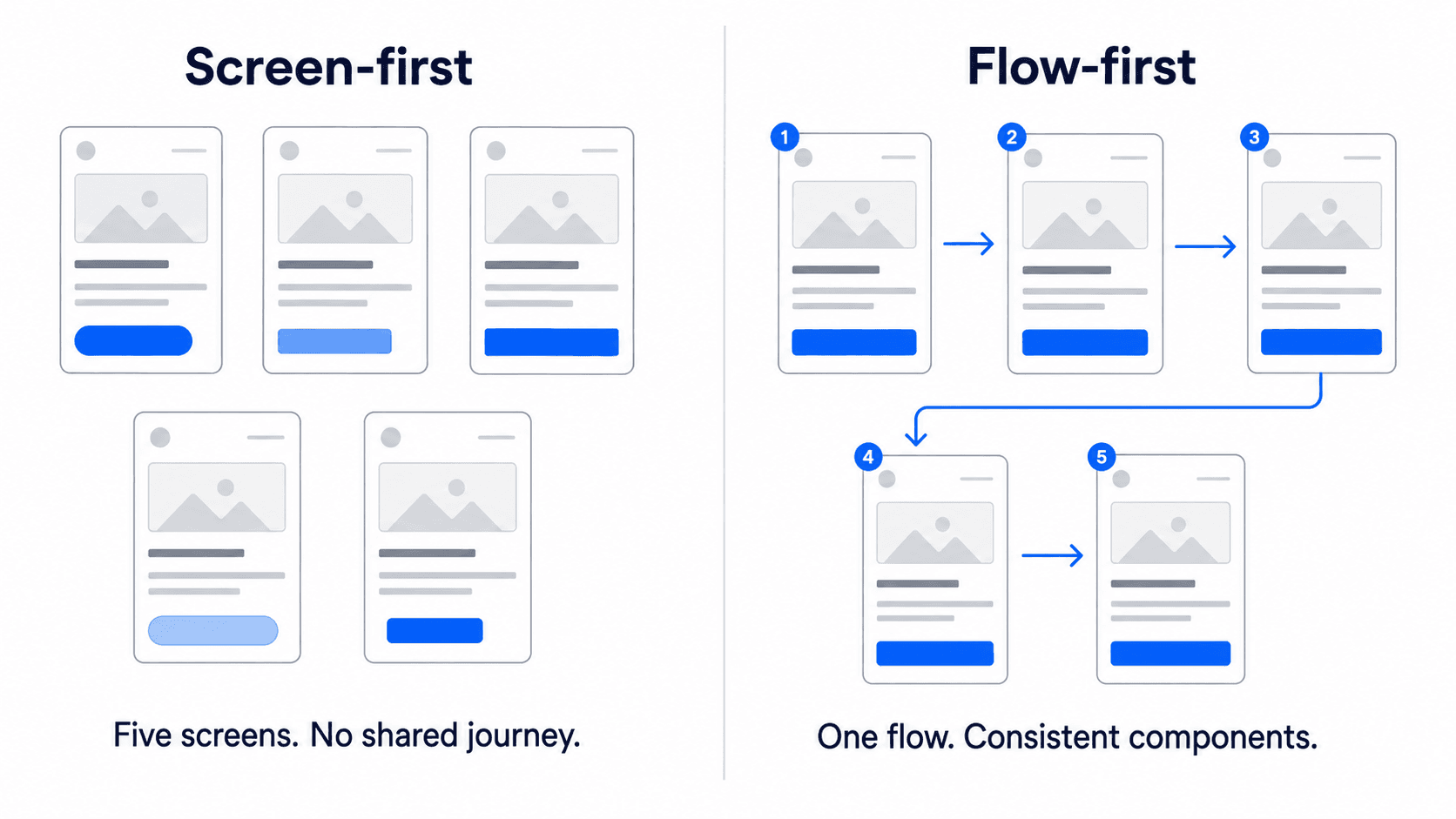
Optimizing individual interface screens in isolation causes fragmented user experiences and cognitive overload. Enterprise users don't experience software as static frames - they interact with continuous sequences where context accumulates over time. Leading product teams build end-to-end user flows first, treating individual screens as dynamic views of an underlying data state rather than independent design artifacts.
Trend 2: Strategic Minimalism and Calm Interface Patterns
Reducing Visual Noise and Utilizing Functional Whitespace
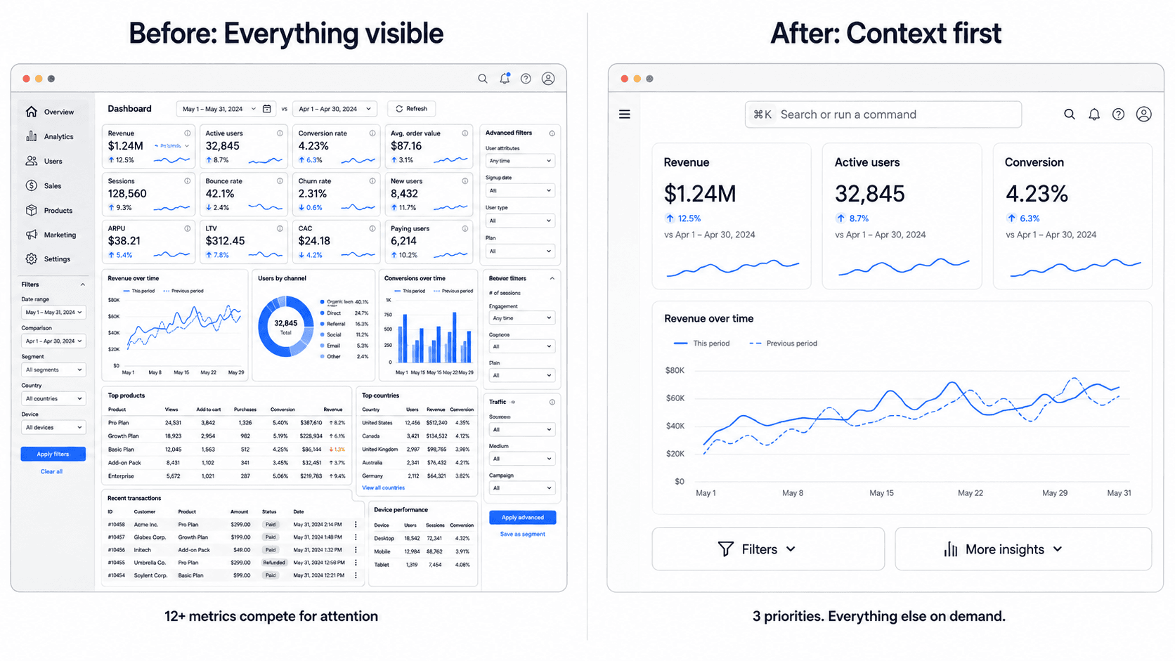
Adding features to a B2B SaaS interface frequently reduces the perceived value of the product, not increases it. While traditional design advice advocates expanding component libraries and surfacing more controls, market leaders in 2026 tend to operate on far fewer design primitives while actively concealing product complexity behind contextual triggers. Strategic UX maturity is measured less by visual density and more by how quietly background system logic resolves complex tasks.
Trend 3: Progressive Disclosure and Adaptive Role-Based UI
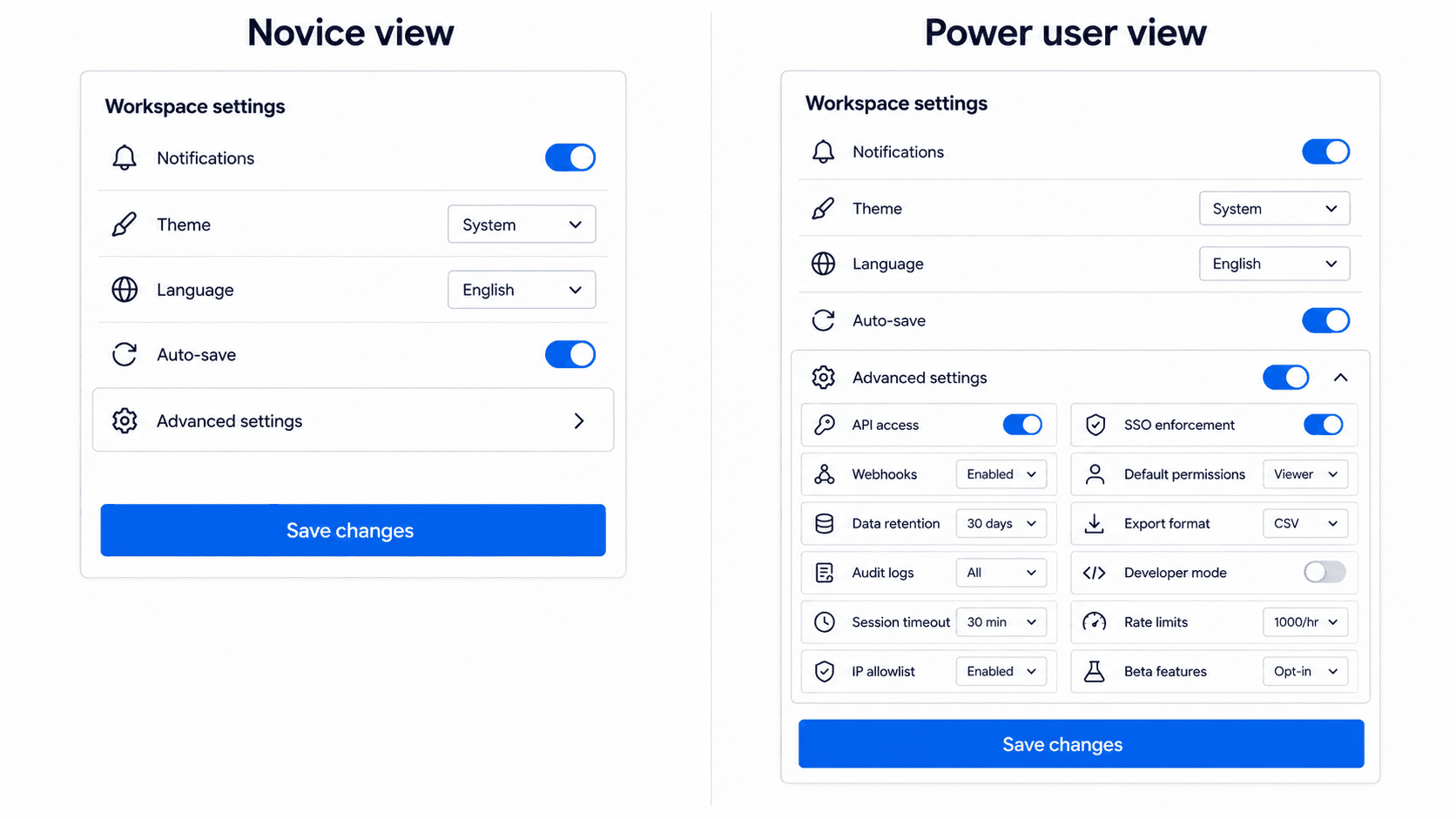
Progressive disclosure presents essential controls by default while concealing advanced configurations behind contextual actions. This pattern lets a single interface serve novice signups and expert power users simultaneously, minimizing cognitive load without limiting software depth - the same underlying discipline as flow-first architecture, applied to feature depth rather than screen sequence.
Trend 4: Invisible Background AI Replacing Sparkle Badges
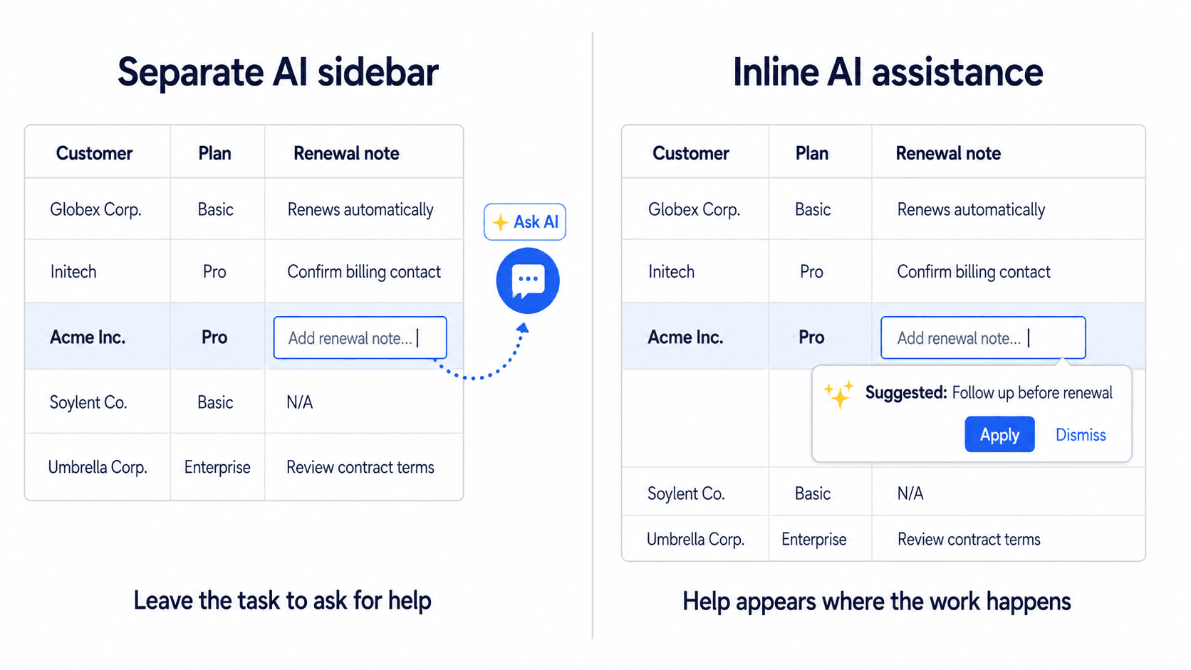
Plastering visual sparkle badges and persistent AI sidebars across an application interface tends to signal broken interaction design more than genuine capability. Generative AI works best as invisible background infrastructure - auto-classifying data on save, providing inline text completions, triggering predictive workflows contextually without requiring a manual prompt panel most users learn to ignore.
Trend 5: Primitive-First Design Systems Built for Engineering Velocity
The belief that an enterprise design system requires hundreds of bespoke components doesn't hold up well in practice. Massive component libraries create governance friction, slow frontend iteration, and lead to inconsistent UI application across expanding teams. Modern design systems tend to scale more effectively when built around a smaller, more flexible set of tokenized primitives that development teams can compose dynamically, rather than maintaining hundreds of single-use variants.
On the specific "20 to 30" figure: treat this as a useful, commonly cited range for a well-run design system rather than a universal rule every team must hit exactly. The right number depends on product complexity and team size. The actual principle worth taking away is that fewer, more composable primitives beat many rigid single-purpose components, not that 27 is somehow the correct number and 35 is wrong.
Trend 6: Guided Activation Mechanics Replacing Empty States
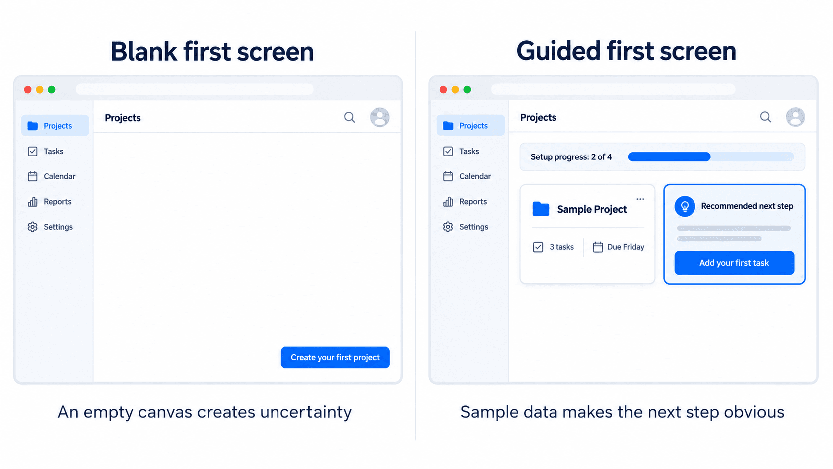
Displaying empty data tables or unpopulated graph containers to new signups shifts real cognitive burden onto the user and can damage retention. A well-designed initial screen state features guided activation mechanics instead of pre-populated sample workflows, contextual welcome pathways, immediate feedback loops that confirm value realization before the user has done anything themselves.
What Not to Do
A quick, direct list of the patterns this guide argues against - worth keeping visible as a gut-check during review:
- Too many components - hundreds of single-use variants instead of a smaller, composable primitive set.
- Persistent AI sidebars - a chat panel bolted onto the edge of every screen, separate from the actual workflow.
- Blank dashboards - a new signup landing on an empty canvas with no context or sample data.
- Excessive default controls - every setting and filter visible at once instead of the two or three that actually matter by default.
- Screen-by-screen prototyping - designing and reviewing isolated frames without mapping the connected journey first.
Implementation Playbook: Shipping Modern UI Trends Without Token Debt
Phase 1: Pre-Design Flow Mapping and Token Infrastructure
Product teams need to start by mapping the continuous user decision path from initial entry to value realization, identifying every point where context accumulates or breaks. Concurrently, designers establish a Role-Based Access Control (RBAC) matrix defining feature visibility across user permissions. This is exactly the kind of upfront structuring a well-scoped PRD exists to formalize - mapping requirements and role logic into a real document before a single screen gets drawn, rather than discovering the RBAC gaps mid-build. Rather than building hundreds of single-use components, the team constructs a primitive-first token architecture in code and design files, establishing strict variables for typography, spacing, and semantic color modes. Skipping decision mapping at this stage is a common cause of fragmented user flows and token drift during implementation.
Phase 2: Execution of Adaptive Interface Patterns
During layout construction, designers apply progressive disclosure rules to default views, hiding secondary controls and edge-case configurations behind contextual popovers or command palette shortcuts (Cmd+K). Generative AI features get embedded directly into primary interaction surfaces as inline context menus or automated back-end triggers rather than standalone sidebars.
Phase 3: Post-Design Activation and Engineering Handoff
Empty dashboard screens get replaced with guided activation mechanics - contextual sample data, clear progress indicators, single-action triggers. Designers assemble individual screens into connected, interactive prototypes to validate state changes and edge cases before handoff. Design token specifications export directly to development repositories, and for teams whose developer handoff runs through an AI coding assistant, connecting that handoff directly into the IDE closes the loop between a locked design and the codebase it needs to land in - rather than static frames someone re-explains to engineering from scratch. Handing off unlinked static frames without documented tokens remains a major point of friction in traditional workflows, and one of the more avoidable ones.
Here's what applying this looks like on two real product surfaces, described directionally rather than with precise benchmarked figures.
Enterprise analytics dashboard optimization: traditional design surfaces dozens of KPIs, dense data tables, and persistent filter panels simultaneously creating real cognitive load and forcing users to manually configure custom views just to find what matters to them. Reducing the default view to a handful of role-specific priority metrics, with detailed filtering moved into a command palette, tends to correlate with lower support ticket volume and faster time-to-insight, though the exact magnitude varies by product and team worth tracking against your own baseline rather than assuming a fixed lift. Generating that kind of role-aware dashboard directly from a description of the priority metrics per role removes the manual reconciliation between "what the RBAC matrix says" and "what the screen actually shows."
First-mile onboarding and user activation: generic multi-step tooltip tours followed by a blank application canvas tend to correlate with higher bounce during the initial trial period specifically, when a user has the least invested reason to push through confusion. Pre-populating the workspace with contextual sample records and surfacing one recommended primary task instead of something real to interact with immediately, versus a blank canvas is generally associated with stronger first-week activation, again best validated against your own product's actual funnel data. This is precisely the job a dedicated signup flow generator is built around - producing the guided, populated first-run sequence directly rather than a blank dashboard someone has to remember to fix later.
Contextual AI workflow integration: a persistent chat sidebar reduces available canvas area and tends to get ignored since it sits outside the active workspace. Embedding intelligence directly into primary interaction points instead inline actions on a selected table row, automatic background tagging on save - tends to drive meaningfully higher genuine feature adoption than a panel users have to actively choose to open.
Where Flow-First Execution Actually Happens
Manually drafting dozens of connected screen variations for a complex enterprise workflow - the RBAC matrix from Phase 1, applied across every role consumes real design bandwidth. For teams building a full application around this operational shift rather than a single flow, starting from an app-builder workflow generates the connected, role-aware structure in one pass instead of wireframing each role variation by hand.
If your team already has a comparable product to reference - a competitor's dashboard, an internal tool worth modernizing - cloning that existing structure directly gives the flow-mapping phase from Phase 1 something concrete to start from, rather than mapping the journey purely from memory.
Build Consistent SaaS Flows Faster
Generate token-consistent, multi-screen product flows from a natural language prompt and reduce the work of designing every RBAC variation by hand.