A blank screen carries real churn risk when a user encounters an empty table displaying a generic system error copy, they're far more likely to close the tab than look for help. Designing zero-data interfaces means treating empty screens as active parts of the product experience rather than static placeholders.
You already understand fundamental design principles, layout grids, and standard component libraries. This isn't a primer on what an empty state is. It's the structural UI decisions, precise copy formulas, and edge-case mitigation that turn a zero-data screen into a genuine activation touchpoint instead of a silent churn event.
What Is an Empty State in User Interface Design?
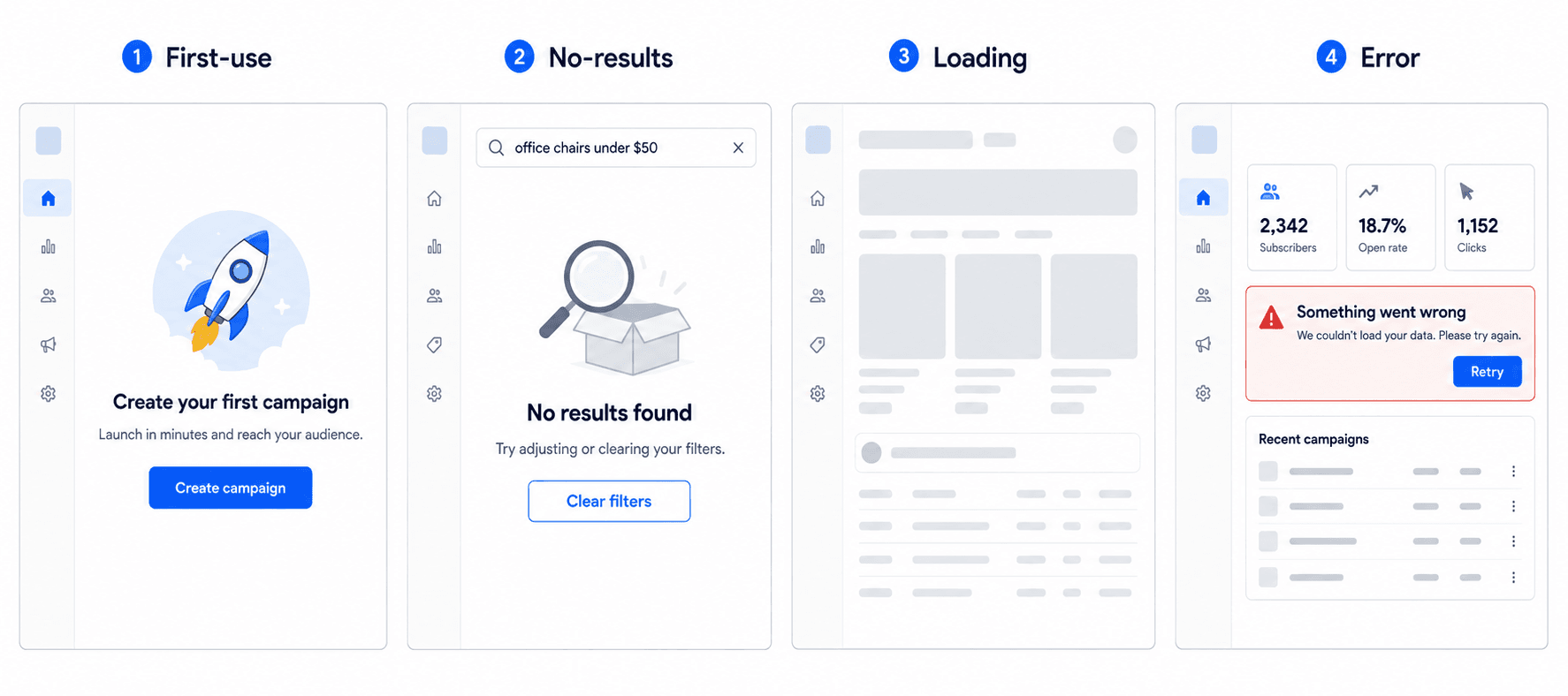
An empty state is a screen or container component that appears when no content or data is available to display during first-time onboarding, after clearing search filters with zero matches, when completing a queue, or during asynchronous system calculations.
The True Cost of Unmanaged Zero-Data Screens
Custom vector illustrations and cutesy apologetic copy don't save bad empty states; they obscure poor product mechanics. The most effective empty states operate like functional landing pages, using structured typography, sample data previews, and clear primary calls to action to drive feature adoption, not decoration meant to soften the disappointment of a blank screen.
The 5 Types of Empty States in Modern SaaS Applications
Before drawing a single UI element, teams need to inventory every screen across five distinct operational types - treating "empty" as one undifferentiated category is exactly how a first-time user ends up seeing the same generic message as someone who just hit a search dead end. This same discipline - mapping every state before generating anything is exactly what structuring effective design prompts covers in more depth from the prompting side specifically.
- First-Time Use Onboarding States
The user has no data created yet. This is the highest-stakes empty state in the entire product, since it's often the first real impression a new signup gets of whether the tool actually works.
- User-Cleared Task Completion States
The user intentionally emptied the queue - Inbox Zero, a completed to-do list. This state should feel like a genuine win, not a system error, since the user did exactly what the product wanted them to do.
- No Results & Search Filter Failures
Search or filter logic returned zero records. This is a recoverable moment, not a dead end - the user's intent is still active, they just need a fast way back to a useful result.
- Asynchronous System Calculation & Delay States
Data is being calculated or fetched. Left unhandled, this state is functionally indistinguishable from a broken product to the person staring at it.
- Permissions, Access Rules, and Paywall Gates
The feature is restricted by access controls or subscription tiers. A blank screen here reads as a bug; a clear explanation reads as a monetization or permissions opportunity.
Structural UX Best Practices for Zero-Data Screens
Writing High-Converting Empty State Copy
A quick note on "high-converting": empty states don't convert in the traditional marketing sense - there's no purchase happening on most of these screens. What they can do is drive activation, task completion, or feature adoption, and the right metric depends entirely on which of the five types you're looking at. That distinction matters more than it sounds, and it's covered in more depth in the measurement section below.
Phrases such as "Oops! It's lonely in here" or "Sorry, we couldn't find anything" diminish product authority and frame standard operational states as system failures. Empty states need to convey system stability and clear direction - copy should explicitly define what the section does, why no data is currently present, and the exact steps required to populate the space.
Visual Hierarchy: Icons vs. Skeleton Previews
Standard design advice continuously advocates for custom brand illustrations or animated visual mascots on empty screens. In practice, heavy visual illustrations clutter the interface, increase asset bundle sizes, and draw visual focus away from the primary user action. Modern product design favors lean component structures, clear operational typography, and interface component skeletons over decorative artwork.
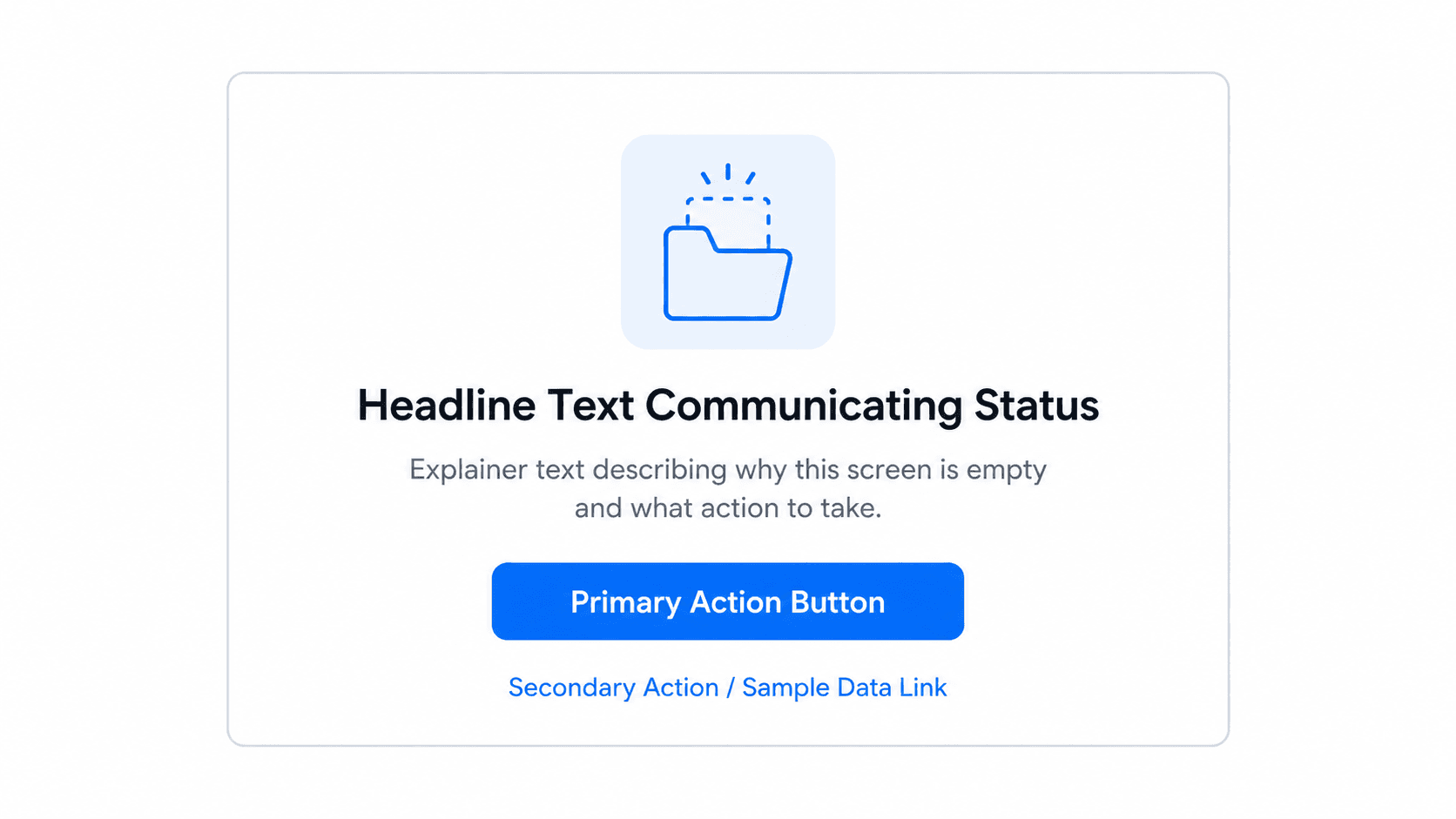
Standard empty state layout blueprint:
CTA Engineering: Bridging the Gap to First Value
Relying exclusively on a single "Create Item" button forces users into a blank creation canvas without mental context, leading to real cognitive friction. High-activation empty states offer multi-modal initiation instead: a primary creation action paired with pre-populated interactive sample data, downloadable industry templates, or a one-click demo dataset - more than one way in, not a single narrow door.
Search empty states need a related but distinct fix. Static "No results found" messages place the burden of recovery entirely on the end user. Effective search systems actively modify user queries by providing instant filter-clearing mechanisms, auto-expanding search radiuses, handling common misspellings, or suggesting contextual alternative categories directly within the component view.
The Empty State Copy Formula
A simple, repeatable structure for writing any empty state's core message:
What happened → Why → What to do next
- What happened: "No campaigns yet" (plain status, no apology)
- Why: "You haven't created a campaign in this workspace"
- What to do next: "[Create your first campaign]" or "[Import from a template]"
Run every empty state through this formula before shipping it. If any of the three parts is missing, the screen is incomplete regardless of how polished it looks visually.
The Four-Stage Empty State Workflow
Phase 1: The Systemic Inventory Audit
Create a test account, apply throttled network conditions, execute nonsense search queries, and inventory every screen across the five operational types covered above - before any UI gets drawn, not after.
Phase 2: UI Component Layout Engineering
Apply the structural hierarchy from the blueprint above to every empty screen: a primary visual anchor (a simple, monochrome icon or low-opacity component preview), a system status headline in plain language ("No active campaigns found"), a contextual explainer, a prominent primary CTA, and a secondary path to templates or sample data.
Phase 3: Developer Handoff and Edge-Case Mapping
Designers need to hand engineers explicit state logic, not just a static screen. Define component behavior during data fetching versus zero-data states to prevent default fallback text from rendering. Specify skeleton loading animations prior to empty state rendering to prevent layout shifting. Store all microcopy in localized content files rather than hardcoding it into front-end components. Once that logic is defined, exporting the structured flow directly to Figma keeps this handoff documentation attached to real, editable components instead of a static screenshot someone has to re-annotate.
Phase 4: Activation Metric Tracking
Measure empty state performance with real operational metrics - covered in detail in the next section, since different state types need genuinely different measurements, not one generic conversion number.
Here's what that looks like in two real scenarios. A B2B predictive analytics dashboard: when an enterprise user connects a new data source, processing can take several hours. The unmanaged version renders an empty dashboard, and the user assumes the connection failed or the product is broken. The structured version replaces the blank space with a status panel - copy explicitly stating system status and expected completion time, plus an "Explore Sample Dataset" button so the user can interact with dummy analytics while awaiting live data. Generic AI visual tools tend to fail here specifically by outputting static, fully populated fake graphs or generic illustrations that don't reflect the actual software component system underneath.
An e-commerce product catalog: combining overly specific filter parameters returns zero search results, and the standard interface displays a blank table, forcing the user to manually untick multiple filter checkboxes. The updated layout restates the search criteria, provides a single "Clear All Filters" button, and auto-populates a curated grid of related products to keep the user engaged instead of stranded. Standard prompt-to-image generators tend to fail here by producing pretty visual scenes that completely miss the functional component elements - active filter chips, parameter reset buttons, dynamic product grids that actually make the screen usable. Starting from a real reference instead of a blind prompt helps here - cloning a live product catalog page captures the actual filter and grid structure to build the empty state around, rather than guessing at it from scratch.
Measuring Each State Type
Different empty states need different success metrics - treating them all as one conversion funnel hides which specific screen is actually underperforming:
| State Type | Suggested Metric |
|---|---|
| First-use | Activation rate |
| No results | Filter reset rate |
| Loading/async delay | Abandonment rate during wait |
| Paywall/access gate | Upgrade CTA click rate |
| User-cleared (completion) | Next-task rate |
Tracking the wrong metric against the wrong state type is a common, quiet measurement error - a high "activation rate" on a no-results screen doesn't actually tell you whether filter recovery is working.
Accessibility Considerations
Empty states get overlooked in accessibility audits almost as often as they get overlooked in design sprints. A few specifics worth building in deliberately:
- Screen-reader announcements - a state change (populated → empty, or loading → loaded) should be announced via ARIA live regions, not silently rendered with no signal to assistive tech.
- Accessible CTA labels - "Create your first campaign" reads clearly to a screen reader; a bare icon-only button labeled only "+" does not.
- Contrast - low-opacity skeleton previews and muted status text still need to clear WCAG contrast minimums, not just look visually subtle.
- Keyboard navigation - primary and secondary CTAs on an empty state need to be reachable and operable via keyboard, same as any other interactive element.
- Don't rely only on icons or color - a red icon alone doesn't communicate "error" to a colorblind user or a screen reader; pair every visual signal with text.
Common Empty State Design Anti-Patterns to Avoid
A quick reference on what the traditional approach gets wrong, mapped against what actually works:
| Traditional Approach | Strategic Framework |
|---|---|
| Decorative vector graphics | Functional skeleton blocks |
| Apologetic copy ("Oops!") | Direct instructional guidance |
| Single creation button | Sample data & guided templates |
| Static zero-result messages | Active query auto-recovery |
How to Streamline Multi-State UI Workflows with UXMagic
Generating populated designs while ignoring zero-data states causes missed edge cases during developer handoffs - the exact gap that produces a default grey box with "No items found" three weeks after a feature ships. UXMagic allows product teams to describe a feature once and instantly generate production-ready UI flows for every state variant - fully populated layouts, first-use empty screens, search-failure screens, and asynchronous loading states - maintaining visual continuity across the product instead of treating each state as a separate, disconnected design task.
Multi-state flow generation pipeline:
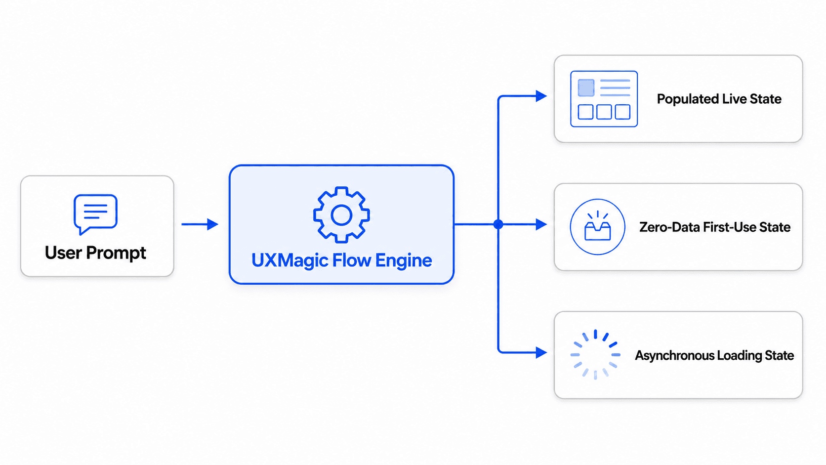
Standard design workflows require manually creating fake data records just to demonstrate a populated component. UXMagic's Flow Mode automates that step by auto-generating contextual sample datasets within the design environment - teams can toggle between empty states and pre-filled sample data layouts to validate component responsiveness and onboarding flows before a single line of code gets written. And since every state generated this way stays tied to a consistent token system via UXMagic's Style Guide Generator, a first-use screen, a loading skeleton, and a fully populated dashboard all share the same spacing, typography, and color logic by default not something a designer has to enforce manually across five separately built screens.
Design Every UI State From One Prompt
Generate populated, empty, loading, and error states from the same prompt, keeping your product flow consistent and ready for validation.