
TL;DR
The best AI UI tool is not the one that creates the prettiest first draft. It is the one that preserves hierarchy, components, brand rules, edge states, and responsive behavior across a complete product flow.
AI can produce a screen quickly, but that output may still contain weak hierarchy, inconsistent spacing, generic components, or missing states. We recommend using AI to reduce blank-canvas work not replace product judgment.
What is AI UI?
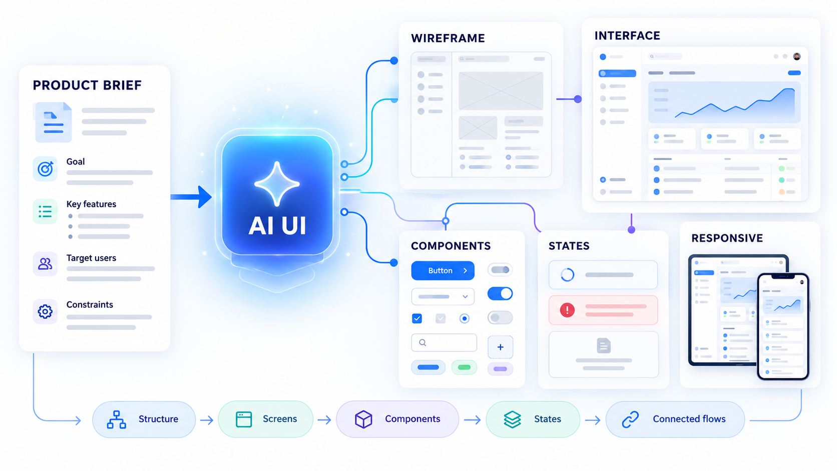 AI UI is the use of generative AI to create or modify interface structures, screens, components, visual styles, and connected product flows. Outputs range from low-fidelity wireframes to editable high-fidelity interfaces and implementation-oriented artifacts.
An AI UI generator can accelerate:
- Early concept exploration
- Layout and screen creation
- Realistic content population
- Repetitive screen production
- State and variant generation
- Responsive adaptation
Designers remain responsible for hierarchy, behavior, accessibility, product logic, and trade-offs. Fast generation has little value if the result cannot survive review, testing, and engineering handoff.
AI UI vs. AI-assisted UX
AI UI design focuses on interface output. AI-assisted UX is broader. It can include research synthesis, journey mapping, information architecture, usability analysis, content modeling, and validation.
A polished interface can still fail when the user goal or workflow is unclear. We recommend validating the structure through a high-fidelity wireframe before treating visual polish as proof that a product decision works.
AI UI generators vs. AI UI frameworks
AI UI generators create screens, layouts, components, or prototypes from instructions. An AI UI framework generally helps engineers build AI-enabled experiences, such as conversational interfaces, streaming responses, tool calls, and model-status feedback.
The terms overlap, but their purposes differ. One generates the product interface; the other supports implementation of interfaces that interact with AI systems.
How to create a UI with AI: a requirement-first workflow
A dependable prompt-to-UI workflow starts with product requirements, not clever wording:
- Define the user, task, and success condition.
- Choose the required fidelity.
- Generate the structural foundation.
- Apply the design system and brand rules.
- Add states, variants, and responsive behavior.
- Validate usability and accessibility.
- Prepare editable output for handoff.
Weak requirements produce weak interfaces, even when the prompt sounds sophisticated. Designers must still decide what deserves attention, how interactions behave, and whether the experience supports the user’s actual task. Our guide to using an AI design assistant for shippable UI explains how to keep that judgment inside the workflow.
Start with users, goals, and constraints
Define the target user, context, primary task, success condition, data priority, platform, business rules, permissions, and technical constraints. Identify the main action and the decisions the interface must support.
“Create a SaaS dashboard” offers little product direction. A stronger brief would ask for an operations dashboard that helps a regional manager identify delayed orders and assign owners before a review. That establishes a user, task, decision, and outcome.
Choose wireframes or high-fidelity UI
Use wireframes when navigation, flow, content order, or information hierarchy remains unsettled. A structured mobile wireframe design system helps teams test whether a task survives smaller screens and different navigation patterns.
Use high-fidelity generation when content, approved components, brand rules, and interaction patterns are defined. High fidelity should test a credible experience, not conceal unresolved UX beneath polished styling.
How to write AI UI prompts that produce usable screens
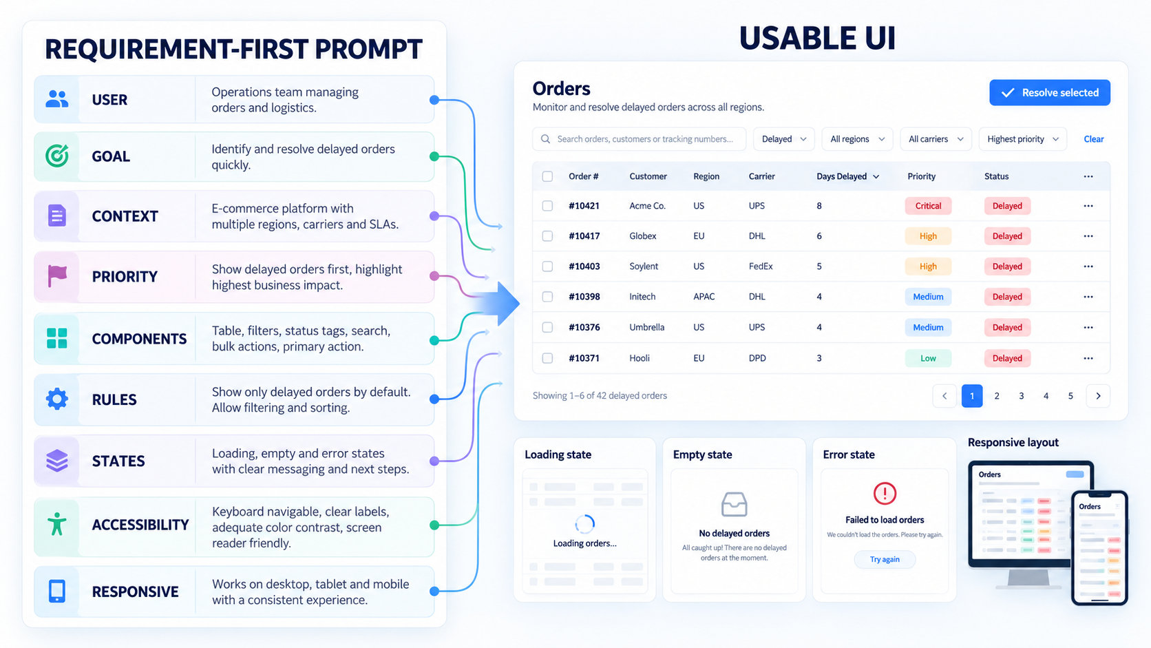 A useful prompt defines the user, goal, context, content, actions, constraints, states, components, and breakpoints. Concrete product language is more useful than subjective directions such as “make it modern.”
For example:
Create a desktop operations dashboard for regional managers reviewing delayed orders. Prioritize at-risk orders, delivery status, owner, delay reason, and next action. Include filters, a sortable table, status tags, bulk assignment, a detail drawer, and role-based actions. Use approved components and compact spacing. Define responsive behavior and generate loading, empty, error, success, and restricted-permission states.
This is more than a detailed prompt. It is a practical product brief.
A practical AI UI prompt template
Use this structure:
- User: Who uses the screen?
- Goal: What must they accomplish?
- Context: When, where, and why is it used?
- Priority: Which information and actions matter most?
- Components: Which approved patterns are required?
- Content: What realistic labels and data should appear?
- Rules: What permissions and validation apply?
- States: What happens during loading, failure, or no data?
- Accessibility: What labels, focus behavior, and non-color cues are needed?
- Responsive behavior: What changes at each breakpoint?
Why more prompting is not always better
Repeated aesthetic prompting can create drift. Spacing changes, components mutate, terminology becomes inconsistent, and later screens stop resembling earlier ones.
We prefer reusable rules over endless variations. Lock accepted tokens, components, content patterns, and interaction behavior. Then generate alternatives within those boundaries.
Avoid generic AI UI with brand and design-system constraints
“Avoid AI UI” usually means avoiding the recognizable AI-generated aesthetic—not rejecting AI tools entirely.
Common symptoms include:
- Interchangeable gradients
- Oversized cards
- Uniform spacing without hierarchy
- Decorative charts with no decision value
- Vague placeholder copy
- Inconsistent controls and patterns
Design systems become more valuable when AI enters the workflow because generators need clear boundaries. Strong Figma design system examples show how reusable rules can create consistency without making every interface identical.
Apply tokens, components, and brand rules
Define typography, color, spacing, radius, elevation, iconography, imagery, and content voice. Require approved components and variants instead of visually similar one-off elements.
Product-specific content matters as much as styling. Distinctive UI comes from brand rules, domain terminology, meaningful data, and interaction logic—not novelty for its own sake.
Use constraints to create better variation
Generate alternatives while keeping core requirements fixed. A team might compare different ways to prioritize delayed orders without changing the approved navigation, table, typography, or status components.
We assess each option against:
- User-goal support
- Brand fit
- Accessibility
- Implementation effort
- Design-system alignment
More options are not automatically better. Constraint-aware variation makes comparisons relevant.
Design complete product flows—not one polished screen
A polished first screen is a weak benchmark for AI UI quality. We use a fifth-screen test: add a detail view, settings screen, destructive confirmation, error state, and mobile variant. Then check whether the system still holds together.
Review navigation continuity, terminology, hierarchy, form behavior, component reuse, and cross-platform consistency. On mobile, the task and decision sequence must remain intact rather than merely fitting into a narrower frame.
Generate loading, empty, error, success, and permission states
Each major state should explain what happened and what the user can do next. Include:
- Loading and partial-data states
- Empty and first-use states
- Field and submission errors
- Success confirmation
- Restricted-permission views
- Destructive-action warnings
- Offline or interrupted states
- Recovery paths
Authentication is a useful stress test. A complete login form wireframe should account for validation, incorrect credentials, recovery, locked accounts, and success—not just fields and a button.
Test responsive behavior
Specify how navigation changes, content reorders, tables adapt, components reflow, and secondary actions collapse. Check touch targets and identify what must remain visible for the primary task.
A mobile layout should not be a stacked desktop screen. It needs to preserve task priority while adapting density, navigation, input behavior, and available space.
Make AI-generated UI editable, accessible, and ready for handoff
Production-ready output depends on structure and clarity, not polish alone. We look for editable layers, reusable components, variants, auto layout, responsive constraints, named styles, and tokens.
Generated code also needs review against the team’s component library, architecture, conventions, and accessibility requirements. Moving AI UI into Figma can make output easier to inspect, but teams must still evaluate the underlying structure.
Run an accessibility check
Review contrast, text hierarchy, labels, focus order, keyboard access, touch targets, error messaging, and non-color cues. Confirm that content and interactions remain understandable with assistive technology.
Never assume polished output is accessible. AI can reproduce poor conventions as readily as good ones.
Prepare a buildable handoff
Document component states, interactions, responsive rules, content behavior, validation, permissions, and edge cases. Map generated elements to approved design-system components or mark them as proposed additions.
At uxmagic.ai, we focus our AI UI/UX features on helping teams move from generated concepts toward editable design workflows. Engineering should not have to reverse-engineer behavior from a screenshot.
How to choose the best AI UI generator
The best tool fits the team’s workflow, design system, output requirements, governance needs, and product complexity. A curated gallery cannot demonstrate that.
Evaluate:
- Control over requirements and constraints
- Multi-screen consistency
- Design-system support
- Editability and export quality
- Responsive behavior
- Collaboration and review
- Privacy and governance
- Developer handoff quality
Test the same brief across a complete flow. An AI UI generator with Figma-ready output should be judged by what remains editable and consistent after revision—not only by its initial output.
Use the fifth-screen evaluation test
Generate:
- A primary screen
- A related detail view
- A settings or configuration screen
- An error or restricted state
- A mobile variant
Score hierarchy, pattern reuse, brand fidelity, UX logic, responsiveness, and revision effort. If consistency collapses across the flow, the initial screen was a convincing demo rather than a dependable system.
Check enterprise control and privacy
Review data retention, model-training policies, workspace access, governance controls, intellectual-property terms, and private asset handling.
Confirm whether the team can safely provide proprietary design-system files, customer content, internal requirements, and unreleased concepts. Enterprise adoption requires more than attractive output.
Understand free-generator trade-offs
Free access can help teams test generation quality, editing behavior, prompt control, and workflow fit before committing.
Check limits on:
- Projects and generations
- Exports and editable formats
- Components and collaboration
- Commercial use
- Privacy
- Generated-code ownership
AI UI checklist: describe, design & ship
AI should accelerate execution while designers retain responsibility for product judgment. We approve AI UI when it works as a system—not simply when it looks complete.
Before generating
- Define the user and primary goal.
- Map the complete flow.
- Provide realistic content and data.
- Specify platforms and breakpoints.
- Document business and technical constraints.
- List required states and permissions.
- Set design-system and brand rules.
- Choose the fidelity and purpose of the output.
Before shipping
- Validate connected flows and edge cases.
- Test responsive variants.
- Review accessibility and recovery behavior.
- Confirm component reuse and brand fidelity.
- Check interaction and content clarity.
- Inspect editable structure and constraints.
- Map designs to engineering conventions.
- Confirm that design and engineering can modify the output.
Describe, design & ship with uxmagic.ai
Turn a defined product requirement into editable, Figma-ready UI, then test it as a complete system. Start generating with uxmagic.ai and move from blank canvas to review-ready design.