
TL;DR
The available sources do not establish that a complete, current Airbnb design system is publicly available. What they do offer is a useful set of documented design principles and visible product examples. We can study those materials without treating third-party files as official. The goal is not to copy Airbnb’s interface, but to understand how principles, reusable assets, engineering, and governance can support a coherent product language.
What is the Airbnb design system—and what is it not?
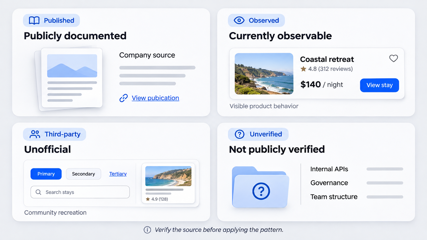 “Airbnb design system” is often used as a broad label for Airbnb-inspired UI kits, community files, public design commentary, and the company’s product interfaces. Those sources are not interchangeable.
A design system is more than a visual library. It connects principles, foundations, reusable components, code, documentation, workflows, ownership, and governance. Together, those elements help teams make consistent decisions and maintain them over time.
We recommend classifying Airbnb-related material carefully:
- Publicly documented: Material published by Airbnb or supported by an authoritative Airbnb source.
- Currently observable: Design and behavior visible in Airbnb’s public products.
- Unofficial: Third-party recreations, templates, commentary, and UI kits.
- Not publicly verified: Internal tools, component APIs, governance, and team structures without authoritative evidence.
An Airbnb-inspired Figma file may be useful, but that does not make it Airbnb’s production system.
Design language vs. UI kit vs. component library
A design language defines shared visual and behavioral rules, including hierarchy, interaction, content, and relationships between elements.
A UI kit contains editable design assets. A component library provides reusable design or coded elements. A production design system goes further by adding documentation, contribution processes, releases, ownership, adoption practices, and maintenance.
The distinction matters when reviewing Figma design system examples and what strong libraries get right. A well-organized file can support a system, but it is not the whole system.
Why the distinction matters
A polished recreation can reproduce colors, cards, icons, and spacing without capturing the research, accessibility requirements, content model, product constraints, or engineering behind them.
Copying visible components therefore does not reproduce the decisions that made them effective. It copies an outcome without explaining when that outcome should be used, adapted, or rejected.
How Airbnb’s design language emerged
The supplied source material does not provide enough primary evidence to reconstruct the development of Airbnb’s internal design system. We should not infer its current component inventory, tools, governance, or team structure from community files or product screenshots.
The broader design-system lesson remains useful: growing products benefit when teams move from isolated screens to reusable rules and building blocks. Shared decisions become especially valuable as a product expands across platforms, markets, and contributors.
The product problem behind the system
Consistency is not merely aesthetic. Teams need a common language for discussing what a feature means, how it behaves, which states it requires, and how engineers should implement it.
Shared rules can reduce repeated debate and make collaboration more concrete. Instead of defining every button, error, or booking state from scratch, teams can begin with an agreed contract and focus on the new problem.
What remains useful today
We recommend encoding recurring decisions while documenting when context should override the default. A system should accelerate common work without suppressing necessary variation.
Specific artifacts and organizational models are less transferable. Unless Airbnb has publicly confirmed a detail, we should not present it as a description of the company’s current production system.
The principles behind Airbnb’s design language
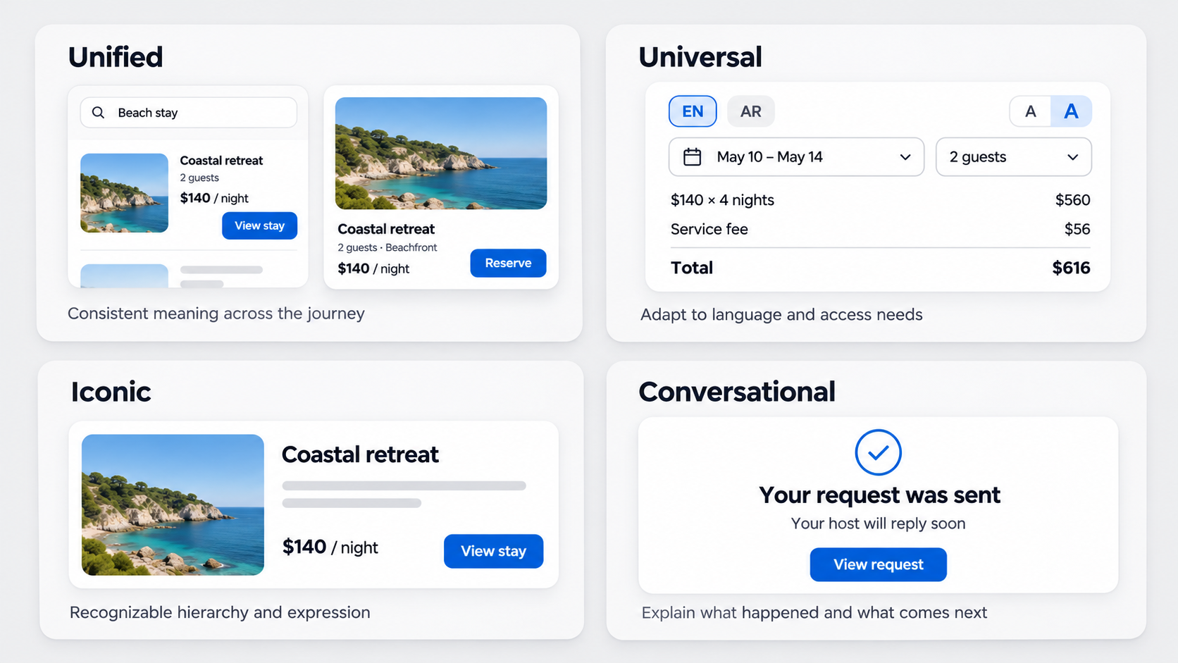 Airbnb publicly documented four design principles: unified, universal, iconic, and conversational. These principles describe the intended qualities of its products and visual language.
Principles should work as decision filters rather than decorative slogans. Our practical framework for applying principles of design explains how teams can use them to assess hierarchy, behavior, content, and implementation.
The published principles reveal design intent. They do not disclose how Airbnb’s current internal system is organized.
Unified and universal
Unified means each part should contribute to a coherent whole rather than behave as an isolated feature. That does not require every platform to look identical. Related journeys should still share recognizable meaning and logic.
Universal reflects Airbnb’s global audience. For us, this principle prompts questions about accessibility, translation, bidirectional layouts, device constraints, cultural interpretation, currencies, and date formats.
Iconic and conversational
Iconic calls for focused, recognizable expression. Typography, imagery, hierarchy, and interaction should communicate a clear point of view without obstructing the task.
Conversational concerns understandable communication. Motion and feedback can explain what happened, what comes next, and how an action affects the wider journey.
How the system could connect foundations, components, patterns, and products
Without claiming access to Airbnb’s private libraries, we can use a layered model to examine how a comparable system might work.
Foundations include typography, color, spacing, elevation, iconography, imagery, motion, and semantic tokens. Components apply those foundations. Patterns coordinate components around tasks such as search, date selection, maps, messaging, booking, and guest selection.
Product compositions sit above those layers. They should serve the needs of a specific journey rather than force every experience into one template.
From tokens to components
Tokens encode named decisions that design and code can share. Semantic names such as text-primary or surface-critical communicate purpose more clearly than raw values.
Components then combine structure, states, behavior, content constraints, and accessibility. A booking card should define its information hierarchy, variable content, interactions, and expected behavior—not only its image ratio and corner radius.
From components to product patterns
Patterns explain how components work together to complete a task. A date-selection pattern might coordinate fields, calendars, validation, availability, and confirmation.
Useful documentation covers valid variations, edge cases, responsive behavior, content rules, and situations where the pattern should not be used. That keeps reuse from becoming blind standardization.
Consistency across web, iOS, and Android does not mean identical UI
Cross-platform consistency should preserve meaning, hierarchy, terminology, states, and outcomes. It should not require pixel-for-pixel parity.
Native conventions, input methods, navigation, screen sizes, and accessibility APIs may justify deliberate differences. We treat cross-platform alignment as a contract: retain the product logic while adapting the interaction to its context.
What should stay consistent
Teams should align:
- Core terminology and content hierarchy
- Brand meaning and trust cues
- State logic and task outcomes
- Component intent
- Semantic token names
- Accessibility expectations
A confirmed booking should carry the same meaning everywhere, even when its presentation differs by platform.
What may need to differ
Navigation, gestures, date inputs, controls, system dialogs, focus behavior, and responsive composition may follow platform conventions. A mobile date picker does not need to imitate a desktop calendar.
We recommend documenting intentional differences so that adaptation does not drift into accidental fragmentation.
Accessibility, localization, inclusion, and functional motion
A global travel product must support variation in languages, scripts, currencies, date formats, devices, cultural expectations, and abilities. Accessibility and localization should shape system decisions from the beginning.
Airbnb’s universal and conversational principles provide a useful lens, but they do not prove compliance with any current accessibility standard.
Designing for global variation
We recommend testing components with:
- Expanded and translated text
- Bidirectional layouts
- Locale-specific dates, currencies, and numbers
- Different address and name formats
- Keyboard, screen-reader, and touch interaction
- Realistic marketplace content
A card that breaks under longer translations is not universal. Its content and layout constraints are underdefined.
Motion with a job to do
Functional motion explains cause and effect, preserves context, confirms input, communicates state, or directs attention. Movement that delays a task adds noise.
Systems should also define reduced-motion behavior. Errors, status information, and instructions must never depend on animation alone.
The real system is how teams make decisions together
A component library is an output. The more valuable system is the shared process behind it.
Designers and engineers should jointly define component contracts, states, accessibility behavior, API boundaries, documentation, and releases. Governance should cover ownership, contributions, versioning, deprecation, exceptions, and communication.
A practical contribution model
A contribution proposal should document:
- The recurring product need
- Required variants and edge cases
- Accessibility and content behavior
- Platform implications
- Maintenance ownership
- Intended adoption and success measures
Reviewers can then decide whether the proposal belongs in a foundation, shared component, task pattern, or one-off composition.
Metrics beyond visual consistency
We look beyond component counts. Useful signals include adoption, duplicate implementations, delivery time, contribution turnaround, exceptions, accessibility defects, and release stability.
Operational measures should be paired with usability evidence. A product can be consistent and still be confusing. Our guide to building a design system case study with evidence of adoption and impact provides a practical way to document both.
Can you download Airbnb’s design system? Verify before you use
Third-party downloads, PDFs, templates, and Figma files may be available, but the supplied sources do not verify them as Airbnb’s complete, current production system.
Airbnb’s official open-source page lists individual engineering projects. That does not establish that a complete Airbnb design system package is available there.
The six-point source check
Before using an Airbnb-branded asset, check:
- Publisher: Is it Airbnb or a third party?
- Original URL: Does an official Airbnb property link to it?
- Publication date: When was it released?
- Revision history: Are versions documented?
- License: What reuse is permitted?
- Scope: Is it a complete system, an example, or a recreation?
A logo, polished presentation, or professional file name is not proof of provenance.
Red flags in unofficial templates
Warning signs include missing source links, no date, no license, copied branding, invented token names, static components, and unsupported claims that a file is official.
We treat such assets as third-party interpretations. Teams should check licensing and trademark restrictions before reusing branded material.
How to apply Airbnb’s lessons without copying Airbnb
The goal is not an Airbnb clone. It is an original system grounded in our users, content, technology, accessibility requirements, and brand.
With uxmagic.ai, teams can describe an original flow and generate a UI starting point. That output can then be aligned with their own tokens, content rules, patterns, accessibility requirements, and coded components.
A five-step reconstruction workflow
- Inventory repeated decisions. Find recurring tasks, states, structures, and inconsistencies.
- Define principles and foundations. Establish tokens, constraints, and platform contracts.
- Model task patterns. Show how components support real outcomes.
- Generate and test original compositions. Use realistic content, devices, and locales.
- Encode proven decisions. Move validated rules into design assets, code, documentation, and governance.
Questions to ask before shipping
Before releasing a shared pattern, we ask:
- Does it solve a real user problem?
- Does it work with realistic and extreme content?
- Does it adapt appropriately across platforms?
- Does it support accessibility and localization?
- Can it map to maintainable code?
- Are valid exceptions documented?
- Can we measure its effectiveness?
Design and ship an original system
Use uxmagic.ai to turn an original product flow into a practical UI starting point, then develop the strongest decisions into accessible foundations, task patterns, production components, and shared team rules.