Copy-pasting component code into your repository felt like complete architectural freedom until your engineering team ended up managing dozens of unversioned UI files that look identical to every AI-generated SaaS prototype on the web. In 2026, component library fatigue isn't caused by a lack of UI elements - it's driven by the hidden maintenance burden of managing raw component source code while fighting template visual homogeneity.
You already understand component reusability, JSX syntax, and basic accessibility principles. This isn't a beginner's guide to what a component is. It's the architectural trade-offs - copy-paste code ownership versus managed packages, headless primitives versus monolithic kits that determine whether your React stack ages well or turns into a refactor waiting to happen.
Quick Comparison
| Library | Best For | Styling | Accessibility | Customization | Bundle/Performance |
|---|---|---|---|---|---|
| shadcn/ui (Base UI) | Custom SaaS, full code ownership | Tailwind CSS, zero-runtime | Strong, actively maintained | Full - you own the source | Lean, no runtime CSS-in-JS |
| shadcn/ui (Radix) | Existing Radix codebases | Tailwind CSS, zero-runtime | Strong, slower updates | Full - you own the source | Lean, no runtime CSS-in-JS |
| MUI v6 / MUI X | Enterprise data density | Runtime CSS-in-JS (Emotion) | Strong, mature | Moderate - override-heavy | Heavier, runtime overhead |
| Mantine v8 | All-in-one developer experience | Build-time, CSS modules | Strong | Good, less than shadcn | Moderate |
| Chakra UI v3 | Zero-runtime teams migrating off Emotion | PandaCSS, zero-runtime | Strong | Good | Lean |
| Magic UI / Aceternity UI | Animation-heavy marketing sites | Tailwind + Framer Motion | Varies by component | High visual customization | Watch bundle size closely |
The Architectural Paradigm Shift: Copy-Paste Code Ownership vs. Managed Packages
How shadcn/ui Redefined Local Source Code Ownership
The shift popularized by shadcn/ui - moving components from external npm packages into local repository directories eliminates package version lock-in and CSS override conflicts. That's a genuine win. It also replaces package management with local code governance debt: when a foundational accessibility issue or edge-case bug gets identified in an unstyled primitive, teams managing raw component files have to manually update every instance across their codebase themselves, since there's no npm update to pull the fix in.
Enterprise Managed Libraries: When MUI v6 and Ant Design Still Apply
Monolithic component packages remain justified in one clear case: applications requiring complex, virtualized data grids, dense form controls, or specialized enterprise charts that would take real engineering time to build from headless primitives alone. If you're not in that category, a managed package is usually solving a problem you don't have yet.
The Primitive Layer Evolution: Base UI Is Now the Default
The Radix → Base UI Timeline
2022 - WorkOS acquires Modulz (the team behind Radix UI)
2022-2025 - Radix development slows; Combobox, multi-select issues linger
Late 2025 - Base UI reaches v1.0 stable (built by ex-Radix engineers, now at MUI)
Early 2026 - shadcn/create users already choosing Base UI over Radix, ~2-to-1
July 3, 2026 - shadcn/ui makes Base UI the official default for new projects
Radix wasn't quietly declining on its own - it was acquired, and that acquisition is the specific event that triggered everything downstream. WorkOS acquired Modulz, the team behind Radix UI, in 2022. Development slowed noticeably afterward, with open issues on components like Combobox and multi-select going unresolved far longer than before the acquisition. Radix isn't abandoned - it still sees roughly 130 million monthly npm downloads and runs in production across huge, established codebases but active engineering investment moved elsewhere.
Base UI Is Now the Official Default, Not Just an Alternative
Where it moved: several of the original Radix engineers joined MUI and built Base UI from scratch, carrying three years of lessons learned. Base UI hit v1.0 stable in December 2025, and on July 3, 2026, the shadcn/ui team made it the official default primitive for new projects - not a beta option, not a future plan. Running npx shadcn init today wires a new project to Base UI automatically; adding -b radix forces the older primitive if you specifically want it.
Radix isn't deprecated as part of this change - shadcn/ui still ships every update and new component for both libraries, and teams already running production apps on Radix have no forced migration to make. The shadcn team was explicit about this: usage data showed developers using shadcn/create were already choosing Base UI over Radix by roughly 2-to-1 before the switch, so the official default just caught up to what the community had already decided.
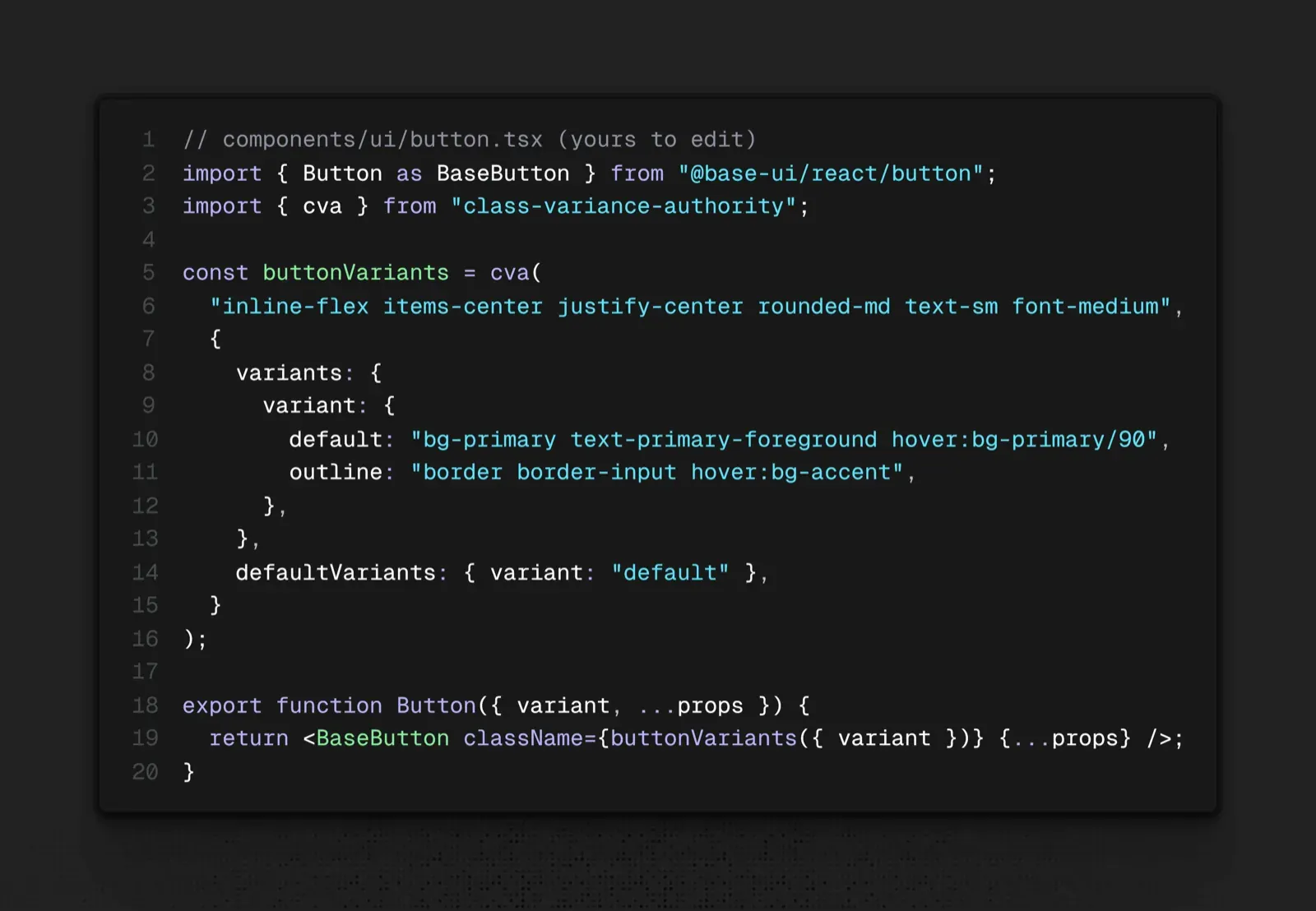
A Quick Code Comparison: shadcn/Base UI vs. MUI
MUI ships as an installed package you configure through props and a theme object, not a file you edit directly:
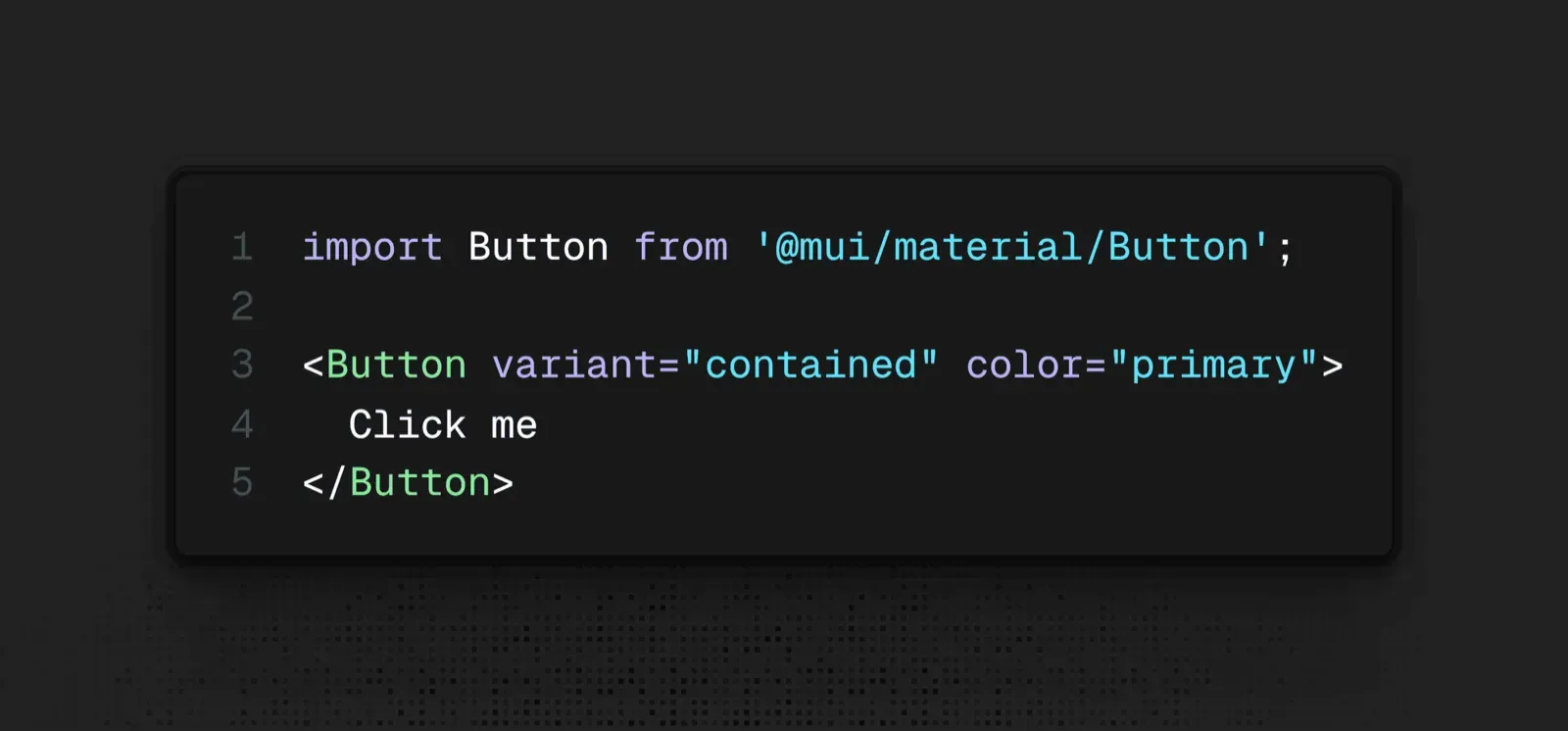
The MUI version is faster to write on day one - no local file to maintain. The shadcn/Base UI version costs a bit more setup but means a future accessibility fix or style change happens in a file you control, not a package update you're waiting on.
Tailwind CSS v4's Role in the Modern Component Stack
Tailwind CSS v4's shift to a fully build-time, zero-runtime engine is a direct match for the copy-paste component model both are built around the same core idea: put the actual styling logic in files you own and compile ahead of time, rather than computing styles at runtime in the browser. That pairing is why shadcn/ui, Base UI, and Tailwind v4 show up together so consistently in 2026 stacks - they're not just compatible, they're solving the same performance problem from two different layers (component structure and styling engine).
PandaCSS, which Chakra UI v3 now builds on, follows the same zero-runtime philosophy worth recognizing as part of one broader industry shift away from runtime CSS-in-JS (legacy MUI, Emotion) rather than three unrelated tools that happen to trend at the same time.
Comprehensive Technical Evaluation: Top React UI Component Libraries
- shadcn/ui: The Copy-Paste Standard, Now Powered by Base UI
shadcn/ui's real innovation was never the components themselves - it's the CLI-driven copy-paste model that gives you full code ownership with zero runtime dependency. With Base UI now the default engine underneath, new projects get active maintenance and stronger React 19 / TypeScript compatibility than they would have gotten by defaulting to Radix a year ago.
- Material UI (MUI v6 & MUI X): Enterprise Data Density and Advanced Grids
MUI's core strength remains its data-dense components - the MUI X Data Grid handles virtualized enterprise tables that would take real engineering time to build from scratch with headless primitives. The trade-off is a documented, observed one rather than a universal rule: MUI's runtime CSS-in-JS style injection can add rendering overhead on server-rendered React 19 routes in some setups, a cost worth benchmarking against your own app rather than assuming it applies uniformly.
- Mantine v8: The All-in-One Developer Experience Champion
Mantine bundles a large component set with strong developer ergonomics out of the box, making it a reasonable pick for teams that want more built-in coverage than shadcn/ui's minimal defaults without going as heavy as full MUI.
- Chakra UI v3: Zero-Runtime Engineering with PandaCSS
Chakra's move to PandaCSS underneath signals the same industry-wide shift away from runtime CSS-in-JS toward zero-runtime, build-time styling - the same performance motivation driving Tailwind CSS v4 adoption elsewhere in this list.
- Specialized Visual Layers: Magic UI, Aceternity UI, and Motion Primitives
These libraries add polished, animation-heavy components on top of a base primitive layer. Worth evaluating specifically on performance overhead and bundle size, not just the visual demo - a motion-heavy component library can quietly become the largest dependency in your bundle if you're not watching it.
Operational Decision Matrix: Selecting the Right Stack for Your SaaS
A few specific patterns worth naming directly, since they show up constantly across engineering teams:
- AI code generators have contributed to a real visual homogeneity trend. Tools like v0, Lovable, Bolt, Cursor, and Claude Code commonly default to shadcn/ui output, and the widely observed result is a lot of new SaaS products sharing similar rounded corners, slate color palettes, and drop shadows. Achieving distinct brand identity now requires deliberately moving past stock component schemas, not just accepting the AI's first draft.
- Headless primitives solve accessibility, not assembly. Radix and Base UI handle keyboard navigation, ARIA roles, and focus trapping correctly out of the box - they don't assemble a complex enterprise data table, date-range picker, or multi-step form for you. That assembly work still has to happen, and skipping the planning step for it slows sprint velocity later.
- Design handoff friction usually traces back to spec precision, not the component library. Developers overriding component CSS specificity rules to match a Figma layout is frequently a symptom of vague visual specs, not a limitation of the library itself.
Here's what breakdown looks like on two real projects. A founding team uses an AI code platform to generate a Next.js SaaS MVP, and the output uses standard shadcn/ui components with default Tailwind slate coloring. The app functions technically, but its aesthetic is indistinguishable from hundreds of other unvalidated indie prototypes hurting brand credibility before a single user has judged the actual product. Extracting structural layout requirements first, then pairing custom visual structures with unstyled Base UI primitives, fixes this without sacrificing accessible component logic.
An enterprise product team maintaining a data-dense admin panel on legacy MUI v5 hits a different wall: runtime style injection adds rendering overhead on large dynamic tables, and overriding Material Design's internal specificity rules to match custom specs slows delivery. The realistic options are migrating to Mantine v8, or an unstyled stack combining shadcn/ui (Base UI primitives) with TanStack Table for the data layer specifically.
Generic AI code tools fail at complex UI generation in predictable ways - hallucinated component props, missing non-happy-path states (loading, empty, error boundaries), and deeply nested utility classes that break responsive layouts. Planning visual layouts before code execution is what actually prevents these failures, not a better prompt written after the fact.
Bridging Visual Design and Frontend Code
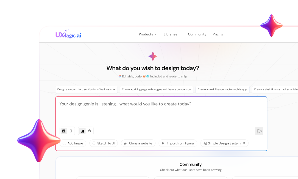
Before engineers run a single component installation command, product teams spend real time debating spatial layouts and screen transitions in code or in scattered Slack threads. UXMagic generates production-ready UI flows directly from text prompts at this exact stage - establishing visual clarity and component requirements before anyone locks in a primitive layer, rather than discovering structural gaps mid-sprint.
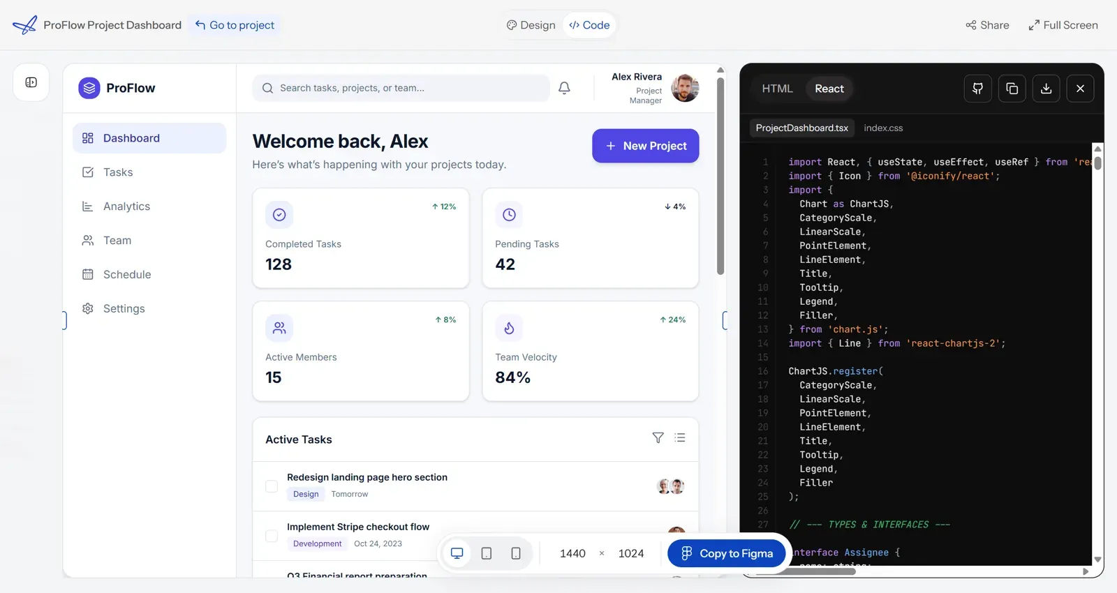
The homogeneity problem gets addressed the same way. Where a generic AI code generator defaults to the same stock shadcn schema every other prototype ships with, UXMagic's Style Guide Generator defines real brand tokens upfront, and Flow Mode applies them consistently across every generated screen - visual differentiation established before code, not patched onto a template afterward. On the code side specifically, UXMagic's AI React Generator is what produces the actual component output - real React components with props and structure, not markup that merely resembles a React layout closing the exact gap between a validated design and code an engineering team can build from directly.
For teams working the opposite direction starting from an existing React codebase rather than a blank prompt - importing existing Figma component styles keeps generated screens anchored to tokens that already match your shadcn or MUI setup, instead of introducing a second, competing design language. And for the specific discipline of writing prompts precise enough to avoid the hallucinated-props problem covered above, structuring effective design prompts covers exactly that gap between a vague request and a generation the engineering team can actually build from.
Build Distinct UI Flows
Create visually distinct, multi-screen UI flows before committing to a component library or writing code.