Most internal design systems don't fail from a lack of visual effort; they collapse under the weight of their own governance. Teams spend months building hyper-nested component tokens in Figma, only to watch engineers ignore the library entirely during high-pressure sprints. If a design system fails to accelerate shipping speed within its first week, it isn't an enterprise asset - it's operational debt.
You already understand component states, auto-layout parameters, and responsive breakpoints. This isn't a primer on what a primary button does. It's the specific token architecture, governance model, and AI-assisted workflow that separates a design system engineers actually use from one that quietly gets abandoned by the third sprint.
The Architecture, Visually
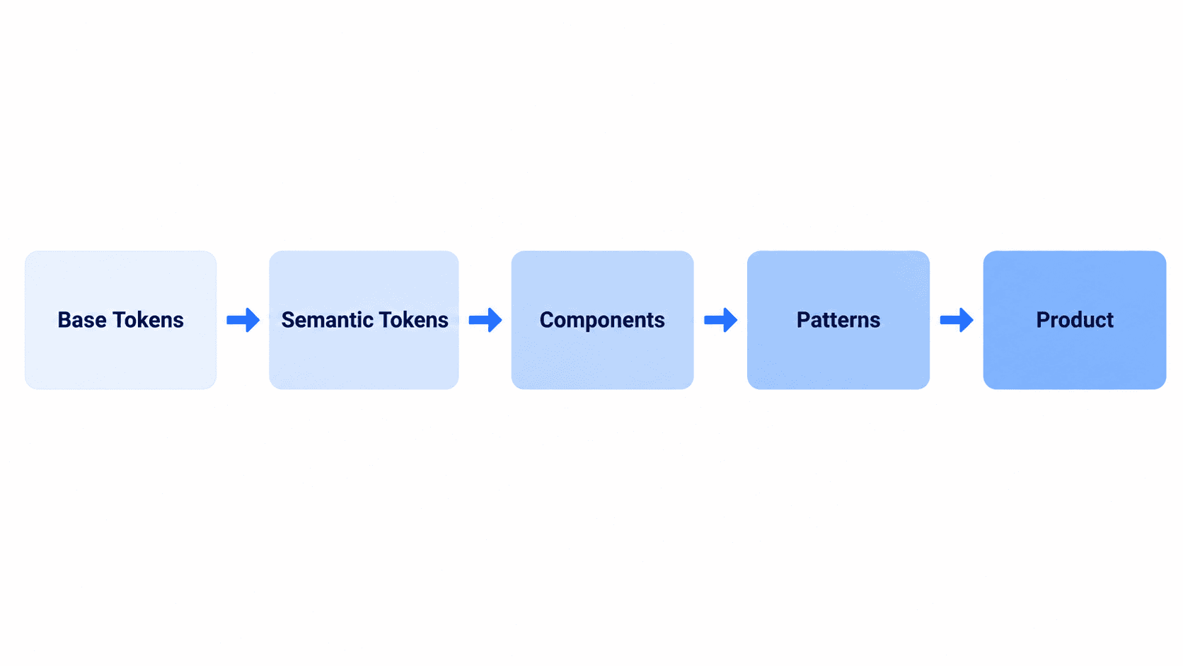
Everything in this playbook maps to one link in that chain. Most systems that get abandoned skipped straight from Base Tokens to Components - no semantic layer, no pattern documentation which is exactly why they can't survive a rebrand or a new engineer joining the team.
Why Traditional Design System Playbooks Fail
The Hidden Costs of Figma Token Over-Engineering
Standard industry literature often recommends complex four-layer token structures - Global, Alias, Semantic, and Component-specific tiers. In practice, this level of nesting tends to introduce real operational friction, obscure variable inheritance, and cause performance latency in visual design environments for most product teams. A strict two-tier architecture generally delivers better flexibility for less governance overhead with a real exception covered further down.
Why Production Code Should Be Treated as the Source of Truth
Conventional design system playbooks positioning static Figma libraries as the ultimate source of truth can introduce real misalignment. Because end users interact solely with compiled front-end code, treating the production codebase as the authoritative standard rather than the Figma file is a defensible default for most teams. When discrepancies arise between Figma variables and CSS tokens, the code repository is the more reliable place to resolve the conflict, since Figma files exist mainly to support rapid spatial reasoning, not runtime behavior.
Phase 1: Designing a Scalable Two-Tier Token Architecture
Primitive Tokens vs. Contextual Semantic Tokens
A two-tier architecture - Base Primitives (raw HSL color scales and spacing units) plus Semantic Contextual Tokens (--surface-primary, --text-muted) tends to deliver seamless light/dark mode theming with far less governance overhead than a four-tier tree.
Here's what that looks like in actual CSS:
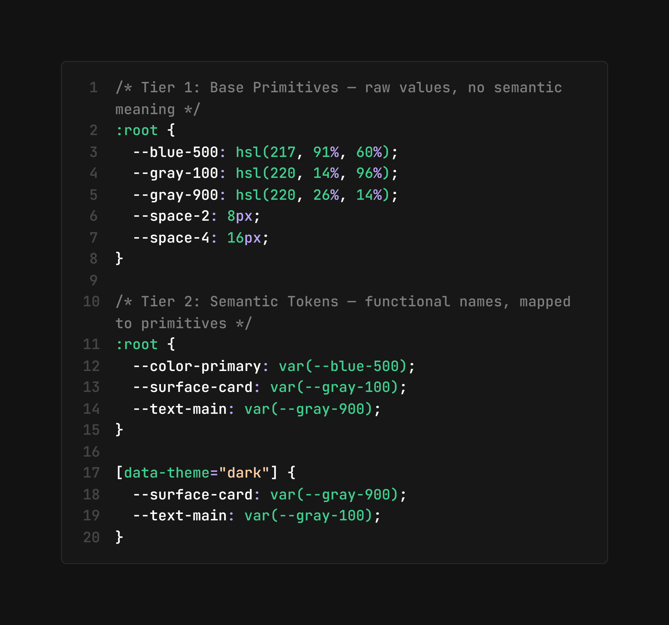
Notice what happens on the theme switch: only the Tier 2 mappings change. No component ever references --gray-100 directly - it references --surface-card, so remapping one variable retheme's every component using it.
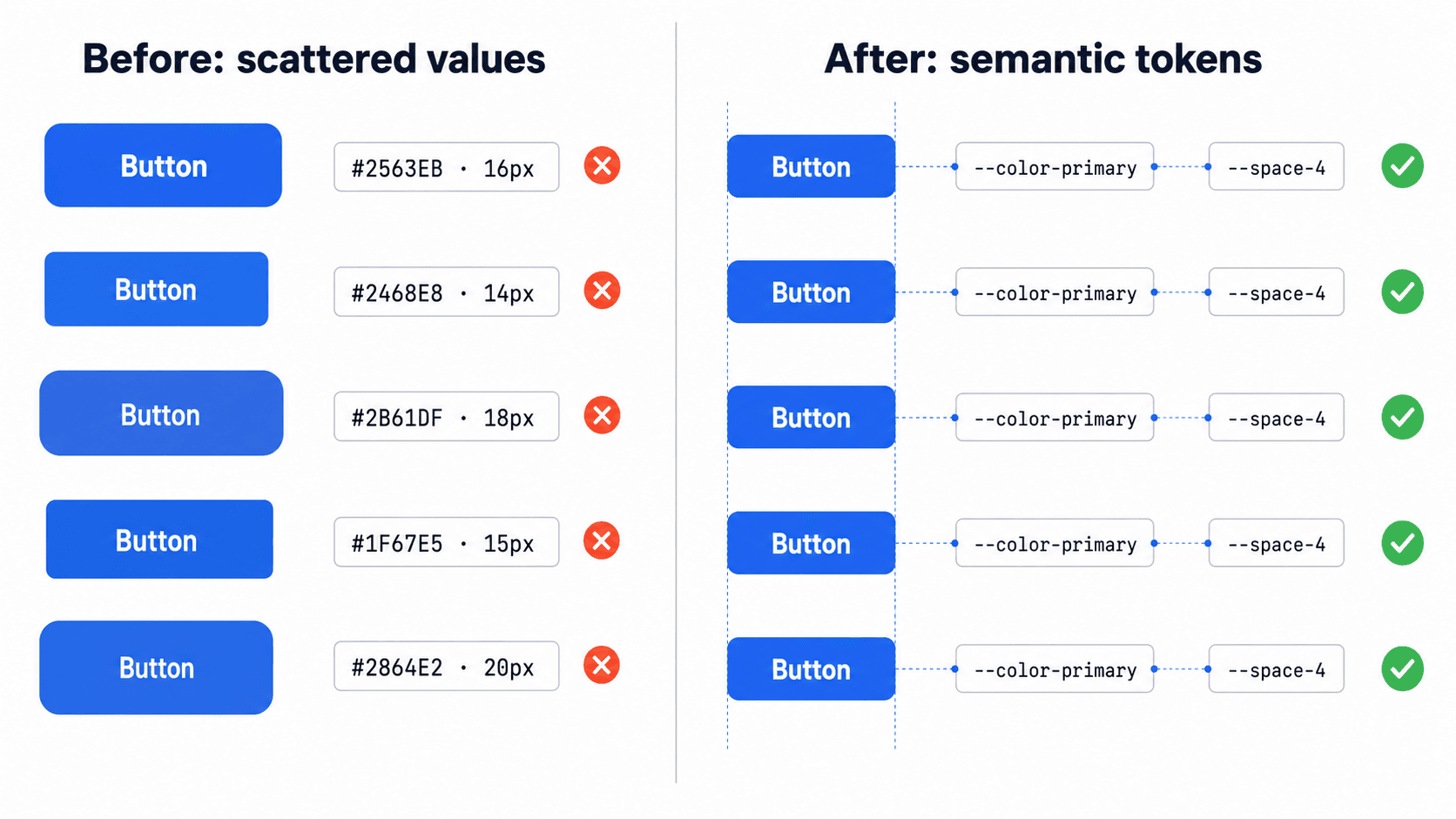
Executing a global visual rebrand across an entire SaaS platform by modifying four central CSS variables in a single afternoon is what this architecture makes possible. Contrast that with manually updating hundreds of decoupled Figma frames and filing dozens of refactoring tickets to fix broken layout spacing - the difference isn't team size, it's token architecture.
Automating the UI Audit with DOM Scrapers
Manual screenshot UI audits are increasingly impractical at scale, even if they still work for a very small surface area. Legacy advice directing design teams to manually capture hundreds of application screenshots and arrange them on virtual whiteboards doesn't scale well past a handful of screens. Modern audits use automated DOM scrapers, CSS extraction tools, and machine-vision scripts to identify color fragmentation, typography violations, and inline styling anomalies fast - compressing weeks of manual cataloging into hours for most teams doing this at real product scale.
When Two Tiers Isn't Enough
The two-tier model is the right default for most product teams, but it's worth being honest about where it stops being sufficient. Large enterprise organizations running multiple distinct sub-brands, white-label products, or platforms with genuinely different visual identities under one design system often need a third layer - Component-Level Overrides - sitting above the semantic tier, to handle cases where one sub-brand's card component needs different values than the shared semantic tokens provide without forking the entire system.
The warning sign that you've outgrown two tiers isn't complexity for its own sake - it's a specific, recurring need to override semantic tokens differently across genuinely separate product lines, not just differently across screens within the same product. If that's not your situation, adding the third tier preemptively just reintroduces the governance overhead this whole architecture is trying to avoid.
Phase 2: Integrating Headless Primitives and AI Flow Generation
Eliminating Redundant Code with Unstyled UI Primitives
Instead of coding standard UI widgets from zero, engineering should generally integrate unstyled, accessible component primitives such as Radix UI or shadcn/ui. These primitives manage focus trapping, ARIA semantics, and keyboard navigation out of the box - building that mechanics layer from scratch when open-source options already exist is usually wasted engineering time.
Generating Production-Ready UI Flows from Text Prompts
Rather than manually placing individual buttons, form fields, and card containers onto empty Figma canvases, product creators can use UXMagic's Flow Mode at this exact stage. Entering functional text prompts generates complete multi-screen user flows structured according to pre-defined spacing tokens and layout grids - turning days of structural wireframing into a much faster process.
Here's what that looks like on a real project. A Series A SaaS startup must design and deploy a complex data analytics dashboard within a tight two-week sprint. The legacy process: a product designer spends eight business days manually assembling cards, data tables, dropdown menus, and filter modals in Figma, and front-end engineers receive static mockups they have to re-code by hand resulting in inconsistent margins, un-tokenized gray shades, and broken mobile breakpoints.
The tokenized process instead: the team configures a two-tier spacing and color token system mapped directly to Tailwind CSS. The product manager inputs functional requirements into UXMagic to instantly generate complete, multi-screen UI flows containing filter states, data tables, and modal layers - structures that adhere to the system's spatial grid, letting engineering attach headless data components immediately instead of rebuilding layout logic from scratch.
Phase 3: Standardizing Pattern Libraries and Microcopy
Why Flow-Level Documentation Beats Component Lists
Pattern and flow documentation tends to matter more than exhaustive component properties. Excessive documentation detailing individual component anatomies - button border-radius, icon padding yields diminishing returns, since user experience degrades across multi-screen flows far more often than within isolated UI widgets. System documentation should prioritize complete interaction patterns: multi-step authentication, settings configuration, complex data filtering, explicit empty and error states.
The team should consolidate individual UI elements into functional interaction patterns - authentication sequences, data management tables, filter bars, settings dashboards documenting operational constraints: explicitly defining "when to use" and "when not to use" specific patterns.
Codifying Error States, Loading Skeletons, and Empty Views
Standardized microcopy protocols need to sit alongside these patterns to govern error states, toast notifications, loading skeletons, and empty states, ensuring cohesive communication across the entire product experience rather than each team improvising its own tone.
Non-designers benefit directly from this discipline too because a system enforces its own tokens and component rules during generation, a PM or marketer using an AI flow tool at this stage can iterate on product concepts without producing off-brand UIs or non-standard component variants.
Phase 4: Syncing Tokens to Code and Managing Governance
Automated Token Pipelines Using Style Dictionary
To prevent design-to-code drift, design tokens should sync across visual design tools and code repositories using transformation pipelines like Style Dictionary - automated, not a manual copy-paste someone forgets to update.
Enforcing Semantic Versioning for System Updates
The design system should operate under strict semantic versioning, where token additions represent minor releases and structural variable renames trigger major releases. Clear ownership models governing the submission and review of new component proposals let the system evolve continuously without sacrificing structural integrity.
A few specific bottlenecks worth watching for regardless of team size:
- Figma variable over-nesting - creating excessive abstraction layers within design files that slow application performance and confuse team members.
- Premature component polymorphism - building complex prop configurations for components before actual feature layouts demand them.
- Decoupled governance - failing to establish automated build checks for token updates, causing immediate divergence between design files and production code.
Here's the inverse scenario, where legacy governance fails at scale. A mid-market technology company operates three separate web portals built by isolated teams, resulting in inconsistent button behaviors, competing font scales, and disparate navigation headers. The legacy process launches a six-month initiative to capture screenshots, recreate every screen in Figma, and request a full front-end rewrite from engineering.
The modern process instead: an automated CSS audit isolates and catalogs hex values and font declarations across all three domains, mapping fragmented visual styles to a unified set of semantic tokens (--brand-primary, --surface-card, --text-main). Engineers update the central CSS variable registry, standardizing visual styles across all three portals in a single sprint without rewriting the underlying HTML structures at all.
Build vs. Extend vs. Buy: Matching Effort to Team Size
Not every team needs the same amount of infrastructure. A quick way to calibrate:
- Small team (pre-seed to Series A): Build a lean two-tier token system on top of an existing open-source component library like shadcn/ui. Don't build custom primitives - the accessibility and interaction mechanics are already solved.
- Growing team (multiple squads, one core product): Extend the same foundation with pattern-level documentation and automated token sync. This is the stage where governance actually starts paying for itself.
- Enterprise (multiple products or sub-brands): Invest in dedicated governance - a design systems team, semantic versioning discipline, and potentially the third token tier covered above for genuinely separate product lines.
Most teams overbuild for their actual stage - the small-team column above is sufficient for far longer than most founders expect.
Analyzing Top Design System Examples
Three real systems worth studying, each strong in a different dimension:
- Shopify Polaris - an industry benchmark specifically for microcopy guidelines and merchant flow documentation, not just component inventory.
- IBM Carbon - an exceptional model for enterprise-grade accessibility architecture and public governance at real scale.
- shadcn/ui - a leading example of unstyled, accessible component architecture for modern web codebases, and the natural pairing with the headless primitives covered in Phase 2.
None of these were built by hand-crafting every primitive from zero. They were assembled from solved foundations, then governed carefully - the same sequence this playbook argues for.
Build Token-Consistent UI Flows
Generate a token-adherent, multi-screen UI flow from a text prompt and keep your visual system consistent from the first screen to the last.