Building a 200-component Figma library when your product only needs a unified style guide is one of the fastest ways to burn three months of product velocity. Most design teams mistake component creation for product progress, building elaborate design systems before establishing product-market fit. The result is an expensive library of unused UI components that rot the moment the core product pivots and a design system vs style guide vs component library confusion that started the whole detour in the first place.
You already understand basic interface terminology, standard design tools, and how a component works in Figma. This isn't a definition post. It's the operational scale that determines what level of design infrastructure your team actually needs to ship right now, and what you can defer without losing anything real.
The Core Taxonomy Breakdown: Definitions and Structural Hierarchy
What Is a Style Guide? Visual and Brand Identity Foundations
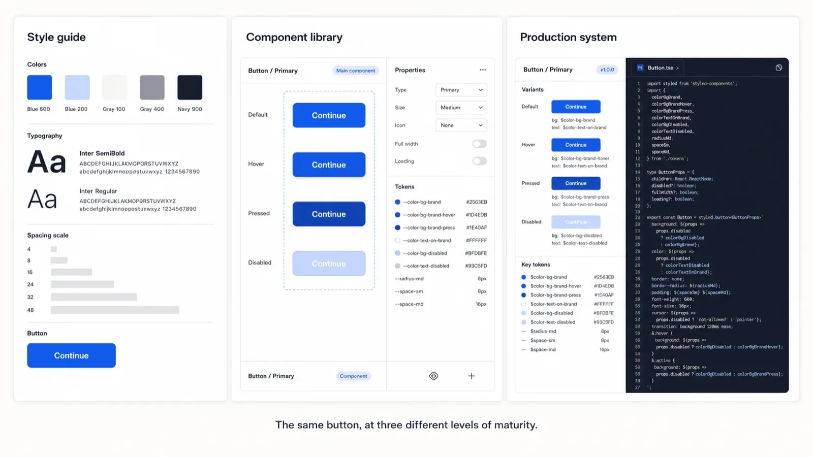
A style guide documents static visual identity standards - colors, typography, brand voice, spacing scale. It's the foundational layer, and for most early products, it's also the correct stopping point. In practice, this often looks like a single Figma page or a short doc listing your 4-6 brand colors, two font families, and a basic type scale nothing more elaborate than that.
What Is a Component Library? Modular UI Building Blocks
A component library is a collection of reusable UI elements - buttons, inputs, dropdowns, modals - built to be assembled into real interfaces. A Figma library without a coded package is worth calling a UI kit, not a design system. Designers frequently call a centralized Figma file "a design system," and that terminology undersells the real distinction: until design decisions exist as production tokens (--color-primary-500) mapped directly to a versioned package like an NPM React module, it's a design-side artifact only. Without code parity, a design library creates an illusion of consistency that breaks the moment engineering starts building.
What Is a Design System? Living Product Infrastructure
A design system is comprehensive, living infrastructure - style guidelines alongside coded component libraries, design tokens, interaction patterns, accessibility standards, and operational governance for production software. It's not a bigger UI kit; it's a different category of artifact entirely, one with versioning and maintenance obligations a static file never has. A real-world example: something like Shopify's Polaris or Google's Material Design - tokens, coded components, documented patterns, and a governance process, all versioned and maintained as a living product.
Direct Comparison: Scope, Ownership, and Technical Deliverables
| Category | Style Guide | Component Library | Design System |
|---|---|---|---|
| Purpose | Visual rules | Reusable components | Complete product infrastructure |
| Lives in | Brand doc, PDF, or Figma page | Figma + code package | Figma + versioned code + docs |
| Code required | No | Optional | Yes |
| Ownership | Brand | Design + Dev | Cross-functional |
| Right for | Pre-product-market-fit startups | Single-team products with real code needs | Multi-squad, multi-product orgs |
The Overengineering Trap: Why Most Teams Build the Wrong Layer Too Early
The Hidden Cost of Premature Design Systems in Early-Stage Startups
Early-stage startups should usually avoid building a full custom design system until product complexity justifies the maintenance cost. Common advice suggests establishing one early ensures long-term scalability for pre-revenue or early-stage companies, that guidance tends to backfire. A custom design system requires dedicated governance, continuous versioning, and cross-functional maintenance overhead that competes directly with the speed a startup actually needs. A lean style guide with core design tokens, paired with an off-the-shelf component library, is generally sufficient until scaling past multiple product squads.
Static style guides for digital products tend to become dead artifacts fast. PDF brand guidelines and documentation sites that lack live code examples or design tokens don't hold up well for modern SaaS. They struggle to document state transitions, hover interactions, screen reader accessibility attributes, or responsive breakpoints - a brand marketing team can produce a 50-page PDF guideline that lives in Google Drive and gets referenced by zero designers or engineers during actual sprint planning.
When to Use a Style Guide vs. When to Upgrade to a Design System
Here's what getting this wrong looks like on a real project. A pre-revenue fintech startup needs to launch an MVP analytics dashboard within six weeks to secure seed funding. The incorrect approach: the lead designer spends four weeks building a custom 50-component Figma library from scratch, setting up complex token taxonomies and a dedicated documentation site. The correct approach: define a lightweight style guide - four brand colors, two font families, a basic spacing scale - adopt an open-source React component library like Shadcn UI or Tailwind UI, and map brand colors via basic CSS variables. The team ships the functional MVP in three weeks instead, gathering real user feedback while preserving critical engineering runway.
The inverse failure shows up at scale. A Series B SaaS platform acquires two complementary web applications, resulting in fragmented visual identities and inconsistent user experiences. The incorrect approach: the brand team circulates a static 60-page PDF style guide and instructs each product team's engineers to manually update their application styles. The correct approach: extract common visual styles into a centralized design token repository, publish a single version-controlled React component library, and host living Storybook documentation. Visual updates then propagate across all applications automatically via token releases, instead of three separate manual passes.
Pattern libraries tend to deliver higher ROI than obsessively polished component libraries. Organizations often spend excessive energy perfecting individual atomic components - button variants, badge padding while ignoring higher-level interface patterns like empty states, onboarding flows, or data filtering bars. A user experience rarely breaks because a button's padding is off by two pixels; it breaks when navigation flows and layout patterns are inconsistent across screens. Without a unified pattern library, three different feature squads can build three distinct modal dialogs with inconsistent padding, hover behavior, and mobile responsiveness redundant work that a shared pattern layer would have prevented entirely.
Signs You Actually Need a Design System
A useful checklist for the "am I actually past the style-guide stage" question:
- Multiple teams keep building the same components independently, with no shared source of truth
- UI inconsistencies keep appearing across screens or products despite everyone "following the same guide"
- Developers manually recreate designs instead of pulling from an existing, coded component
- A single brand update (a color, a font) requires touching dozens of files by hand
- Product variants or sub-products are increasing, and visual divergence between them is becoming a real problem
If none of these are true yet, a lean style guide and an off-the-shelf component library are almost certainly still the right call.
The Technical Execution Pipeline: Connecting Design Tokens to Code
Bridging Figma Component Libraries to Production Code Repositories
The transition from visual identity to a scalable product follows three real stages:
- Stage 1 - Establishing visual foundations. Define brand assets, color palettes, typography scales, and accessibility contrast standards. Extract those choices into design tokens named variables representing exact values, stored as JSON or CSS (--color-brand-primary: #FF4F01).
- Stage 2 - Constructing reusable UI assets. Build modular component sets in Figma while engineering writes matching component packages in production code. Compose individual components into higher-level pattern libraries representing common interactions - login modals, navigation bars.
- Stage 3 - Operationalizing product architecture. Once multiple product squads need synchronized updates, elevate assets into a living design system combining style guides, coded component libraries, pattern documentation, and automated testing (Storybook is the common example), managed via semantic versioning and continuous deployment.
Getting Stage 1 right matters more than teams usually budget time for a rushed color palette or an unchecked contrast ratio here becomes expensive to fix once components are built on top of it. UXMagic's Style Guide Generator automates this foundational step directly, generating colors, typography, and spacing as a structured token system rather than a static reference doc. If you're building that palette manually first, this roundup of UI color palette generators covers the tools that actually produce real 50–950 tonal scales instead of five disconnected swatches. And since accessibility contrast standards are part of this same foundational layer, running the result against the accessibility heuristics checklist before moving to Stage 2 catches contrast and legibility problems while they're still cheap to fix not after they're baked into forty component variants.
Pattern Libraries: Connecting Atomic Components to Multi-Screen Flows
Tokenless maintenance is a real, recurring failure mode. Every time marketing tweaks a secondary brand color, developers end up manually searching and replacing hex values across dozens of CSS files because the team published a static visual style guide instead of enforcing design tokens as the actual source of truth.
Modern AI Workflows: Automating UI Flow Generation Within Design Constraints
Component parity delusion is one of the more common handoff failures. Designers assume that creating component variants in Figma automatically equates to a functional component library, causing real friction during developer handoff when interaction states are simply missing from the design file.
Generic AI tools attempting to bypass real UI design work tend to fail in production for three consistent reasons: token ignorance (hardcoded hex values like #3B82F6 instead of --color-primary-500, creating instant design system drift), non-standard DOM generation (arbitrary HTML/CSS instead of established, accessible component variants), and multi-screen inconsistency (mismatched font scales and irregular padding across a user journey).
While building a full component library in Figma requires manually constructing auto-layout frames and variant sets, UXMagic bypasses that manual drag-and-drop assembly. Product managers and designers can input text prompts alongside explicit style guide parameters, generating multi-screen UI flows that automatically respect established design tokens and layout grids instead of a prompt that hallucinates its own color values.
Early-stage teams often stall feature development specifically because building a comprehensive Figma library takes weeks. UXMagic's Flow Mode lets teams generate end-to-end, visually consistent user journeys without engineering a massive design system upfront bridging the actual gap between a lightweight style guide and a fully coded production application, which is exactly the gap the fintech MVP scenario above fell into by building the wrong layer too early. For teams ready to formalize the pipeline once product-market fit is real, structuring consistent design tokens across a SaaS dashboard covers the next stage of that discipline.
Generate Token-Consistent UI Flows Faster
Create multi-screen product flows from a lean style guide and prompt with consistent design tokens, without building unnecessary component libraries upfront.