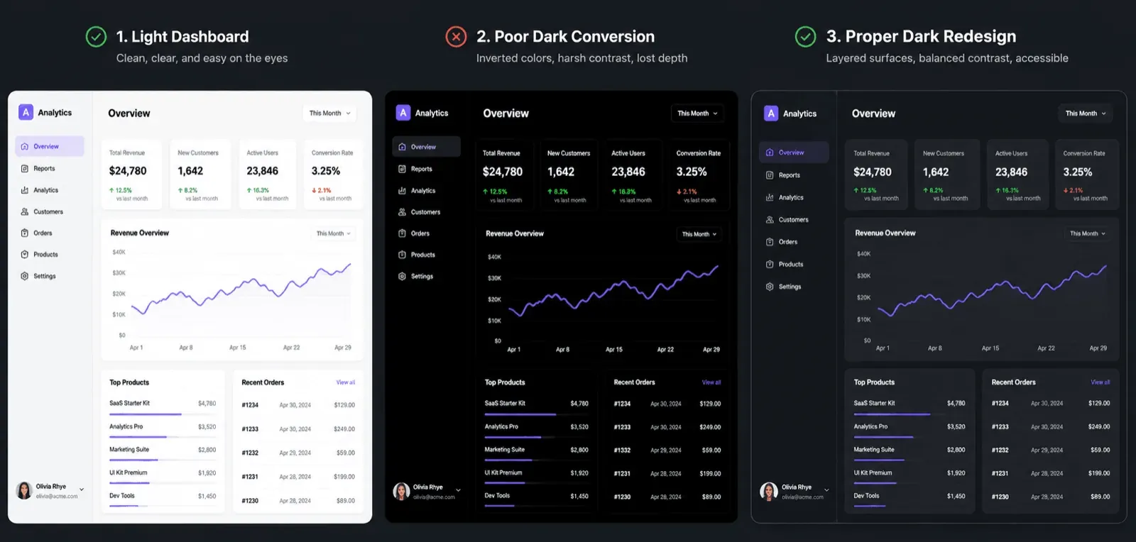
Direct color inversion is the fastest way to ruin a dark theme and drive users away from an application. Swapping light hex values for absolute black creates unreadable, vibrating components that fail fundamental accessibility audits. High-performing dark UIs rely on stepped surface luminance and semantic token architecture to maintain visual clarity across screens, not a global "invert" filter and a prayer.
You already understand contrast ratios, color theory, and standard light-mode UI conventions. This isn't a primer on what a hex code is. It's the exact luminance steps, token structure, and CSS primitives that separate a dark mode that ships from one that gets reverted after the first accessibility review.
Poor Dark Mode vs. Production Dark Mode
| ❌ Poor Dark Mode | ✅ Production Dark Mode |
|---|---|
| Pure black background (#000000) | Layered dark grays (#121212 base) |
| Bright white text (#FFFFFF) | Off-white text at 87% opacity |
| Flat cards, no depth cues | Proper elevation via surface stepping |
| Vibrating, oversaturated colors | Desaturated, luminance-boosted semantic colors |
Why Direct Hex Inversion Fails UI Systems
The Science of Optical Halation and Strain
Pure black canvas backgrounds are worth treating as an anti-pattern, not a default. Pitch-black pixels offer minor power savings on OLED displays, but using #000000 as a universal background introduces extreme contrast that causes optical halation and text bleeding. High-luminance white text against a pitch-black canvas causes light bleed across the human corneal lens, leading to blurred letterforms and accelerated eye fatigue during extended sessions.
Professional dark interfaces use dark grays - #121212 or #0F0F0F as the base surface, reserving pure black strictly for high-immersion media playback or specific OLED power-optimization modes.
The Collapse of Spatial Depth
Flipping white backgrounds directly to black and black text to white breaks more than contrast. Cards, dropdowns, and floating modals flatten completely because drop shadows are invisible on dark backgrounds - ambient light physics can't render a shadow darker than an already pitch-black surface, eliminating any visual distinction between canvas, card, and modal overlay.
Spatial Elevation: Designing Depth Without Drop Shadows
Stepped Surface Luminance Framework
In most dark interfaces, stepped surface luminance is more reliable than traditional drop shadows for communicating depth. Casting a drop shadow on a dark background runs into a basic light-physics problem - a shadow can't render darker than an already near-black surface. In dark mode, depth gets communicated instead by increasing the surface luminance of elevated elements - floating cards, dropdowns, and modals get progressively lighter as they move closer to the user.
Quick reference - surface elevation table:
| Layer | Example Value |
|---|---|
| Base canvas | #121212 |
| Card (primary elevation) | #1E1E1E |
| Modal (secondary elevation) | #2A2A2A |
| Border (subtle separation) | rgba(255,255,255,0.08) |
The practical rule: set the base canvas to a low-luminance dark gray, step primary elevated surfaces (cards, sidebars) up 5%–8% brighter, and step secondary elevated surfaces (dropdowns, popovers, floating modals) another 5%–8% above that. Where the luminance shift is subtle, apply the low-opacity light border above to maintain structural separation.
Opacity Tiers for Text and Components
Text and interactive elements need their own structured opacity tiers, not reused light-mode values. High-emphasis body text sits at 87% opacity, medium-emphasis text at 60%, and disabled states at 38%. Applying static alpha-transparency values that worked fine in light mode produces unpredictable contrast and muddy hover states once the underlying surface luminance changes.
Semantic Token Architecture for Multi-Theme Scaling
Decoupling Token Names from Hex Values
Descriptive token names can seriously undermine system maintainability. A color token system named after visual values rather than functional roles tends to fail the moment a second theme gets introduced. A token named gray-100 that represents a light surface in light mode becomes an actual dark value in dark mode - the variable name is now lying about what it holds, and every developer touching it has to remember the exception.
Reference Tokens vs. Semantic Alias Tokens
The fix: adopt mode-agnostic semantic aliases --surface-base, --text-primary, --interactive-default instead of descriptive names tied to a specific appearance. A single-source-of-truth mapping table connects global reference palette values to these mode-specific aliases, so switching themes means remapping the alias, not hunting down every hardcoded hex value across the codebase.
Rather than defining these tokens by hand for every project, UXMagic's Style Guide Generator generates the full spacing, typography, and color token system directly from a prompt, screenshot, or URL including the semantic structure this section argues for, so light and dark values stay tied to the same functional role instead of drifting apart across two separately maintained palettes.
Color Calibration: Desaturation and Brand Preservation
Adjusting Primary Accent Luminance
Saturated brand accents tend to vibrate against dark surfaces, and this is a failure teams often notice too late. Primary brand colors designed for light interfaces appear overly intense and visually aggressive when placed unadjusted on a dark surface, often failing WCAG AA compliance outright.
The fix: reduce accent saturation by 20%–30% and boost luminance until it clears the contrast threshold. A fintech startup with a high-saturation electric blue (#0055FF) brand color hits exactly this wall placed directly on a #121212 card, that blue fails accessibility audits with a contrast ratio below 3:1, appearing muddy rather than vibrant. Mapping the brand token to #4A9EFF for dark mode instead boosting luminance while preserving the hue achieves a 5.2:1 contrast ratio that reads cleanly without glare.
Accessible Status and Data Visualization Colors
Here's what this looks like on a real dashboard. A product team converting a dense analytics dashboard data tables, cards, complex charts from light to dark mode via direct hex inversion ends up with a pure-black canvas, vanished card borders, halation-inducing pure-white body text, and bright green/red status indicators vibrating aggressively against the dark surface.
The architected version instead sets the canvas to #121212, steps cards up to #1E1E1E and modals to #2A2A2A, uses 87% off-white opacity for body text, and desaturates chart data colors by 25% while still holding WCAG AA compliant contrast - same data, same brand, none of the visual harshness. This kind of systematic contrast checking is exactly what belongs in a broader review pass - see the full accessibility heuristics checklist for the rest of what a real audit should cover beyond color alone.
Modern Production Implementation in CSS
Leveraging color-scheme and light-dark()
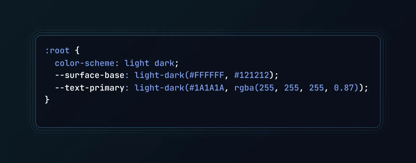
Modern CSS primitives are making duplicated media query blocks largely unnecessary. Relying on manually duplicated CSS wrapped inside separate media queries introduces real styling redundancy. Declaring color-scheme: light dark; on the :root element enables native browser form-control styling automatically, and the light-dark() function lets you declare both mode values inline, in a single property, without repeating selector blocks:
System Preferences and Manual Switch Overrides
Bind root system preferences using @media (prefers-color-scheme: dark) as the default behavior, while providing an explicit override attribute - data-theme="dark" so users can manually switch regardless of their OS setting. Skipping the manual override is a common oversight that quietly annoys any user whose system preference doesn't match what they actually want inside your specific product.
Pre-Launch WCAG Testing Checklist
Run every dark theme against this before calling it shipped:
☐ Text contrast checked - minimum 4.5:1 for standard body text, 3:1 for large text and interactive boundaries (WCAG 2.2)
☐ Buttons tested - primary and secondary actions hold contrast against their surface, not just the canvas
☐ Focus states verified - keyboard focus rings remain visible against every elevation tier, not just the base canvas
☐ OLED/LCD tested - rendering checked across both true-black OLED emission and traditional LCD panels for color shifting or banding
☐ Status colors adjusted - success/error/warning indicators desaturated and luminance-boosted, not reused from light mode unadjusted
Automating Dark Theme Flows with UXMagic
Multi-screen dark mode conversion is where manual workflows tend to fall apart fastest. Redesigning an entire 12-screen onboarding flow for dark mode by hand can realistically take two full sprints of frame-by-frame tweaking and that's before accounting for the visual drift that creeps in between screen 3 and screen 9 once fatigue sets in.
A founder prototyping a 5-screen dark-mode onboarding flow for an AI SaaS platform hits this directly if done manually: re-skinning each screen individually in Figma produces inconsistent surface grays across screens, broken focus states, and mismatched input field borders the same elevation rule applied slightly differently five separate times. Using UXMagic's Flow Mode instead, a single prompt generates all five connected screens directly in dark mode, maintaining the same spatial elevation rules, desaturated status colors, and semantic tokens across the entire flow simultaneously with no screen-by-screen drift to catch in review.
Generic AI image and layout generators frequently produce inconsistent background grays and mismatched surface levels across consecutive prompts, which is exactly the problem a deterministic system solves. This is the same underlying gap covered in how designers are actually using AI in production workflows; the tools worth trusting are the ones enforcing consistency automatically, not the ones generating a new guess every prompt. UXMagic applies the same luminance elevation steps - +5% to +8% per surface tier automatically, so cards, dropdowns, and navigation bars hold visual depth without manual tweaking screen after screen. Dark mode treated as a first-class system context from the start, rather than a re-skin bolted onto a finished light design, is what keeps a multi-screen flow from fragmenting the way manual conversion tends to.
Generate Consistent Dark Mode UI Flows Faster
Create complete dark-mode product flows with consistent surface luminance, semantic tokens, and design system rules applied from the first screen.