
TL;DR
The best mobile app wireframe examples reveal hierarchy, navigation, actions, and edge states without looking like polished mockups in grayscale. We break down 11 essential screens, connect them into complete journeys, and explain when to use low- or mid-fidelity wireframes. Treat these structures as hypotheses to test, not layouts to copy unchanged.
Mobile App Wireframe Examples: 11 Screens With Decisions Explained
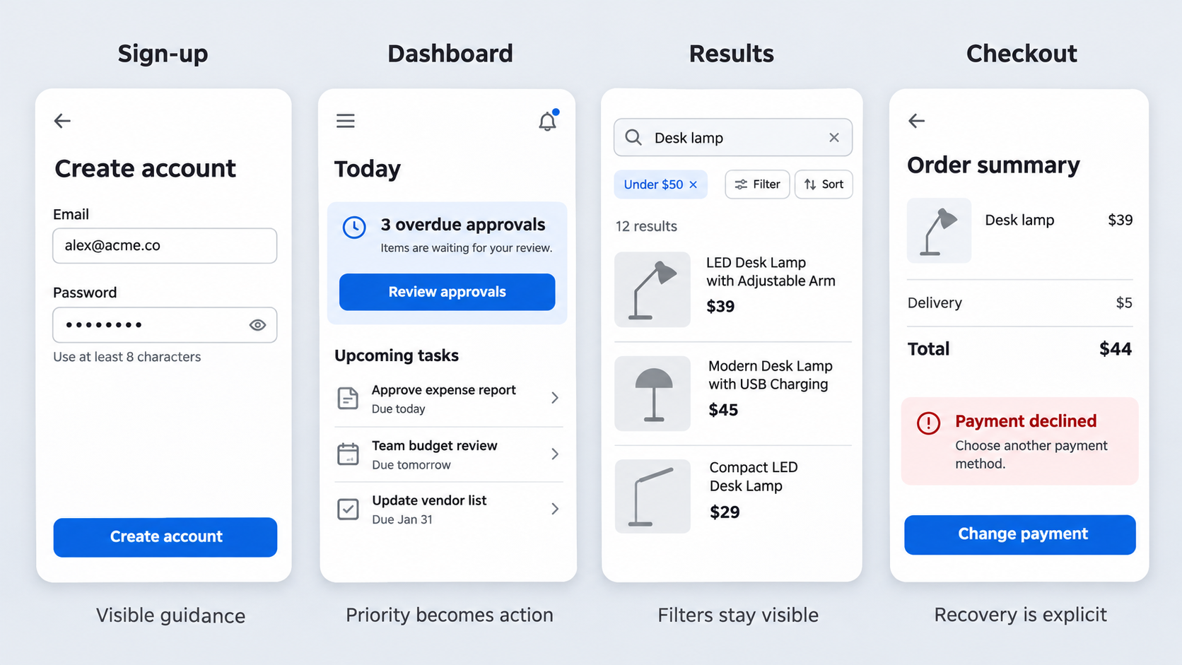 More detail does not automatically make a wireframe more useful. When typography, iconography, spacing, and components look final, reviewers tend to discuss decoration instead of structure.
Our examples remain deliberately low or mid fidelity. We evaluate each mobile app wireframe sample using the same criteria:
- User goal: What the person wants to accomplish.
- One-screen job: The screen’s primary purpose.
- Primary CTA: The action that moves the journey forward.
- Hierarchy: What people should notice first, second, and third.
- Navigation: How they arrive, leave, or move elsewhere.
- Thumb reach: Whether frequent actions are comfortably accessible.
- Edge state: What happens when content is missing, delayed, denied, or unavailable.
- Rejected alternative: A plausible structure we would avoid.
Here is our visual index:
| Screen | Fidelity | One-screen job | Primary CTA | Essential edge state |
|---|---|---|---|---|
| 1. Onboarding | Low | Explain immediate value | Continue | Skip or revisit |
| 2. Sign-up | Mid | Create an account | Create account | Validation failure |
| 3. Home | Low | Direct the next frequent task | Start task | First-use state |
| 4. Dashboard | Mid | Turn status into action | Resolve priority | Data unavailable |
| 5. Search | Low | Capture specific intent | Submit search | No recent searches |
| 6. Results and filters | Mid | Compare relevant options | Open result | No results |
| 7. Detail | Mid | Support a decision | Select or continue | Unavailable item |
| 8. Checkout | Mid | Complete a purchase | Place order | Payment failure |
| 9. Messaging | Low | Continue a conversation | Send | Offline message |
| 10. Profile | Mid | Review or edit identity data | Save changes | Invalid input |
| 11. Settings | Low | Control preferences | Apply change | Permission denied |
These are starting structures. Product goals, content depth, usage patterns, platform conventions, and business rules should shape the final layouts.
Onboarding and Sign-Up Wireframe
An onboarding wireframe should communicate enough value to earn the next action. We favor a short sequence with visible progress, a consistent Continue action, and a clear Skip option for nonessential steps.
Permission requests should appear when their purpose becomes relevant. Requesting access to notifications, location, contacts, and the camera before explaining the benefit creates interruption without context.
The sign-up screen should contain required fields, visible labels, password guidance, validation, and account recovery. A complete login form wireframe should also cover invalid credentials, locked accounts, loading, password reset, and connection failure.
- Hierarchy: Value statement, required input, primary CTA, alternate sign-in.
- Navigation: Back navigation preserves completed information.
- Thumb reach: Continue remains near the lower interaction area.
- Rejected alternative: One long screen combining education, permissions, profile setup, and registration.
One action per screen does not mean one control. It means one unmistakable outcome supported by secondary options that do not compete with it.
Home and Dashboard Wireframes
A focused home screen reflects the user’s most frequent intent. It might prioritize continuing a lesson, checking a delivery, logging a workout, or responding to an assigned task.
An overloaded home screen gives metrics, promotions, shortcuts, feeds, alerts, and product features equal weight. That pushes prioritization work onto the user.
A dashboard should turn information into a next step. For example, “3 overdue approvals” becomes more useful when paired with Review approvals rather than displayed as an isolated metric.
- Hierarchy: Current priority, supporting context, secondary destinations.
- Navigation: Reserve bottom navigation for frequently accessed peer-level areas.
- Thumb reach: Keep frequent actions within comfortable reach.
- Edge state: Define first-use, stale-data, and unavailable-data states.
- Rejected alternative: Equally prominent cards for every feature.
We prioritize content by user intent, task frequency, urgency, and consequence—not by which internal team requests the largest module.
Search, Results, and Filter Wireframes
A search-first wireframe should show a prominent field, recent searches, useful suggestions, and a route to browse. Autocomplete should help people form valid queries rather than merely repeat popular terms.
Results need enough content for comparison. Compact lists suit text-heavy choices, while cards work when imagery or visual attributes affect the decision.
Filters and sorting should expose active selections and make them easy to clear. A no-results state should retain the query, identify restrictive filters, and offer recovery actions.
- Primary CTA: Search, apply filters, or open a result.
- Navigation: Returning from a detail page preserves position.
- Thumb reach: Filter and sort controls remain accessible.
- Edge state: No history, no results, loading, or limited connectivity.
- Rejected alternative: Hiding essential filters behind an unlabeled icon.
Browse-first layouts support exploration. Search-first layouts suit specific intent. Combining them without establishing priority often weakens both.
Detail, Checkout, Messaging, Profile, and Settings Wireframes
A detail screen should answer the questions required for one decision. We use realistic titles, descriptions, prices, metadata, and availability because generic placeholders hide wrapping and hierarchy problems.
A persistent CTA can help on long pages, provided it does not cover content or conflict with system controls. Progressive disclosure keeps secondary specifications, policies, and advanced information available without crowding the initial view.
Checkout should connect cart review, address, delivery, payment, confirmation, and order status. Messaging needs conversation context, send status, attachment behavior, and failure recovery. Profile and settings screens should separate identity data from security, permissions, notifications, and destructive controls.
- Navigation: Define back, cancel, discard, and save behavior.
- Thumb reach: Keep the composer and transaction CTA accessible.
- Edge states: Sold out, payment rejected, offline send, invalid field, and permission denied.
- Rejected alternative: One long settings page without grouping or search.
Three Complete Mobile Wireframe Flows—Not Disconnected Screens
Individual screens can appear reasonable while the wider journey contains gaps. We review entry points, transitions, back behavior, cancellation, confirmation, interruptions, and recovery as one system.
Start with a compact map:
Entry → decision → action → validation → success → next step
Branches should include errors, cancellation, skipped steps, and resumable states. Our mobile wireframe flow system explains how to connect screens without losing state.
Onboarding to Activation
A practical flow could be:
Value proposition → account setup → personalization → contextual permission → first task → success
Optional personalization should be skippable and revisitable. Defer permissions until a feature needs them, then provide an alternate route or system-settings guidance after denial.
Activation should end with a meaningful result, not just “setup complete.” Show the created project, saved preference, scheduled task, or another sign that the product is ready.
Browse to Purchase
A purchase flow might follow:
Browse/search → results → detail → cart → address → payment → confirmation → order status
A persistent detail CTA can work when substantial information precedes the decision. Bottom sheets suit compact choices such as size or quantity, not long address forms or nested configurations.
Payment failure should preserve the cart, address, and valid information. Recovery should explain the problem, support retry or another method, and reduce the risk of duplicate orders.
Dashboard to Task Completion
A task flow can connect:
Dashboard alert → prioritized task → form or action → review → confirmation → refreshed dashboard
Define what happens when someone leaves midway, loses connectivity, submits invalid data, or completes the task elsewhere. Make save-and-resume behavior explicit.
After success, offer a relevant next step: view the result, handle another task, or return to the updated dashboard.
Low Fidelity vs. Mid Fidelity: Use Only the Detail the Decision Needs
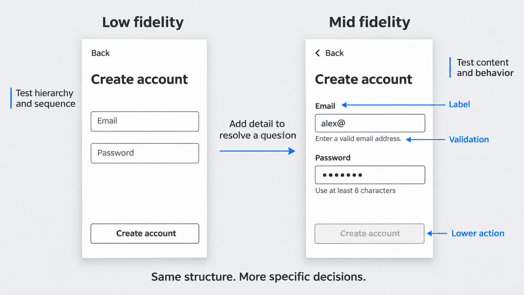 A wireframe exists to test structure, content, navigation, and behavior. Turning a finished interface gray does not make it a wireframe.
| Version | Includes | Questions it can answer |
|---|---|---|
| Low fidelity | Blocks, labels, arrows, step order | Is the sequence logical? Is anything missing? |
| Mid fidelity | Real fields, errors, spacing logic, component states | Is the form clear? Will content fit? Is behavior defined? |
We increase fidelity only when added detail resolves a product, usability, or implementation question.
Choose Low Fidelity for Exploration
Use rough blocks, direct labels, and flow arrows when comparing hierarchies or navigation models. Alternatives should remain inexpensive to reject.
Keep styling unresolved. If a review turns into a debate about fonts or corner radii, the artifact contains more detail than the current decision requires.
Choose Mid Fidelity for Validation and Handoff
Add realistic content, component states, interaction notes, and spacing logic when testing comprehension or discussing feasibility. Forms should show labels, input expectations, validation, and disabled or loading behavior.
Stop before polished typography, brand colors, illustrations, and decorative icons redirect the feedback. Mid fidelity clarifies behavior; it does not imply that visual design is finished.
How to Choose the Right Mobile Layout Pattern
A mobile layout should respond to intent, information depth, action frequency, and device constraints. Patterns are design decisions, not interchangeable components.
Each screen should usually have one dominant job. Secondary actions can remain available without competing with the intended next step.
Tab Bar, Back Stack, or Single-Action Flow
Use a tab bar for frequently accessed peer-level destinations. Preserve each destination’s state when continuity is expected.
Hierarchical navigation works when people move from collections into categories, details, and supporting information. Single-action flows suit focused tasks such as checkout, account recovery, or publishing.
We avoid persistent global navigation in every transactional step because it creates escape routes when focus matters.
Cards, Lists, and Search-First Layouts
Lists provide density and efficient comparison. Cards work when imagery, status, or grouped visual context affects the decision.
Search-first layouts suit specific intent; browse-first layouts support discovery. Test realistic text, long titles, localization, status labels, and one-handed reach before choosing.
For substantial content, apply long-scrolling UX principles so each section earns its place and essential actions remain discoverable.
Bottom Sheets, Steppers, and Progressive Disclosure
Bottom sheets work for limited contextual choices while preserving the underlying place. They are poor containers for long tasks, multiple hierarchy levels, or information that must remain visible for comparison.
Use steppers when sequence and progress matter. Use progressive disclosure for advanced options, secondary explanations, and conditional fields.
Wireframe the States Most Galleries Leave Out
Happy-path-only wireframes are incomplete. Empty, loading, error, offline, and permission-denied states can change hierarchy, actions, and the viability of a flow.
Each state should preserve context, explain what happened, and offer a next step. Status should not rely on color alone; include readable text, meaningful labels, logical focus order, and usable touch targets.
Empty, Loading, and No-Results States
A first-use empty state should explain what belongs there and how to create it. Empty states caused by deleted content or active filters require different language and recovery.
Loading states should preserve the expected layout where practical. Skeletons can communicate progress, but they should not resemble active controls.
No-results screens should retain the query and filters, then suggest clearing filters, changing terms, or browsing a related category.
Error, Offline, and Permission-Denied States
Plan retry, save-and-resume, alternate routes, and system-settings recovery before visual polish. “Something went wrong” is inadequate when the product can identify an input, connection, permission, or service problem.
Place field errors beside the affected inputs. Preserve valid work when another field fails.
Offline states should distinguish blocked actions from actions that can be queued. Permission denial should explain the consequence without trapping the user.
Long Content and Accessibility Stress Tests
Replace tidy placeholders with long names, translated labels, multiline errors, large text, and realistic keyboard states. Test safe areas, keyboard overlap, orientation changes, and constrained widths.
Essential controls should remain understandable without icon recognition or precise gestures. We also check focus order and screen-reader labels while structural changes remain inexpensive.
iOS and Android Mobile Wireframe Examples
Core goals and information architecture can often remain shared across platforms. Navigation, back behavior, sheets, permissions, and interruptions may require separate wireframes.
iOS Structural Considerations
An iOS wireframe should account for navigation stacks, familiar back behavior, tab bars, sheets, safe areas, and keyboard movement. Full-screen flows and dismissible sheets create different cancellation expectations.
Include permission prompts and system interruptions in the journey. Show the context before a prompt and the recovery route after denial.
Android Structural Considerations
An Android wireframe should account for system back behavior, predictive back, bottom navigation, sheets, and varied device dimensions. Back navigation should not discard work unexpectedly.
Test resumed states after interruption, backgrounding, or reopening. Confirm that exits, unsaved changes, destructive actions, and completed submissions remain coherent.
Free Mobile App Wireframe Samples and Figma-Ready Setup
Templates can save setup time, but they remain editable hypotheses rather than finished answers. A useful starter file covers core screens and their critical states.
Adapt its content, navigation, action priority, platform behavior, and recovery logic. Do not copy a layout merely because its geometry looks plausible.
What a Useful Mobile Wireframe Template Should Include
A practical template includes:
- Realistic content with variable lengths.
- Primary, loading, empty, and error states.
- User-goal and CTA annotations.
- Connected flows and transition notes.
- Platform variants where necessary.
- Reusable inputs, lists, cards, navigation, and status components.
Organize frames by journey so reviewers can follow the task without reconstructing the sequence.
Set Up Wireframes in Figma
Name frames by journey and sequence, such as Checkout / 03 Payment / Error. Use components, variants, auto layout, constraints, and consistent spacing tokens so revisions propagate cleanly.
Keep wireframe components separate from final design-system assets. Test several viewport widths before moving validated structures through an AI-to-Figma workflow.
From Product Requirements to Wireframes With AI
AI can accelerate structural exploration, but the first output is not the answer. Our team still evaluates hierarchy, content, states, and product logic.
UXMagic turns a concise description of a screen or journey into an editable starting point through a simple rhythm: describe, design, and ship.
Describe the Screen, User, and Outcome
A useful prompt identifies:
- The user and immediate goal.
- Required content and realistic labels.
- Primary and secondary actions.
- Navigation context and platform.
- Content or device constraints.
- Loading, empty, error, offline, and permission states.
- The expected outcome and next screen.
Request the complete flow when the product question spans multiple screens.
Generate and Compare Starting Structures
Generate alternatives for hierarchy, navigation, content density, or CTA placement. Compare search-first and browse-first home screens instead of polishing the first output.
Assess each option against task frequency, information priority, reach, platform expectations, and edge states. Our AI UI generator speeds exploration without replacing design judgment.
Review, Refine, and Ship
Replace generic content, repair missing transitions, and add recovery routes. Test the connected journey before increasing fidelity.
Move validated structures into critique, an interactive prototype, Figma refinement, or implementation handoff. AI creates momentum; our team remains responsible for usability, accessibility, and logic.
Mobile App Wireframe Quality Checklist
Screen-Level Checks
- [ ] The screen has one dominant job.
- [ ] The primary action is visible and unambiguous.
- [ ] Secondary actions do not compete with it.
- [ ] Content and hierarchy reflect user intent.
- [ ] Frequent controls are comfortably reachable.
- [ ] Labels remain clear without icons.
- [ ] Long text does not break the structure.
- [ ] Edge states are defined.
- [ ] Back and close actions have predictable outcomes.
Flow-Level Checks
- [ ] Entry points and transitions are connected.
- [ ] Cancel, discard, and save behavior is explicit.
- [ ] Success leads to a meaningful next step.
- [ ] Errors have recovery routes.
- [ ] Interrupted work can resume where appropriate.
- [ ] Navigation and terminology remain consistent.
- [ ] Offline and permission-denied behavior is covered.
- [ ] Platform differences are documented.
Common Failures to Fix Before Mockups
Remove desktop layouts squeezed into mobile dimensions, overloaded home screens, competing CTAs, ambiguous icons, and inconsistent navigation.
Add missing loading, empty, error, offline, permission-denied, and validation states. Strip out decorative precision that encourages premature debates about color, typography, imagery, or icon style.
Turn Requirements Into an Editable Mobile UI
Use UXMagic’s free AI UI generator to describe the user, screen, actions, and edge states, then generate an editable mobile UI to compare, refine, and ship.