
TL;DR
An MVP prototype should not prove that we can design an entire product. It should test one risky assumption through a narrow, credible journey. We define the decision first, control the scope, choose only the fidelity the test requires, and document everything that is simulated.
What is an MVP prototype?
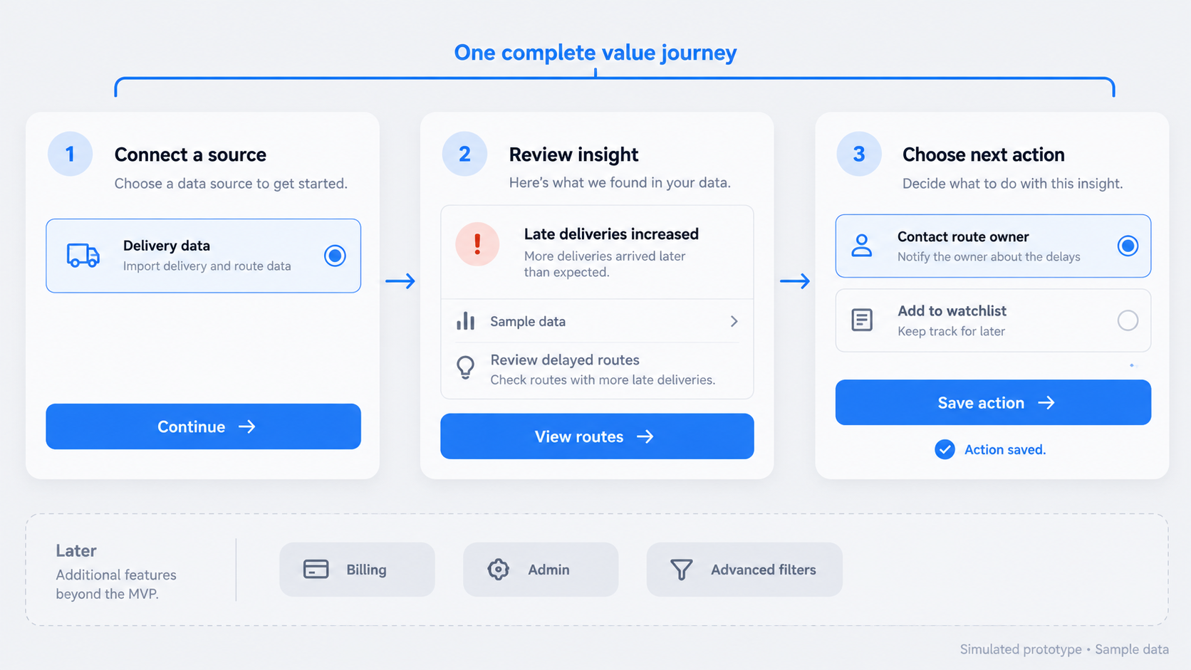 An MVP prototype is a testable representation of the smallest end-to-end product experience needed to evaluate a specific assumption. It helps us learn before committing to full implementation.
MVP stands for minimum viable product, but an MVP prototype is not necessarily released, coded, or fully functional:
- Minimum limits the scope.
- Viable preserves a meaningful user outcome.
- Prototype signals that interactions, data, or system behavior may be simulated.
An MVP and a prototype are not identical. An MVP is a usable product release; a prototype is a learning artifact. Our rule is simple: minimize scope, not the credibility of the journey.
What an MVP prototype should prove
A strong prototype helps us determine whether target users:
- Understand the intended value.
- Can complete the critical workflow.
- Recognize the result as useful or desirable.
- Encounter confusion that undermines the current direction.
The findings should support a decision: continue, revise, narrow, pivot, or stop. “People liked it” is not a useful decision threshold.
What an MVP prototype cannot prove by itself
Positive usability feedback does not establish market demand, willingness to pay, retention, scalability, or technical feasibility. Completing a simulated workflow shows only that the tested experience was understandable under the test conditions.
We separate observations from claims. “Participants understood the recommendation” is usability evidence. “The market will adopt this product” is a commercial conclusion that requires different evidence.
MVP prototype vs. clickable prototype, coded MVP, and proof of concept
Teams often use “MVP” as a catch-all label. Naming the artifact precisely prevents stakeholders from expecting production behavior from a simulated interface.
| Artifact | Purpose | Primary risk | Audience | Functionality | Fidelity | Evidence produced |
|---|---|---|---|---|---|---|
| MVP prototype | Test the minimum value journey | Usability and desirability | Target users, buyers, stakeholders | Mostly simulated | Low to high | Workflow and comprehension evidence |
| Clickable prototype | Test navigation and interaction | Interface clarity | Target users and stakeholders | Linked screens | Usually mid to high | Task-flow evidence |
| Coded MVP | Deliver usable core value | Adoption and operation | Real users | Functional | Production-oriented | Behavioral and operational evidence |
| Proof of concept | Test a technical approach | Feasibility | Engineers and technical stakeholders | Narrow technical implementation | Often visually basic | Technical feasibility evidence |
These categories can overlap. An MVP prototype may be clickable, but not every clickable prototype represents a minimum viable end-to-end experience.
Clickable prototype: Can users navigate the flow?
A clickable prototype uses linked or simulated UI to test comprehension, sequence, and interaction. We use it when evidence depends on whether people can move from a clear starting point to a meaningful result.
Clickability does not imply a working backend or release readiness. Our guide to building a clickable prototype for a startup explains how to scope, test, and present that distinction.
Coded MVP: Will users adopt a functioning release?
A coded MVP is a usable implementation with enough production behavior to deliver its core value. It introduces engineering, reliability, security, data, and operational requirements that a design prototype does not carry.
We recommend one when the evidence depends on real usage, performance, integrations, or sustained adoption rather than understanding a proposed workflow.
Proof of concept: Can the technology work?
A proof of concept tests whether a technical approach is feasible. It may validate an integration, model, data pipeline, or processing method without providing a polished user experience.
A technically successful POC can still produce an undesirable or confusing product. Feasibility and usability answer different questions.
Define the decision before designing the interface
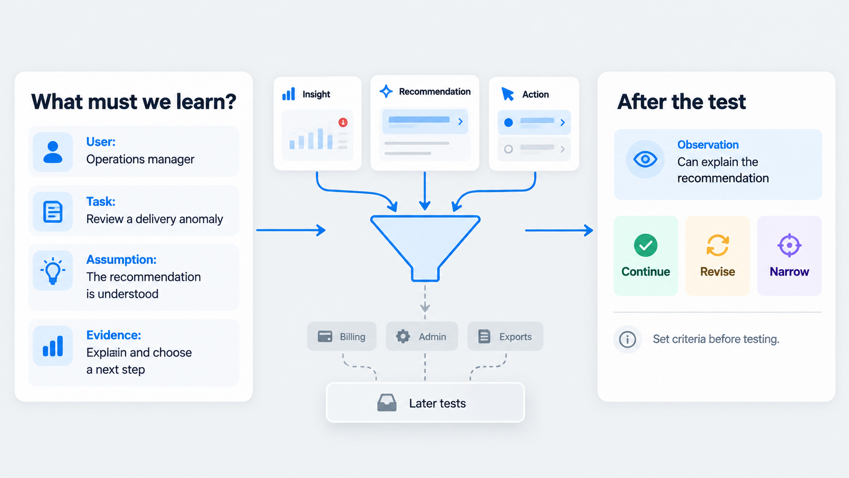 We start with the riskiest product assumption, not a feature list. The testable statement should identify the user, problem, action, expected value, and observable evidence.
For example: “Operations managers who receive an unexplained anomaly will understand the recommended action and choose an appropriate next step without assistance.”
Next, identify whose evidence matters: target users, buyers, internal operators, or stakeholders. Set the decision threshold before testing so vague comments cannot later be reframed as validation.
AI-generated UI can accelerate exploration. It cannot decide which product risk matters most.
Use a hypothesis-to-evidence scope matrix
Before opening a design tool, we define these fields:
| Field | Question |
|---|---|
| Hypothesis | What assumption are we testing? |
| Audience | Whose behavior provides valid evidence? |
| Decision | What will we do after the test? |
| Fidelity | How much realism does the evidence require? |
| Evidence required | What must participants understand or complete? |
Every proposed screen should map to this matrix. If it supports another hypothesis, we move it to a later test.
Choose one critical user journey
Select the journey most directly connected to the risky assumption and product value. Define its starting state, user goal, success state, and meaningful outcome.
We avoid merging unrelated use cases simply because they share a roadmap. A narrow end-to-end journey generally produces clearer evidence than a broad product tour.
Choose fidelity based on the decision
Higher fidelity is not automatically more useful. We recommend the lowest fidelity that allows participants to understand the scenario and provide trustworthy evidence.
Excessive polish can redirect feedback toward colors, typography, and microcopy before the workflow has earned validation. Consistent components and realistic content usually matter more than decorative completeness.
Use low fidelity for structure and direction
Sketches or basic wireframes work well for testing information architecture, sequence, and competing concepts. Limited visual detail keeps attention on structure and makes major changes easier.
Low fidelity becomes less useful when participants need realistic content, visual hierarchy, or contextual trust to understand the task.
Use mid fidelity for workflow and comprehension
Mid-fidelity prototypes add realistic hierarchy, components, labels, and representative content. In our experience, this is a practical default for many early MVP prototype tests.
The interface feels coherent enough to navigate without implying that every visual or functional detail is final.
Use high fidelity when realism affects the evidence
Increase fidelity when trust, dense interaction, accessibility, visual hierarchy, brand credibility, or stakeholder alignment affects the hypothesis.
High fidelity still does not mean functional completeness. A polished recommendation card may contain fixed data and predetermined behavior.
Scope the smallest credible end-to-end flow
Include the core happy path, essential states, realistic content, and a meaningful outcome. Exclude settings, secondary personas, speculative features, full administration, backend completeness, and exhaustive edge cases by default.
We add an exception only when it could change the build-or-pivot decision. Viability means demonstrating value, not recreating the roadmap in a design file.
Apply a practical screen budget
A focused flow may include:
- A context or entry screen.
- The screens required to complete the core task.
- A meaningful outcome screen.
- Any decision-changing exception states.
Every additional screen must strengthen the evidence for the primary hypothesis. When the flow expands, we replace or remove screens instead of continually adding them.
Use a scope filter for every proposed feature
A feature belongs only if it is required to:
- Start the journey.
- Complete the critical task.
- Understand the outcome.
- Test a decision-changing exception.
We move everything else to a clearly labeled later-learning or product-roadmap list. This preserves useful ideas without letting them dilute the current test.
Build an MVP prototype from brief to testable UI
Our recommended rapid workflow is define, scope, generate, connect, review, test.
Write the scenario and success criteria first. Then create only the UI permitted by the approved journey, maintaining consistent components, terminology, hierarchy, and realistic content.
Describe the journey
Capture the user, context, starting point, task, outcome, and constraints in a concise brief. State what must remain outside the prototype too.
A clear exclusion list matters. Without one, generation speed can turn optional ideas into apparently required screens.
Design the evidence path
Create the smallest screen set that lets a participant experience the intended value. Add loading, empty, success, or error states only when they affect comprehension or the decision.
With uxmagic.ai, our teams can describe a journey and generate consistent UI variants quickly. We use that speed to explore and standardize the selected path, not to expand its scope.
Ship a clearly bounded test artifact
Check links, component consistency, realistic content, and success-state clarity. Review the result against the hypothesis rather than the full roadmap.
We also attach a prototype contract stating:
- What the prototype tests.
- What is clickable.
- What is simulated.
- Which data is placeholder content.
- What is excluded.
- What evidence will trigger a build, revision, or pivot.
Two MVP prototype examples with controlled scope
A credible prototype can feel complete within one journey without representing a complete product.
B2B dashboard: From onboarding to a recommended action
Hypothesis: An operations manager can connect a source, understand the first generated insight, and act on the recommendation.
Included: Workspace onboarding, a data connection, a processing state, the first insight, and a recommended action. Realistic sample data helps participants assess clarity and value.
Excluded: Permissions, billing, broad integrations, advanced filters, exports, and complete data processing. Mid fidelity can provide enough context without suggesting production readiness.
We would examine whether users understand the insight, trust its presentation, and know what action follows. Our dashboard design decision framework offers further guidance for turning data into clear decisions.
Ecommerce: From discovery to checkout confirmation
Hypothesis: A shopper can find, evaluate, and purchase a suitable product without assistance.
Included: Product discovery, product details, cart review, checkout, a meaningful validation state, and confirmation. Use realistic descriptions, pricing, delivery information, and totals.
Excluded: Full account management, loyalty features, returns, order history, and exhaustive payment failures. Mid or high fidelity may be justified because product credibility, price clarity, and checkout trust affect the evidence.
Test the workflow without overstating what works
Give participants a realistic context and goal instead of guiding them through each screen. We observe completion, hesitation, wrong turns, comprehension, and reactions to the outcome.
When aesthetic comments dominate, we ask how the visual issue affected the task or decision. Simulated interactions and placeholder data should be documented clearly without disrupting the scenario.
Capture behavior, not just opinions
We prioritize observed actions over comments that the interface “looks good.” Findings should be separated into:
- Usability evidence.
- Desirability signals.
- Technical assumptions.
- Commercial claims.
Compare the results with the threshold selected before testing. Then recommend building, revising, narrowing, pivoting, or stopping.
Make simulation transparent
Document which interactions are clickable, which responses are predetermined, and which data was created for the scenario. For AI concepts, state whether outputs are generated live, curated, or fixed.
Never imply that a backend, automation, integration, or AI capability works when it is simulated. Realism supports testing; ambiguity misleads stakeholders.
Turn one risky assumption into testable UI
Define the decision, limit the scope, and generate only the journey needed to learn. Use uxmagic.ai to describe, design & ship a focused MVP prototype without turning it into the entire product roadmap.