
TL;DR
There is no universally accepted number of principles of design. We use nine—hierarchy, contrast, balance, alignment, proximity, repetition, proportion, movement, and white space—as a practical framework for evaluating interfaces. The goal is not memorization. It is to make actions clear, relationships understandable, and design decisions defensible.
What are the principles of design—and why do the lists disagree?
 Search for the principles of design and one source may give seven, while another gives nine, 12, or 13. These frameworks often divide, combine, or rename the same underlying ideas.
Design principles guide how we organize visual information. They help determine the order, position, size, color, spacing, and grouping of elements so people can understand a composition and act on it.
There is no official universal count. Models change with the medium, context, and teaching approach. Art frameworks may emphasize rhythm, pattern, and unity. Interface frameworks often give more attention to hierarchy, alignment, proximity, responsive behavior, and interaction states.
Many labels overlap:
- Emphasis often results from hierarchy and contrast.
- Rhythm can emerge from repetition, spacing, and movement.
- Unity may result from alignment, proximity, repetition, and consistency.
- Pattern is frequently treated as structured repetition.
- Scale and proportion are sometimes combined.
- White space may stand alone or sit within proximity and composition.
We recommend judging a framework by whether it improves decisions, not by how many terms it contains. Our nine-principle model is designed for dashboards, landing pages, forms, data tables, responsive websites, and mobile apps.
What are the 7 basic principles of design?
One representative seven-principle set includes:
- Balance
- Contrast
- Emphasis
- Movement
- Pattern
- Rhythm
- Unity
Other versions substitute hierarchy, proportion, repetition, or white space. That variation reflects how closely these concepts connect. A designer can create emphasis through contrast, hierarchy through proportion, and unity through repetition.
The useful question is whether the framework explains what people notice, how they interpret the composition, and where they go next.
Why do some sources list 9, 12, or 13 principles?
Longer lists usually separate concepts that shorter frameworks combine. Pattern and repetition may become distinct principles, for example, while emphasis and hierarchy receive separate definitions. Some lists add variety, harmony, scale, proportion, or typography.
More labels can add nuance, but they can also make critique harder. For UI/UX work, we prefer a compact set that reliably identifies interface problems. If a principle does not clarify a trade-off or change a decision, its label adds little value.
Elements of design vs. principles of design
Elements are what designers work with. Principles describe how those elements are arranged.
Common elements include line, shape, color, value, texture, space, form, and type. These lists also vary. Some models combine shape and form, omit typography, or classify space differently. UC Berkeley’s design fundamentals guide treats the concepts as broadly applicable rather than limited to one interpretation.
The same colors, typography, cards, and icons can produce either a focused interface or a confusing one. The difference lies in their hierarchy, contrast, alignment, and proximity.
Consider a button. Its color, shape, label, and typography are elements. Its prominence, position near a decision, and relationship to surrounding content reflect design principles.
This distinction matters because replacing an element rarely fixes a structural problem. Changing a button’s color will not repair a checkout screen where several actions compete equally.
A UI example: the same elements, a different outcome
Imagine two dashboards using the same type scale, colors, icons, cards, and navigation components.
On the first, every card is the same size, every number is bold, and several actions use the accent color. The design is consistent, but its priorities are unclear.
On the second, one key metric receives greater scale, related data is grouped, card edges align, and one next action carries the strongest emphasis. No new elements were added; only the arrangement changed.
A strong Figma component library provides dependable building blocks, but it cannot guarantee a clear experience. Designers must compose those blocks around the task and context.
A practical UI/UX framework: nine principles of design
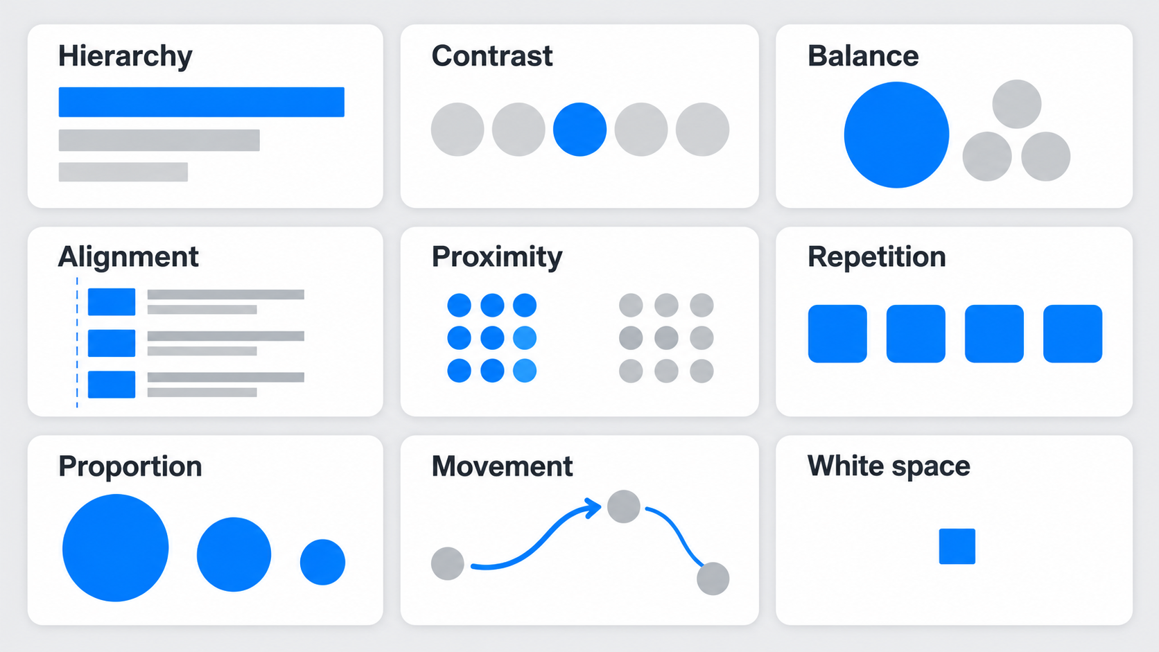 Our framework covers hierarchy, contrast, balance, alignment, proximity, repetition, proportion, movement, and white space. Together, these principles answer three questions:
- What gets noticed first?
- What appears to belong together?
- What should happen next?
- Hierarchy: make the next step unmistakable
Hierarchy controls scanning order through position, scale, weight, color, and spacing. It tells people what a screen is about before they read every detail.
Problems appear when supporting content overpowers the purpose or primary action. Promotional badges may dominate a headline, or several buttons may use identical emphasis.
We start by defining the intended sequence of visual signals. One element should lead, several should support it, and the rest should remain available without demanding immediate attention.
- Contrast: create meaningful difference
Contrast distinguishes importance, actions, sections, and states. It can come from color, size, weight, shape, spacing, position, or density.
More contrast is not always better. When every heading is oversized and every action is bold, nothing stands out.
Reserve the strongest contrast for differences that matter: a primary action, an error, a selected state, or an important exception. Supporting information should be quieter.
- Balance: distribute visual weight
Balance describes how visual weight is distributed. Size, color intensity, density, imagery, position, and surrounding space all contribute.
Symmetrical balance distributes elements evenly. Asymmetrical balance uses unequal elements that still feel stable and can create stronger direction. Radial balance organizes content around a center, although it is less common in application interfaces.
Balance does not require equal space. A large headline and CTA can be offset by a smaller but visually dense product image.
- Alignment: reveal structure
Alignment creates relationships through shared edges, baselines, grids, and axes. It helps people scan information and compare content.
Almost-aligned elements create friction. Mismatched card padding or labels beginning on inconsistent edges can make an interface feel unreliable.
We recommend setting deliberate rules: align comparable data, maintain consistent content edges, and use grids to coordinate sections. Alignment should expose structure, not merely satisfy a template.
- Proximity: show what belongs together
Proximity uses distance to communicate relationships. Nearby items tend to appear connected; larger gaps suggest separation.
Poor proximity often harms forms. A label may sit closer to the previous field than its own input, or an error may appear detached from its cause.
Treat spacing as information. Tighten space within a group and increase it between groups so relationships remain clear during quick scanning.
- Repetition: build recognition without sameness
Repetition creates familiarity through recurring styles, interaction patterns, spacing rules, and component behavior. People do not need to reinterpret each screen.
It becomes harmful when every section receives the same importance. A dashboard built entirely from identical cards may look cohesive while concealing the difference between monitoring and action.
Repeat shared rules, but vary size, density, or emphasis when the meaning changes.
- Proportion: signal relative importance
Proportion concerns size relationships among headings, controls, cards, images, data, and surrounding content. Larger elements generally attract more attention.
Problems arise when scale exceeds functional importance. A decorative illustration can dominate a sign-up form, while a promotion can overpower the task people came to complete.
Compare each large element with the screen’s goal. Proportion should make the content model visible before people start reading closely.
- Movement: guide the eye and the flow
Movement is the path created by sequence, direction, continuity, and motion. It can guide attention down a page, across a process, or from context to action.
Step indicators, progressive disclosure, directional imagery, and restrained animation can support movement. Decorative motion that competes with reading adds distraction and can create accessibility problems.
Our guidance on designing long-scrolling experiences explains how clear progression and meaningful transitions encourage the next scroll.
- White space: clarify relationships, not just aesthetics
White space separates groups, creates focus, and supports readability. It does not need to be white; it is simply unoccupied space.
More space is not always better. Excessive gaps can disconnect labels from fields, separate related cards, or push actions away from the decision point.
Keep connected content close, separate distinct sections decisively, and use generous space where focus matters. White space should clarify the interface, not merely make it look minimal.
How to spot broken design principles in real interfaces
Definitions matter only when they support diagnosis. We use this critique sequence:
- Identify the immediate user goal.
- Predict the intended visual sequence.
- Inspect which items appear related.
- Find competing visual signals.
- Connect each correction to an interaction outcome.
Feedback should be more specific than “cleaner” or “more modern.” A useful correction improves action discovery, scanning, comparison, error prevention, or flow comprehension.
Dashboard: everything has equal weight
Before: Identical cards and competing accent colors leave no dominant metric or action.
After: Emphasize the key metric, group secondary data, align comparable values, and reserve strong contrast for exceptions or decisions.
Landing page: every section demands attention
Before: The announcement bar, navigation, headline, illustration, badges, and several CTAs compete.
After: Establish one value proposition and primary CTA. Reduce the weight of navigation and supporting proof, then build a path from promise to evidence to action.
Form: fields look clean but relationships are unclear
Before: Large gaps disconnect labels, help text, inputs, and errors.
After: Tighten field-level proximity, separate logical sections, and place validation feedback beside the relevant control.
Mobile app: desktop balance collapses on a small screen
Before: Two desktop columns become an arbitrary vertical stack, placing secondary content before the task-critical action.
After: Reorder content around mobile task priority and use progressive disclosure for supplementary information.
Responsive design is not simply shrinking a layout. It requires rebuilding hierarchy for a different viewport, reading order, and interaction pattern.
Gestalt principles for clearer grouping and flow
Gestalt principles explain how people perceive relationships and complete visual patterns. They support rather than replace the broader principles of design.
Four ideas are especially useful in interfaces:
- Proximity: Nearby elements appear related.
- Similarity: Elements that look alike appear to share a role.
- Continuity: Aligned elements appear to follow a path.
- Common region: Items inside one boundary appear grouped.
These cues can create false expectations. If a link resembles a disabled label, people may assume neither is interactive. If unrelated controls sit inside one card, the container implies a connection that does not exist.
Proximity and common region: two ways to create groups
Proximity groups items through spacing. Common region uses borders, backgrounds, panels, or other visible containers.
Use the lightest sufficient cue. Spacing may connect a label and input without another card or divider. A common region works better when boundaries must remain clear in a dense layout.
Too many containers can flatten hierarchy because every group receives the same treatment.
Similarity and continuity: guide expectations
Similarity should signal shared purpose or behavior. Controls with the same style should behave comparably, while primary and secondary actions need enough difference to show priority.
Continuity directs scanning. Aligned steps, connected progress indicators, and consistent content edges make a process easier to follow. Similarity creates recognition; controlled contrast prevents repeated elements from appearing equally important.
Apply design principles with accessibility and responsive constraints
Accessibility informs every principle. It affects how we use contrast, hierarchy, typography, spacing, focus, movement, and interaction states.
Contrast should support readable content and recognizable states without relying on color alone. Hierarchy must survive zoom and reflow. Motion should respect reduced-motion preferences, while keyboard and semantic order should remain meaningful.
During critique, we check:
- Browser zoom and text scaling
- Keyboard navigation and visible focus
- High-contrast settings
- Reduced-motion preferences
- Narrow viewports and content reflow
- Touch-target spacing
- Semantic order versus visual order
Contrast that works beyond a color ratio
Accessible contrast extends beyond text against a background. Focus, hover, selected, disabled, success, and error states must also remain distinguishable.
Do not encode meaning through hue alone. Combine color with labels, icons, borders, patterns, or position. An error field might use a border change, message, and icon rather than depending only on red.
Rebuild hierarchy at each breakpoint
When sidebars collapse, grids stack, and actions move, the original hierarchy can disappear. Responsive design requires reprioritization rather than mechanical compression.
Check that visual, semantic, and keyboard orders remain aligned. After the layout changes, the screen’s purpose and primary action should still appear at the appropriate point in the task.
Design systems: repeat the rules, not every composition
Design systems operationalize principles through tokens, components, and interaction patterns. Spacing tokens support alignment and proximity, typography scales establish proportion, and component states create predictable contrast.
Useful consistency reduces interpretation. Sameness repeats a composition whether or not it fits the context.
Principles also strengthen component reviews. We can ask whether a component preserves hierarchy, communicates states, supports responsive behavior, and remains accessible—not just whether it resembles existing components.
When consistency should be broken
Break presentation consistency when an action carries exceptional importance, risk, or irreversibility, not for novelty. A destructive action may need distinct treatment, while a checkout decision may deserve stronger emphasis.
Keep behavior, terminology, and accessibility predictable. Document the reason for each exception so deliberate variation does not become arbitrary drift.
Controlled variety without visual drift
Controlled variety changes emphasis, density, or composition within shared tokens and rules. It lets a system respond to meaning instead of forcing every situation into one template.
If two variants mean the same thing, consolidate them. If different roles look identical, strengthen the distinction. A system should limit unnecessary choices while preserving enough flexibility for clear hierarchy.
How to critique AI-generated UI before you ship
AI can produce credible layout directions quickly, but visual polish does not guarantee clarity.
Design principles provide the quality-control layer between generation and production. Our workflow is to describe, generate, compare, critique, refine, test, and ship.
Compare each candidate against the same user goal, content, system, and constraints. This approach is central to an effective AI in UX design workflow.
Evaluate generated screens for:
- Task hierarchy and action clarity
- Grouping and information relationships
- Meaningful contrast
- Responsive behavior
- Accessibility across states
- Realistic content
- Design-system fit
An AI UI generator can accelerate exploration and produce editable directions. Designers still own the goals, trade-offs, critique, and final quality.
A six-pass AI interface review
Pass 1—task: Is the screen’s purpose and primary action clear?
Pass 2—hierarchy: Do the strongest visual signals match the intended sequence?
Pass 3—relationships: Are labels, controls, content, and feedback grouped correctly?
Pass 4—system: Do components follow established patterns, and do variations communicate real differences?
Pass 5—constraints: Does the design remain usable across states, input methods, zoom levels, and breakpoints?
Pass 6—simplify: Remove emphasis, containers, spacing, motion, or decoration that communicates nothing.
Reusable generation, editable layouts, and design-to-code support can shorten this cycle. Teams can review the available AI UI/UX design features based on where they need speed without outsourcing judgment.
Turn critique into stakeholder-ready rationale
Replace “it looks better” with an observable explanation: “This reduces competing emphasis so the submit action becomes the clearest decision.”
Strong critique identifies the user goal, relevant principle, observed problem, proposed change, and expected outcome. This gives designers, product managers, and engineers a shared basis for discussing trade-offs.
Principles of design checklist
Use this checklist during reviews, handoffs, and comparisons of generated UI:
- Hierarchy: Are the purpose and primary action clear?
- Contrast: Does each strong difference communicate importance or state?
- Balance: Is visual weight stable without flattening priority?
- Alignment: Do shared edges reveal structure?
- Proximity: Are related items visibly connected?
- Repetition: Do patterns build recognition without creating sameness?
- Proportion: Does size reflect functional importance?
- Movement: Does attention follow the intended sequence?
- White space: Does spacing clarify relationships?
- Accessibility: Do states work without color or motion alone?
- Responsiveness: Does task priority survive reflow?
Quick interface review checklist
Before approving a screen, ask:
- Can people identify its purpose and primary action without inspecting every element?
- Does each strong visual treatment reflect actual importance or state?
- Are related items more closely connected than unrelated ones?
- Does the layout remain understandable without color, motion, or desktop width?
- Is repetition building recognition or making every section look equally important?
If the answers are unclear, return to the user goal before changing decoration. Structural problems need structural corrections.
Describe, design, and ship with stronger judgment
Use UXMagic to generate editable, Figma-ready interface directions, compare them with our nine principles, and refine the option that makes the next action clearest. Start designing with UXMagic today.