TL;DR
A polished set of pages is not automatically a useful website prototype. We recommend prototyping the riskiest journey, including its branches and failure states, then choosing fidelity based on the question our team needs to answer. Generate the first pass quickly, connect and test it in Figma, and move to HTML only when browser behavior or technical feasibility matters.
What is a website prototype and what should it prove?
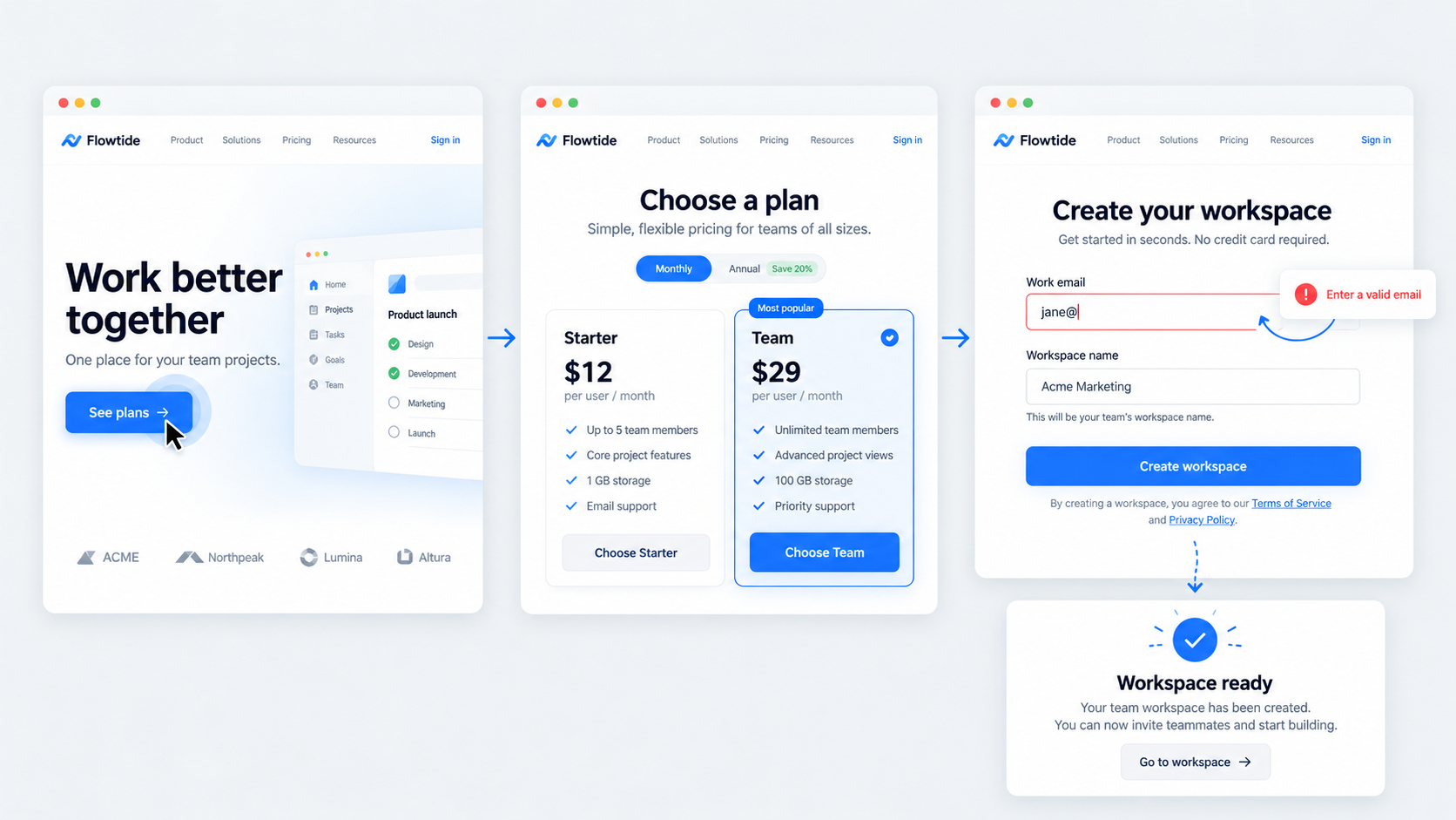 A website prototype is a testable representation of a site’s structure, content, navigation, interactions, and system states before production development. Unlike a static gallery, an interactive prototype shows how someone moves from an entry point to a meaningful outcome.
We judge quality by the question answered, not the number of screens. High fidelity can be counterproductive if visual polish leads reviewers to debate colors while overlooking confusing navigation, weak copy, or missing recovery paths.
AI can accelerate first-pass UI, repeated page patterns, and content creation. Designers still own journey logic, accessibility, hierarchy, edge cases, and the interpretation of test evidence.
Website prototype vs wireframe, mockup, MVP, and proof of concept
Each artifact reduces a different kind of uncertainty:
| Artifact | Primary purpose | Typical fidelity | Main uncertainty reduced |
|---|---|---|---|
| Wireframe | Define structure and hierarchy | Low | Where content and controls belong |
| Mockup | Establish visual direction | Medium to high | How the interface should look |
| Prototype | Test behavior and journeys | Variable | Whether a flow is understandable |
| MVP | Learn from real use | Production | Whether the product delivers value |
| Proof of concept | Verify feasibility | Task-specific | Whether a capability can work |
A prototype should behave convincingly enough to support valid observation. It does not need production architecture, live databases, or complete functionality unless those elements affect the research question.
How much fidelity do we need?
We use low fidelity to test information architecture, page sequence, labels, and early navigation. Rough screens also make structural changes easier.
We add realistic UI, copy, data, trust signals, and system states when testing comprehension or conversion. Production-level detail is worthwhile only when typography, motion, browser behavior, or visual credibility affects the outcome.
Scope the prototype website around the riskiest journey
Rather than prototype an entire sitemap, we select the journey whose failure creates the greatest user or business risk. We then include the minimum screens required to test it properly.
Define the starting context, user goal, happy path, critical branches, completion state, recovery paths, and exclusions. The same principle applies when creating a clickable prototype for a startup: scope around the decision the team needs to make, not the volume of UI it can produce.
Templates can accelerate structure, but they cannot supply product-specific content, permissions, hierarchy, or business rules.
Map pages, transitions, and states before designing
List each user decision and system response between entry and completion. A form may require entry, validation, submission, loading, failure, correction, and confirmation states—not just empty and completed screens.
We also map navigation, overlays, permission restrictions, unavailable states, errors, and recovery actions. This prevents disconnected screens from masquerading as a coherent prototype.
Set observable success criteria
Success criteria should describe behavior. Can participants identify where to start, understand the labels, make a choice, recover from an error, and complete the task without unnecessary help?
We keep preference separate from evidence. “The pricing cards feel plain” is an opinion. “Participants could not distinguish the plans” identifies a problem the team can address.
How to create a website prototype in 7 steps
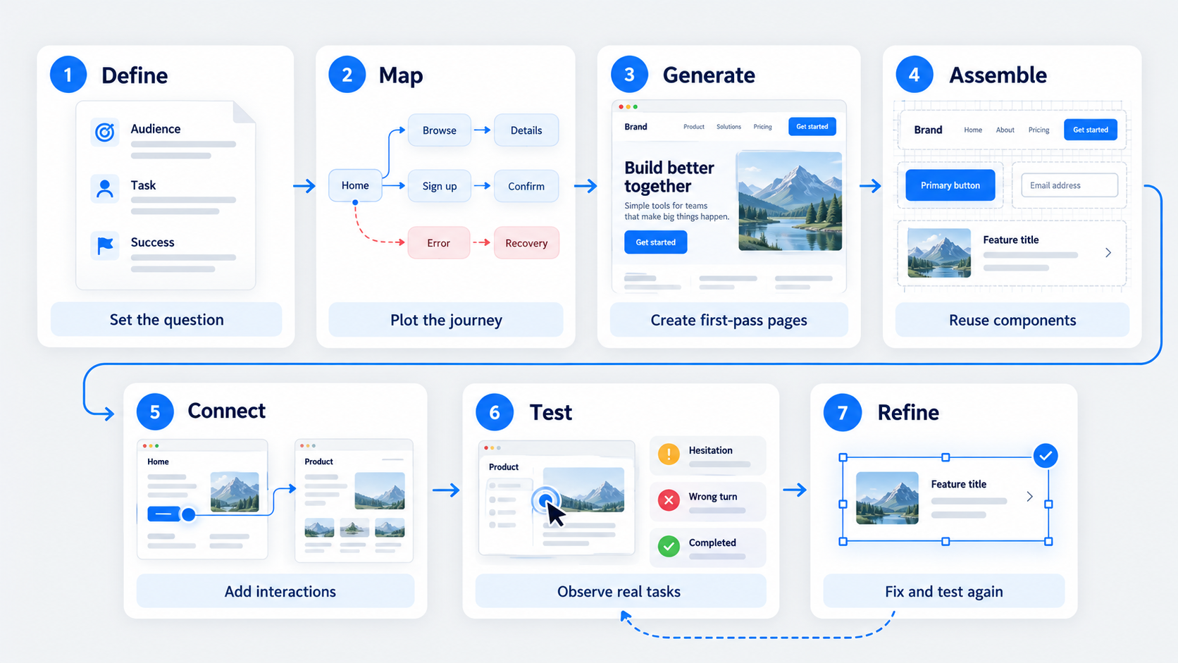 Our process uses seven actions: define, map, generate, assemble, connect, test, and refine. Each stage needs a clear output.
1–3: Define, map, generate
- Define: Record the audience, task, uncertainty, fidelity, test method, and success signal.
- Map: Plot the critical journey, branches, failure states, and responsive risks.
- Generate: Create realistic first-pass pages and recurring patterns without treating generated UI as validated design.
AI is most useful during generation. It reduces repetitive setup work, but it should not decide the journey or remove difficult states.
4–7: Assemble, connect, test, refine
- Assemble: Build reusable headers, cards, fields, and page sections.
- Connect: Add navigation, validation, loading, errors, and completion states.
- Test: Observe representative users attempting the priority scenario.
- Refine: Fix the most consequential breakdowns, then test again.
The result is not simply “finished UI.” It is a set of design decisions informed by observed behavior.
Two website prototype examples with complete flows
Useful examples include both the intended journey and credible failure states.
Example 1: SaaS marketing site to signup
A focused SaaS flow might include a homepage, pricing page, plan selection, signup form, validation, confirmation, unavailable-plan branch, and server-error recovery.
Navigation, selection, form entry, and recovery actions should be interactive. Account creation can remain simulated unless live behavior matters to the test. We would use this flow to assess value comprehension, plan comparison, trust, validation, and recovery.
Example 2: E-commerce discovery to checkout
An e-commerce flow might cover category browsing, filtering, product details, cart, checkout, confirmation, an empty cart, out-of-stock products, invalid promotions, and payment errors.
Filtering, quantity changes, promo submission, and checkout progression should behave consistently. Inventory and payment processing can remain simulated while presenting believable responses.
How to prototype a website in Figma
Figma supports interface design, connected prototypes, sharing, and collaborative review. In our experience, structure matters more than frame count.
Build shared headers, footers, cards, fields, buttons, and responsive sections once. Strong Figma design system examples show how reusable foundations can reduce inconsistency without making every page identical.
Use descriptive frame names, flow labels, realistic tasks, and clear reset instructions for testing.
Components, variants, and variables
Use components for repeated structures and variants for states such as default, selected, invalid, loading, and disabled. Variables can help manage shared values or repeated properties that need controlled updates.
These tools reduce maintenance, but they do not replace careful state mapping.
Overlays, interactions, and flow starting points
Use overlays for menus, dialogs, and contextual interactions that do not require a duplicate page. Interactive components can represent repeated state changes while keeping the file manageable.
Create distinct starting points for priority scenarios, roles, or account states. Reviewers should know whether they are testing a new visitor, returning customer, administrator, or someone recovering from an error.
Prototype responsive behavior and realistic content without overproducing
A responsive prototype does not require frames for every device. We validate the layout changes most likely to disrupt navigation, comprehension, or task completion.
Priority areas include navigation changes, grid collapse, content order, pricing comparisons, form width, dialogs, long copy, focus order, labels, and errors. Realistic content exposes hierarchy problems that placeholder text can hide.
Choose breakpoints by risk, not device count
We usually begin with desktop and mobile layouts, then add an intermediate viewport if behavior changes materially. For example, a breakpoint may be necessary where navigation condenses or pricing cards become difficult to compare.
Document the responsive rule, not just the resulting screens. A clear rule gives engineering more useful guidance than several disconnected frames.
Prioritize content before micro-interactions
Test whether headings explain the offer, calls to action set expectations, labels support decisions, and errors help people recover. Use credible names, prices, images, limits, and form data.
Add animation when motion supports orientation, feedback, comprehension, or accessibility—not merely decoration.
How UXMagic accelerates the first pass
We built UXMagic to reduce blank-canvas work without removing design judgment. The AI UI generator for Figma-ready designs provides starting material for a prototype, not evidence that the experience works.
Generated pages still need assembly, connection, review, and testing.
Describe or provide a reference
Describe the website type, audience, critical journey, visual direction, required pages, and key states. Include failure and recovery states instead of requesting only polished happy-path screens.
References can communicate structure or visual direction, but we recommend adapting their hierarchy, content, and behavior rather than copying another product’s assumptions.
Generate, refine, and move into Figma
Generate first-pass pages and repeated patterns, then standardize shared elements. Refine the content, hierarchy, accessibility, and edge states while structural changes remain inexpensive.
An AI-to-Figma conversion workflow can bring editable UI into the team’s design environment. From there, connect the journey, test it, and revise it using observed behavior.
Choose a website prototype tool for the workflow—not the demo
The right tool depends on fidelity, testing, collaboration, handoff, governance, and security requirements. Presentation software, specialized prototyping tools, and coded prototypes serve different purposes; there is no universal best option.
Website prototype tool buying checklist
Assess generation quality, editability, multi-page support, component reuse, responsive behavior, Figma compatibility, permissions, version history, testing support, developer handoff, privacy, security, and workflow cost.
Our guide to evaluating an AI-powered UI design platform covers the criteria that matter after the initial demo.
Practical limits of free plans
A free plan is often an entry tier rather than a cost-free workflow. Check limits on projects, pages, collaborators, exports, storage, sharing, and testing.
We also recommend confirming whether exported work remains editable and whether public-file requirements, branding, or usage restrictions create problems for confidential work.
Should the website prototype stay in Figma or move to HTML?
Use Figma to validate structure, content, navigation, forms, and standard interactions. Move to HTML when valid evidence depends on live data, browser behavior, performance, accessibility behavior, complex logic, or technical feasibility.
| Criterion | Figma prototype | HTML prototype |
|---|---|---|
| Speed | Faster to assemble | Requires development |
| Behavior | Simulated | Browser-based |
| Editing | Designer-friendly | Code-based |
| Best use | Flows and comprehension | Technical behavior |
Keep it in Figma for fast behavioral validation
We keep prototypes in Figma when simulated data can answer the research question. Pricing and signup, for example, can be tested without building a real account system.
Move to HTML only when the question requires it
Use HTML for browser APIs, live data, performance, advanced responsiveness, accessibility testing, or implementation feasibility. Code the smallest slice needed to answer the unresolved question.
Quick answers to common questions
A design or AI UI tool suits rapid flow validation; code suits browser-dependent testing. Figma supports collaborative interface design and connected flows. Our seven-step process is define, map, generate, assemble, connect, test, and refine.
Build the journey before polishing the screens
Start with the riskiest website flow, generate its first-pass UI with UXMagic, and move it into Figma for connection and testing. Create your first prototype with UXMagic today.