Imagine a user clicking a critical "Upgrade Plan" button, only for the interface to freeze for 400 milliseconds without a loading spinner, press state, or visual response. That brief moment of uncertainty causes double-clicks, payment failures, and checkout abandonment. Micro-interactions aren't decorative polish - they're the core feedback system that preserves usability at the exact moments a user is deciding whether to trust the product.
You already understand layout principles, visual hierarchy, and basic responsive design. This isn't a primer on what UI stands for. It's the execution specs - timing conventions, CSS performance rules, accessibility fallbacks that separate a micro-interaction that reduces friction from one that gets stripped out at developer handoff because nobody defined the state logic underneath it.
Functional Motion vs. Decorative Motion
This distinction is worth establishing upfront, since it shapes every decision in this guide.
Functional motion confirms a state change - a button was pressed, a form was submitted, a save succeeded. It exists to reduce uncertainty, and its absence is a real usability gap.
Decorative motion exists to entertain - a confetti burst, a bouncing mascot, a flourish with no informational purpose. It's not inherently wrong, but it's optional, and in B2B SaaS specifically, decorative motion that repeats on every use tends to become friction rather than delight after the third or fourth exposure.
The rest of this guide is almost entirely about functional motion. Where an interaction is genuinely about clarity or task completion rather than driving a conversion outcome, that's noted explicitly rather than folded into a blanket "high-converting" claim.
What Are UI Micro-Interactions? (The 4-Part Logic)
Triggers, Rules, Feedback, and Loops Defined
Every micro-interaction consists of four structural elements: a trigger (user-initiated - click, hover, tap or system-initiated, like a toast alert), rules governing what happens and in what state, feedback confirming the action, and a loop determining what happens next. That framework isn't academic - it's the actual spec structure engineering needs, not a theory to reference in a design deck.
Why Micro-Interactions Reduce Friction and Support Retention
Reducing Perceived Latency and Cognitive Load
Standard online tutorials suggest prototyping every micro-interaction variant frame-by-frame inside static design software. In fast-paced product environments, managing hundreds of manual component variants clutters files and fails to output production-ready CSS or functional motion code for engineering. Interactive logic tends to work better engineered at the state level rather than manually drawn across dozens of duplicate artboards - the same discipline covered in more depth in structuring prompts for consistent, production-aligned dashboards.
The underlying research here is genuinely well-established: Jakob Nielsen's response time thresholds - reaffirmed repeatedly by Nielsen Norman Group and dating back to Miller's 1968 research - hold that around 0.1 seconds (100ms) feels instantaneous, around 1 second maintains a user's flow of thought (though the delay is noticeable and feedback becomes important), and beyond roughly 10 seconds, attention drifts and users disengage. Worth being precise here: that's system response time, not animation duration specifically - the two are related but distinct, and the timing conventions below apply that research to CSS motion design rather than quoting Nielsen's numbers directly.
The Psychology of System Feedback Loops
Industry blogs place a lot of emphasis on "delightful" confetti explosions and whimsical loading animations. In B2B SaaS applications specifically, decorative motion can become genuinely annoying upon repeated exposure. Clarity and execution speed tend to matter more for sustained usability than novelty confirming state changes quickly and predictably, not surprising the user with something new every time.
7 UI Micro-Interaction Patterns Worth Getting Right
Inline Form Validation and Error Handling
Validation feedback works better at the field level, immediately, rather than bundled into a single error summary after full-form submission. A user should know a field is wrong before they've moved on to the next one - this is primarily a clarity and task-completion improvement, not a direct conversion lever.
Button Press States and Dynamic Loading Spinners
A response gap with no feedback creates genuine ambiguity about whether a click registered. Longer gaps without any visual acknowledgment tend to make an interface feel unresponsive, which is where the perceived-latency research above becomes directly practical.
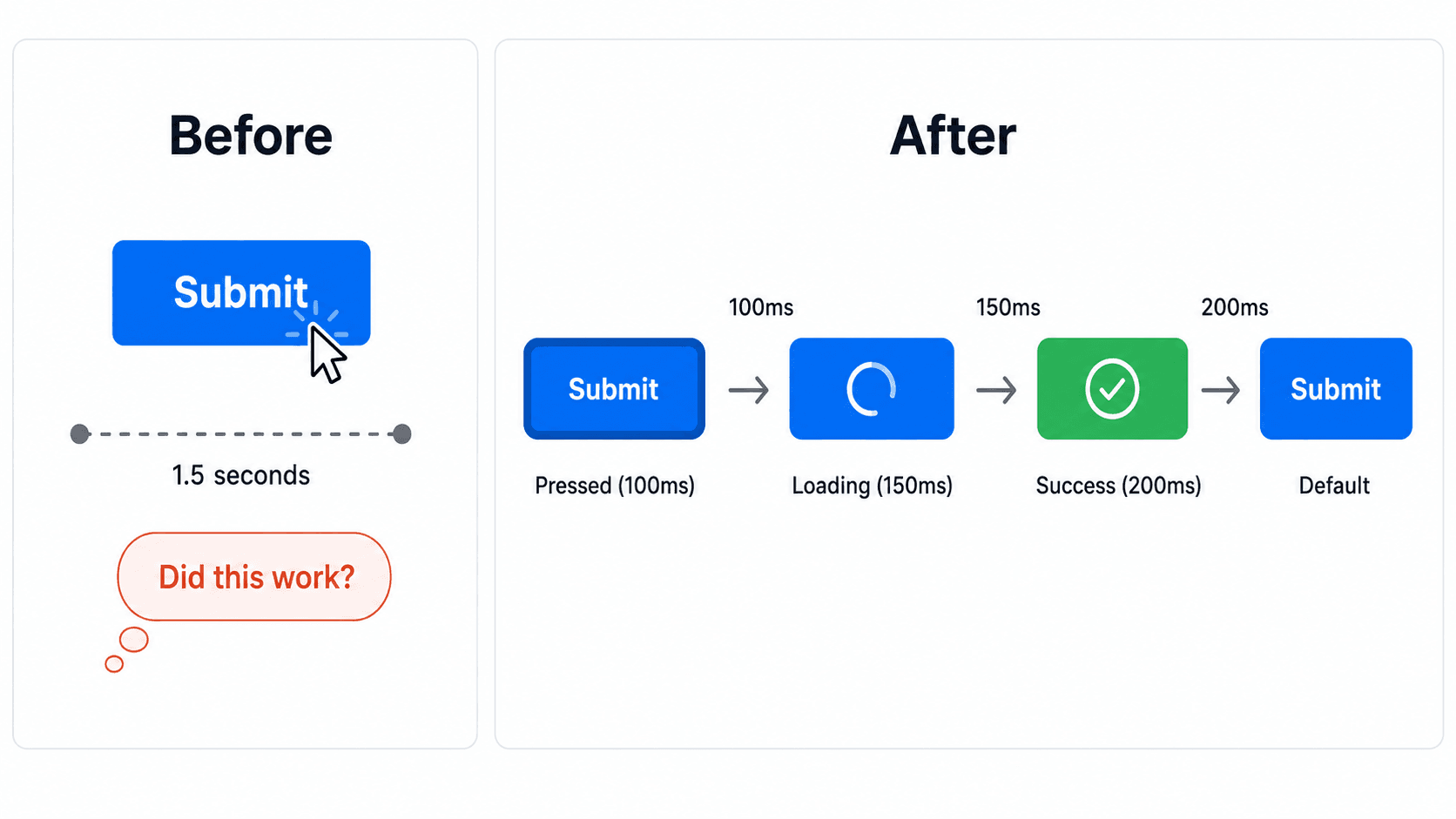
Here's what an unhandled version of this looks like on a real form. A user fills out a 10-field account settings form and clicks "Save Settings." The button remains visually static, providing no feedback while the backend completes the API request. Believing the click failed, the user repeatedly taps the button, triggering duplicate submission requests and generating form validation errors.
An interaction-aware version handles the same click as a response chain instead: the button depresses visually to confirm the physical press, the button text transitions into an inline loading spinner while disabling pointer events to prevent duplicate clicks, and upon server response, the spinner transitions into a success checkmark before returning to default. The user gets clear feedback at every stage, which is what actually prevents the multi-click submission error, not any single one of those states in isolation.
Milestone Celebrations and Progress Tracking
A meaningful milestone - completing onboarding, hitting a usage tier can genuinely benefit from a moment of visual acknowledgment. The distinction from the decorative-motion trap above: reserve it for actual milestones, not routine actions, or the celebration itself becomes noise a user learns to ignore.
Modal Transitions and Contextual Overlays
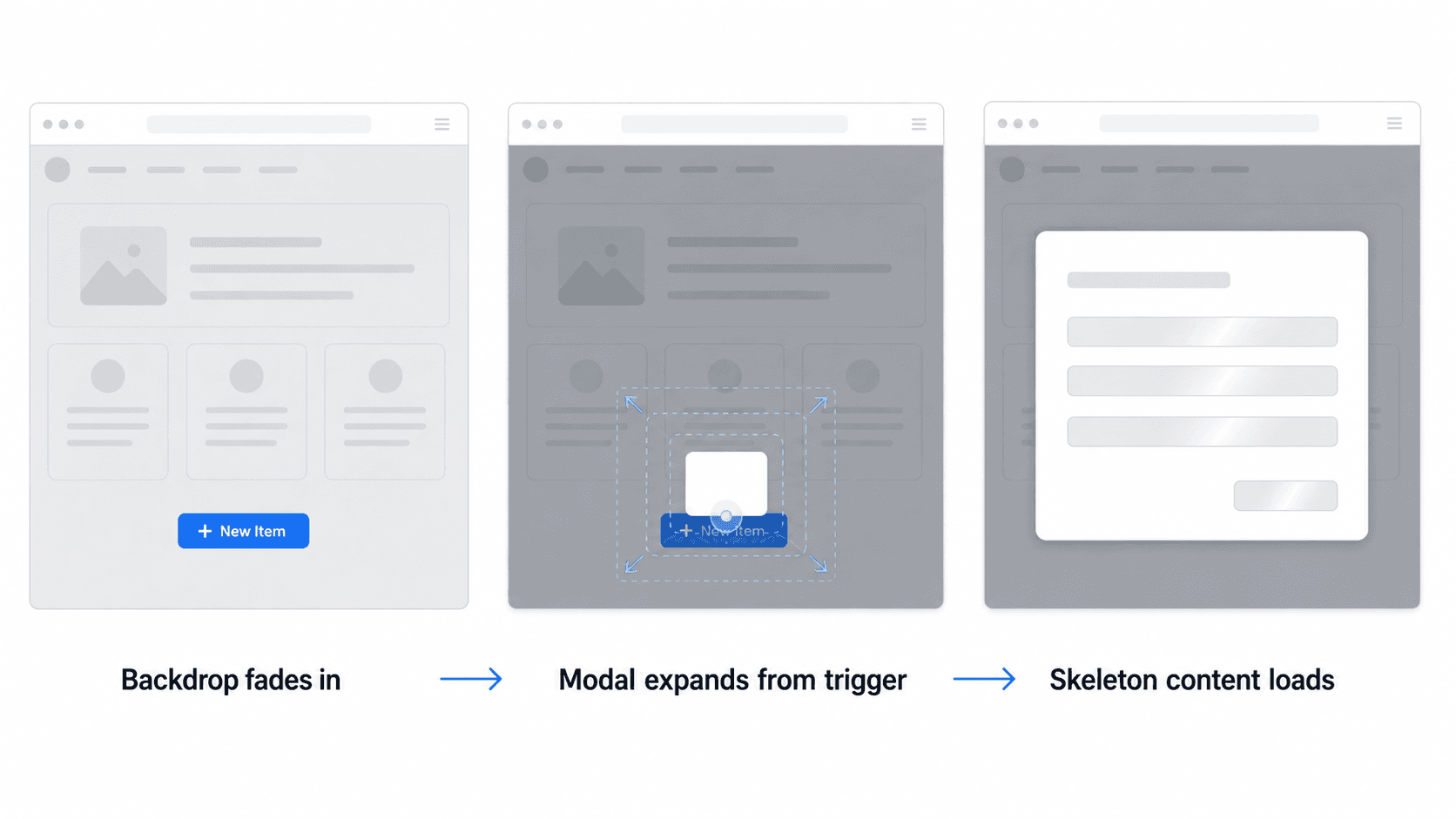
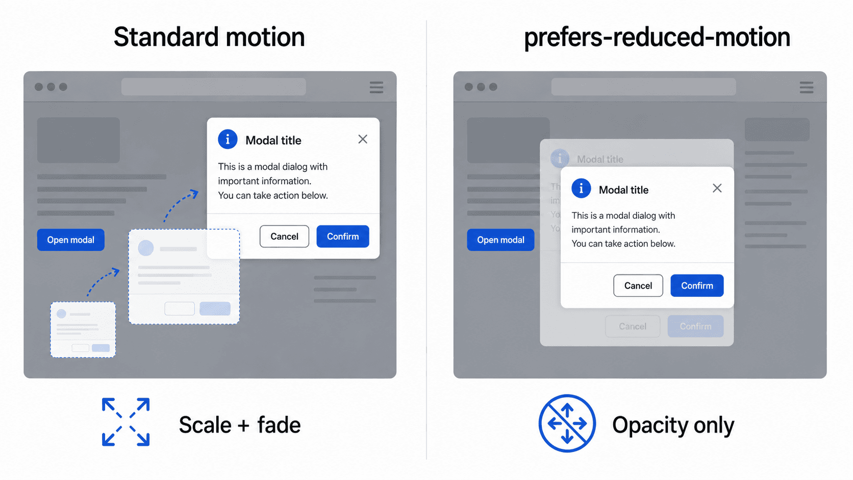
A full-page reload to open a checkout modal breaks context and tends to increase drop-off - the interface flashes white before rendering the form. A backdrop overlay fading in, paired with the modal expanding from the CTA's coordinate origin, maintains visual continuity instead. Skeleton placeholder screens populating form fields while a payment gateway initializes keeps the user oriented during the wait rather than staring at a blank space.
Hover Affordances on Interactive Elements
A hover state exists to signal that an element is actually clickable before the user commits to the click. Skipping it or making it visually indistinguishable from the resting state - forces users to guess at what's interactive, which is exactly the kind of ambiguity a micro-interaction is meant to remove. This one is squarely a clarity improvement, not a conversion mechanism.
Empty-to-Populated State Transitions
The moment content first populates a previously empty container benefits from a subtle, fast transition rather than a jarring instant swap - enough motion to signal "this changed" without feeling like a glitch.
Inline Confirmation for Destructive Actions
A delete or archive action deserves feedback proportional to its weight - a distinct visual and textual confirmation, not the same subtle shift used for a routine toggle. This is about preventing errors and building trust, not conversion.
Generic AI image generators fail across all seven of these patterns in the same way. They produce static UI mockups that show only the ideal visual layout, capturing a single frame while completely failing to define dynamic component state transitions, hover affordances, inline validation, and loading indicators. Frontend engineers attempting to build from static AI images end up inventing interaction rules independently, which is exactly how a product ends up with inconsistent feedback timing across screens built by different engineers at different times.
Technical Specifications: Animation Timing and CSS Performance
The 100ms-300ms Duration Framework
As a common motion-design convention rather than a single hard rule: frequent micro-feedback like button presses and toggle switches tends to work well between 100ms and 150ms. Structural transitions like dropdown expansions and modal displays tend to work well between 200ms and 300ms. Beyond roughly 400ms, motion increasingly reads as sluggish regardless of how smooth the easing curve is worth treating as a strong signal to investigate, not an automatic universal usability bug in every context.
CSS Transforms vs. Main-Thread Layout Recalculation
transform and opacity are generally the preferred properties for performant animation, since browsers can composite them on the GPU without triggering a full layout recalculation. Animating layout-triggering properties - width, height, margin, padding - forces main-thread recalculation, which can cause visible stutter, particularly on mobile devices where the performance margin is thinner. That said, "generally preferred" is the accurate framing here, not an absolute rule that no other property can ever be animated - some layout-affecting transitions are unavoidable and just need more careful performance testing.
WCAG Compliance and Reduced-Motion Protocols
Accessibility compliance needs to be engineered directly into the interaction specs, not bolted on afterward. Every animated interaction should include a prefers-reduced-motion CSS fallback that replaces movement with an instant state or opacity shift for users with vestibular sensitivities. Visual focus indicators should never be animated out or delayed, since an animation that looks fine to a mouse user can genuinely disorient someone navigating by keyboard if focus visibility gets treated as optional.
Timing and Easing Cheat Sheet
| Interaction Type | Duration | Easing | Purpose |
|---|---|---|---|
| Button press feedback | 100–150ms | ease-out | Confirm physical press instantly |
| Toggle switches | 100–150ms | ease-in-out | Immediate state confirmation |
| Hover affordance | 150–200ms | ease-out | Signal interactivity without lag |
| Dropdown expansion | 200–300ms | cubic-bezier(0.4, 0, 0.2, 1) | Structural reveal, clear but not slow |
| Modal / overlay transitions | 200–300ms | cubic-bezier(0.4, 0, 0.2, 1) | Maintain context during a larger UI shift |
| Loading → success transition | 150–250ms | ease-in-out | Smooth handoff between states |
| Longer/decorative animations | Use sparingly, with clear justification | Varies | Reserved for genuine milestones only |
Accessibility Beyond Reduced Motion
Reduced motion is necessary but not sufficient on its own. A complete accessibility pass on micro-interactions should also cover:
- Focus states - every interactive element needs a visible, non-animated-away focus indicator, distinct from hover styling.
- Keyboard interaction - every micro-interaction triggerable by mouse or touch needs an equivalent keyboard path (Enter/Space activation, not just click handlers).
- Screen readers - state changes (loading, success, error) need to be announced via ARIA live regions, since a visual-only spinner or checkmark is invisible to assistive tech.
- Motion as the only feedback signal - never rely on animation alone to communicate a state change; pair it with text or an icon change so the information survives even if motion is disabled or missed.
Automating Interactive UI Flows in Production
Eliminating Manual Component Variants with UXMagic
Component-by-component animation specification is a friction-heavy workflow at scale. Manually configuring hover, active, focused, disabled, and loading states for every individual input field consumes engineering bandwidth and design resources that could go toward actual product logic. UXMagic reduces that manual overhead by generating complete visual UI flows with built-in interactive state logic directly from text prompts - designers receive fully specified UI flows complete with interactive component states, rather than manually drawing default, hover, active, loading, success, and error variants one screen at a time.
Flow-Wide Interaction Consistency via Flow Mode
Inconsistent animation durations and state cues across a multi-screen journey create real cognitive friction - a modal that transitions in 250ms on one screen and 400ms on another reads as inconsistency, not intentional variation. UXMagic's Flow Mode addresses that fragmentation directly, maintaining unified visual styles, state logic, and interaction patterns across every screen in a user journey, so engineering receives standardized interaction logic across every touchpoint instead of reconciling several slightly different implementations of the same button.
That same token discipline extends to the visual system underneath the interactions - UXMagic's Style Guide Generator locks colors, typography, and spacing once, so the timing conventions in the cheat sheet above get applied against a consistent visual foundation rather than drifting alongside inconsistent brand tokens. For teams with an existing component library already governing these states, importing that Figma system directly keeps every generated interaction anchored to real, existing patterns instead of introducing a second, competing set of conventions.
Design Every Interaction State Faster
Generate fully specified, multi-state UI flows from a single prompt and keep interaction behavior consistent across your product.