Modifying two words on a high-traffic interface can move engagement by real, measurable margins without touching layout, color, or ad spend. In 2017, Google UX writer Maggie Stanphill and her team changed a hotel booking button's copy from "Book a room" to "Check availability," and saw an instant 17% lift in engagement (a figure worth keeping attributed to that specific Google case study each time it's cited, not treated as a general rule for every button rewrite). The change worked because the new copy matched the user's actual psychological readiness - "book" implies a commitment most visitors weren't ready to make yet; "check" doesn't.
You already understand what a CTA is, how wireframing tools work, and what a design system does. This isn't a UX writing 101 post explaining grammar rules. It's the operational framework - risk-reduction copy, intent-matched verbs, co-generated layout and text that separates microcopy that actually removes friction from copy that just fills space.
Bad Copy vs. Better Copy
| Bad Copy | Better Copy | Why It Works |
|---|---|---|
| "Submit" | "Get My Quote" | Names the actual outcome, not the mechanical action |
| "Book Now" | "Check Availability" | Lower-commitment language matches early-stage intent |
| "Continue" | "Review Order" | Tells the user what's coming next, not just that something will happen |
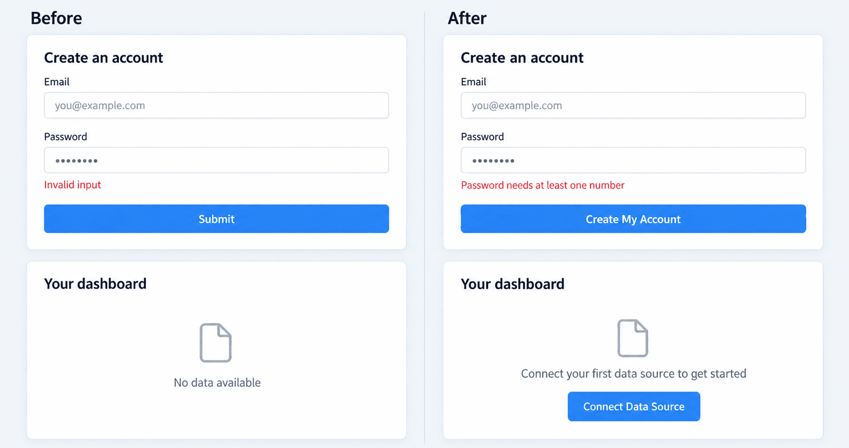
| "Invalid input" | "Password needs at least one number" | Tells the user exactly what's wrong and how to fix it |
| "No data available" | "Connect your first data source to get started" | Gives a brand-new user a clear next action instead of a dead end |
| "Start Free Trial" (as the very first CTA) | "See How It Works" | Matches a first-time visitor's actual readiness, not the product's ideal outcome |
Search Intent & The ROI of Interface Microcopy
How Microcopy Impacts SaaS Conversion Funnels
Product teams often observe real drop-off on primary buttons displaying generic copy like "Start Free Trial" because visitors anticipate an immediate demand for credit card details or aggressive sales follow-ups - the copy itself creates hesitation before the user even reaches the actual form.
Reducing Commitment Friction in Primary CTAs
The underlying issue is almost always commitment mismatch, not brevity. When a button demands more psychological commitment than a visitor is ready to give at that specific stage of their journey, they leave not because the offer was bad, but because the copy asked for too much too soon.
Core Principles of Conversion-Focused Microcopy
Action Verbs vs. Passive Jargon
Buttons displaying terms like "Submit," "Continue," or "Click Here" force users to infer the result of their own action. Call-to-action elements need to communicate explicit outcomes instead - "Get Estimated Quote" rather than "Submit," "Check Availability" rather than "Book Now," "Review Order" rather than "Continue" - setting clear expectations before the click happens, not after.
Reassurance Signals and Doubt-Removers
The common assumption that interface copy must always be ultra-brief is flawed, and it's worth pushing back on directly. Including "doubt-remover" microcopy - "No credit card required," "Cancel anytime" - increases character count, and it also directly addresses the specific hesitation stopping someone from clicking. Brevity is secondary to risk reduction. High-converting microcopy isn't defined by character suppression; it's defined by the systematic removal of cognitive risk at the exact moment a user is deciding whether to act.
Microcopy Patterns Across Interface States
High-Converting Button Copy Frameworks
Match call-to-action copy to the user's actual intent stage. Use low-risk, outcome-focused verbs during early interaction phases - exploration, comparison, reserving higher-commitment language for the point where a user has already decided to act. Placing "Start Free Trial" at the top of a landing page a first-time visitor just arrived on is asking for a commitment nobody's ready to make yet; something closer to "See How It Works" respects where that visitor actually is.
Field Labels, Hints, and Inline Error Messages
Users frequently abandon multi-step signup flows when input validation errors display non-descriptive messages like "Invalid input" without providing actionable instructions for resolution. A field error needs to tell the user exactly what's wrong and exactly how to fix it:
- Generic and unhelpful: "Invalid input"
- Actionable: "Password needs at least one number"
- Generic and unhelpful: "Error"
- Actionable: "That email is already registered - try logging in instead"
- Generic and unhelpful: "Field required"
- Actionable: "Add a phone number so we can text your verification code"
Empty States and Onboarding Guidance
Newly onboarded users encounter empty dashboard screens displaying generic phrases like "No data available" rather than guided prompts for immediate setup actions. An empty state is a real opportunity to tell a brand-new user exactly what to do next:
- Passive: "No data available"
- Guided: "Connect your first data source to get started"
- Passive: "No projects yet"
- Guided: "Create your first project - it takes about two minutes"
- Passive: "Nothing to show here"
- Guided: "Invite a teammate to start collaborating"
Internal product terminology also quietly stalls onboarding activation. Product activation rates suffer when onboarding tooltips rely on internal database schemas or engineering jargon rather than clear, user-centric outcomes - a tooltip that says "Configure your webhook endpoint" means nothing to a non-technical user who just wants their data to sync automatically.
Inconsistent brand voice creates a related but distinct problem. Marketing landing pages often maintain an engaging tone while secondary application modals and error alerts sound like dry, legalistic system logs - a jarring tonal shift that makes the product feel like two different teams built two different halves of it.
Integrated Workflow for Designing Interface Copy
Mapping Drop-Off Friction to User Intent
Phase 1 - Discovery and friction identification. Audit analytics data to identify screens exhibiting high drop-off or abandonment - signup flows, checkout steps, complex configuration settings. Map the user's psychological readiness at each interaction stage, distinguishing early exploration (low commitment) from active execution (high commitment). Translate brand-specific voice guidelines into contextual tone parameters adjusted for specific scenarios, since a system error and a billing confirmation shouldn't sound identical.
Co-Generating Layouts and Microcopy
Phase 2 - Multi-state co-design. Treating UX writing as an isolated, late-stage design phase creates structural flaws - copy applied to a pre-built wireframe risks overflowing padding the moment it's dropped into the actual layout. Interface copy and multi-state visual architecture work better generated together, within the same workflow, not sequentially. Populate primary action elements with outcome-oriented language supported by risk-mitigating subtext, and configure system interaction points with clear field labels, helper tooltips, and human-readable inline validation messages.
Phase 3 - Validation and optimization. Covered in detail in the next section, since not every copy decision needs the same testing method.
Manual text iteration causes real productivity bottlenecks across this whole process. Designers spend significant time manually updating, re-aligning, and checking text strings across numerous wireframe screens whenever product requirements change - a single copy revision rippling into hours of manual layout cleanup across every screen it touches.
Choosing the Right Testing Method
Not every microcopy decision needs the same validation approach:
- Five-second tests - best for checking whether the primary action and core value proposition are immediately clear on first glance. Use this early, before investing in a full A/B test, to catch obviously confusing copy fast and cheap.
- Usability testing - best for understanding why users hesitate or misinterpret specific copy, through direct observation and follow-up questions. Use this when a five-second test flags a problem but doesn't explain the cause.
- A/B testing - best for measuring the actual conversion impact of a specific copy change at scale, the way Google's team validated "Check availability" against "Book a room." Use this once you have a specific hypothesis and enough traffic to reach statistical significance not as the first step for every minor wording tweak.
A reasonable sequence: five-second test to catch obvious confusion, usability testing to understand root causes, A/B testing to validate the fix at scale before rolling it out everywhere.
Audit copy iterations across mobile and desktop breakpoints regularly regardless of which testing method you use, since text that fits cleanly at one width can overflow or wrap awkwardly at another.
AI-Driven UI Generation: Beyond Generic LLMs
Spatial Limitations of Standard AI Text Models
Standard language models typically produce multi-sentence marketing paragraphs that overflow Figma button padding and disrupt established visual hierarchies. General-purpose conversational AI tools are inherently unsuited for interface copy design specifically - they lack awareness of spatial UI constraints entirely, so a prompt for "button copy" can just as easily return a full sentence as a two-word label, with no concept of what actually fits inside a real component.
General-purpose AI tools also struggle with a second, related failure: they frequently introduce inappropriate jargon inside functional interfaces and fail to account for secondary UI states like loading prompts or field validation errors, since a chat-based tool has no persistent model of the product's other screens to stay consistent with.
Generating Production-Ready UI Flows with UXMagic
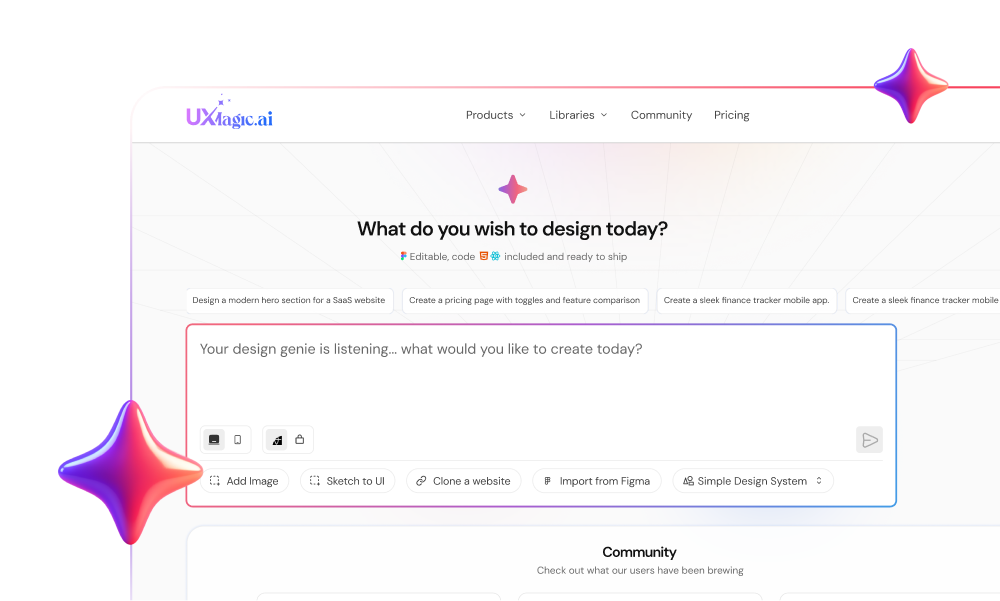
During early prototyping, design teams can input natural language prompts into UXMagic to generate multi-screen UI flows populated with context-aware microcopy rather than relying on generic placeholder text, the platform generates functional button labels, field hints, and headlines tailored to the specific user journey being built.
Product managers frequently overlook secondary interface states during feature planning - exactly the empty-state and error-message gap covered earlier in this guide. UXMagic's Flow Mode generates corresponding microcopy across primary, hover, error, empty, and success states simultaneously, so error alerts and success toasts stay aligned with the core interface's tone and terminology instead of drifting into a different voice screen by screen.
UXMagic also enforces character bounds and brand voice rules across generated layouts automatically - text content gets calibrated to fit exact component dimensions, eliminating the manual spatial adjustment work in Figma that eats real design time whenever copy changes after the fact.
Worth being precise about what "production-ready" means here: AI-generated microcopy gives you a genuinely strong, spatially-correct first draft - it doesn't replace human review. Factual accuracy (does this error message describe what your system actually does), tone consistency with your specific brand voice, accessibility (does this make sense to a screen reader), and correct product terminology all still need a real person checking the output before it ships. Treat AI-generated copy as a fast, well-structured starting point, not a final sign-off.
Design Better Microcopy
Generate layouts and context-aware microcopy together across every UI state, so your CTA matches user intent and reduces conversion friction.