Stakeholders spend forty-five minutes critiquing grayscale boxes and placeholder copy while completely overlooking a fundamental logic flaw in the checkout flow. Traditional wireframing forces non-designers to wrestle with complex vector grids rather than refining product functionality. Constructing functional user interface blueprints shouldn't require mastering specialized design tools just to validate structural decisions.
You already understand navigation bars, hero blocks, form fields, and card containers, and you know wireframes come before visual design. This isn't a primer on what a wireframe is. It's the specific process - flow-first generation, real-copy stress-testing, grayscale review discipline that separates a wireframe stakeholders can actually critique from one that derails into an argument about placeholder text.
A quick clarification before diving in: "production-ready" gets thrown around loosely in this space. A wireframe itself is never truly production-ready - it's handoff-ready, or production-aligned: structurally sound enough that engineering isn't guessing at layout logic, even though visual polish and real code still come later. That distinction matters, and it's used precisely throughout this guide.
Traditional Wireframing vs. AI Flow Generation
| Feature | Traditional Vector Tools | AI Flow Generation |
|---|---|---|
| Time to first draft | Hours per screen, manual setup | Minutes for a connected flow |
| Editing | Manual constraint reconfiguration | Prompt-driven regeneration |
| Multi-screen flows | Manually linked, prone to sprawl | Generated as one connected journey |
| Collaboration | Requires design tool fluency | Accessible to non-designers |
| Export | Native to the design tool only | Figma, HTML, React depending on platform |
The Wireframing Bottleneck: Why Traditional Vector Tools Fail Non-Designers
Configuring auto-layout padding, frame nesting, and responsive constraints inside standard vector design software consumes real hours for screens that just need quick structural validation. That overhead falls hardest on the people; this guide is actually for product managers, founders, and junior designers who need a structural answer fast, not a lesson in constraint-based layout systems.
Compounding that, non-technical stakeholders often lack the visual abstraction required to evaluate unpolished hand-drawn sketches effectively; they perceive them as incomplete or low quality, and the conversation shifts to aesthetic flaws instead of the logic underneath. Production-aligned grayscale wireframes with clean components and realistic microcopy tend to generate more actionable feedback than sketches do, for exactly that reason. If you're working from a rough hand-drawn concept rather than starting from text, Sketch to UI converts that sketch directly into the same kind of clean, structured wireframe this section is arguing for.
How to Build Structural Wireframes Step-by-Step
Step 1: Establish Information Hierarchy Before Opening a Canvas
Before opening any wireframe builder, define the core user intent for each screen - complete registration, filter data, execute a payment and map the essential visual entities: headers, forms, data tables, primary CTAs, secondary navigation. Then document the non-happy-path conditions explicitly: empty states, invalid field inputs, missing permissions, page load states. Operating a wireframe builder without these inputs defined leads to unstructured layout generation regardless of which tool you're using.
Step 2: Generate Flow-First Layouts, Not Isolated Screens
Designing screens as independent artboards on an infinite canvas creates sprawl and conceals navigation breakdowns across a multi-step journey - a failure mode that shows up repeatedly in non-designer wireframing attempts specifically because nothing forces the screens to relate to each other. Wireframing works better flow-first, where navigation transitions, modal triggers, and cross-screen state persistence get generated simultaneously rather than linked together retroactively after the fact.
Step 3: Stress-Test Layouts with Live Content and Edge Case States
Placeholder copy masks layout breakages. Designing wireframes with dummy text obscures real space constraints - when live copy, like localized translations or multi-line error notices, gets introduced during engineering, component layouts break. Wireframes need stress-testing with realistic, full-length content early in the structural phase, so component dimensions get established against reality instead of a tidy Lorem Ipsum placeholder that never appears in production.
Step 4: Validate Breakpoints Across Mobile and Desktop Views
Switch the workspace between desktop, tablet, and mobile artboard dimensions to confirm element reflow holds up. A layout that looks clean at one viewport width and breaks at another is a structural failure just as real as a missing navigation link - it just surfaces later, usually after handoff.
A Simple Wireframe Flow, Visualized
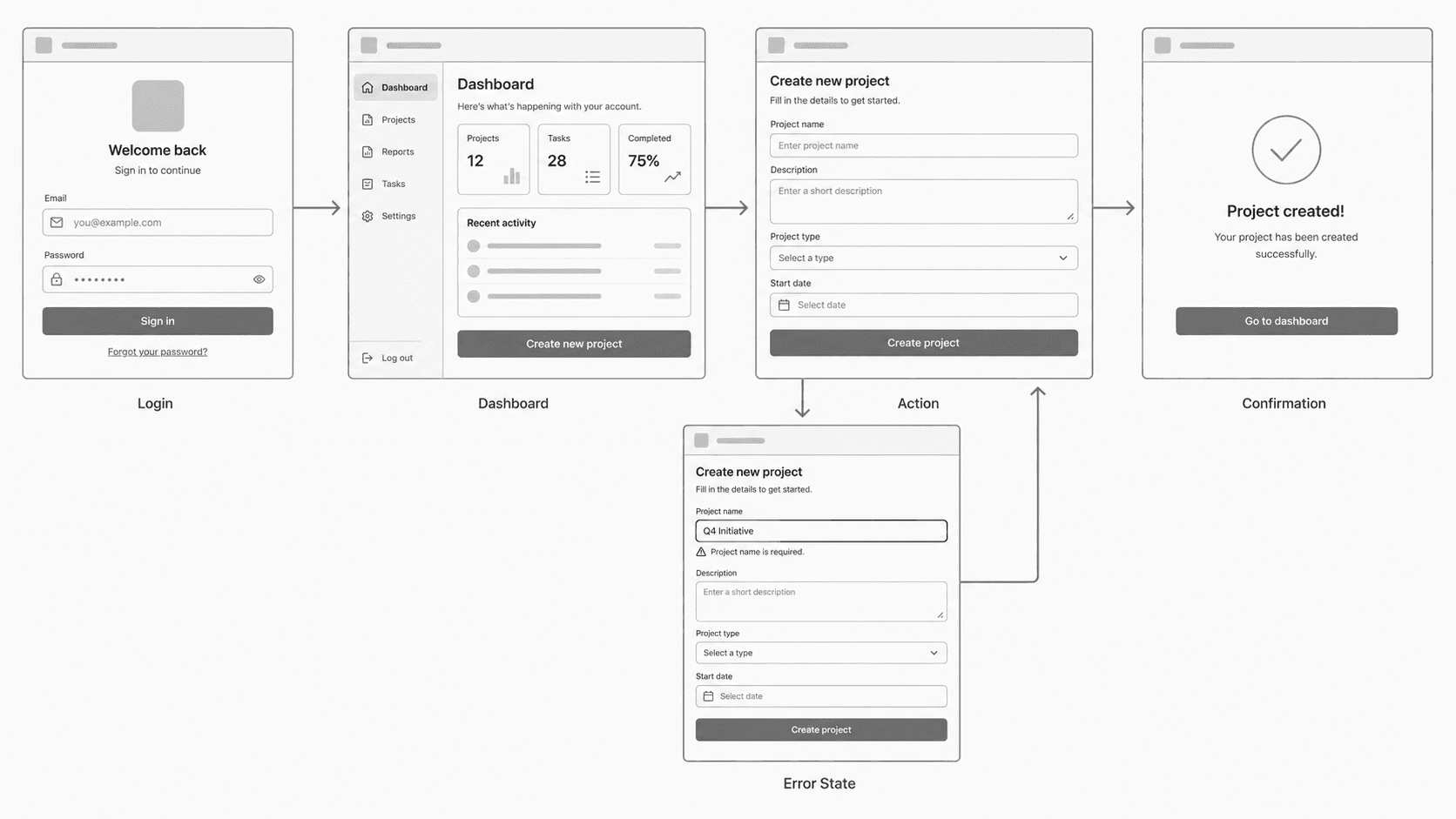
This is the actual shape a "flow-first" wireframe takes - not five separate artboards someone manually links after the fact, but one connected sequence including the branch that happens when something goes wrong. Notice the error state isn't a duplicate screen with different text; it's a genuinely different structural state of the Action screen.
Comparing Wireframe Builders
Wireframe builders generally fall into three categories, worth distinguishing clearly before choosing one:
- Static digital whiteboards (e.g., Miro, FigJam) - fast, collaborative, but manual; good for early brainstorming, weak for anything resembling a real interface structure.
- Vector design suites (e.g., Figma, Sketch) - precise and powerful, but require real tool fluency and manual constraint setup; the right tool once a design system exists.
- AI flow generators (e.g., UXMagic) - convert text requirements directly into connected, multi-screen structures; strongest for non-designers needing fast, structurally sound first drafts.
None of these categories fully replaces the others - a mature product team often uses all three at different stages, not one exclusively. For a broader look at how the wider wireframing tool landscape breaks down beyond these three categories, this comparison of the best wireframing tools covers where each option genuinely fits and where it stalls out.
Flow Continuity vs. Single-Screen Canvas Sprawl
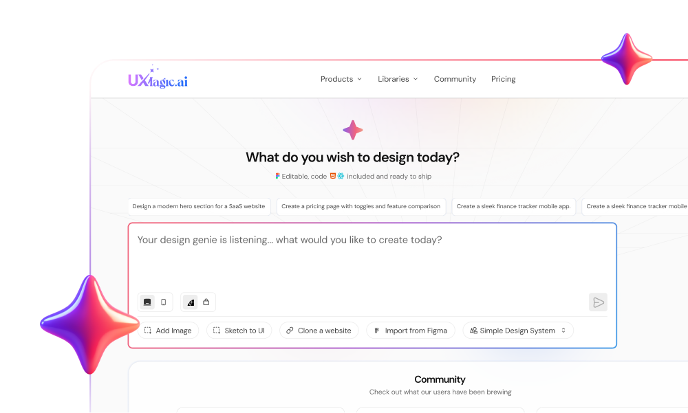
Overcoming canvas paralysis - the specific problem of screens sprawling across an infinite canvas with no enforced relationship to each other - is exactly where UXMagic's AI Wireframe Generator fits in as an operational alternative to manually dragging shapes onto a canvas. Entering a functional prompt builds connected user screens with consistent layout logic and component hierarchy, without the manual vector alignment step most non-designers get stuck on.
Production Alignment: Layered Figma Assets and Clean Code Export
Wireframes built in a basic online tool traditionally have to be completely recreated inside Figma or a code framework before engineering can use them, doubling the actual design work. UXMagic's export capabilities bridge that gap directly - converting structured wireframes into editable, layered Figma components or production-aligned HTML and React code, so structural work transitions into development without a duplicate visual effort in between.
Here's what that difference looks like in practice, treated as an illustrative comparison rather than a controlled benchmark. A non-technical founder needs to demonstrate an invoice processing workflow to investors within 24 hours. Manually building it in a vector canvas can mean hours spent adjusting auto-layout padding for a single dashboard table, with the risk of presenting misaligned, disconnected screens at the end. Generating the same flow from a functional prompt describing the submission, parsing, and approval stages can produce a structured, connected sequence in a fraction of that time - though the real time saved depends heavily on how clearly the initial prompt is scoped, not a fixed number either approach guarantees.
Best Practices for Stakeholder Wireframe Reviews
The Monochromatic Grayscale Rule
Enforce a monochromatic visual review with stakeholders specifically to restrict feedback to information placement and user flow logic. The moment color, brand typography, or rounded corners enter a review session, feedback tends to drift toward aesthetic preference instead of structural correctness.
Mapping Unhappy Paths and Error Validation States
Failing to lay out visual feedback for system failures forces engineers to invent UI patterns during implementation - exactly the gap that turns a clean sprint into a series of ad hoc decisions made under deadline pressure. Documenting zero-result searches, invalid field inputs, and loading states directly within the primary wireframe flow means those decisions get made deliberately, during review, instead of improvised later.
When Not to Use AI Wireframing
AI flow generation is a strong default for the scenarios covered throughout this guide, but it's not universally the right tool:
- Highly complex, novel interaction design - a genuinely new interaction pattern (a custom gesture-based control, an unconventional data visualization) needs hands-on exploration a text prompt can't substitute for.
- Teams with an existing, mature design system - if precise component-level control and strict adherence to an established system matters more than speed, working directly in the design tool that already governs that system may be the better fit. Though worth noting, importing that existing Figma system directly into an AI flow generator can bridge this gap rather than forcing a strict either/or choice.
- Situations requiring extensive manual exploration - early-stage, highly divergent concept work where the goal is generating many wildly different directions to react to, rather than converging quickly on one structurally sound flow.
UXMagic: The Wireframing Engine Built Around This Whole Guide
Everything covered above - flow-first generation over isolated screens, edge-case coverage, handoff-ready export - maps onto a specific, real workflow rather than staying theoretical.
Solving canvas paralysis at the source. UXMagic's AI Wireframe Generator is built around exactly the Step 2 problem covered earlier: instead of manually dragging shapes onto an infinite canvas and hoping the screens relate to each other, a functional prompt generates the connected flow - login through error state as one structural unit from the start.
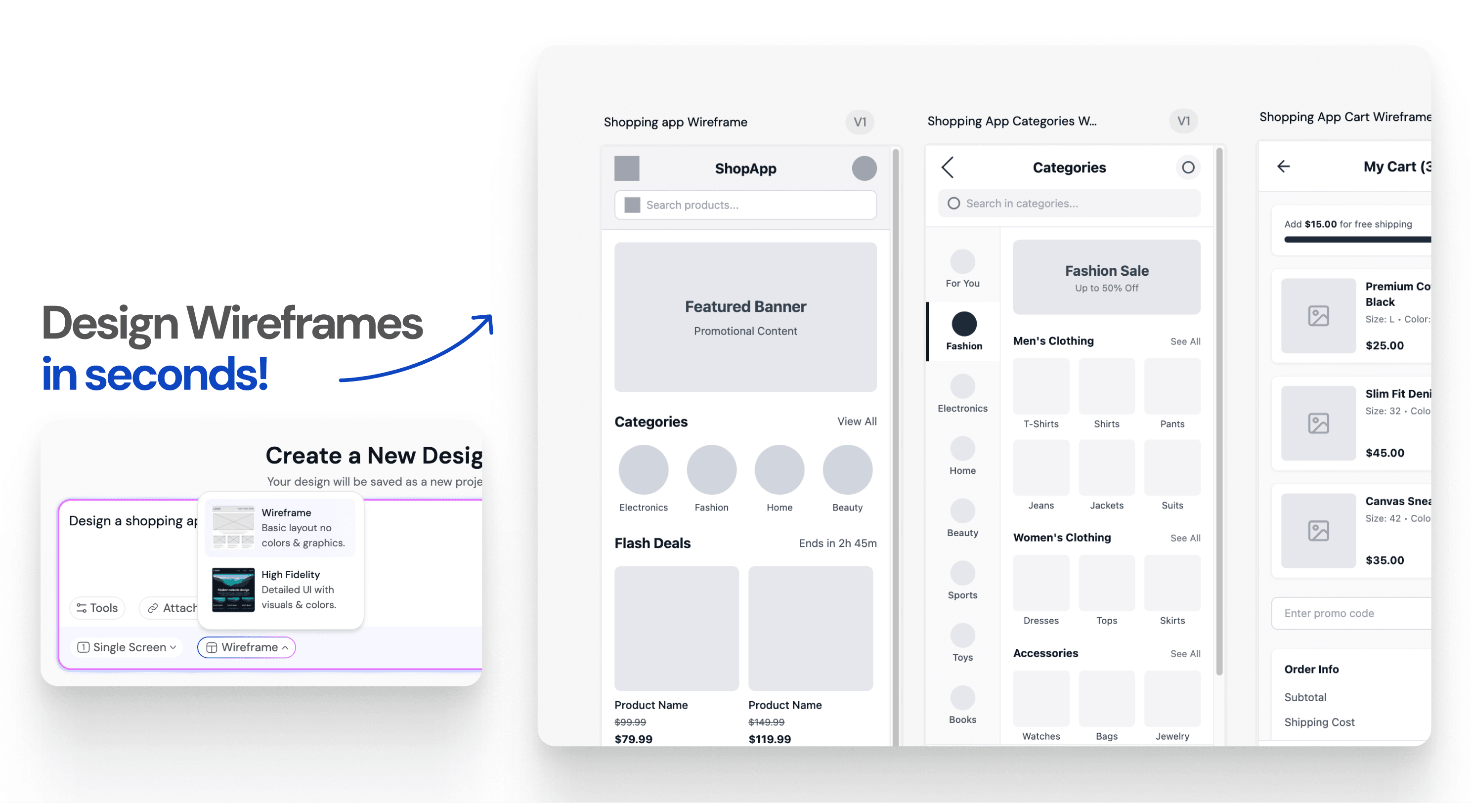
Carrying edge cases into the generation itself. The empty states, error states, and loading states this guide argues belong in the primary flow, not bolted on later, are exactly what a well-scoped prompt can generate directly rather than leaving as five separate manual additions.
Closing the handoff gap. Once a flow is grayscale-reviewed and approved, exporting to Figma carries the structure forward as real, layered components or straight into production-aligned HTML and React - so the wireframe doesn't need a full manual rebuild before engineering can use it.
Meeting teams wherever they're starting from. Whether the input is a plain-text requirement, a hand-drawn sketch, or an existing site to reference, the same flow-first, edge-case-aware generation applies - the starting format changes, but the structural discipline this guide has been arguing for doesn't.
Generate Connected Wireframes Faster
Turn functional requirements into a connected, multi-screen wireframe flow and keep stakeholder reviews focused on structure and user logic.