Every day, seven out of ten new SaaS signups abandon software within their first week because the interface forces them to read about features instead of using them. Product teams continuously patch this leak by stacking multi-step modal popups that users frantically click through just to find the close button. If a SaaS onboarding flow requires an unskippable slideshow to explain the interface, the core UX design has already failed.
You already understand friction, conversion funnels, and activation metrics. This isn't a "what is onboarding" primer. It's the specific screen-level decisions, pre-populated states versus blank canvases, intent surveys versus frictionless signup, real conversion benchmarks that separate a flow users complete from one they abandon at the invite-your-team step.
The Flow, Visually
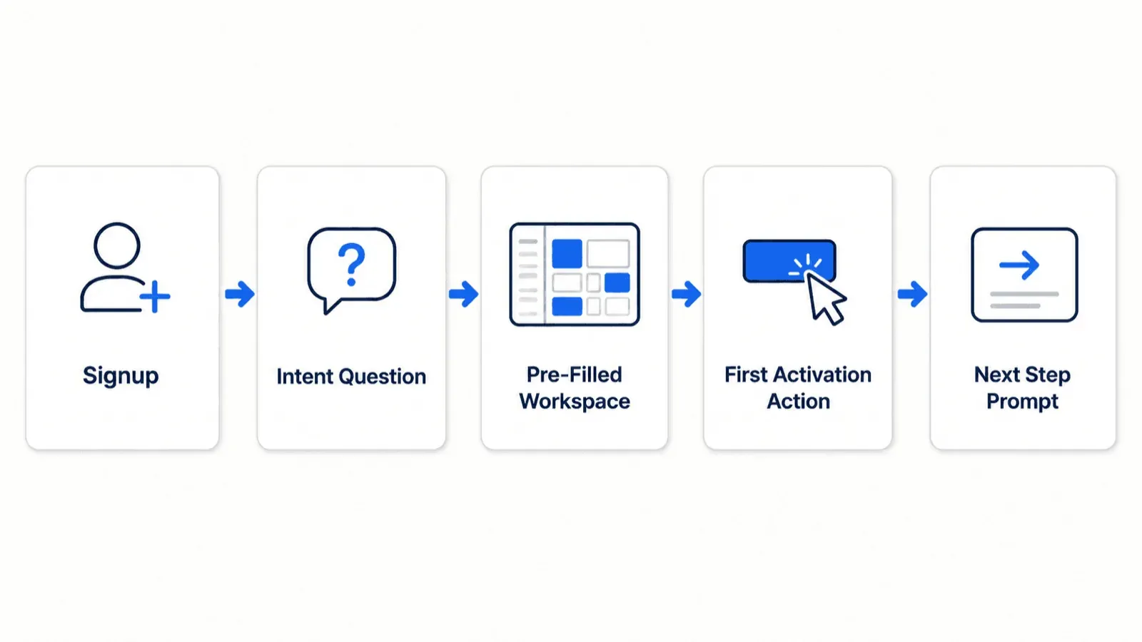
That's the entire architecture this guide is arguing for, compressed into one line. Everything below is really just justifying why each arrow matters and what breaks when a team skips one.
Traditional Onboarding vs. Activation-Focused Onboarding
| Category | Traditional Onboarding | Activation-Focused Onboarding |
|---|---|---|
| First screen | Blank dashboard | Pre-populated sample workspace |
| Guidance style | Multi-step modal tour | One real task, guided in context |
| Signup form | Email only | 2–3 intent questions |
| Progress tracking | Starts at 0% | Starts pre-completed (e.g., 20%) |
| Team setup | Required before activation | Deferred until after activation |
| Typical completion | ~16% (7+ step tours) | ~72% (3-step, action-first) |
The Anatomy of High-Converting SaaS Onboarding
Measuring Real Onboarding Benchmarks: Activation Rate vs. TTV
The average SaaS activation rate across B2B platforms sits at 37.5% (median 37%), based on Userpilot's 2024 Activation Rate Benchmark Report, drawn from 62 B2B SaaS companies. Top-performing product-led companies clear 50%. Time-to-value (TTV) is the metric underneath that numbers the actual gap between signup and the moment a user experiences real product value, not just the moment they finish clicking through a tour.
The Hidden Cost of Linear Modal Product Tours
Long, linear product tours often underperform shorter, action-based ones. Sliding modal cards labeled "Step 1 of 6" have become a default UI pattern more out of habit than evidence. According to Chameleon's Benchmark Report, three-step tours achieve a 72% completion rate, while seven-step tours collapse to just 16%. Users tend not to read popup text during initial logins; they look for the exit and every added step is another chance to lose them entirely.
Onboarding works better as action-driven walkthroughs instead, where the user completes a real task on a live interface, or guided UI routing that adapts to real-time interactions rather than marching everyone through the same static sequence.
The Metrics That Actually Matter
A quick reference on what to actually track, since "onboarding is working" isn't a single number:
- Activation rate - the percentage of new users who reach your defined value milestone. This is the core metric; everything else explains why it's high or low.
- Time-to-value (TTV) - how long it takes a user to reach that milestone from signup. Shorter is generally better, but only if the milestone is real, not artificially rushed.
- Step-level drop-off - where in the flow users actually abandon. A 60% overall completion rate can hide a 40% cliff at one specific step that's worth fixing directly.
- Completion rate - the percentage who finish the full onboarding sequence, tour or checklist. Useful, but only meaningful alongside activation and retention; a high completion rate on a checklist that doesn't predict retention isn't actually telling you much.
- 7/30/90-day retention - the real test of whether onboarding worked. Activation gets someone to first value; retention confirms that value was real enough to bring them back.
Strategic UI Patterns That Compress Time-to-Value
Pre-Populated Canvases and the End of the Empty State
Empty dashboard states tend to function as design failures more than neutral starting points. Presenting a newly registered user with a blank workspace, zero data, and an abstract "Create New" button creates real cognitive overload. Leading SaaS platforms treat empty states as active UI components; instead a dashboard should rarely ship without pre-populated sample datasets, interactive demo cards, or ready-to-edit templates.
Intent-Based Routing: Converting Surveys into Custom Interfaces
Segmentation tends to outperform pure friction elimination. Reducing signup forms to a single email field can actually harm activation quality by flooding the product with unsegmented, disoriented users. Collecting two or three precise intent data points during setup - user role, primary goal enables conditional routing, since a team leader and an individual contributor usually shouldn't see the same initial interface. Hiding irrelevant product features based on an intent survey reduces visual clutter and accelerates TTV more effectively than removing one input field on its own.
Leveraging the Zeigarnik Effect in Onboarding Checklists
Uncompleted checklists can produce real task paralysis. Displaying an onboarding checklist starting at "0 of 5 completed" creates psychological friction before the user has done anything wrong. Onboarding flows that lean on the Zeigarnik effect and goal-gradient theory tend to pre-complete early milestones instead setting the initial state to "Account Created - 20% Complete" creates immediate task momentum, raising total flow completion meaningfully compared to an empty progress tracker.
Step-by-Step Framework for Designing Your Onboarding Sequence
Mapping the Core Activation Moment
Before drawing a single screen, identify the one specific in-app action that correlates directly with 90-day retention. Everything in the flow should point toward that single moment, not toward a feature tour, not toward account completeness, toward the one action that actually predicts whether this user sticks around.
Eliminating Administrative Friction and Deferring Setup
Team invitations, profile setups, and billing configuration work better sitting behind the initial activation milestone, not in front of it. Asking a brand-new user to invite three teammates before they've experienced any value themselves is exactly the kind of administrative friction that turns a promising signup into a drop-off statistic.
Here's what that looks like on two real products. A B2B project management platform, before: user signs up, lands on a completely empty dashboard with a "Create Workspace" modal, gets forced to name the workspace, invite three team members, and picks a billing tier and drops off at the team invitation screen. After: user signs up, answers one intent question ("What project are you tracking today?"), lands in a pre-populated workspace containing sample project cards, completes the single action of dragging a card to "Done," and receives instant micro-feedback. Same product, very different odds of activation.
A developer API and analytics platform shows the same pattern differently. Before: user creates an account, gets redirected to a static documentation page demanding manual JavaScript snippet installation on their production server before granting dashboard access. After: user creates an account, enters a sandbox dashboard pre-loaded with live, simulated event traffic, tests real-time filtering controls directly in the browser, and only gets prompted to install the script after the reporting utility has already proven itself.
Generic AI design tools tend to fail specifically at this multi-state requirement. They typically produce static, isolated screens, a flat sign-up form, a standard text modal without accounting for the actual complexity onboarding requires: empty states, partially filled states, error responses, and branched paths based on intent survey logic. They also tend to introduce visual style drift between screens, leaving the resulting assets unusable in production design systems without exhaustive manual reconstruction.
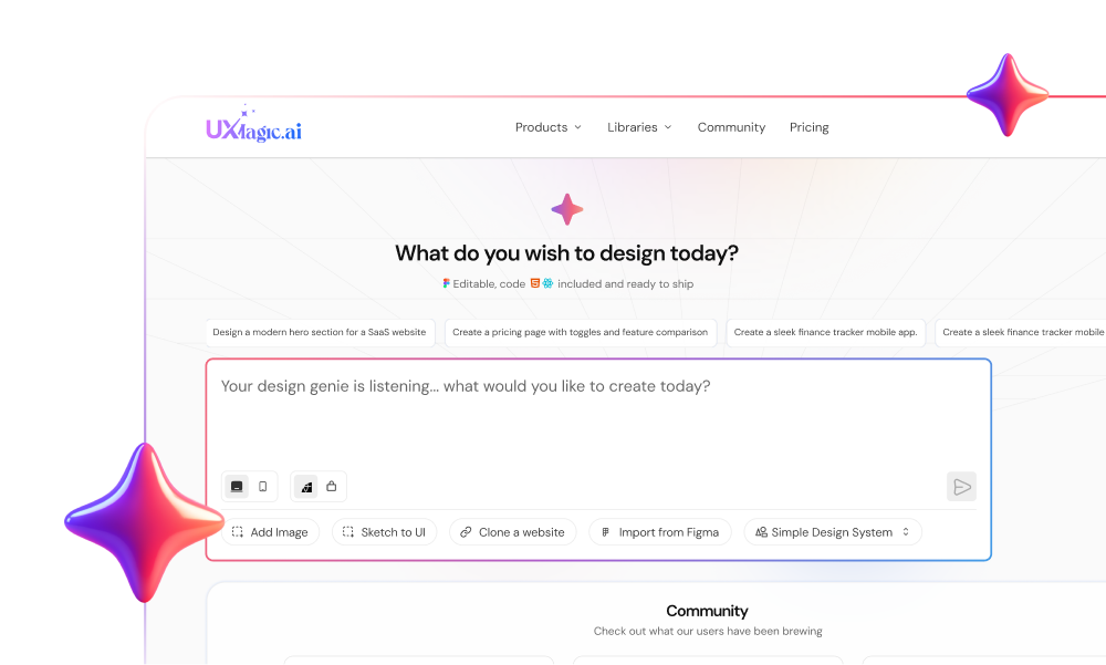
Instead of manually drawing wireframes for every one of those variations, teams can use UXMagic to generate production-ready UI states directly from text prompts - designers explore pre-filled dashboard sandboxes and intent-survey layouts within minutes, not days.
Planning the branching logic itself is where this typically gets messy - routing admin accounts to setup panels while directing team members to shared workspaces frequently produces chaotic design canvases when built by hand, screen by screen. UXMagic's Flow Mode generates connected, interactive user flows that maintain visual design tokens across every branched path instead, so the admin path and the team-member path stay on-brand and consistent with each other, not two disconnected efforts that happen to share a logo.
Onboarding Teardowns: Lessons from Market Leaders
Grammarly drops new users into a sample document already pre-populated with deliberate errors to fix - instant, hands-on demonstration of the product's core value, no tour required. Canva opens directly into intent-matched visual templates rather than a blank canvas, so the first thing a new user sees is something they can immediately edit and make their own.
Two more patterns worth noting. Figma-style tools that open a new user directly into an editable starter file - rather than an empty canvas with a "New Project" button follow the same logic: something to react to and modify beats a blank page every time. Slack-style products that drop a new user into a pre-populated set of default channels, with a bot already posting a welcome message, achieve the same effect through content rather than a template where there's immediately something happening, not a silent empty inbox waiting for someone else to post first.
All four examples reinforce the same underlying principle: the empty state is the enemy, and giving a user something real to act on beats explaining what they could theoretically do.
Third-party overlay vendors - Appcues, Userpilot, Chameleon, Pendo approach this problem from the opposite direction, selling tooltips and banners layered on top of an existing interface after the fact. That's treating onboarding as a band-aid applied post-launch, rather than a structural part of the native UI design itself. Real onboarding conversion tends to come from native screen architecture, contextual layouts, and structural empty states, not a popup script bolted on afterward.
UXMagic: From Onboarding Concept to Shippable Flow
Everything covered above pre-populated states, intent-based branching, deferred setup maps onto a specific, real workflow rather than staying theoretical. The first screen most onboarding sequences need is exactly what UXMagic's Signup Flow Generator is built around: describe the account creation, verification, and intent-survey sequence, and get back a connected, multi-screen flow instead of a single isolated signup form someone has to manually extend into the rest of the journey. This is the direct fix for the "generic tools produce one flat screen" problem covered earlier - the signup step and the pre-populated first-experience step need to share the same visual language, and generating them together is what actually guarantees that.
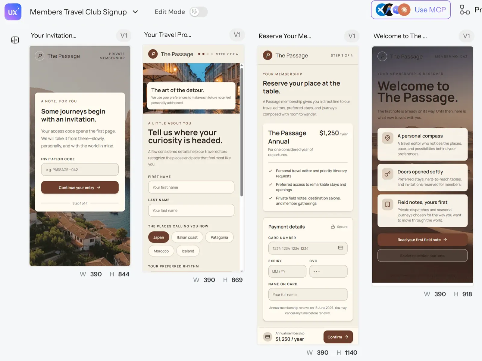
For teams still validating which onboarding approach fits their product before committing engineering time, UXMagic's AI MVP Builder generates a testable version of the full user journey - intent survey, pre-filled workspace, first action fast enough to put in front of real users before a single line of production code exists. And if the activation event itself still needs defining clearly, structuring that requirement as a real spec first keeps the eventual generated flow tied to an actual documented hypothesis, not a guess about what "good onboarding" should look like.
Once a direction is validated, Flow Mode is what carries it into the branching logic this guide argues for admin paths, team-member paths, and error states generated together, sharing the same design tokens throughout. Teams with an existing brand system don't need to rebuild it from scratch either: importing your Figma styles directly keeps every generated onboarding screen anchored to real, existing tokens instead of a generic default.
Generate Activation-Focused Onboarding
Create complete, branched onboarding flows with pre-populated states and contextual guidance from a single prompt.