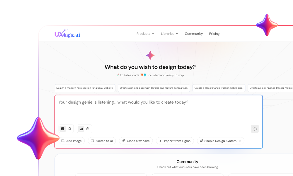
Most SaaS product tours are just UI debt dressed up as user guidance. Forcing new signups through a seven-step tooltip tour across a blank dashboard doesn't teach them your software - it teaches them how to find the Skip button. Effective SaaS platforms tend to eliminate product tours entirely and hand users their first real outcome fast.
You already understand that friction causes drop-off and that mobile responsiveness is mandatory. This isn't a primer on what a modal or a progress bar is. It's the actionable breakdown of micro-interactions, state-dependent design strategy, and the paradigm shift from open-ended prompts to guided AI workspace generation that separates onboarding flows people actually finish from ones they abandon in the first five minutes.
At a Glance: 10 Onboarding Patterns
| Product | Onboarding Pattern | Activation Moment | What to Copy |
|---|---|---|---|
| Slack | Pre-populated starter channels | Joining a conversation | Never show a truly empty first screen |
| Notion | Role-based intent survey | Editing a role-specific workspace | Make survey answers actually change the UI |
| Calendly | Pre-configured shareable asset | Sharing a booking link | Give the user something to share, not just set up |
| Duolingo | Learn-by-doing first session | Completing the first lesson | The first session should be the product, not a tutorial |
| Gamma | Structured prompt → editable draft | Editing a generated document | Never open on a blank prompt box |
| Dropbox | Active drag-and-drop empty state | Uploading a first file | Turn the empty state into an interactive surface |
| Airtable | Pre-populated template bases | Editing an existing base | Give a structure to modify, not a blank grid |
| Mural | In-context guidance | Completing a board action | Surface help where the action happens, not before it |
| Figma | Progressive feature disclosure | Creating a first frame | Hide complexity until it's needed |
| ActiveCollab | Collapsible setup checklist | Completing first checklist item | Track progress without blocking access |
The Onboarding Paradigm Shift: Moving Beyond Product Tours
Why Traditional Modal Tours Accelerate First-Session Churn
Conventional design blogs regularly advocate for multi-step product tours to orient new users. In practice, linear walkthroughs tend to disrupt momentum, increase cognitive load, and trigger immediate dismissal - teams running these tours commonly report the large majority of users clicking "Skip" without reading a single tooltip. Effective SaaS platforms deploy contextual, behavioral triggers instead, revealing tooltips only when a user interacts with the relevant control, not as an upfront gate before they've touched anything.
Designing for Activation: Reverse-Engineering Time-to-Value
Reverse-engineering the flow starts with identifying the single user action that correlates with retention for your specific product, then removing every non-essential field or step standing between signup and that action. That relationship varies meaningfully by product - a collaboration tool's activation event looks nothing like an analytics platform's - so treat every example in this guide as a pattern to adapt, not a formula to copy exactly. A founder who signs up, skips the welcome survey, lands on an empty workspace with zero sample data, and closes the tab isn't lost because your app lacks features - they're lost because the empty dashboard felt like unpaid labor before any value was demonstrated.
10 Effective SaaS Onboarding UX Examples
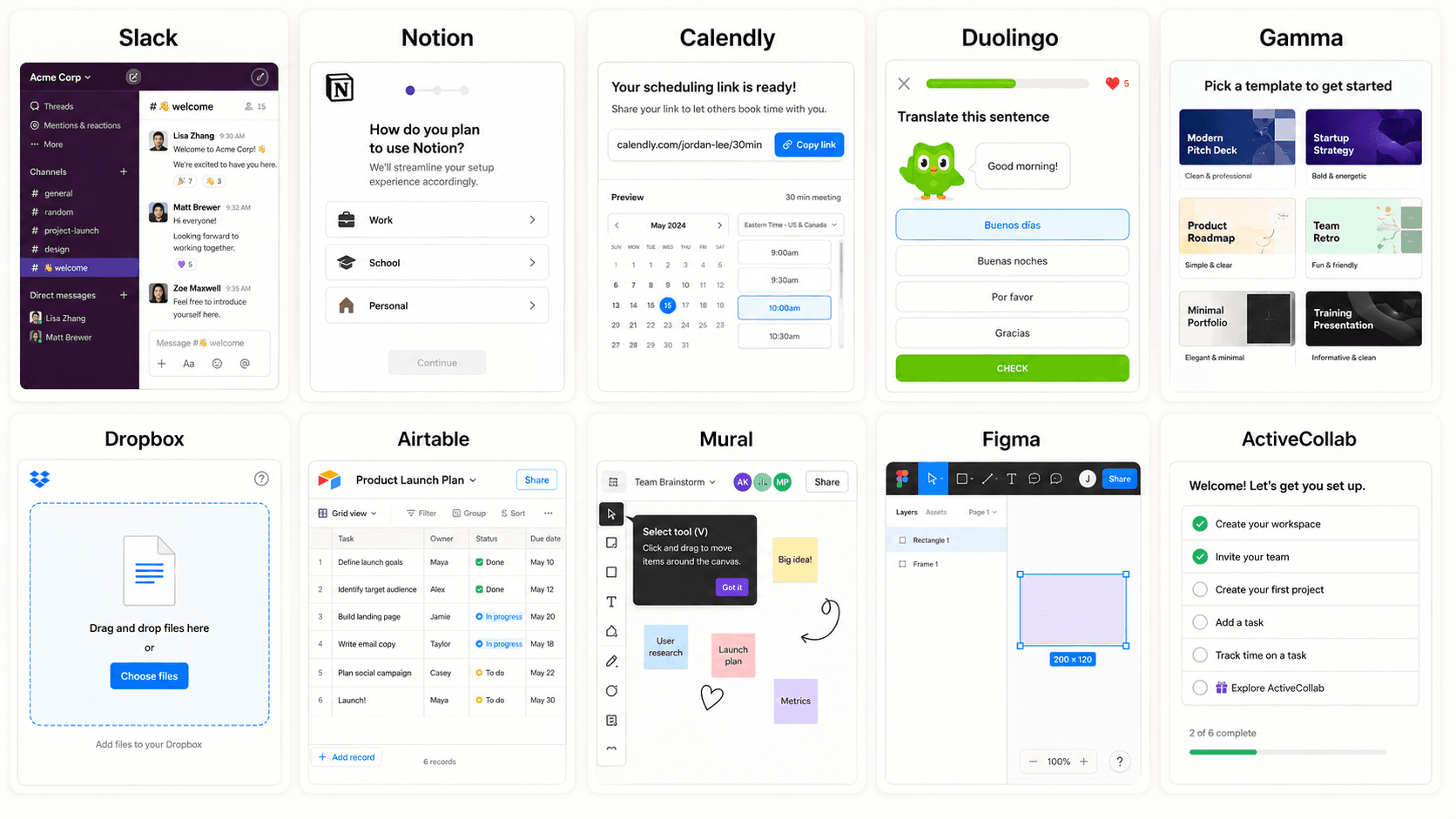
- Slack: Eliminating Blank States with Contextual Starter Channels
New users land inside a pre-populated set of default channels with a bot already posting - something is immediately happening, not a silent inbox waiting for someone else to post first. Activation moment: joining or reading a conversation, not creating a channel from scratch.
- Notion: Tailoring Workspaces via Role-Based Intent Surveys
A role-based intake question directly restructures the workspace that follows, rather than just collecting data for later segmentation nobody acts on. Activation moment: editing content inside a workspace that already matches the user's stated role.
- Calendly: Delivering Immediate Value with Pre-Configured Assets
Rather than an empty scheduling page, the user gets a pre-configured booking link they can share immediately - value delivered before any deep setup work happens. Activation moment: sharing that booking link with someone else.
- Duolingo: Frictionless Learn-by-Doing First Sessions
The first session is the product itself, not a tutorial about the product - users complete a real lesson before any account-level setup gets in the way. Activation moment: completing the first lesson.
- Gamma: Converting Open Prompts into Editable Generated Drafts
Instead of an open-ended prompt box, the user selects a structured starting point that generates a complete draft ready for direct editing - solving the blank canvas problem covered in more depth below. Activation moment: editing the generated document.
- Dropbox: Focused Single-Action Canvas Layouts
The empty state converts into an active drag-and-drop zone rather than a passive instructional graphic, giving the user one clear thing to do immediately. Activation moment: uploading a first file.
- Airtable: Generating Systems Directly from Plain Intent
Pre-populated template bases mean a new user edits an existing structure instead of starting from an intimidating blank grid. Activation moment: editing an existing base rather than building one from zero.
- Mural: Contextual Workspace Guidance Without Flow Disruption
Guidance surfaces inside the actual workspace as the user works, rather than as a separate tour sequence that has to be sat through before real work can start. Activation moment: completing a real action on the board, guided in context.
- Figma: Progressive Feature Disclosure for Complex Tools
Advanced capabilities stay hidden until a user's actions suggest they're ready for them, keeping a genuinely complex tool approachable on day one without limiting its depth long-term. Activation moment: creating a first frame or shape.
- ActiveCollab: Building Momentum with Setup Checklists
A persistent, collapsible checklist tracks remaining setup tasks without blocking access to the actual workspace - momentum without a gate. Activation moment: completing the first checklist item while already inside the live product.
How to Choose the Right Onboarding Pattern
Not every pattern above fits every product. A quick way to match approach to product type:
- New or complex product → guided setup, closer to Figma's progressive disclosure - hide depth until the user is ready for it.
- Template-based product → pre-populated workspace, closer to Airtable or Notion - give something to edit, not build.
- Collaboration product → invite/team activation, closer to Slack or Mural - activation happens through other people showing up, not solo setup.
- AI-powered product → structured starting prompts, closer to Gamma - never open on a truly blank prompt box.
What to Actually Measure
"High-converting" gets thrown around loosely in onboarding advice - the more precise claim is that these patterns tend to support activation, not that they're independently proven to lift conversion in every context. Track these instead of assuming:
- Activation rate - the percentage of new users reaching your defined value milestone
- Time-to-value (TTV) - how long it takes a user to reach that milestone from signup
- Onboarding completion rate - how many users finish the full sequence, tour or checklist
- First-session engagement - depth of interaction within the first session specifically, not just whether they logged in
- Feature adoption - whether users engage with the features the onboarding flow was meant to introduce, weeks later
Core UX Patterns for High-Activating Onboarding
Instructional Empty States and Sample Data Injection
Standard UX guidelines often treat empty states as visual placeholders with friendly copy and an illustration. High-activating onboarding treats empty states as primary activation engines instead populated with ready-made templates, interactive sample data, or instant editable artifacts. Requiring a user to build a structure from scratch on day one is a reliable way to lose them before they've seen any real value.
Progressive Disclosure and Behavioral Triggering
Collecting onboarding survey data on role, company size, or goals without dynamically modifying the post-signup interface is largely wasted effort. If an admin and an individual contributor select different goals but see the identical dashboard, the survey serves no functional purpose - it just adds signup friction for no downstream benefit.
Where generic AI design and image tools fail specifically: they treat onboarding screens as isolated static graphics with no understanding of state transitions, context persistence, or design system logic. Asked to generate an onboarding wizard, they tend to produce mismatched typography, inconsistent UI tokens, and detached screens that can't be handed off to engineering without significant manual rework.
Here's what that looks like on two real product types. B2B product analytics platform: the traditional version has the user finish account creation and land on an empty analytics dashboard - empty chart frames, zero-data badges, a dead-end button requesting a database API connection. The optimized version loads a pre-populated dashboard with benchmark data instead, contextual badges highlighting key metrics, and a top bar letting the user instantly switch between "Sample Data View" and "Live Connection Setup" - blank-screen confusion eliminated, analytical value demonstrated in seconds.
AI-powered visual document generator: the traditional version opens to a blank canvas with an open-ended prompt box and an extensive tool palette, leaving the user unsure how to even structure a first command. The optimized version presents three structured template prompts based on the user's selected industry instead selecting one instantly generates a complete, multi-section draft ready for direct visual editing, replacing open-ended creation friction with a structured editing workflow.
Common Onboarding Design Errors
A fuller reference on the recurring mistakes worth checking for:
- Blank dashboards - a new signup lands on an empty canvas with no context or sample data to react to.
- Too many onboarding steps - every additional screen or field before value realization is another chance to lose the user.
- Generic surveys - collecting role or goal data that never actually changes the interface the user sees next.
- Forced setup - requiring full configuration before granting any access to the actual product.
- No recovery path - a user who abandons mid-flow has no clear way back in without starting over.
- Asking for information before demonstrating value - front-loading data collection instead of earning it after the user has seen why it matters.
- Overloading setup forms - demanding extensive configuration details during initial signup rather than deferring setup until after value realization.
- Dead-end confirmation screens - ending an onboarding flow on a passive confirmation page instead of immediately routing users into an active workspace.
- Uncoordinated cross-channel messaging - triggering generic onboarding emails that ignore real-time in-app progress, re-engaging users who already completed setup.
Accessibility Considerations
Onboarding flows get overlooked in accessibility reviews almost as often as empty states do. A few specifics worth building in deliberately:
- Keyboard navigation - every step of a setup wizard or checklist needs to be completable via keyboard, not just mouse or touch.
- Focus states - a visible, non-animated-away focus indicator on every interactive element in the flow, especially multi-step wizards.
- Screen-reader support - state changes (a checklist item completing, a step advancing) need to be announced via ARIA live regions, not silently rendered.
- Avoid relying only on tooltips or color - a contextual tooltip that only appears on hover, or a status communicated by color alone, excludes keyboard-only and colorblind users respectively; pair every signal with text.
How to Prototype Multi-State Onboarding Flows in UXMagic
Designers waste real days manually drafting every screen permutation across an onboarding sequence - welcome surveys, setup wizards, populated workspaces, error states. UXMagic's Flow Mode eliminates that bottleneck directly: inputting a plain text prompt like "Generate a 3-step SaaS onboarding flow featuring a welcome intent survey, an interactive setup checklist, and a populated dashboard empty state" produces a complete, production-ready UI sequence in one pass, not three weeks in Figma before engineering even touches it.
For the signup and intake survey portion specifically - the exact structure covered in the Notion and Gamma examples above - UXMagic's Signup Flow Generator is purpose-built around that first step: generating the account creation and intent-survey sequence as a connected flow, rather than a single isolated form someone has to manually extend into the rest of the onboarding journey.
Maintaining visual consistency across welcome modals, setup wizards, and workspace states otherwise requires tedious manual token management. Flow Mode enforces deterministic style consistency across every generated screen state - modals, progress indicators, buttons, and empty-state placeholders automatically inherit brand tokens, typography, and component styling, letting teams prototype and test full onboarding sequences in minutes instead of weeks. For teams building the underlying discipline this depends on, structuring effective design prompts covers the groundwork that makes a Flow Mode prompt like the one above actually generate something usable on the first pass.
Build Better Onboarding Flows
Generate a complete, multi-state onboarding sequence from a single prompt and move users from signup to activation faster.