Spending forty-five minutes whiteboarding a seamless onboarding flow during a product discovery session should feel like momentum. Instead, it usually marks the start of a tedious grind manually rebuilding every frame, container, and auto-layout stack inside Figma. Manual wireframe conversion is an unnecessary tax on creative bandwidth that actively degrades shipping velocity.
You already understand button states, user journeys, and what low-fidelity sketching is for. This isn't a wireframing 101 post. It's the technical bridge from a flat photographed drawing to a structured, multi-screen system - the difference between an AI tool that generates a pretty static screen and one that converts hand-drawn logic into token-aligned architecture an engineer can actually build from.
A quick clarification on terminology before diving in: "production-ready," "handoff-ready," and "prototype-ready" get used loosely and interchangeably in this space, and they're not the same thing. A prototype-ready output is structurally sound enough to click through and validate a concept. Handoff-ready means it carries real Auto Layout and tokens an engineer can build from without a rebuild. Production-ready implies shipped, accessible, edge-case-complete code which almost nothing coming out of an AI generation step actually is without human review. This guide is mostly about getting reliably from sketch to handoff-ready, not claiming a shortcut to production.
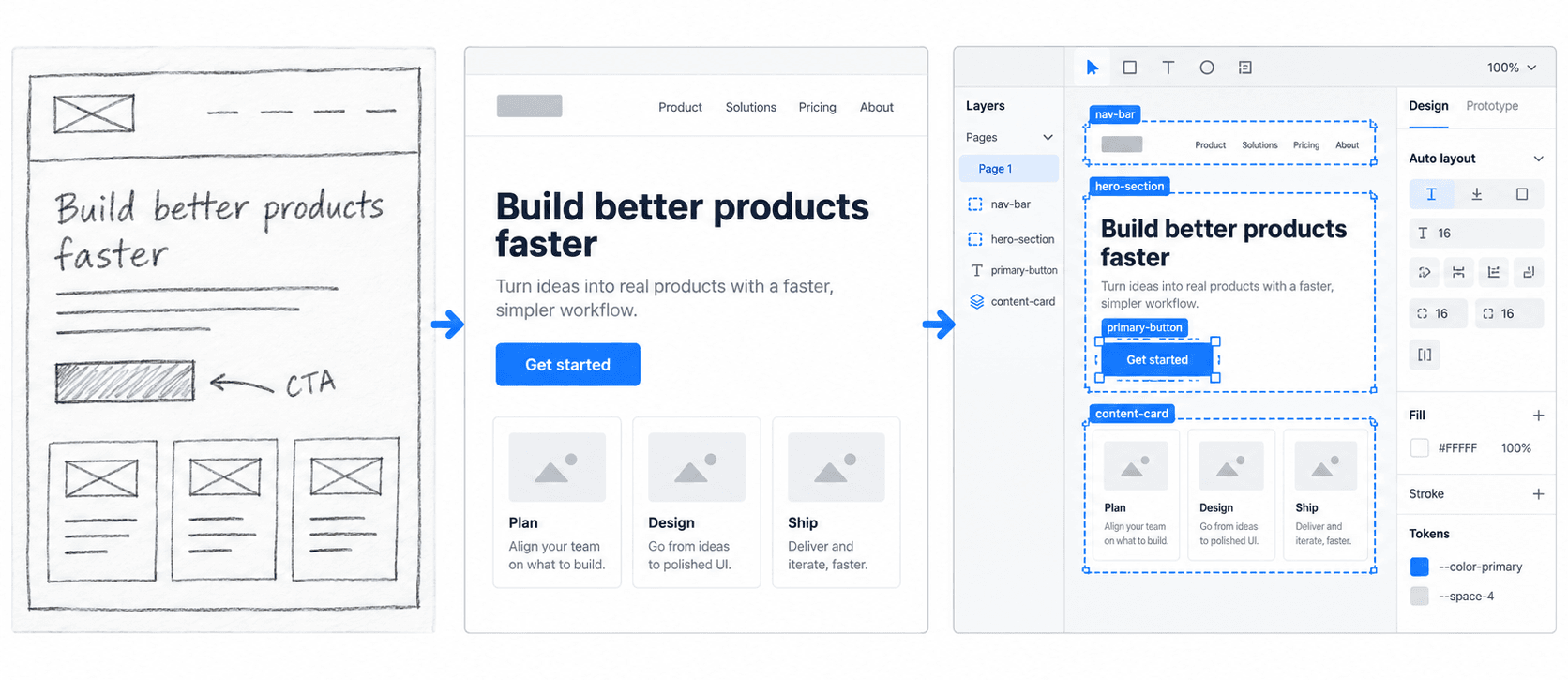
The Pipeline, Visually
The Napkin Sketch Bottleneck: Why Traditional Prototyping Slows Product Teams
Single-Screen Sketch Generators Create Dead-End Design Debt
Generating isolated UI screens from a paper drawing creates static visual artifacts that can't scale into actual software. Digital products function as interconnected user flows, requiring persistent navigation, dynamic state transitions, and coherent information architecture. Tools that lack multi-screen flow awareness force designers to manually stitch screens together, which negates whatever initial time savings AI was supposed to provide.
Manual Low-Fidelity Wireframing in Figma Is Unnecessary Overhead
Starting every digital design sprint with a blank Figma canvas to build basic low-fidelity wireframes is generally an inefficient use of senior design talent. Teams integrating AI into rapid prototyping workflows have reported meaningful reductions in prototyping cycle time - treat that as a directional benefit worth validating against your own workflow rather than a fixed universal percentage, since the actual gain depends heavily on sketch quality and tool choice. Standard UI patterns should be instantly synthesizable by AI vision models from rough drawings, reserving human effort for high-level architecture and edge-case validation instead.
How Vision AI Reimagines the Sketch-to-Prototype Pipeline
Physical Sketches Serve as Essential Structural Constraints for AI
Unconstrained text-to-UI prompts tend to produce generic layout output, since generative models predict something close to the statistical average of their training data. High-quality output requires supplying strict spatial bounds via physical wireframes alongside a structured contextual brief. A hand-drawn sketch acts as a real visual constraint that forces the AI model to respect specific spatial hierarchies and element placements, rather than guessing at a layout from text alone.
Sketching Best Practices for AI Parsing
A well-prepared sketch does more to determine output quality than the AI tool itself. Before photographing anything:
- Use high contrast - black ink on white paper, or dark marker on a clean whiteboard, parses far more reliably than light pencil or a busy background.
- Label important elements - annotate directly on the sketch ("sticky header," "primary CTA," "filter drawer") rather than leaving shapes to speak for themselves.
- Mark interactions - a small arrow or note indicating "tap opens modal" gives the parser something to project into the next screen, not just this one.
- Keep screens clearly separated - distinct boxes or page breaks for each screen prevent the parser from merging two intended screens into one.
- Avoid unnecessary visual detail - shading, decorative flourishes, and precise pixel alignment add noise without adding parsing accuracy; structural clarity matters more than artistic polish.
The Workflow, Step by Step
| Step | Input | AI Action | Output |
|---|---|---|---|
| 1. Sketch | Paper, whiteboard, or tablet drawing | — (human step) | Annotated physical wireframe |
| 2. Digitize | Photo or scan, high contrast, straight-on | Image capture and cleanup | Clean digital image file |
| 3. Contextualize | Digitized image + persona/task/platform brief | Vision parsing + prompt interpretation | Structured layout draft |
| 4. Project flow | Primary screen | Multi-screen interaction logic inference | Connected multi-screen sequence |
| 5. Bind tokens | Generated screens | Design token + Auto Layout mapping | Handoff-ready Figma frames |
| 6. Export | Verified prototype | Format conversion | Figma file, code, or preview link |
Preparing High-Contrast Wireframe Inputs
The physical sketch gets captured with a mobile camera or scanner. Capture straight-on under neutral overhead lighting to avoid the shadows across component boundaries that distort parsing accuracy - this single step affects output quality more than almost any prompt refinement done afterward.
Pairing Visuals with Contextual System Prompts
The digitized image gets uploaded alongside a structured context prompt, not left to speak for itself. That prompt defines the target user persona, core application tasks, visual theme direction, and component library constraints. The AI engine parses the spatial layout of the image against that textual context together, synthesizing a structured digital interface rather than a literal pixel trace of the drawing.
Synthesizing Multi-Screen Interactive User Flows
Once the primary screen layout generates, a genuinely capable tool projects the adjacent connected screens based on the interaction logic already implied by the sketch - uploading a sign-up form sketch, for instance, should automatically generate the confirmation modal, verification screen, and initial dashboard view that logically follow it, maintaining continuity across the full journey instead of stopping at one frame.
Evaluating AI Prototyping Tools: What Design Teams Must Demand
Generative UI Engines Must Map Design Tokens, Not Raw CSS
Any generative UI engine that outputs arbitrary hex codes and unmapped pixel margins fails a real production standard. To provide actual value beyond a quick visual, AI models need to parse sketches directly into designated design tokens - specific color variables, spacing scales, predefined typography tokens not raw, one-off CSS values.
Absolute Positioning vs. Token-Mapped Auto Layout: The Core Technical Divide
This is the actual line that separates a usable tool from a demo. Absolute positioning locks every element to a fixed x/y coordinate - visually correct in the exact conditions it was generated under, and broken the moment content length changes, a screen resizes, or a token updates elsewhere in the system. Token-mapped Auto Layout instead binds containers to responsive constraints and components to actual design variables, so a button generated from a sketch references color-primary and padding-md rather than a hardcoded hex value and an arbitrary pixel number.
The practical difference shows up immediately at handoff: absolute-positioned output requires a designer to manually rebuild every frame into real Auto Layout before an engineer can touch it, while token-mapped output arrives already structured, so a rebrand or spacing update propagates automatically instead of requiring a screen-by-screen fix.
Tool Comparison
| Tool | Figma Output | Multi-Screen Support | Auto Layout | Code Export |
|---|---|---|---|---|
| UXMagic | Native, editable | Yes, connected flows | Yes | Yes (React, Tailwind) |
| Uizard | Limited | Basic, less flow-aware | Partial | Limited |
| v0 (Vercel) | No (code-first) | Weaker, single-component focus | N/A (code, not Figma) | Yes (React, Tailwind) |
| Generic image AI (Midjourney, etc.) | No | No | No | No |
Real Workflow Scenarios
B2B SaaS discovery workshop: during a client session, a PM and lead designer sketch a complex multi-tenant analytics dashboard on a whiteboard. Under the traditional workflow, the designer photographs the board, opens Figma, and spends two full days manually constructing grid containers, charts, filter menus, and data tables. Using a vision-AI workflow instead, the photo gets captured and uploaded with a brief defining the data architecture - in one documented case, a comparable workflow produced a responsive, dark-mode analytics view with functional filter drawers and structured data tables in about fifteen minutes; treat that as an illustrative example of what's achievable with a clean sketch and a well-scoped brief, not a guaranteed timeline for every project. Generic image AI generators tend to fail here specifically by rendering chart regions as flat, non-responsive pixel blocks that break under dynamic screen resizes.
Mobile app onboarding optimization: a UX team needs to evaluate three distinct onboarding flows for a fintech app to improve sign-up conversion. Under a manual workflow, sketching three 4-screen concepts means building twelve separate screens in Figma - an entire design sprint. With AI flow generation instead, the designer uploads paper drawings of the three concepts, and the engine parses the line art and applies the established design token library - again, illustratively, comparable workflows have produced complete 4-screen click-through journeys for all three concepts in around twenty minutes, though actual time will vary with sketch complexity and tool. Standard prompt-to-UI tools tend to fail here in a related but distinct way - altering primary brand colors, typography scales, and border radii between screen one and screen four, creating a disjointed journey nobody would present to a real stakeholder.
Avoiding the Traps: Design Token Fragmentation and Broken Auto-Layouts
Absolute positioning is the root cause behind most of the specific failure modes teams run into:
- Redraw destabilization - submitting a follow-up prompt to refine one element of an already-generated draft can cause some models to redraw the entire canvas, destroying typography hierarchy and button styling across every other connected screen.
- Component fragmentation - frontend code exporters that output isolated React components for individual buttons but fail to maintain scalable container logic across a complex dashboard view.
- Unstyled stakeholder drops - non-technical stakeholders pulling unstyled, broken AI wireframes into a design review and expecting engineering to ship them next sprint, without realizing the underlying component architecture was never actually there.
The token-mapping problem gets addressed at the same generation step rather than left for manual cleanup in a well-built tool - binding recognized wireframe elements to predefined design tokens (padding scales, color variables, typography roles) delivers clean, Auto Layout-ready Figma frames for engineering handoff, rather than the unorganized, absolute-positioned output basic engines tend to produce. For teams refining the contextual prompt discipline this whole pipeline depends on, structuring effective design prompts and prompt structuring for complex B2B dashboards specifically cover that groundwork in more depth.
UXMagic's Sketch to UI: The Feature Built for This Exact Workflow
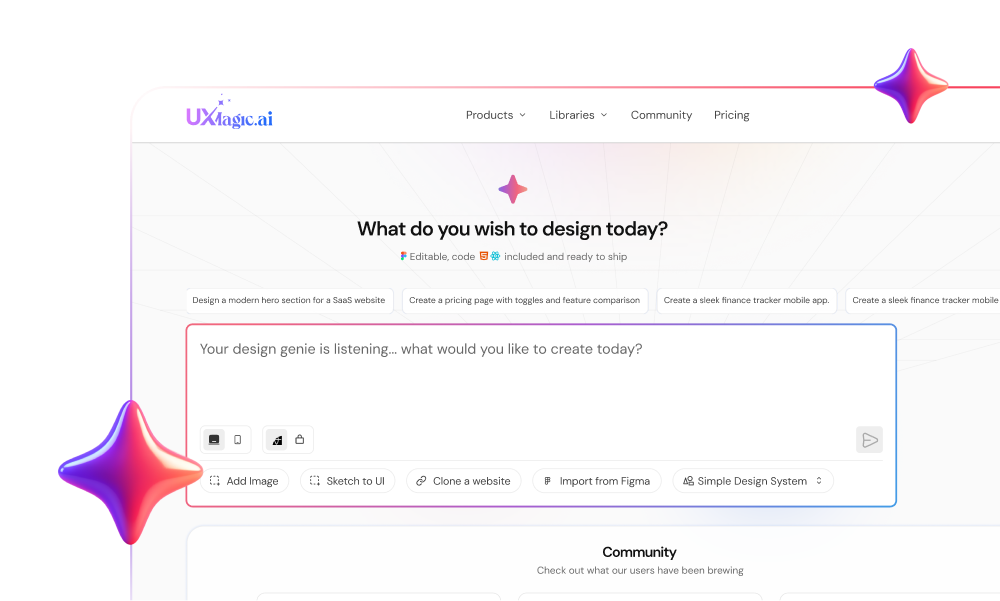
Everything covered in this guide - high-contrast capture, contextual prompting, multi-screen projection, token binding - maps directly onto UXMagic's Sketch to UI, the feature built specifically to take a photographed hand-drawn wireframe and turn it into an editable, structured screen rather than a flat trace of the drawing.
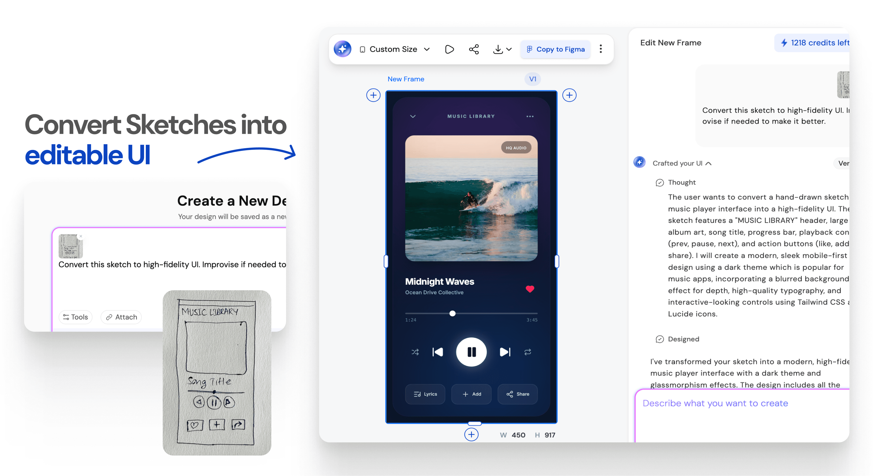
Closing the multi-screen gap. Where generic AI generators convert a napkin sketch into an isolated static frame, UXMagic analyzes the underlying interaction logic of the drawing to project complete, multi-screen user flows - confirmation modals, empty states, error handling while maintaining visual continuity across every screen, closing the exact drift gap the fintech onboarding scenario above ran into.
Delivering handoff-ready structure, not another cleanup job. UXMagic binds recognized wireframe elements to predefined design tokens - padding scales, color variables, typography roles at the generation step itself, so the output arrives as clean, Auto Layout-ready Figma frames instead of the unorganized, absolute-positioned mess most basic sketch tools produce.
Meeting teams wherever the input format actually is. A sketch is one entry point among several - screenshots of existing interfaces or a live competitor URL feed into the same structured, token-aware pipeline, useful when a discovery session references an existing product rather than starting from a blank whiteboard.
Turn Sketches Into Prototypes
Transform hand-drawn wireframes into token-mapped, multi-screen prototypes without rebuilding every frame manually.