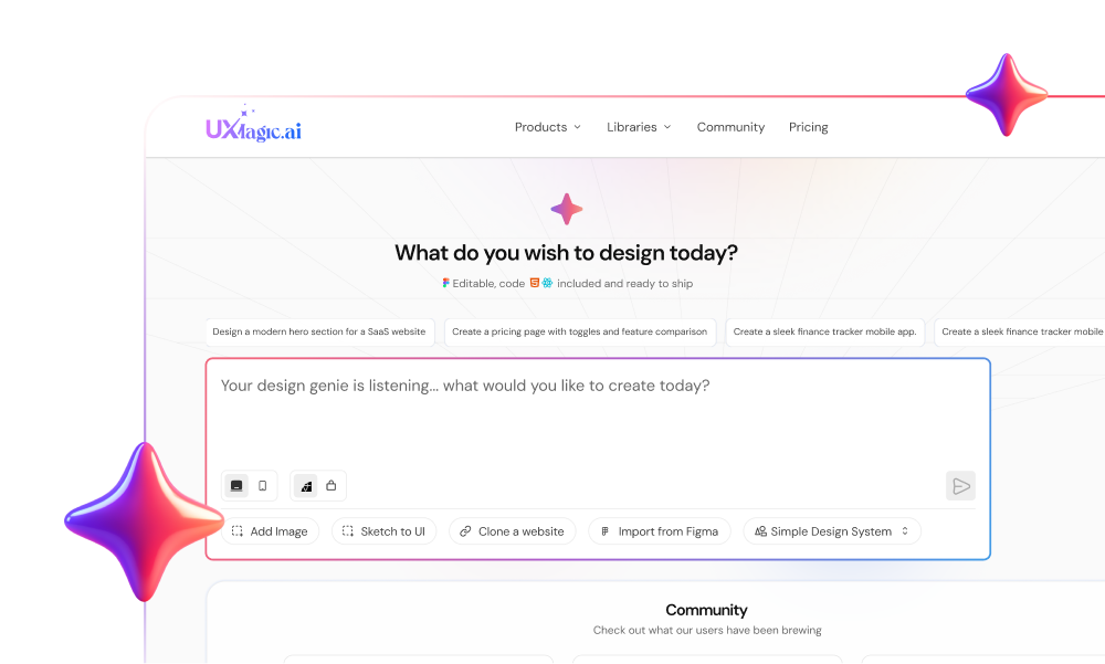
When a meaningful share of design teams report their leadership pushing AI features into products without a validated user need behind them, the industry has reached a real friction point. The result is an influx of uncalibrated AI features, broken auto-layouts, and manual refactoring that drains engineering velocity. Shipping real product value in 2026 means moving past superficial AI sparkle and adopting tools that output strict, production-ready design flows instead.
You already understand design system tokens, auto-layout constraints, and basic prompt construction. This isn't an AI-101 primer. It's a practical framework for evaluating whether generative tools deliver measurable efficiency gains or just create additional cleanup overhead - the actual question behind most searches for the state of AI in design right now.
Before AI vs. After AI: The Workflow Shift
| Traditional Process | AI-Assisted Process |
|---|---|
| Requirement → Wireframes → Screens → Prototype | Requirement → Prompt → Flow → Validation |
| Manual component setup, screen by screen | Token-aware generation across the full flow |
| Inconsistencies fixed after the fact | Constraints applied upfront, at generation time |
Key Benchmarks: What the Real Data Shows
Figma's State of the Designer 2026 report - an independent survey of 906 designers conducted by NewtonX found 72% of designers now use generative AI, with usage increasing year over year for 98% of that group. That same research found real gains reported by designers who've leaned in: 91% say AI improves the quality of their output, 89% say it helps them work faster, and 80% say it helps them collaborate more effectively.
That's a more optimistic picture than some industry commentary suggests, but it comes with a real caveat worth stating plainly: those gains concentrate specifically among designers using AI as a structured, constrained tool inside an existing workflow, not among teams bolting AI features onto a product without a valid reason. The rest of this piece is about that distinction specifically.
Moving Beyond the Hype: Autopilot vs. Copilot Architecture
Why Dynamic Layout Personalization Fails Without Restraint
Autonomous "autopilot" interfaces are worth treating as a product anti-pattern, not the future. Common commentary suggests a self-generative UI that dynamically reshapes itself based on user prompts is where design is headed. Unprompted visual mutations tend to disrupt human muscle memory and erode user trust instead. High-performing products treat AI as a copilot - the interface shell stays predictable and calm, and AI capabilities operate exclusively within transparent, user-controlled boundaries.
Hyper-personalized "personas of one" tend to drive user churn, not retention. Industry commentators promote predictive interfaces that dynamically reorder menus and hide navigation paths based on machine learning. When software continuously alters where the primary action lives based on a probability model, cognitive load tends to spike and users disengage. Restraint - consistent, low-friction interfaces with targeted micro-personalization - tends to outperform aggressive algorithmic layout restructuring.
Calm Design Principles and Cognitive Clarity as the New Baseline
Stakeholders keep pushing for hyper-personalized, self-rearranging layouts, but users generally don't respond well to unpredictable software. When an interface dynamically shifts its navigation or hides primary buttons based on predictive models, users lose mental context. Calm, stable UI shells aren't a design limitation in 2026 - they're the baseline that makes any AI feature layered on top of them trustworthy.
The Commoditization of UI Assembly: Where Human Value Concentrates
Transitioning from Pixel Assembly to System Architecture
The widespread adoption of design tokens, standardized component libraries, and visual guidelines means assembling a polished UI screen no longer represents specialized craft on its own the way it once did. Designers who evaluate their professional value primarily on pixel alignment or auto-layout adjustments face real pressure - design value in 2026 increasingly concentrates in problem framing, system architecture, behavioral research, and accessibility governance instead.
Bridging the Strategic AI-UX Skills Gap
Because AI tools make surface-level UI generation cheap, junior team members can end up dropping unrefined AI outputs into shared design system files. Senior designers then spend more time acting as visual custodians fixing auto-layouts and layer hierarchies than actually driving product strategy. That's not really a junior-designer problem; it's a tooling problem, since the cleanup burden only exists because the generation tool didn't respect the design system in the first place. Pairing generation with a real, referenced token system like the one UXMagic's Style Guide Generator produces from a brand prompt or existing Figma file is what removes that custodial burden at the source.
Where AI Still Fails
Worth being direct about the actual limits, not just the wins:
- Understanding complex business rules. AI can generate a plausible-looking permission matrix; it can't know which edge case your specific compliance team actually cares about without being told explicitly.
- Making product strategy decisions. Generation tools can produce five layout variations fast - they can't tell you which one serves the actual business goal, since that judgment call sits outside what the tool has visibility into. This is exactly the reasoning gap a structured PRD is meant to close before generation starts, so the tool has a real decision to work from instead of guessing.
- Handling edge cases without human review. Empty states, error states, and unusual data conditions still need a human to confirm the generated version actually makes sense for the real product, not just that it exists.
- User research interpretation. Synthesizing raw interview transcripts into structured input is one thing; understanding why a user hesitated or what they didn't say out loud is a different, still-human skill.
Operationalizing AI: Eliminating Design System Overhead
Flow Mode: Multi-Screen Continuity vs. Single-Screen Prompting
Single-screen text-to-UI prompting often creates real design debt when teams need production-ready flows. Generating isolated artboards from text prompts is a common workflow error, because production software doesn't consist of standalone screens - it operates as interconnected state machines. Tools that generate single frames without maintaining flow-level context tend to force designers into manually connecting logic, fixing token discrepancies, and building missing states afterward.
Deploying AI effectively follows three real stages:
- Stage 1 - Pre-generation context setting. Define user requirements, business logic, and design system parameters before entering a single prompt. Prompting without specifying token constraints, color scales, and spatial grid systems tends to yield unstructured visual noise regardless of how capable the model is.
- Stage 2 - Copilot flow generation. Input context-rich prompts specifying the target user goal and step-by-step journey requirements. The platform generates primary navigation paths, modal overlays, system alerts, and edge cases simultaneously, maintaining global visual state continuity across every screen instead of one isolated frame at a time.
- Stage 3 - Post-generation validation. Human design expertise evaluates cognitive hierarchy, verifies brand tone, audits WCAG accessibility compliance, and inspects edge cases. Once validated, tokens get locked and clean auto-layout structures exported directly to engineering.
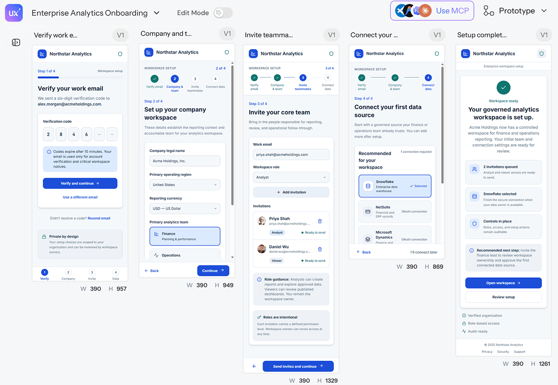
Here's what that looks like on a real project. A senior product manager at an enterprise SaaS company needs a complex 5-step onboarding funnel - multi-factor authentication, organization setup, role assignment, workspace invitations. The traditional process: roughly 20 hours drawing wireframe frames, building input variants, and manually linking prototype transitions across 15 distinct state screens. An unstructured AI attempt fares worse in a different way - prompting a generic text-to-screen generator produces four visually disconnected artboards with inconsistent padding, missing error states, and non-standard form controls.
The system-constrained version: a structured prompt specifying "Enterprise SaaS onboarding flow, 5 steps, dark mode, corporate finance brand tokens, explicit validation, error, and success states" generates a complete sequence using Flow Mode in a fraction of that time - linked states, consistent auto-layout padding, and correct form field tokens, without a manual reconciliation pass afterward. A multi-step account or signup sequence specifically follows the same pattern purpose-built signup flow generation is designed around.
A second case follows the same pattern for a smaller team. A non-technical founder needs to prototype a mobile checkout experience - guest checkout, saved payment selection, order summary toggles, promo code inputs to validate before committing engineering time. Hiring an agency traditionally means weeks and a real budget for static mockups that still need further iteration. Generic image generators fare no better here either: a tool like Midjourney produces visually appealing flat raster images that can't be edited, exported as vectors, or handed to a developer for production work. Entering the same description into a full app-generation workflow instead generates an editable, vector-based checkout flow where every frame respects standard 48×48px touch-target guidelines with clean auto-layout structures, ready for immediate developer export.
Enforcing Design System Tokens and WCAG Compliance
During the transition from rough concept to production-ready UI, generic AI engines tend to fail specifically because they invent arbitrary colors, non-standard typography, and broken auto-layout hierarchies instead of respecting an existing system. Binding generated elements directly to a component library that's already coded like UXMagic's Figma Component Library closes that gap at the styling phase, eliminating manual refactoring rather than fixing it after the fact.
Accessibility Failures AI Tools Commonly Introduce
Unconstrained generative UI tools tend to reproduce the same handful of accessibility failures, worth naming specifically since they show up so consistently:
- Poor contrast on generated text and buttons. Models optimizing purely for visual appeal frequently produce color pairings that fail WCAG AA contrast thresholds outright.
- Missing focus states. Interactive elements generated without a visible focus ring leave keyboard users with no way to tell what's currently selected.
- Incorrect component hierarchy. A visually styled heading that isn't actually coded as a heading breaks screen reader navigation, even though it looks correct on screen.
- Broken keyboard navigation. Custom dropdowns, modals, and multi-step forms generated without real semantic structure often can't be operated via keyboard at all.
Prior to developer handoff, design teams routinely lose real time auditing layer stacks, checking contrast, and organizing component states manually. Automatically outputting clean, semantic auto-layout hierarchies that satisfy contrast rules (4.5:1 minimum ratio for body text) and target dimensions (48×48px minimum for interactive elements) turns that audit into a built-in property of generation, not a separate QA pass someone has to remember to run. This checklist for running that audit systematically covers the manual version of the same discipline, for teams not yet using a system-constrained generator.
Tool Evaluation Framework: Selecting Production-Grade Platforms
| Tool Type | Best For | Limitation |
|---|---|---|
| Figma AI / legacy vector suites | Editing inside existing design files | Limited full-flow generation from scratch |
| AI wireframe tools (Uizard, Relume, Galileo AI, UXMagic) | Early concepts, landing pages | Less production-ready; rigid templates collapse on complex logic |
| System-aware AI tools | Full product workflows, multi-screen flows | Requires structured inputs to work well |
The competitive landscape splits into three real categories, and confusing them is how teams end up disappointed with a tool that was never built for the job they needed. Legacy vector platforms retrofitting AI focus primarily on canvas-level optimizations auto-naming layers, generating single components inside existing files but struggle with multi-screen flow generation from scratch, forcing users to manually wire prototypes and reconcile disconnected frames.
Generative wireframe engines like Relume provide rapid preliminary landing pages or sitemap structures, but their outputs frequently lack production-ready tokens and rely on rigid templates that collapse when applied to complex B2B SaaS logic. Galileo AI - now folded into Google Stitch has the same single-screen limitation covered earlier in this piece: strong for a quick concept, weak the moment a project needs more than one connected screen. For a broader read on where these wireframe-first tools genuinely fit versus where they stall out, this comparison of wireframing tools walks through the full landscape, including where UXMagic sits relative to Uizard and its closest competitors on that same spectrum. Generic LLMs and image generators are widely adopted for preliminary ideation, but entirely incapable of producing editable, component-driven vector UI files with proper auto-layout hierarchies - the flat-image failure mode covered in the checkout scenario above.
Most existing coverage of this space focuses heavily on initial visual generation while ignoring post-generation cleanup costs entirely - the token drift, layer refactoring, and accessibility compliance work that actually determines whether a tool saves time or just relocates the work. UXMagic is the system-aware option in the table above specifically because it treats those cleanup costs as the thing worth eliminating at generation time, not the wireframe itself. For teams whose developer handoff runs through an AI coding assistant, UXMagic's MCP integration connects generated flows directly into Cursor, Claude Code, or VS Code, closing the specific gap between "generated something" and "generated something shippable" that most of this landscape hasn't solved yet.
Where UXMagic Fits Into This
The pattern across every section above is the same: AI helps when it's constrained by real tokens, real flows, and real accessibility rules, and it hurts when it's left to guess. UXMagic was built around that exact distinction - Prompt to UI and Flow Mode generate connected, multi-screen work bound to your actual design system instead of a plausible-looking single frame you'll spend the afternoon fixing.
Generate Token-Consistent Product Flows Faster
Turn competitive research into production-ready, multi-screen UI flows with consistent tokens and layouts in minutes.