Most color palette generators were engineered for graphic illustrators, not product teams building multi-state digital applications. When a five-swatch color bar gets pasted into Figma, it inevitably falls apart across dark modes, interactive states, and accessibility compliance. This evaluation covers ten free tools that generate mathematically precise, production-ready interface color scales instead of superficial swatches.
You already understand contrast requirements, responsive layout principles, and component-driven workflows. This isn't a color theory primer. It's which tools actually produce a usable 50–950 scale, why legacy WCAG contrast math has real limitations, and how to get a finished system into production code without manually re-engineering every shade.
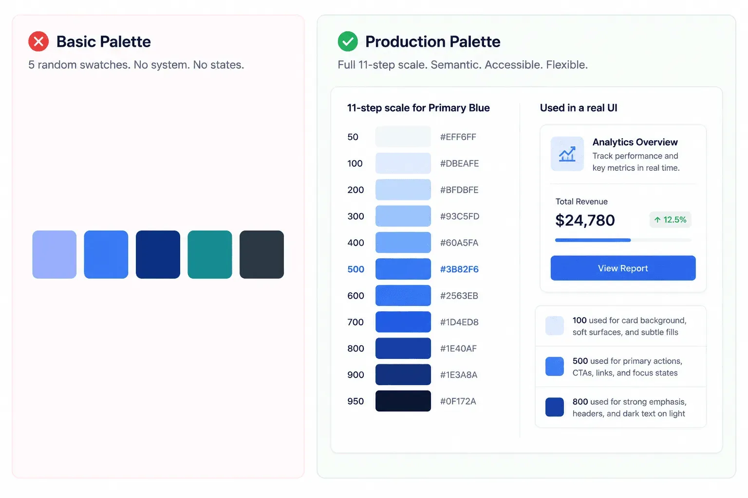
Bad Palette vs. Production Palette
| ❌ Basic Palette | ✅ Production Palette |
|---|---|
| 5 random swatches | Full 50–950 tonal scale |
| No interactive states | Hover, active, disabled states defined |
| No dark mode consideration | Dark mode built in from the start |
| Isolated hex values | Semantic design tokens |
What Distinguishes UI Color Generators from Basic Swatch Tools?
Tonal Scale Expansion (50–950) vs Static Swatches
Five-swatch bars are largely obsolete for product interfaces. Tools built around random spacebar generation don't hold up for real UI work. Digital products need complete 11-step tonal scales (50 through 950) for every hue, tinted neutral scales for surfaces and borders, and strict semantic mappings for status indicators - a primary 500 that looks great on a button still needs a 100 that doesn't wash out on a card background and an 800 that doesn't turn to mud in dark mode.
Perceptual Color Spaces: Transitioning to OKLCH and HCT
WCAG 2.1 contrast ratios have real limitations because they don't fully account for human perception. The formula doesn't factor in spatial frequency, which means it can penalize valid dark mode combinations while approving light text on saturated backgrounds that's genuinely hard to read. OKLCH and HCT color spaces calculate lightness curves based on how humans actually perceive color, which is why modern tools increasingly lean on them instead of raw hex math.
Perceptual Accessibility: Why APCA Outperforms Legacy WCAG 2
Color harmony is best evaluated on real components, not a color wheel. Judging balance on a theoretical wheel or a horizontal swatch bar can create visual illusions from simultaneous contrast - colors that look fine side by side in isolation can fail once they're rendered in a real 60-30-10 spatial distribution across backgrounds, cards, typography, and CTAs. APCA (Advanced Perceptual Contrast Algorithm) measures against that real distribution instead of a static ratio. This same perceptual-accuracy problem shows up across accessibility work generally, not just color - the accessibility heuristics checklist covers the broader pattern of testing against real conditions instead of static, isolated checks.
The 10 Best Free Color Palette Generators for UI Design (2026)
| Tool | Best For | Export | Dark Mode | Tokens |
|---|---|---|---|---|
| UI Colors | Tailwind CSS scales | CSS, Tailwind config | Manual | No |
| Realtime Colors | Instant layout visualization | CSS | Manual | No |
| Material Theme Builder | Dynamic design tokens | Theme files | Yes | Yes |
| Atmos | OKLCH curves, APCA contrast | Tokens, CSS | Yes | Yes |
| Khroma | AI-driven personalization | Hex/CSS | Manual | No |
| Colorbox by Lyft | Precision scale tuning | CSS, JSON | Manual | Limited |
| Learn UI Design Color Picker | Equidistant chart palettes | Hex list | N/A | No |
| Coolors | Rapid exploration, image extraction | Hex, PNG | Manual | No |
| Adobe Color | Traditional color theory rules | ASE, hex | Manual | No |
| Huemint | AI component color mapping | Hex/CSS | Manual | Limited |
1. UI Colors - Best for Tailwind CSS Scale Generation. Instantly expands a single hex code into a full 50–950 Tailwind CSS scale with live UI previews, so a shade choice gets judged in context, not isolation.
2. Realtime Colors - Best for Instant Layout Visualization. Applies a palette directly onto a live mock interface as you adjust it, closing the gap between "looks good on a swatch" and "looks good on a real screen."
3. Material Theme Builder - Best for Dynamic Design Tokens. Google's own tool for generating full Material Design token sets, useful if your stack is already leaning on that system's conventions.
4. Atmos - Best for OKLCH Easing Curves and APCA Contrast. Advanced lightness curve editing in OKLCH space paired with APCA contrast modeling - the strongest option here for a team that wants real perceptual control, not just a generated scale.
5. Khroma - Best AI-Driven Personalization Tool. Learn your preferences over repeated use and generate combinations trained on that pattern rather than a generic algorithm.
6. Colorbox by Lyft - Best for Precision Scale Tuning. Built by Lyft's own design team for granular, manual control over scale generation - a strong pick if you want to hand-tune every step rather than accept a default curve.
7. Learn UI Design Data Color Picker - Best for Equidistant Chart Palettes. Specifically solves the data-visualization problem most generators ignore - generating chart colors that stay visually distinguishable when rendered side by side in a stacked bar chart, not just distinct as isolated swatches.
8. Coolors - Best for Rapid Exploration and Image Extraction. Fast, broad exploration tool, including the ability to pull a palette directly from an uploaded image.
9. Adobe Color - Best for Traditional Color Theory Rules. The most rule-based option here, generating harmonies of classic color theory relationships (complementary, triadic, analogous).
10. Huemint - Best for AI-Driven Component Color Mapping. Maps generated colors directly onto sample UI components rather than a flat swatch bar, giving a faster sense of real application than most tools on this list.
Where generic AI color tools fail specifically: they tend to hallucinate hex codes with no systematic shade steps, no accounting for state changes (hover, active, disabled), and no structural token relationships an engineering team can actually build against.
Which Tool Should You Actually Use?
- Need Tailwind-ready shades → UI Colors
- Need advanced accessibility and perceptual accuracy → Atmos
- Need a Material Design system → Material Theme Builder
- Need fast, low-stakes exploration → Coolors
- Need AI-assisted personalization → Khroma or Huemint
- Need equidistant chart/data-viz colors specifically → Learn UI Design Data Color Picker
How to Integrate Generated Color Scales into Production Design Systems
Phase 1 - Pre-generation and strategic alignment. Establish core anchor hues from brand identity guidelines, and audit hue angles for inherent contrast limitations before generating anything. Identify required semantic indicators - success, warning, error, info based on your specific application's actual needs.
Phase 2 - Scale generation and perceptual refinement. Expand seed colors into full 11-step tonal scales, adjusting lightness easing curves in OKLCH or HCT space to eliminate oversaturated mid-tones and muddy dark shades. Create neutral gray scales by injecting a minor fraction of the primary hue's chroma - an untinted gray reads as cold and disconnected next to a warm brand color. Evaluate contrast matrices against both WCAG 2.1 AA and APCA criteria across every interactive state, then test the calculated system on real page templates to verify the 60-30-10 distribution actually holds. Setting this up correctly the first time follows the same discipline covered in structuring prompts for consistent SaaS dashboards - get the token structure locked before generation starts, not patched screen by screen afterward.
**
Phase 3 - Post-generation and system handoff.** Assign system values to semantic token roles and export directly as Figma Variables, Tailwind CSS theme configs, or CSS custom properties:
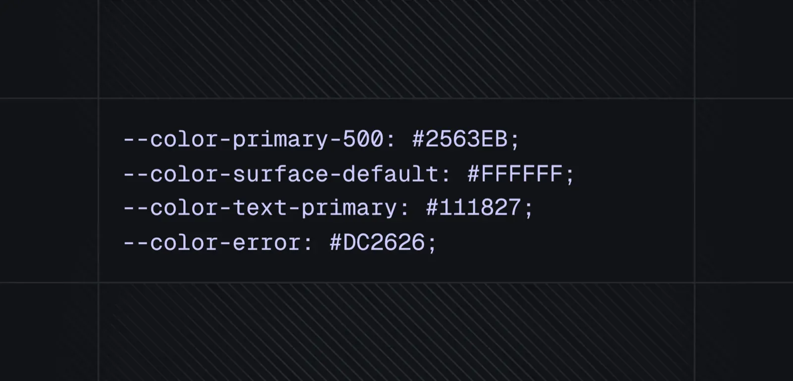
The most common breakpoint teams hit: maintaining an un-tinted neutral scale that clashes with the brand palette, ignoring dark mode contrast during initial scale generation instead of building it in from the start, or manually pasting isolated hex values into component files instead of adopting systematic token mappings from day one.
Here's what the difference looks like on a real project. A B2B SaaS team selected brand colors using a standard swatch generator, and once applied to complex data tables and multi-tier navigation, action buttons lacked contrast compliance, table borders vanished, and dark mode required a full manual rebuild. Using UI Colors and Atmos to calculate OKLCH-derived 50–950 scales for the primary hue and a blue-tinted neutral scale for dark surfaces instead - with APCA contrast checking on every table header and badge - cut implementation time significantly, since nothing needed retrofitting after the fact.
Figma Workflow: Variables, Tokens, and Theme Switching
Getting a generated scale into Figma cleanly takes a bit more structure than pasting hex codes into swatches:
- Set up Figma Variables, not styles. Variables support mode switching (light/dark) natively; legacy color styles don't. Every token from your generated scale should become a Variable, not a static style.
- Use a consistent naming structure. Match your CSS token names to your Figma Variable names exactly - color/primary/500, color/surface/default - so designers and engineers are speaking the same language without a translation step.
- Build light/dark as paired modes on the same Variable, not two separate color palettes. This is what lets a single component instance switch themes correctly instead of needing a duplicate dark-mode version of every frame.
- Map components to tokens, not hex values. Every button, card, and badge should reference a Variable (fill: color/primary/500) rather than a literal color, so a future token update propagates everywhere instantly. If your team is starting from an existing Figma file rather than a blank one, importing that file's styles directly keeps a generated scale anchored to the tokens you already have instead of introducing a second, competing naming system.
UXMagic: From Color Scale to Production Screens
Everything covered above - the 50–950 scale, the semantic tokens, the Figma Variable setup is still just the raw material. Generating a scale is only half the work; someone still has to manually map those values across dozens of Figma component states, one button and card and badge at a time.
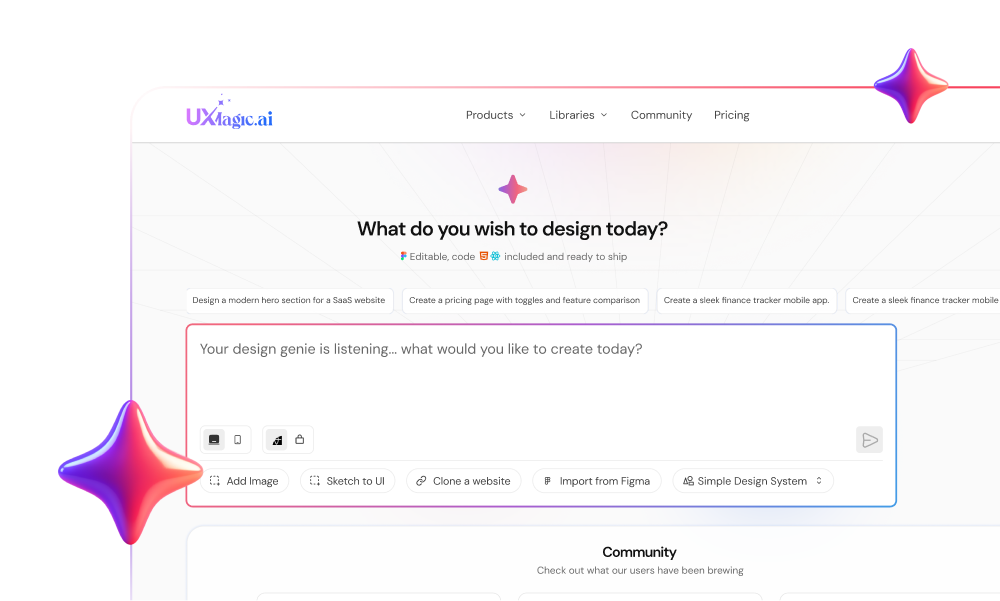
UXMagic's Style Guide Generator closes that specific gap. Feed it a prompt, a screenshot, or a URL, and it generates the full system - colors, typography, spacing, and components as one structured output, rather than a color scale you then have to distribute by hand across a design file. The generated tokens carry the same semantic structure this guide argues for, so a color defined once applies consistently everywhere it's used, not redefined screen by screen.
That consistency compounds across a multi-screen journey specifically. Conventional palette tools export isolated CSS scales and leave the distribution work to you; UXMagic's Flow Mode enforces the same semantic color token logic across an entire product flow, so buttons, containers, and interactive states stay visually consistent from onboarding through settings - not just correct on the one screen someone happened to check closely. For teams weighing how this fits into a broader AI-assisted process, how designers are actually using AI in production workflows covers where this kind of automation earns its place versus where manual judgment still matters more.
A non-technical founder building a rapid prototype hits the manual version of this directly - hours spent copying hex codes into Figma wireframes, ending up with inconsistent button states, uneven visual hierarchy, and accessible contrast failures across mobile screens. Generating the same flow through UXMagic's Prompt to UI instead calculates and distributes accessible color token scales across every screen automatically, establishing visual hierarchy from the first generation rather than after several rounds of manual fixing.
Generate Token-Mapped UI Flows Faster
Create complete product screen flows with semantic color tokens, consistent states, and production-ready design systems from your brand colors.